Showing posts with label Site. Show all posts

Friday, April 24, 2015

Your Portfolio Site Sucks, Here"s How to Fix It

I need to start with a disclaimer. When I say “sucks”, I don’t mean your design (which I’m sure is beautiful). I mean, does your portfolio site bring you clients on demand?


No? Then it sucks. But don’t worry. Mine used to suck too. So did everyone else’s.


There’s a big problem in the design community. We don’t know how to sell our services. In fact, we fail miserably at it. It’s the part of the biz we didn’t realize we had to do, and by the time we figured it out, the rent was already due and we had to put food on the table.


I hope to help you overcome that in this blog post.


I co-run an agency, Unexpected Ways, and from many years of testing, tweaking, and refining, we finally turned our website into a predictable source of business. We turn on ads and traffic sources when we want clients. We turn them off when we don’t.


It really can be that simple.


Right now we’re undergoing a major renovation based on even more things we’ve learned – but here are some of the biggest lessons that made the last version of our site such a huge success.


Preparing Your “Client Magnet” Website

pic2


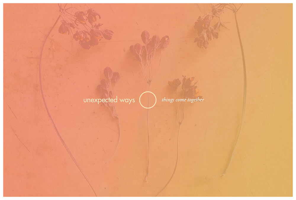
The first thing you need to do is the thing I see missing most: address your market’s problems, and talk about how you solve them.


That’s the goal of your website: to convince your market that you’re capable of helping them solve their problems. If you do that, you win their business. That’s how it works.


The first step to that is to know what their problems are in the first place. Think back to your past clients. What were their goals? What problems did they face with other designers? What did they really want from your services?


Ponder this over for a while, and write out a list of these problems. Then set it aside. It’s going to come in handy in every piece of marketing you ever do to promote yourself.


What Pages Do I Need?


Let’s talk about the overview of your portfolio site. Then I’ll go into the “nitty gritty” and give you concrete steps for creating content that sells.


Unless you’re mega-famous and power the world’s top brands, you need to dedicate a good portion of your site to selling yourself. I’ve found that the following pages work best:


  • Home

  • Services


    • Service 1

    • Service 2

    • Service 3

    • Etc.


  • Portfolio

  • About

  • Contact

Your home page creates a splash and conveys your core brand message. Your main “services” page lists each of your services with a 1-2 sentence description that links to the individual services pages. Your individual services pages discuss how you perform each of those services, how they helps clients solve their problems, and what makes you different.


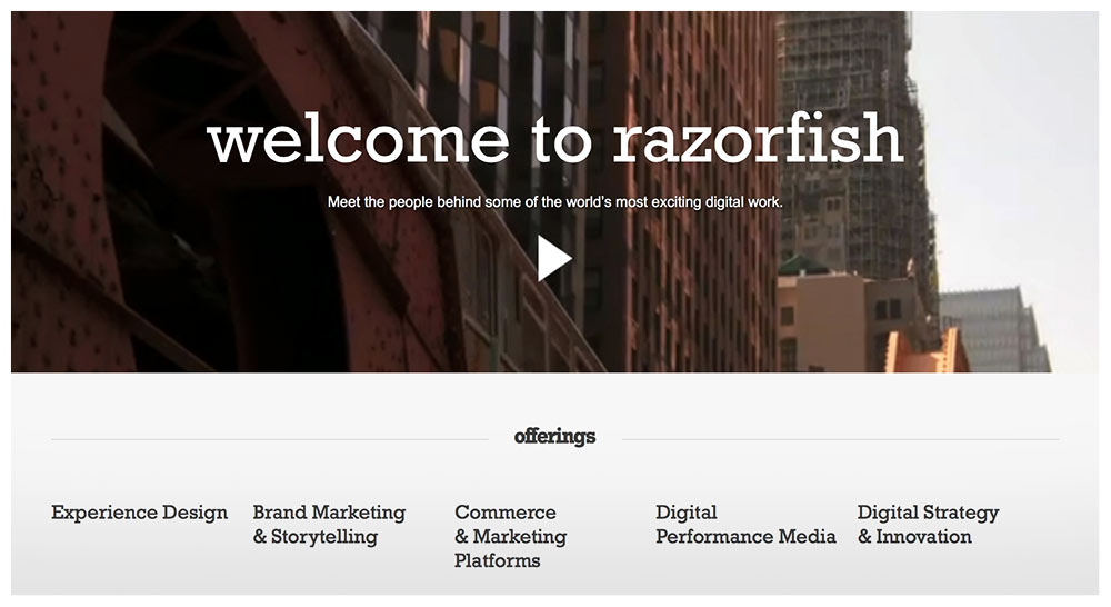
Even mega-agency Razorfish has a page for each of their services (each phrase under “offerings” links to a page describing a single service):

pic3


The “Portfolio” page seems pretty self-explanatory, but the rest of this blog is dedicated to how to organize one, because aside from your home page, it’ll be your most visited page.


“About” isn’t your bio or resume. It’s your “hero tale” – how you discovered design, how you help clients, why you do what you do. It still needs to sell, so the facts of your life / story that you reveal need to tie back into how they help you solve your clients’ problems.


Again, “Contact” seems straightforward, but it can be tricky to do it right. Just keep these words in mind though and you’ll do alright: approachable, approachable, approachable. Make reaching out to you feel natural, fun, and easy.


The Portfolio: A: Provide Background


If design is function + form, then the only way you can know if the “function” side of things is up to par is to know what problems it’s attempting to solve. Basically, in each of your portfolio pieces, present what challenges / problems / goals your clients faced for the particular projects you’re highlighting.


What was going on that they needed to hire you in the first place? Start each portfolio piece off with a short paragraph that discusses this. State who the client is, and what they wanted to accomplish.

pic5


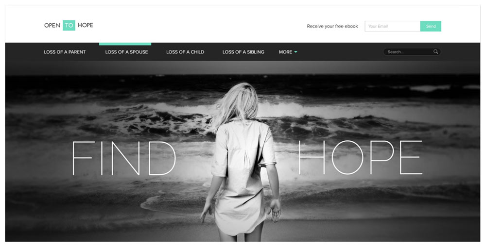
Here’s a great example from agency Zumeo:


OpentoHope.com is an online community where individuals can share inspirational stories of loss and love… Open to Hope was faced with the challenge of providing users with a safe place to share, as well as discovering and contributing helpful resources.


The Portfolio: B: Images Aren’t Enough


Design is about choices. Why that color? Why that shape? Why that font? In each of your portfolio pieces, discuss the choices you made along the way. This is your chance to show off how thoughtful you are.


Break down elements of your pieces that aren’t so obvious, and explain how they helped your client achieve their goals. Discuss the mood the colors create, the message the font conveys, the feeling the photography portrays.


Show off how smart you are, and that your design comes packaged with a whole lot more than just beauty.

pic4


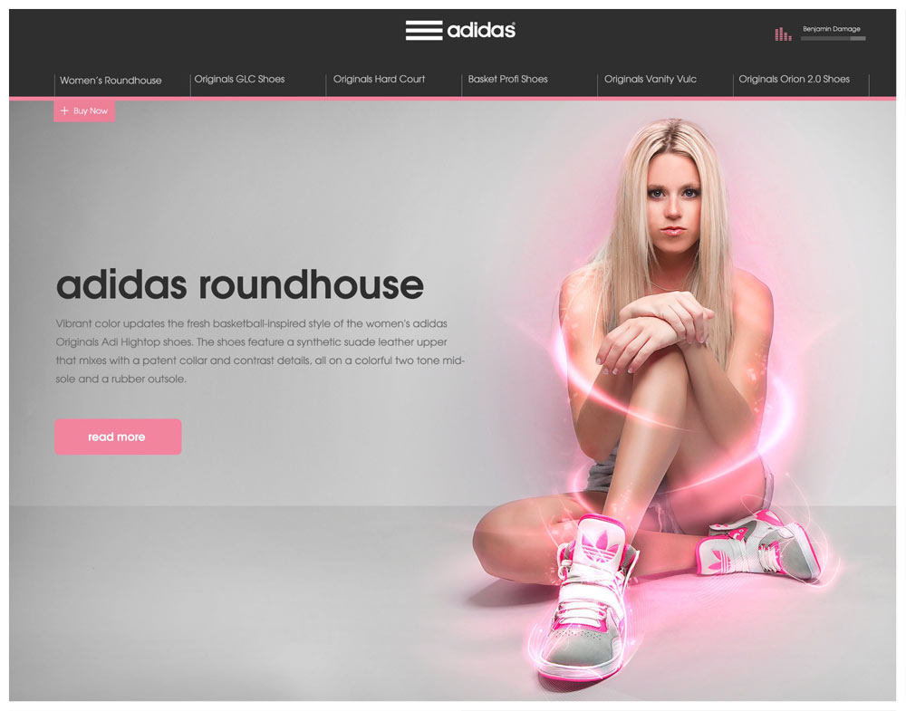
Here’s another great example from Zumeo on a campaign they did for Adidas:


“… Our goal was to create a single, responsive web page highlighting top shoes. The page would include audio, video, text, and ‘tech specs’. Each page would match the shoe color and style and tell a story. We chose to highlight the Adidas Roundhouse from Journeys. In this case, we wanted to think outside of the traditional sports box and focus on the fashionable side of the shoe…”


And one more example from these guys from another campaign for Incase:


“In order to showcase multiple products in a simple way, we created a Parallax scrolling system with new products at the forefront. The two product rows would scroll faster than the campaign, and in turn, the campaign would collapse with the scroll.”


The Portfolio: C: Quality Over Quantity


Your portfolio is only as strong as your weakest piece. Leave out anything that brings the group down as a whole.


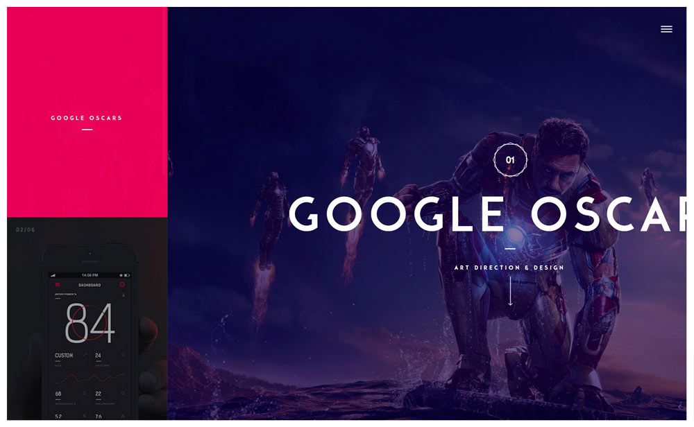
Studio “Design Embraced” has only 5 portfolio pieces, though each one powerfully shows what they’re capable of:

pic8


The Portfolio: D: Incorporate Testimonials


Now that you’ve discussed your clients’ problems and how you overcame them, drive this home with a short snippet of a testimonial. Just a fragment of a sentence, a single sentence, or a few very short sentences of your client expressing their gratitude will do.


Testimonials that discuss the following get you extra brownie points:


  • How easy you are to work with

  • How much extra revenue the client generated because of your design (a percentage or even just a vague statement works too)

  • How happy your client’s customers are with the work

This is because everyone has heard the horror stories of working with designers who are a pain in the butt. The first kind of testimonial eases that fear. Another major fear clients have is, “Will this even pay off?”


By showing testimonials from real people saying it pays off in droves, you’re countering that fear.


And finally, people want to know that other people will like and respect their branding – in particular, their customers. The third testimonial type eases this worry.


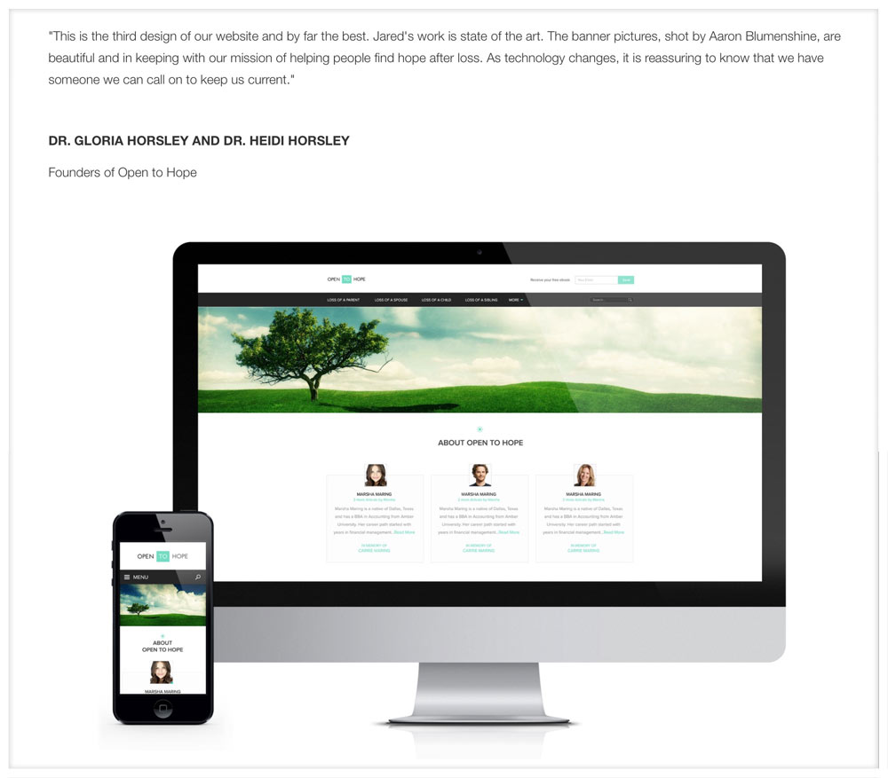
From the “Open to Hope” portfolio piece above, I found this later on the page, mixed right in with the images and background info:

pic6


The Portfolio: E: Big Images


Display your work big, bold, and beautifully. (It probably goes without saying, but I’ve come across many designer portfolios that featured thumbnails and nothing else.)


Services


An “easy” way to create the content for your services pages is to go through this exercise:


List out all the steps you take for each service. Then list why you take that step, and how it helps your clients in the end.


For example: Do you do market research? Why? How does it help?


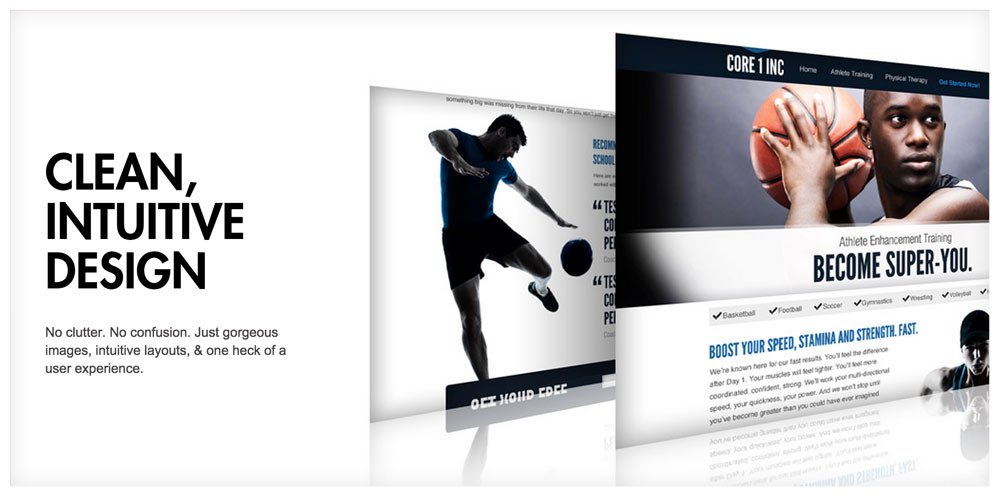
Our website is currently under construction, but up until recently, this was a blurb on our “Websites” page that outlined one unique benefit:

pic9


That page listed our key benefits, as well as key parts of our process.


Contact


Unless you’re overflowing with leads, you want to make contacting you feel as easy as possible.


Here’s what you don’t want to do:


  • Make it feel “risky,” or like you’re going to have a “heavy” or lengthy conversation

  • Make it feel burdensome

  • Make it feel time-consuming

I like phrases like “Let’s talk” for contact pages because they make it sound like you’re just going to have an easy, laid back chat about the project. It’s easy to transition from a laid back convo into a lengthy, heavy, and deep conversation.


But you’ll never get to the important stuff if you don’t make it approachable.


If you have a contact form, make it feel fun to fill out. Ask for info in unique ways. Don’t get carried away with fields – use as few as you possibly can.


(Again, unless you’re overflowing with leads. If so, make yourself less approachable so only the most eager of prospects reach out.)


To start, I’d have the following:


  • First & Last Name

  • Email

  • Phone Number

  • What are you looking for help with? (Have a checkbox for each of your services)

  • When’s a good time to talk? (Message box with something like “Thursday at 2pm” pre-filled in)

That’s it. Before the form, I’d put text that makes the contact process feel easy and inviting, For example:


Let’s talk!


I’d love to hear about your project, and see if we’re the right fit to help you grow. Fill out the form below or give us a call at [number] and we’ll make it happen.

[form]


Some Closing Thoughts


pic10


It might take time to really get your website down, but it’s the centerpiece of your marketing, so it’s worth it. Start with these tips, and then grow and evolve your site based on the feedback you get from customers.


Don’t get bogged down with what other designers say. There’s only one audience whose input into your site matters: your market.


Your market is giving you good feedback when they contact you after viewing your site. They’re giving you bad feedback when they don’t. It’s as simple as that.


Questions? Thoughts? Leave Them Below


Feel free to leave a comment below and ask any questions you might have. I’d love to help in any way that I can.


David Tendrich is the co-head of creative agency Unexpected Ways, as well as the co-founder of Reliable PSD: the first-ever PSD to HTML & PSD to WordPress service run by designers, for designers. He co-runs his companies from Portland, Oregon with his lovely wife and business partner, Lou Levit.

Products Seen In This Post:


getpaidtowrite-banner
Your Portfolio Site Sucks, Here"s How to Fix It

Tuesday, April 14, 2015

Create a Responsive Site Without a Single Line of Code Using Webydo

Editor’s note: This article is brought to you by Webydo.


Designers have always had a challenging role to play in the website creation process. They are often the first ones to work with a client, establishing a rapport with them as they work together to create the look and feel for a new website. Then, just as the design of that new site is being finalized and approved, those designers are often forced to hand over their work to a developer.


The developer then codes that design into the resulting webpages – a process that takes time and, in some cases, as much as 70% of a project’s budget to complete. Unless that designer decides to learn how to code websites themselves, this is the process which they are forced to work under – until now.


Promoted with the “by designers, for designers” chant, Webydo is a code-free, web design suite that empowers design professionals to take a greater role in the website creation process, offering a compelling alternative for designers looking to break away from the traditional process of handing work (and budget) off to a developer for hand coding.


Let’s take a look at what to expect from Webydo.


A Professional-Quality Platform


There have been plenty of DIY web design options available for many years now. These rudimentary tools are however not professional-grade. They are B2C offerings that are suitable for hobbyists looking to quickly build a basic web presence by choosing a template, adding a few photos and text, and calling it a day.


This is not how a professional designer works. And it’s also not how Webdyo works. Webydo is a B2B solution that was created with the needs of design professionals in mind.


Versatility and Ease of Use


Webydo has the flexibility and features that you simply will not find in simpler alternatives. Webydo is an online software accessible via a browser, and getting started on it is quick and easy.


Once you are signed in, you can begin a project by either selecting an existing design theme, choosing a popular layout structure as your starting point, or opening a blank canvas to have total control over your design/project.


Drag-and-drop features and an intuitive interface allow designers to create the look and feel of a webpage directly in-browser while the software writes the code needed to turn that design into a working webpage. The code, by the way, is W3C validated and of a high standard.


Code-Free Web Development Features


It’s one thing to be able to use Webydo to set fonts, colors and layout – aspects of a webpage that any design professional will be familiar and comfortable with, but how about more development-centric features that are popular on websites today?


Webydo allows for these features to be easily added too. Many of the popular features the platform includes are ones that were added based on requests from their community of 130,000 designers.


On top of that, one of the most powerful features of Webydo is its pixel-perfect responsive editor. On today’s Web, sites must work well across a wide range of devices and screen sizes. On Webdyo, designers can create websites that respond to mobile devices, large screen desktops, and everything in between and they have total control over how their sites will look for each size.


Another popular approach on websites today is a parallax scrolling effect, where elements of the foreground move at a different rate than those in the background. This effect creates a sense of depth and can be used very effectively as a storytelling device. Webydo allows designers to easily add parallax scrolling animations to their sites, all without writing a line of code.


No tool will ever be able to fully mirror the rapid pace of change in the web design industry, but it is encouraging to see that Webydo is actively listening to their community of users and being committed to the continual improvement on their platform.


Powerful Business Capabilities


In addition to the design and development features of Webydo, the platform also includes a number of more business-centric capabilities that designers should also be excited for.


  • CMS features will give professional designers the ability to train their clients on how to manage their websites and make typical content changes once that site has gone live.

  • There is even a white-label option for designers who want to brand the solution as their own.

  • Client billing can also be handled from directly within Webydo, making it much more than just a platform used to design websites.

The Limitations of the Webydo Platform


Webydo sounds pretty amazing, and it is, but like any software, it does have its limitations.


First off, Webydo is a subscription-based service. There is a 30-day free trial which gives you access to features like client billing and while label solutions. After that period, the cost depends on the plan you select, starting at /month for one website.


Another limitation is that should you decide to move away from Webydo, you can export your site design to take it with you. You won’t, however have access to the CMS-editing capabilities as well as other helpful features of the platform.


In Summary


If you are a design professional who has been frustrated with the typical way of creating websites and want to have more control over the entire process, then Webydo is certainly worth a look. You can create an account in minutes and take advantage of the 30-day free trial to see if it is a fit for your design business.


You can learn more, and create your account, at www.webydo.com.


Create a Responsive Site Without a Single Line of Code Using Webydo

Saturday, April 11, 2015

Create a Responsive Site Without a Single Line of Code Using Webydo

Editor’s note: This article is brought to you by Webydo.


Designers have always had a challenging role to play in the website creation process. They are often the first ones to work with a client, establishing a rapport with them as they work together to create the look and feel for a new website. Then, just as the design of that new site is being finalized and approved, those designers are often forced to hand over their work to a developer.


The developer then codes that design into the resulting webpages – a process that takes time and, in some cases, as much as 70% of a project’s budget to complete. Unless that designer decides to learn how to code websites themselves, this is the process which they are forced to work under – until now.


Promoted with the “by designers, for designers” chant, Webydo is a code-free, web design suite that empowers design professionals to take a greater role in the website creation process, offering a compelling alternative for designers looking to break away from the traditional process of handing work (and budget) off to a developer for hand coding.


Let’s take a look at what to expect from Webydo.


A Professional-Quality Platform


There have been plenty of DIY web design options available for many years now. These rudimentary tools are however not professional-grade. They are B2C offerings that are suitable for hobbyists looking to quickly build a basic web presence by choosing a template, adding a few photos and text, and calling it a day.


This is not how a professional designer works. And it’s also not how Webdyo works. Webydo is a B2B solution that was created with the needs of design professionals in mind.


Versatility and Ease of Use


Webydo has the flexibility and features that you simply will not find in simpler alternatives. Webydo is an online software accessible via a browser, and getting started on it is quick and easy.


Once you are signed in, you can begin a project by either selecting an existing design theme, choosing a popular layout structure as your starting point, or opening a blank canvas to have total control over your design/project.


Drag-and-drop features and an intuitive interface allow designers to create the look and feel of a webpage directly in-browser while the software writes the code needed to turn that design into a working webpage. The code, by the way, is W3C validated and of a high standard.


Code-Free Web Development Features


It’s one thing to be able to use Webydo to set fonts, colors and layout – aspects of a webpage that any design professional will be familiar and comfortable with, but how about more development-centric features that are popular on websites today?


Webydo allows for these features to be easily added too. Many of the popular features the platform includes are ones that were added based on requests from their community of 130,000 designers.


On top of that, one of the most powerful features of Webydo is its pixel-perfect responsive editor. On today’s Web, sites must work well across a wide range of devices and screen sizes. On Webdyo, designers can create websites that respond to mobile devices, large screen desktops, and everything in between and they have total control over how their sites will look for each size.


Another popular approach on websites today is a parallax scrolling effect, where elements of the foreground move at a different rate than those in the background. This effect creates a sense of depth and can be used very effectively as a storytelling device. Webydo allows designers to easily add parallax scrolling animations to their sites, all without writing a line of code.


No tool will ever be able to fully mirror the rapid pace of change in the web design industry, but it is encouraging to see that Webydo is actively listening to their community of users and being committed to the continual improvement on their platform.


Powerful Business Capabilities


In addition to the design and development features of Webydo, the platform also includes a number of more business-centric capabilities that designers should also be excited for.


  • CMS features will give professional designers the ability to train their clients on how to manage their websites and make typical content changes once that site has gone live.

  • There is even a white-label option for designers who want to brand the solution as their own.

  • Client billing can also be handled from directly within Webydo, making it much more than just a platform used to design websites.

The Limitations of the Webydo Platform


Webydo sounds pretty amazing, and it is, but like any software, it does have its limitations.


First off, Webydo is a subscription-based service. There is a 30-day free trial which gives you access to features like client billing and while label solutions. After that period, the cost depends on the plan you select, starting at /month for one website.


Another limitation is that should you decide to move away from Webydo, you can export your site design to take it with you. You won’t, however have access to the CMS-editing capabilities as well as other helpful features of the platform.


In Summary


If you are a design professional who has been frustrated with the typical way of creating websites and want to have more control over the entire process, then Webydo is certainly worth a look. You can create an account in minutes and take advantage of the 30-day free trial to see if it is a fit for your design business.


You can learn more, and create your account, at www.webydo.com.


Create a Responsive Site Without a Single Line of Code Using Webydo

Thursday, March 5, 2015

10 Best Photo Gallery Plugins For Your WordPress Site

A photography website is not just a regular website – it is a collection of someone ‘s talent and capabilities. There are plenty of websites that can properly display a photographer ‘s work but WordPress is an option that gives you ample room for customization. This means that you want to ensure that you have the right plugins to make the browsing experience as efficient and smooth as possible.


There are many WordPress photo gallery plugins available on the web that help you with just that. Here, we have gathered 10 of the best photo gallery plugins that can help you make your WordPress site even more alluring. From editing images to including audio, there are various functions you can find. If you think we’ve missed out on any that should be included, do let us know in the comments.


1. NextGEN Gallery


NextGEN Gallery is one of the most popular WordPress gallery plugins around. It allows batch uploading and management of image galleries, slideshow and thumbnail style galleries, editing of thumbnails. It also allows one to turn group galleries into albums and various other features that can really give a striking look to one ‘s website. [Get it here – Free and Premium]


2. Easy Media Gallery


Easy Media Gallery is a plugin which provides an easy way to display grid galleries, photo albums, galleries with pagination and Google Maps and Google Street View as well. You can also embed videos from YouTube, Vimeo and other video sites. This allows for more interactivity on your site and gives a better experience too. [Get it here – Free and Premium]


3. Photo Gallery


Photo Gallery is a responsive WordPress plugin equipped with different tools and options for adding image galleries as well as editing images. It offers the management of unlimited photos, support for many image formats. It also has support for adding YouTube and Vimeo Videos within galleries and comes with audio playback for image slide shows. [Get it here – Free and Premium]


4. Responsive Photo Gallery


Responsive Photo Gallery is based on the Bootstrap framework and allows tiy to add unlimited images on WordPress website. It also provides light box preview using a fading animation effect. The shortcode [WRG] can be used to publish photo galleries into any page of your WordPress site. Other important features are simple and easy admin gallery dashboard, two design layouts, hover colour opacity effect and much more. [Get it here – Free and Premium]


5. Gallery


Gallery is an easy to use WordPress plugin that gives you a simple way to create galleries of high quality images. You can add descriptions for each gallery, choose how you ‘d like to display all the galleries and so on. There is a premium version of Gallery as well which is loaded with a bundle of more advanced features, if you ‘re interested. [Get it here – Free and Premium]


6. Grand Flagallery


Grand Flagallery is a powerful and user friendly photo gallery plugin which comes with some amazing 3D gallery skins. It not only displays well on desktop systems but also works impeccably in full-screen mode of mobile phones. Specifically for desktop browsers, the background music along with the image slide show can deliver a really pleasant effect to visitors of the website. [Get it here – Free]


7. Simple Photo Gallery


Simple Photo Gallery works just as the name suggests. A couple of this plugins important features include easy gallery creation, the ability to watermark images, galleries done in masonry style, the offer of various thumbnail templates as well as plenty of other features to choose from. Definitely a handy plugin to have. [Get it here – Free]


8. Gallery Bank


Gallery Bank is a responsive WordPress plugin. It helps in the creation of stylish and beautiful image galleries, list albums, grid albums, thumbnail layouts and various other functions and special effects to elevate your WordPress site. The pro version of WP Gallery Bank is equipped with more than 200 features to give an eye-catching look to your website. [Get it here – Free and Premium]


9. Lazyest Gallery


Lazyest Gallery provides a simple way for creating photo galleries with folders, sub folders, thumbnail pages and slide shows. The key features offered by the plugin are an unlimited number of images, automatic thumbnail creation, the capability to add captions, shortcodes that can be used for galleries and much more. Thus letting you work in a more efficient manner. [Get it here – Free]


10. Facebook Photo Fetcher


Facebook Photo Fetcher is a handy WordPress plugin to create photo galleries from a facebook album automatically. Some of its noteworthy features are simple PHP template functions, fully customizable galleries and a built-in light box. You also don ‘t require a database table to give a stylish look to your website with this plugin. [Get it here – Free]


10 Best Photo Gallery Plugins For Your WordPress Site

Tuesday, February 24, 2015

10 Best Photo Gallery Plugins For Your WordPress Site

A photography website is not just a regular website – it is a collection of someone ‘s talent and capabilities. There are plenty of websites that can properly display a photographer ‘s work but WordPress is an option that gives you ample room for customization. This means that you want to ensure that you have the right plugins to make the browsing experience as efficient and smooth as possible.


There are many WordPress photo gallery plugins available on the web that help you with just that. Here, we have gathered 10 of the best photo gallery plugins that can help you make your WordPress site even more alluring. From editing images to including audio, there are various functions you can find. If you think we’ve missed out on any that should be included, do let us know in the comments.


1. NextGEN Gallery


NextGEN Gallery is one of the most popular WordPress gallery plugins around. It allows batch uploading and management of image galleries, slideshow and thumbnail style galleries, editing of thumbnails. It also allows one to turn group galleries into albums and various other features that can really give a striking look to one ‘s website. [Get it here – Free and Premium]


2. Easy Media Gallery


Easy Media Gallery is a plugin which provides an easy way to display grid galleries, photo albums, galleries with pagination and Google Maps and Google Street View as well. You can also embed videos from YouTube, Vimeo and other video sites. This allows for more interactivity on your site and gives a better experience too. [Get it here – Free and Premium]


3. Photo Gallery


Photo Gallery is a responsive WordPress plugin equipped with different tools and options for adding image galleries as well as editing images. It offers the management of unlimited photos, support for many image formats. It also has support for adding YouTube and Vimeo Videos within galleries and comes with audio playback for image slide shows. [Get it here – Free and Premium]


4. Responsive Photo Gallery


Responsive Photo Gallery is based on the Bootstrap framework and allows tiy to add unlimited images on WordPress website. It also provides light box preview using a fading animation effect. The shortcode [WRG] can be used to publish photo galleries into any page of your WordPress site. Other important features are simple and easy admin gallery dashboard, two design layouts, hover colour opacity effect and much more. [Get it here – Free and Premium]


5. Gallery


Gallery is an easy to use WordPress plugin that gives you a simple way to create galleries of high quality images. You can add descriptions for each gallery, choose how you ‘d like to display all the galleries and so on. There is a premium version of Gallery as well which is loaded with a bundle of more advanced features, if you ‘re interested. [Get it here – Free and Premium]


6. Grand Flagallery


Grand Flagallery is a powerful and user friendly photo gallery plugin which comes with some amazing 3D gallery skins. It not only displays well on desktop systems but also works impeccably in full-screen mode of mobile phones. Specifically for desktop browsers, the background music along with the image slide show can deliver a really pleasant effect to visitors of the website. [Get it here – Free]


7. Simple Photo Gallery


Simple Photo Gallery works just as the name suggests. A couple of this plugins important features include easy gallery creation, the ability to watermark images, galleries done in masonry style, the offer of various thumbnail templates as well as plenty of other features to choose from. Definitely a handy plugin to have. [Get it here – Free]


8. Gallery Bank


Gallery Bank is a responsive WordPress plugin. It helps in the creation of stylish and beautiful image galleries, list albums, grid albums, thumbnail layouts and various other functions and special effects to elevate your WordPress site. The pro version of WP Gallery Bank is equipped with more than 200 features to give an eye-catching look to your website. [Get it here – Free and Premium]


9. Lazyest Gallery


Lazyest Gallery provides a simple way for creating photo galleries with folders, sub folders, thumbnail pages and slide shows. The key features offered by the plugin are an unlimited number of images, automatic thumbnail creation, the capability to add captions, shortcodes that can be used for galleries and much more. Thus letting you work in a more efficient manner. [Get it here – Free]


10. Facebook Photo Fetcher


Facebook Photo Fetcher is a handy WordPress plugin to create photo galleries from a facebook album automatically. Some of its noteworthy features are simple PHP template functions, fully customizable galleries and a built-in light box. You also don ‘t require a database table to give a stylish look to your website with this plugin. [Get it here – Free]


10 Best Photo Gallery Plugins For Your WordPress Site

Saturday, January 24, 2015

Is Minimal Design the Best Strategy for Your Site?


One of the buzzwords of modern marketing or design work is “understanding your customers.” Before you jump on board with a trend or design style, it’s good to research how consumers or clients in your industry respond to it. One particular trend that has dominated the web for several years is minimalism. So, if you’re considering a minimalist redesign, let’s take a look and see if it’s the best strategy for you and your site.


Why Minimalist Design is All the Rage


Modern minimalism has been around for over 80 years. Several decades of lavish design and skeuomorphic hyper-realism supplanted the postwar minimalist movement, but it has once again become a mainstream trend. The most common elements include:


  • Letting a handful of visuals convey your larger message (“less is more”). Videographer Cedric Vella does this by featuring just his name and title, three informative links, and a calming background image above the cut of his one-page website.
    Videographer Cedric Vella

  • Cutting anything that distracts from your main point or purpose — only leave an element in place if your design makes no sense without it.

  • Making every detail fit your theme in the way it communicates your message. Eleonora Zorzi’s digital design page has very few elements, but they each fit her personal brand — structured and creative at the same time.
    Eleonora Zorzi digital design page

  • Using sparse, carefully selected colors. Minimalist design usually includes one or two highlight colors, which draws the viewer’s eye.

  • Providing as much direction with your white space as with your words. Separate text into sentences or small paragraphs, and spread these out in the order and direction that you want them to be read.

All of these things lead to design that many users appreciate because it’s fundementally easy to use. Additionally, so many user’s lives are full of clutter that a bare-minimum design aesthetic feels very refreshing.


Pros and Cons of Minimalism


As with any fad, minimalism has some inherent downfalls. It’s not a one-size-fits-all solution; some businesses need more visual content or intricate design because of the nature of their work. A minimalist approach wouldn’t fit sites like Square Circle, the Hard Rock Hotel brand, or SensiSoft, for example.


Trimming all content down to bare bones would downplay the impact of Square Circle’s bold ad work, eliminate the lush details sought by Hard Rock Hotel guests, and fail to

illustrate the adaptability that SensiSoft brings to the advertising world. Minimalism can also make you unsure about whether you still have too much content, or be so austere that your message is unclear to visitors.


There are, however, well-documented advantages to using minimalism for the right endeavor:


  • Faster load time — there aren’t multiple photo and video files that take forever to load.

  • Ease of navigation — it’s hard to get lost when there aren’t many places to go.

  • Lack of ads — highly appreciated by most visitors, especially those in a hurry.

  • Less server strain.

  • Centrality of content — all distracting elements are eliminated.

  • Responsiveness — easier to optimize for mobile browsers.

  • Aura of importance — not cluttering up the page lends your site an authoritative mystique.

Determining whether the pros and cons are of more weight depends largely on the kind of business your site represents. Beta testing on a core group of loyal users is one way to gauge how your customers are likely to receive a complete minimalist redesign of your site.


How Using Minimalist Design Can Affect Your Business


If you are in ecommerce, minimalism can definitely be a design asset. The loading and navigation speed of a streamlined site makes the casual shopper more likely to buy, whereas you can lose 4 out of 10 visitors because of a slow-loading page. Consistent design and an understated, professional appearance also make viewers feel better about doing business with you. With simple, intuitive use being important to 76 percent of surveyed web users, minimalism can be a safe default option.


leading companies like Apple have made minimalism the standard for design


Others argue that since leading companies like Apple have made minimalism the standard for design, many people forget that there are other, equally viable ways to make technology beautiful. Many consumers middle-aged and older find minimal design ugly — they appreciate well-placed details and cozy spaces with more than ‘two pieces of furniture’.


In addition, minimalism’s simple appearance belies the intense design process required to get it right. This makes for many badly designed “minimalist” sites.


Concluding


If you think minimalism will appeal to your target demographic and enhance the aesthetic of your business, go for it, as long as you consider the following:


  • Run many tests before you fully commit to your site’s new look.

  • Implement changes gradually; this can sometimes make people more comfortable with the updating process. (Include a notice in your blog or newsletter to avoid confusing your visitors.)

  • Accept honest feedback. If you realize that your sleek redesign is less of a hit than you hoped, be willing to add back in a few of the older elements that your customers appreciated.

  • Don’t use good design — minimal or otherwise — as a substitute for strong marketing and customer service.

How has minimalism figured into your business? Share your stories with us!


The post Is Minimal Design the Best Strategy for Your Site? appeared first on Speckyboy Web Design Magazine.


Is Minimal Design the Best Strategy for Your Site?