Thomsoon is a free portfolio template built with HTML5, CSS3 and jQuery. It includes 9 ready to be used pages.
The post Thomsoon – Free portfolio template appeared first on Freebiesbug.

Thomsoon – Free portfolio template
Thomsoon is a free portfolio template built with HTML5, CSS3 and jQuery. It includes 9 ready to be used pages.
The post Thomsoon – Free portfolio template appeared first on Freebiesbug.
Dribbble is a popular website to in the design sphere where you can share your WIP projects, designs, mockups, and even freebies. In return you will get feedback and criticism from fellow designers which is good to push your design up to the next level.
If you want to personalize how you display your portfolio, you can display the shots under your own domain. To help you with that, you can try out Dribbbox.

Dribbbox is a library that helps us display Dribbble shots under our own domain, will none of the hassle. Let’s take a look at how you can setup Dribbbox for showcasing your works of art.
I assume that you have your domain and a server setup; a shared hosting should work just fine. Otherwise, you can run a local server if you dont have one. If you need instructions on how to set up a local server with AMPPS, read about it here.
Download the ZIP package, and upload the content to the server. Include the index.html, the config.js, and the assets folder.

Open the config.js and specify the username to retrieve your portfolio from Dribbble.
In this case, I am using Thoriq Firdaus’ portfolio for the demo. Here’s how you retrieve the portfolio.
dribbbox.config =
 dribbble_username : "tfirdaus",
 short_description : "A world class designer wanna-be.",
 email_address : "tfirdaus@helloworld.com"
Save it and refresh the page.

It’s really that simple, isn’t it?
The setup is simple. You have three columns. Your contact details are at the far left in a static side bar. Your Dribbble shots are in the middle scrollable column, and on the right, is where viewers can see your project in full view, one at a time. The setup is perfect only as a display which means the public won’t be able to give you feedback like comments or likes. They won’t be able to share your work either.
Dribbbox has been optimized for view on mobile devices. When the website is viewed on mobile, the layout as well as the HTML of the DOM tree will be reconstructed through mobile.js. Specify the viewport width of which the mobile.js should take place in the index.html.
(function()
 var s = document.createElement("script")
 s.src = "assets/js/" + (matchMedia("(max-width: 414px)").matches ? "mobile" : "desktop") + ".js"
 document.head.appendChild(s)
)()
Dribbbox is a handy library to show off your Dribbble shots under your own domain name. It is very intuitive to work with even if you do not know JavaScript; simply add your username and (optionally) your email address, and you are all set. If you don’t like the default presentation, you can further personalize the appearance through CSS.
More On Hongkiat: Host Your Static Website in Dropbox With Pancake
Dribbble is a popular website to in the design sphere where you can share your WIP projects, designs, mockups, and even freebies. In return you will get feedback and criticism from fellow designers which is good to push your design up to the next level.
If you want to personalize how you display your portfolio, you can display the shots under your own domain. To help you with that, you can try out Dribbbox.
Dribbbox is a library that helps us display Dribbble shots under our own domain, will none of the hassle. Let’s take a look at how you can setup Dribbbox for showcasing your works of art.
I assume that you have your domain and a server setup; a shared hosting should work just fine. Otherwise, you can run a local server if you dont have one. If you need instructions on how to set up a local server with AMPPS, read about it here.
Download the ZIP package, and upload the content to the server. Include the index.html, the config.js, and the assets folder.
Open the config.js and specify the username to retrieve your portfolio from Dribbble.
In this case, I am using Thoriq Firdaus’ portfolio for the demo. Here’s how you retrieve the portfolio.
dribbbox.config = dribbble_username : "tfirdaus", short_description : "A world class designer wanna-be.", email_address : "tfirdaus@helloworld.com"
Save it and refresh the page.
It’s really that simple, isn’t it?
The setup is simple. You have three columns. Your contact details are at the far left in a static side bar. Your Dribbble shots are in the middle scrollable column, and on the right, is where viewers can see your project in full view, one at a time. The setup is perfect only as a display which means the public won’t be able to give you feedback like comments or likes. They won’t be able to share your work either.
Dribbbox has been optimized for view on mobile devices. When the website is viewed on mobile, the layout as well as the HTML of the DOM tree will be reconstructed through mobile.js. Specify the viewport width of which the mobile.js should take place in the index.html.
(function() var s = document.createElement("script") s.src = "assets/js/" + (matchMedia("(max-width: 414px)").matches ? "mobile" : "desktop") + ".js" document.head.appendChild(s) )() Dribbbox is a handy library to show off your Dribbble shots under your own domain name. It is very intuitive to work with even if you do not know JavaScript; simply add your username and (optionally) your email address, and you are all set. If you don’t like the default presentation, you can further personalize the appearance through CSS.
More On Hongkiat: Host Your Static Website in Dropbox With Pancake
I need to start with a disclaimer. When I say “sucks”, I don’t mean your design (which I’m sure is beautiful). I mean, does your portfolio site bring you clients on demand?
No? Then it sucks. But don’t worry. Mine used to suck too. So did everyone else’s.
There’s a big problem in the design community. We don’t know how to sell our services. In fact, we fail miserably at it. It’s the part of the biz we didn’t realize we had to do, and by the time we figured it out, the rent was already due and we had to put food on the table.
I hope to help you overcome that in this blog post.
I co-run an agency, Unexpected Ways, and from many years of testing, tweaking, and refining, we finally turned our website into a predictable source of business. We turn on ads and traffic sources when we want clients. We turn them off when we don’t.
It really can be that simple.
Right now we’re undergoing a major renovation based on even more things we’ve learned – but here are some of the biggest lessons that made the last version of our site such a huge success.
The first thing you need to do is the thing I see missing most: address your market’s problems, and talk about how you solve them.
That’s the goal of your website: to convince your market that you’re capable of helping them solve their problems. If you do that, you win their business. That’s how it works.
The first step to that is to know what their problems are in the first place. Think back to your past clients. What were their goals? What problems did they face with other designers? What did they really want from your services?
Ponder this over for a while, and write out a list of these problems. Then set it aside. It’s going to come in handy in every piece of marketing you ever do to promote yourself.
Let’s talk about the overview of your portfolio site. Then I’ll go into the “nitty gritty” and give you concrete steps for creating content that sells.
Unless you’re mega-famous and power the world’s top brands, you need to dedicate a good portion of your site to selling yourself. I’ve found that the following pages work best:
Your home page creates a splash and conveys your core brand message. Your main “services” page lists each of your services with a 1-2 sentence description that links to the individual services pages. Your individual services pages discuss how you perform each of those services, how they helps clients solve their problems, and what makes you different.
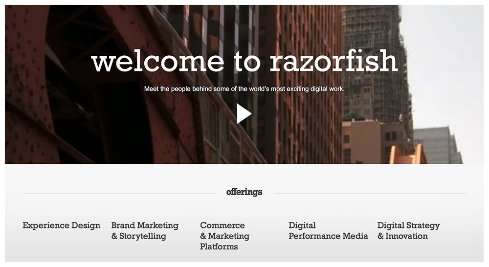
Even mega-agency Razorfish has a page for each of their services (each phrase under “offerings” links to a page describing a single service):
The “Portfolio” page seems pretty self-explanatory, but the rest of this blog is dedicated to how to organize one, because aside from your home page, it’ll be your most visited page.
“About” isn’t your bio or resume. It’s your “hero tale” – how you discovered design, how you help clients, why you do what you do. It still needs to sell, so the facts of your life / story that you reveal need to tie back into how they help you solve your clients’ problems.
Again, “Contact” seems straightforward, but it can be tricky to do it right. Just keep these words in mind though and you’ll do alright: approachable, approachable, approachable. Make reaching out to you feel natural, fun, and easy.
If design is function + form, then the only way you can know if the “function” side of things is up to par is to know what problems it’s attempting to solve. Basically, in each of your portfolio pieces, present what challenges / problems / goals your clients faced for the particular projects you’re highlighting.
What was going on that they needed to hire you in the first place? Start each portfolio piece off with a short paragraph that discusses this. State who the client is, and what they wanted to accomplish.
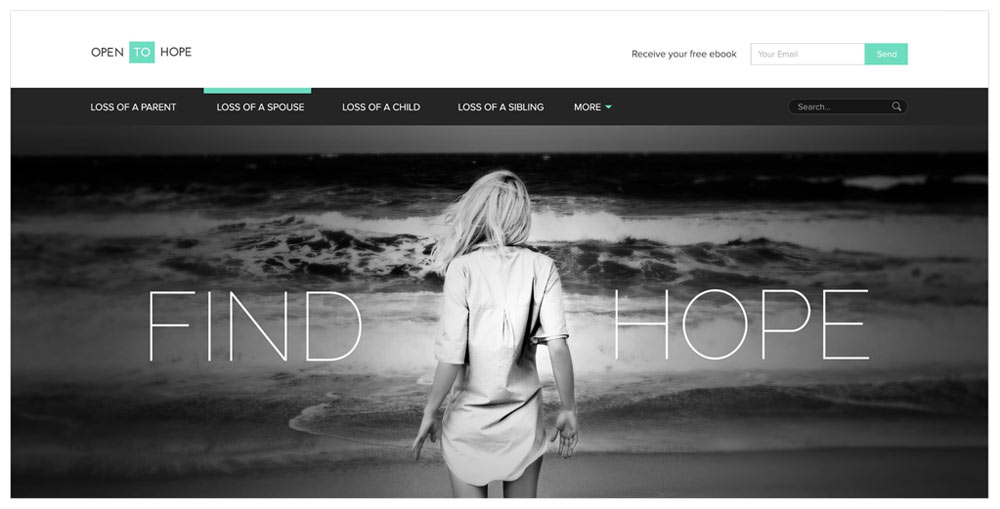
Here’s a great example from agency Zumeo:
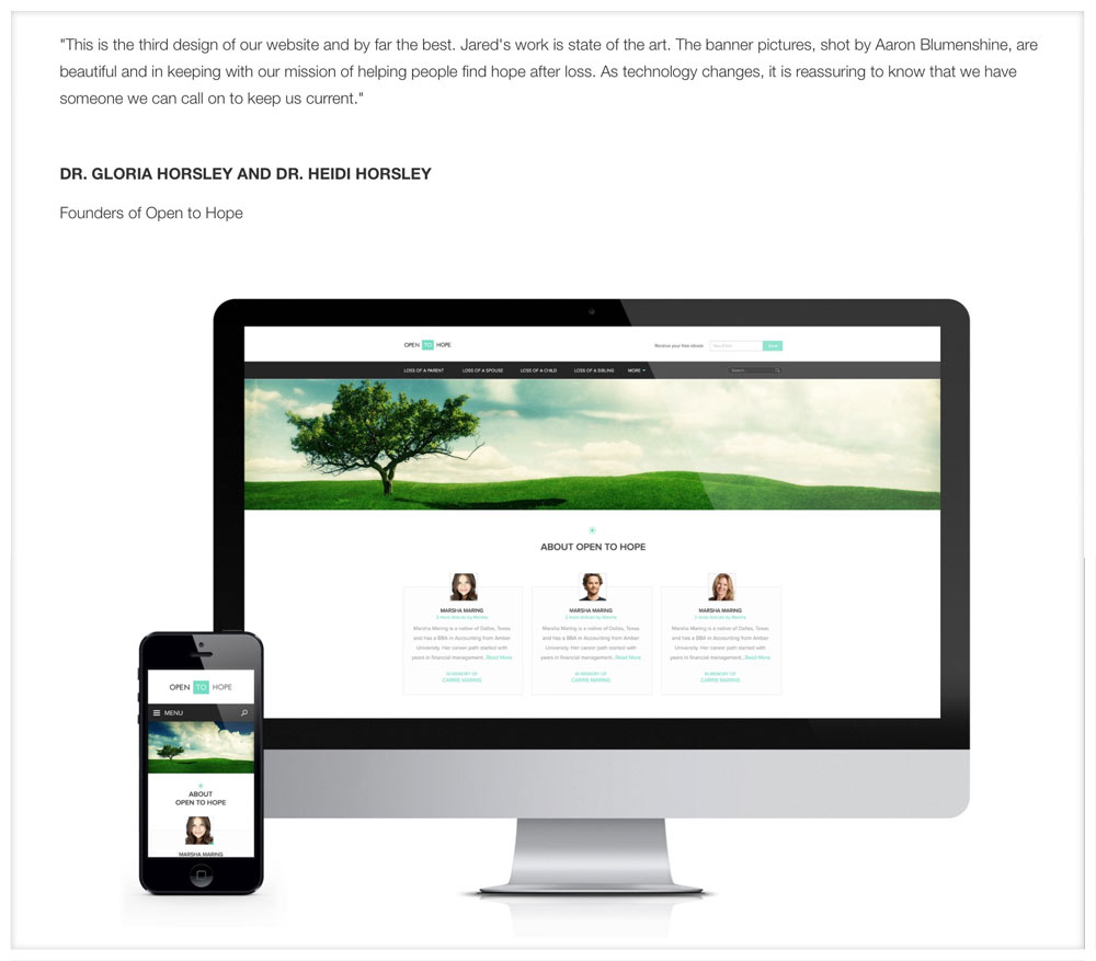
OpentoHope.com is an online community where individuals can share inspirational stories of loss and love… Open to Hope was faced with the challenge of providing users with a safe place to share, as well as discovering and contributing helpful resources.
Design is about choices. Why that color? Why that shape? Why that font? In each of your portfolio pieces, discuss the choices you made along the way. This is your chance to show off how thoughtful you are.
Break down elements of your pieces that aren’t so obvious, and explain how they helped your client achieve their goals. Discuss the mood the colors create, the message the font conveys, the feeling the photography portrays.
Show off how smart you are, and that your design comes packaged with a whole lot more than just beauty.
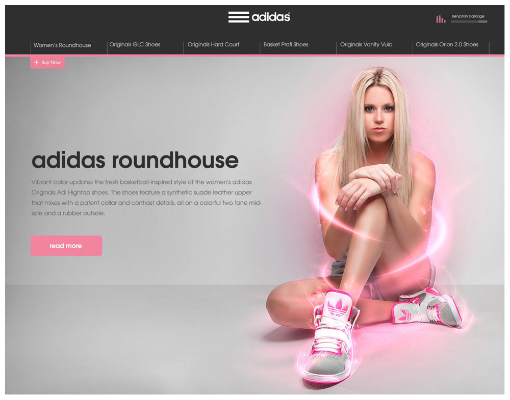
Here’s another great example from Zumeo on a campaign they did for Adidas:
“… Our goal was to create a single, responsive web page highlighting top shoes. The page would include audio, video, text, and ‘tech specs’. Each page would match the shoe color and style and tell a story. We chose to highlight the Adidas Roundhouse from Journeys. In this case, we wanted to think outside of the traditional sports box and focus on the fashionable side of the shoe…”
And one more example from these guys from another campaign for Incase:
“In order to showcase multiple products in a simple way, we created a Parallax scrolling system with new products at the forefront. The two product rows would scroll faster than the campaign, and in turn, the campaign would collapse with the scroll.”
Your portfolio is only as strong as your weakest piece. Leave out anything that brings the group down as a whole.
Studio “Design Embraced” has only 5 portfolio pieces, though each one powerfully shows what they’re capable of:

Now that you’ve discussed your clients’ problems and how you overcame them, drive this home with a short snippet of a testimonial. Just a fragment of a sentence, a single sentence, or a few very short sentences of your client expressing their gratitude will do.
Testimonials that discuss the following get you extra brownie points:
This is because everyone has heard the horror stories of working with designers who are a pain in the butt. The first kind of testimonial eases that fear. Another major fear clients have is, “Will this even pay off?”
By showing testimonials from real people saying it pays off in droves, you’re countering that fear.
And finally, people want to know that other people will like and respect their branding – in particular, their customers. The third testimonial type eases this worry.
From the “Open to Hope” portfolio piece above, I found this later on the page, mixed right in with the images and background info:
Display your work big, bold, and beautifully. (It probably goes without saying, but I’ve come across many designer portfolios that featured thumbnails and nothing else.)
An “easy” way to create the content for your services pages is to go through this exercise:
List out all the steps you take for each service. Then list why you take that step, and how it helps your clients in the end.
For example: Do you do market research? Why? How does it help?
Our website is currently under construction, but up until recently, this was a blurb on our “Websites” page that outlined one unique benefit:
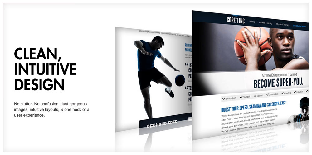
That page listed our key benefits, as well as key parts of our process.
Unless you’re overflowing with leads, you want to make contacting you feel as easy as possible.
Here’s what you don’t want to do:
I like phrases like “Let’s talk” for contact pages because they make it sound like you’re just going to have an easy, laid back chat about the project. It’s easy to transition from a laid back convo into a lengthy, heavy, and deep conversation.
But you’ll never get to the important stuff if you don’t make it approachable.
If you have a contact form, make it feel fun to fill out. Ask for info in unique ways. Don’t get carried away with fields – use as few as you possibly can.
(Again, unless you’re overflowing with leads. If so, make yourself less approachable so only the most eager of prospects reach out.)
To start, I’d have the following:
That’s it. Before the form, I’d put text that makes the contact process feel easy and inviting, For example:
Let’s talk!
I’d love to hear about your project, and see if we’re the right fit to help you grow. Fill out the form below or give us a call at [number] and we’ll make it happen.
[form]

It might take time to really get your website down, but it’s the centerpiece of your marketing, so it’s worth it. Start with these tips, and then grow and evolve your site based on the feedback you get from customers.
Don’t get bogged down with what other designers say. There’s only one audience whose input into your site matters: your market.
Your market is giving you good feedback when they contact you after viewing your site. They’re giving you bad feedback when they don’t. It’s as simple as that.
Feel free to leave a comment below and ask any questions you might have. I’d love to help in any way that I can.
Products Seen In This Post:

Whether you’re seeking employment in a studio, or trying to bring in a few more clients for your freelance operation, one of the key components in doing so is your portfolio. As a designer your portfolio plays a large part in peeking interest and winning over those clients interested in your services, however a lot of portfolios fall short in achieving this and here are 7 reasons as to why that might be.
Regardless of whether you’re printing out your portfolio, posting it on a website, or presenting it in person on a tablet, the general presentation of your portfolio needs to work with whatever environment it’s being viewed in.
If you’re printing your portfolio, the .jpegs that you posted on Behance aren’t going to be good enough. If you’re presenting on a tablet, a full-size .pdf isn’t the way to go. Maybe present a few zoomed-in crop-outs plus a reduced size version of the final product. Always tailor your portfolio to its environment.
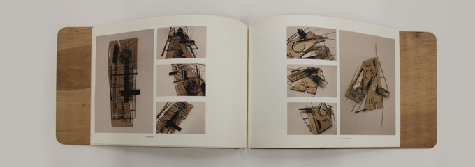
If you designed a poster for a local charity event and have it in your portfolio you should be including either a small brief on the project, its specifications & purpose, or several visual cues as to what the project was about such as photographs of the charity the poster was for, where the posters were displayed, etc. Despite the fact that you know the project inside and out, what it was for, and how it turned out for the client, whoever is looking at your portfolio likely has no idea who the project was for, what its purpose was, and whether it was successful or not.

Are you guilty of falling into a pattern with your work? One thing designers will sometimes need to do (if they haven’t already intuitively realized it) is stop and take a look at their collective body of work as a whole. If everything is looking pretty similar maybe it’s time to shake it up and try something new. Branch out and take a crack at trying to emulate a style you never have before, take on projects you normally wouldn’t, and don’t be afraid of change! This isn’t to say people can’t make a living off of a particular ‘style’ however these are usually people who have already established their names in the community, and for designers trying to get their foot in the door it’s more often than not a deterrent for prospective clients/employers.

Calls-To-Action are not only important for landing pages, flyers, or marketing materials, they’re useful anywhere you want to influence someone to perform an action of some kind. It’s basic logic that the mere act of telling someone to do something increases the chances of them doing it ten-fold. If you want someone to get in touch with you, if you want them to know you’re looking for clients, or looking to be employed, then indicate it in your portfolio. Not just pushed down in a corner somewhere in 9 pt Helvetica either, incorporate it in to the content of your portfolio, make it part of the content.

If you’re applying for a job with an app company, make sure that your portfolio puts emphasis on your UI work and that it’s not filled with editorial spreads and book covers. Likewise, if you’re applying for a job with a magazine, make sure you’re including lots of editorial and typography work. Tailoring your portfolio for whatever industry you’re trying to break into may seem obvious but its a technique that can often be overlooked by designers with eclectic interests or skills (guilty!).
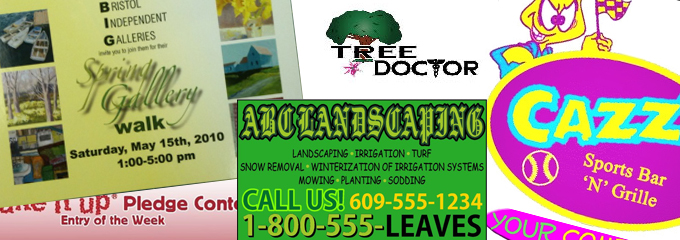
Can people find your work? Do you have a website, and if so, is your portfolio buried in the depths of it somewhere? How easy is your portfolio to navigate? The best ways to make sure your portfolio is accessible these days is to either set up a Behance account or set up your own website and have the home page be your portfolio. For those who have no programming knowledge, you can always find a free or premium theme/template for one of the many popular content management systems available today (eg. WordPress). It’s also important to note that Behance is now owned by Adobe and is connected to a huge community of both creatives and employers and is a great way to get your work out there.

The last reason is the one that is the hardest to fix. Maybe the work in your portfolio is just not up to par with the companies you’re applying for or clients you’re trying to swing. In this case, the only way to change is to continue working on your craft. You’ve got to get better, and the only way to get better is to put in the hours.
To really get a sense of good design and understand why things are the way they are, I suggest researching into design history or the history of whatever niche you’re in for that matter. Everything you see today comes from something and it’s always beneficial to know and understand where that is and how it got from there to here. It also helps to understand why the “rules” of design even exist in the first place.
A few reasons as to why your portfolio may not be attracting the attention that you think it deserves. Hopefully it wasn’t too redundant, and you’ll be able to take these and put that polish on your collective work and finally get that job or client you’ve been after.
Products Seen In This Post:
Share on Pinterest Share on Pinterest
 Share on Pinterest
 Share on Pinterest