I need to start with a disclaimer. When I say “sucks”, I don’t mean your design (which I’m sure is beautiful). I mean, does your portfolio site bring you clients on demand?
No? Then it sucks. But don’t worry. Mine used to suck too. So did everyone else’s.
There’s a big problem in the design community. We don’t know how to sell our services. In fact, we fail miserably at it. It’s the part of the biz we didn’t realize we had to do, and by the time we figured it out, the rent was already due and we had to put food on the table.
I hope to help you overcome that in this blog post.
I co-run an agency, Unexpected Ways, and from many years of testing, tweaking, and refining, we finally turned our website into a predictable source of business. We turn on ads and traffic sources when we want clients. We turn them off when we don’t.
It really can be that simple.
Right now we’re undergoing a major renovation based on even more things we’ve learned – but here are some of the biggest lessons that made the last version of our site such a huge success.
Preparing Your “Client Magnet” Website
The first thing you need to do is the thing I see missing most: address your market’s problems, and talk about how you solve them.
That’s the goal of your website: to convince your market that you’re capable of helping them solve their problems. If you do that, you win their business. That’s how it works.
The first step to that is to know what their problems are in the first place. Think back to your past clients. What were their goals? What problems did they face with other designers? What did they really want from your services?
Ponder this over for a while, and write out a list of these problems. Then set it aside. It’s going to come in handy in every piece of marketing you ever do to promote yourself.
What Pages Do I Need?
Let’s talk about the overview of your portfolio site. Then I’ll go into the “nitty gritty” and give you concrete steps for creating content that sells.
Unless you’re mega-famous and power the world’s top brands, you need to dedicate a good portion of your site to selling yourself. I’ve found that the following pages work best:
- Home
- Services
- Service 1
- Service 2
- Service 3
- Etc.
- Portfolio
- About
- Contact
Your home page creates a splash and conveys your core brand message. Your main “services” page lists each of your services with a 1-2 sentence description that links to the individual services pages. Your individual services pages discuss how you perform each of those services, how they helps clients solve their problems, and what makes you different.
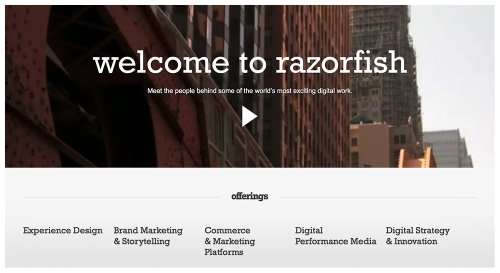
Even mega-agency Razorfish has a page for each of their services (each phrase under “offerings” links to a page describing a single service):
The “Portfolio” page seems pretty self-explanatory, but the rest of this blog is dedicated to how to organize one, because aside from your home page, it’ll be your most visited page.
“About” isn’t your bio or resume. It’s your “hero tale” – how you discovered design, how you help clients, why you do what you do. It still needs to sell, so the facts of your life / story that you reveal need to tie back into how they help you solve your clients’ problems.
Again, “Contact” seems straightforward, but it can be tricky to do it right. Just keep these words in mind though and you’ll do alright: approachable, approachable, approachable. Make reaching out to you feel natural, fun, and easy.
The Portfolio: A: Provide Background
If design is function + form, then the only way you can know if the “function” side of things is up to par is to know what problems it’s attempting to solve. Basically, in each of your portfolio pieces, present what challenges / problems / goals your clients faced for the particular projects you’re highlighting.
What was going on that they needed to hire you in the first place? Start each portfolio piece off with a short paragraph that discusses this. State who the client is, and what they wanted to accomplish.
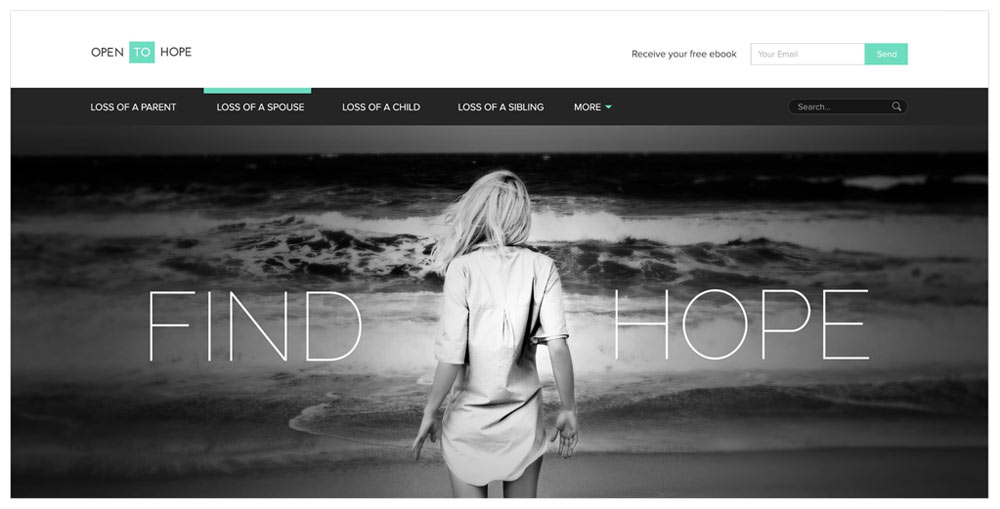
Here’s a great example from agency Zumeo:
OpentoHope.com is an online community where individuals can share inspirational stories of loss and love… Open to Hope was faced with the challenge of providing users with a safe place to share, as well as discovering and contributing helpful resources.
The Portfolio: B: Images Aren’t Enough
Design is about choices. Why that color? Why that shape? Why that font? In each of your portfolio pieces, discuss the choices you made along the way. This is your chance to show off how thoughtful you are.
Break down elements of your pieces that aren’t so obvious, and explain how they helped your client achieve their goals. Discuss the mood the colors create, the message the font conveys, the feeling the photography portrays.
Show off how smart you are, and that your design comes packaged with a whole lot more than just beauty.
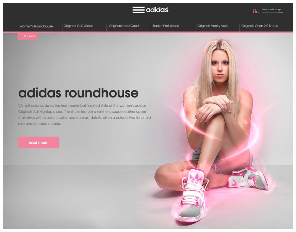
Here’s another great example from Zumeo on a campaign they did for Adidas:
“… Our goal was to create a single, responsive web page highlighting top shoes. The page would include audio, video, text, and ‘tech specs’. Each page would match the shoe color and style and tell a story. We chose to highlight the Adidas Roundhouse from Journeys. In this case, we wanted to think outside of the traditional sports box and focus on the fashionable side of the shoe…”
And one more example from these guys from another campaign for Incase:
“In order to showcase multiple products in a simple way, we created a Parallax scrolling system with new products at the forefront. The two product rows would scroll faster than the campaign, and in turn, the campaign would collapse with the scroll.”
The Portfolio: C: Quality Over Quantity
Your portfolio is only as strong as your weakest piece. Leave out anything that brings the group down as a whole.
Studio “Design Embraced” has only 5 portfolio pieces, though each one powerfully shows what they’re capable of:

The Portfolio: D: Incorporate Testimonials
Now that you’ve discussed your clients’ problems and how you overcame them, drive this home with a short snippet of a testimonial. Just a fragment of a sentence, a single sentence, or a few very short sentences of your client expressing their gratitude will do.
Testimonials that discuss the following get you extra brownie points:
- How easy you are to work with
- How much extra revenue the client generated because of your design (a percentage or even just a vague statement works too)
- How happy your client’s customers are with the work
This is because everyone has heard the horror stories of working with designers who are a pain in the butt. The first kind of testimonial eases that fear. Another major fear clients have is, “Will this even pay off?”
By showing testimonials from real people saying it pays off in droves, you’re countering that fear.
And finally, people want to know that other people will like and respect their branding – in particular, their customers. The third testimonial type eases this worry.
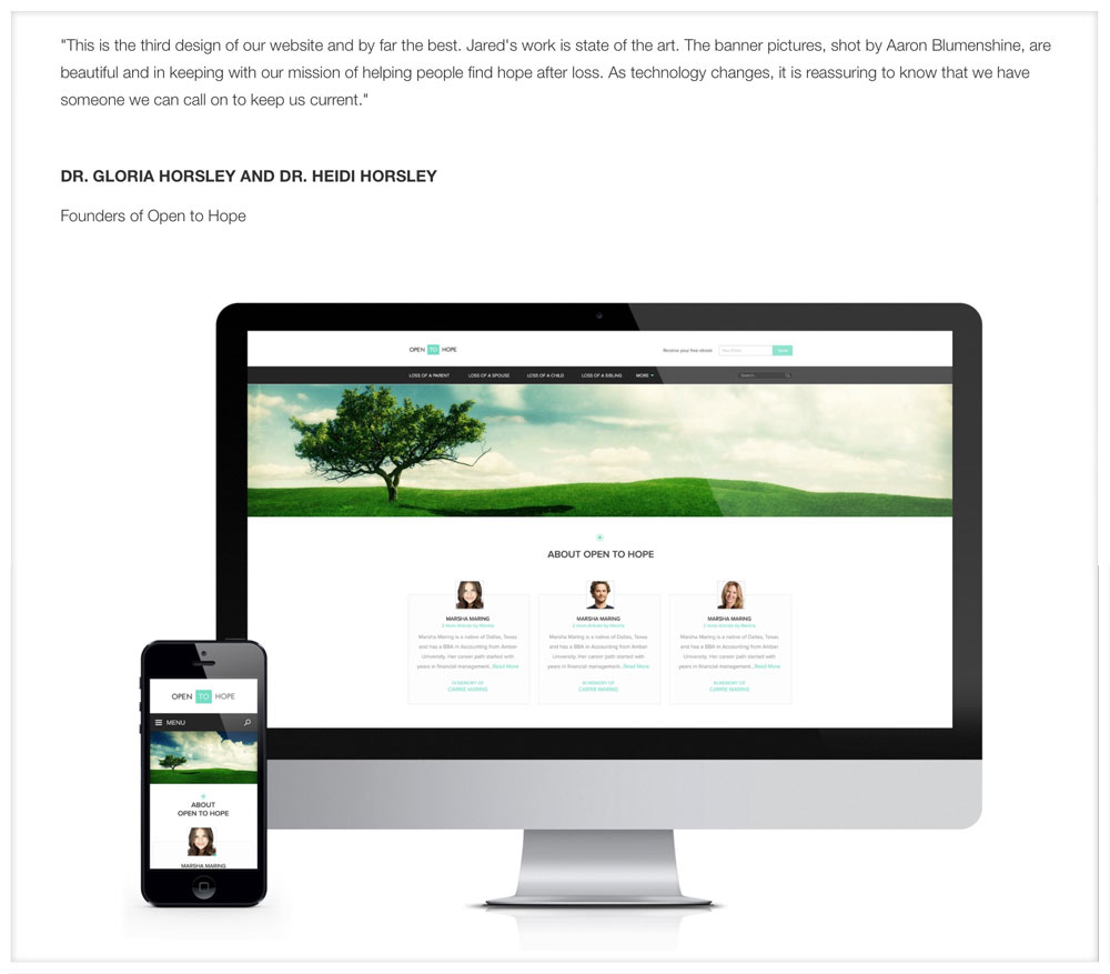
From the “Open to Hope” portfolio piece above, I found this later on the page, mixed right in with the images and background info:
The Portfolio: E: Big Images
Display your work big, bold, and beautifully. (It probably goes without saying, but I’ve come across many designer portfolios that featured thumbnails and nothing else.)
Services
An “easy” way to create the content for your services pages is to go through this exercise:
List out all the steps you take for each service. Then list why you take that step, and how it helps your clients in the end.
For example: Do you do market research? Why? How does it help?
Our website is currently under construction, but up until recently, this was a blurb on our “Websites” page that outlined one unique benefit:
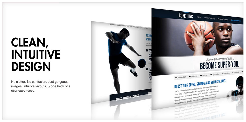
That page listed our key benefits, as well as key parts of our process.
Contact
Unless you’re overflowing with leads, you want to make contacting you feel as easy as possible.
Here’s what you don’t want to do:
- Make it feel “risky,” or like you’re going to have a “heavy” or lengthy conversation
- Make it feel burdensome
- Make it feel time-consuming
I like phrases like “Let’s talk” for contact pages because they make it sound like you’re just going to have an easy, laid back chat about the project. It’s easy to transition from a laid back convo into a lengthy, heavy, and deep conversation.
But you’ll never get to the important stuff if you don’t make it approachable.
If you have a contact form, make it feel fun to fill out. Ask for info in unique ways. Don’t get carried away with fields – use as few as you possibly can.
(Again, unless you’re overflowing with leads. If so, make yourself less approachable so only the most eager of prospects reach out.)
To start, I’d have the following:
- First & Last Name
- Phone Number
- What are you looking for help with? (Have a checkbox for each of your services)
- When’s a good time to talk? (Message box with something like “Thursday at 2pm” pre-filled in)
That’s it. Before the form, I’d put text that makes the contact process feel easy and inviting, For example:
Let’s talk!
I’d love to hear about your project, and see if we’re the right fit to help you grow. Fill out the form below or give us a call at [number] and we’ll make it happen.
[form]
Some Closing Thoughts

It might take time to really get your website down, but it’s the centerpiece of your marketing, so it’s worth it. Start with these tips, and then grow and evolve your site based on the feedback you get from customers.
Don’t get bogged down with what other designers say. There’s only one audience whose input into your site matters: your market.
Your market is giving you good feedback when they contact you after viewing your site. They’re giving you bad feedback when they don’t. It’s as simple as that.
Questions? Thoughts? Leave Them Below
Feel free to leave a comment below and ask any questions you might have. I’d love to help in any way that I can.
David Tendrich is the co-head of creative agency Unexpected Ways, as well as the co-founder of Reliable PSD: the first-ever PSD to HTML & PSD to WordPress service run by designers, for designers. He co-runs his companies from Portland, Oregon with his lovely wife and business partner, Lou Levit.
Products Seen In This Post:

Your Portfolio Site Sucks, Here"s How to Fix It
No comments:
Post a Comment
Note: Only a member of this blog may post a comment.