iPixel Creative is a Singapore web design and development Company. At iPixel Creative, we provides web design solution which helps your company stand out from the competitors. Our Solutions includes web design, website development, cms development, ecommerce solution and hosting solutions.
Are you looking for a quick and easy to edit platform to speed up your web design process? Well, you have come to right place. We have collected 50 fantastic pre-built responsive HTML5 templates that with just a little bit of creative tweaking will have your web design project live in no time. And the best thing is they are all FREE!
A readymade template is the perfect option for you to build a powerful website for your business. There are numerous professionally designed templates available, but fairly often they require a degree of customization. Eventually, you find yourself with lines of code to change to get the required result. It’s great if you know some HTML and CSS basics, but what’s the option for those users who don’t know a thing about coding?
All templates you find in this collection have been sourced only from trusted websites. They are also built in accordance with the latest web design trends and combine a striking look with unmatched functionality. In addition, they feature a number of cool effects like parallax scrolling, mega menu, responsive design and much more. Here they are:
As you will probably already know, designing basic cross-client HTML emails is difficult (looking at you Outlook!) in itself, but designing emails that work on all email clients and also work on all of the varied sized mobile phones and tablets currently available, is even harder. Much harder.
Thankfully there are a bunch of guys out there that have done most of the work for you, by creating a collection of easy to edit and free responsive email templates that work across all clients and are readable on any device. We have split the templates into two categories, ‘Bare-Bones’ and ‘Pre-Designed’, here they are:
Isn’t it frustrating to design the perfect webpage in your mind, but to be unable to create it for real? It’s time you found out about Qards, an awesome page builder plugin that you can use to create beautiful and responsive websites. Keep reading and find out how you can get your hands on a Qards license, worth !
Design infinite types of web pages without using a single code
The new Qards drag and drop WordPress plugin allows you to build awesome and appealing webpages or websites without having to write a single line of code yourself. Not only does this plugin let you build a page from scratch, but it also saves weeks of work time, otherwise spent on programming. If you know how to code, then Qards gives you the possibility to tweak CSS by accessing the CSS option and customize your page even further.
Qards works with any WordPress theme and helps you to design a wide variety of webpages, such as blogs, e-commerce sites, landing pages, case studies and many more. Moreover, you can enhance your project’s originality by using their easy to use visual editor and the TypeKit Integration, which allows you to select from an entire collection of fonts.
Add beautiful components to your website in no time
There are no more limitations for your creativity. You can add as many elements as you want: Qards comes with a drag & drop feature, allowing you to edit every aspect of your site and make changes easily before sharing the page with your audience. Choose your favorite elements from a wide range of pre-designed blocks, or adjust them to your design preferences.
You can use Qards to add images, videos, smooth scrolling effects and fixed menus to your page. Feel free to modify their styles and place them wherever you like on your website.
Win one of three Qards Plugin Licenses
All you have to do to win a license for Qards, the drag & drop WordPress tool for website design, is to enter the contest through the form below. But if you don’t want to wait any longer, feel free to try Qards now.
Editor’s note: This article is brought to you by Webydo.
Designers have always had a challenging role to play in the website creation process. They are often the first ones to work with a client, establishing a rapport with them as they work together to create the look and feel for a new website. Then, just as the design of that new site is being finalized and approved, those designers are often forced to hand over their work to a developer.
The developer then codes that design into the resulting webpages – a process that takes time and, in some cases, as much as 70% of a project’s budget to complete. Unless that designer decides to learn how to code websites themselves, this is the process which they are forced to work under – until now.
Promoted with the “by designers, for designers” chant, Webydo is a code-free, web design suite that empowers design professionals to take a greater role in the website creation process, offering a compelling alternative for designers looking to break away from the traditional process of handing work (and budget) off to a developer for hand coding.
There have been plenty of DIY web design options available for many years now. These rudimentary tools are however not professional-grade. They are B2C offerings that are suitable for hobbyists looking to quickly build a basic web presence by choosing a template, adding a few photos and text, and calling it a day.
This is not how a professional designer works. And it’s also not how Webdyo works. Webydo is a B2B solution that was created with the needs of design professionals in mind.
Versatility and Ease of Use
Webydo has the flexibility and features that you simply will not find in simpler alternatives. Webydo is an online software accessible via a browser, and getting started on it is quick and easy.
Once you are signed in, you can begin a project by either selecting an existing design theme, choosing a popular layout structure as your starting point, or opening a blank canvas to have total control over your design/project.
Drag-and-drop features and an intuitive interface allow designers to create the look and feel of a webpage directly in-browser while the software writes the code needed to turn that design into a working webpage. The code, by the way, is W3C validated and of a high standard.
Code-Free Web Development Features
It’s one thing to be able to use Webydo to set fonts, colors and layout – aspects of a webpage that any design professional will be familiar and comfortable with, but how about more development-centric features that are popular on websites today?
Webydo allows for these features to be easily added too. Many of the popular features the platform includes are ones that were added based on requests from their community of 130,000 designers.
On top of that, one of the most powerful features of Webydo is its pixel-perfect responsive editor. On today’s Web, sites must work well across a wide range of devices and screen sizes. On Webdyo, designers can create websites that respond to mobile devices, large screen desktops, and everything in between and they have total control over how their sites will look for each size.
Another popular approach on websites today is a parallax scrolling effect, where elements of the foreground move at a different rate than those in the background. This effect creates a sense of depth and can be used very effectively as a storytelling device. Webydo allows designers to easily add parallax scrolling animations to their sites, all without writing a line of code.
No tool will ever be able to fully mirror the rapid pace of change in the web design industry, but it is encouraging to see that Webydo is actively listening to their community of users and being committed to the continual improvement on their platform.
Powerful Business Capabilities
In addition to the design and development features of Webydo, the platform also includes a number of more business-centric capabilities that designers should also be excited for.
CMS features will give professional designers the ability to train their clients on how to manage their websites and make typical content changes once that site has gone live.
There is even a white-label option for designers who want to brand the solution as their own.
Client billing can also be handled from directly within Webydo, making it much more than just a platform used to design websites.
The Limitations of the Webydo Platform
Webydo sounds pretty amazing, and it is, but like any software, it does have its limitations.
First off, Webydo is a subscription-based service. There is a 30-day free trial which gives you access to features like client billing and while label solutions. After that period, the cost depends on the plan you select, starting at /month for one website.
Another limitation is that should you decide to move away from Webydo, you can export your site design to take it with you. You won’t, however have access to the CMS-editing capabilities as well as other helpful features of the platform.
In Summary
If you are a design professional who has been frustrated with the typical way of creating websites and want to have more control over the entire process, then Webydo is certainly worth a look. You can create an account in minutes and take advantage of the 30-day free trial to see if it is a fit for your design business.
You can learn more, and create your account, at www.webydo.com.
Editor’s note: This article is brought to you by Webydo.
Designers have always had a challenging role to play in the website creation process. They are often the first ones to work with a client, establishing a rapport with them as they work together to create the look and feel for a new website. Then, just as the design of that new site is being finalized and approved, those designers are often forced to hand over their work to a developer.
The developer then codes that design into the resulting webpages – a process that takes time and, in some cases, as much as 70% of a project’s budget to complete. Unless that designer decides to learn how to code websites themselves, this is the process which they are forced to work under – until now.
Promoted with the “by designers, for designers” chant, Webydo is a code-free, web design suite that empowers design professionals to take a greater role in the website creation process, offering a compelling alternative for designers looking to break away from the traditional process of handing work (and budget) off to a developer for hand coding.
There have been plenty of DIY web design options available for many years now. These rudimentary tools are however not professional-grade. They are B2C offerings that are suitable for hobbyists looking to quickly build a basic web presence by choosing a template, adding a few photos and text, and calling it a day.
This is not how a professional designer works. And it’s also not how Webdyo works. Webydo is a B2B solution that was created with the needs of design professionals in mind.
Versatility and Ease of Use
Webydo has the flexibility and features that you simply will not find in simpler alternatives. Webydo is an online software accessible via a browser, and getting started on it is quick and easy.
Once you are signed in, you can begin a project by either selecting an existing design theme, choosing a popular layout structure as your starting point, or opening a blank canvas to have total control over your design/project.
Drag-and-drop features and an intuitive interface allow designers to create the look and feel of a webpage directly in-browser while the software writes the code needed to turn that design into a working webpage. The code, by the way, is W3C validated and of a high standard.
Code-Free Web Development Features
It’s one thing to be able to use Webydo to set fonts, colors and layout – aspects of a webpage that any design professional will be familiar and comfortable with, but how about more development-centric features that are popular on websites today?
Webydo allows for these features to be easily added too. Many of the popular features the platform includes are ones that were added based on requests from their community of 130,000 designers.
On top of that, one of the most powerful features of Webydo is its pixel-perfect responsive editor. On today’s Web, sites must work well across a wide range of devices and screen sizes. On Webdyo, designers can create websites that respond to mobile devices, large screen desktops, and everything in between and they have total control over how their sites will look for each size.
Another popular approach on websites today is a parallax scrolling effect, where elements of the foreground move at a different rate than those in the background. This effect creates a sense of depth and can be used very effectively as a storytelling device. Webydo allows designers to easily add parallax scrolling animations to their sites, all without writing a line of code.
No tool will ever be able to fully mirror the rapid pace of change in the web design industry, but it is encouraging to see that Webydo is actively listening to their community of users and being committed to the continual improvement on their platform.
Powerful Business Capabilities
In addition to the design and development features of Webydo, the platform also includes a number of more business-centric capabilities that designers should also be excited for.
CMS features will give professional designers the ability to train their clients on how to manage their websites and make typical content changes once that site has gone live.
There is even a white-label option for designers who want to brand the solution as their own.
Client billing can also be handled from directly within Webydo, making it much more than just a platform used to design websites.
The Limitations of the Webydo Platform
Webydo sounds pretty amazing, and it is, but like any software, it does have its limitations.
First off, Webydo is a subscription-based service. There is a 30-day free trial which gives you access to features like client billing and while label solutions. After that period, the cost depends on the plan you select, starting at /month for one website.
Another limitation is that should you decide to move away from Webydo, you can export your site design to take it with you. You won’t, however have access to the CMS-editing capabilities as well as other helpful features of the platform.
In Summary
If you are a design professional who has been frustrated with the typical way of creating websites and want to have more control over the entire process, then Webydo is certainly worth a look. You can create an account in minutes and take advantage of the 30-day free trial to see if it is a fit for your design business.
You can learn more, and create your account, at www.webydo.com.
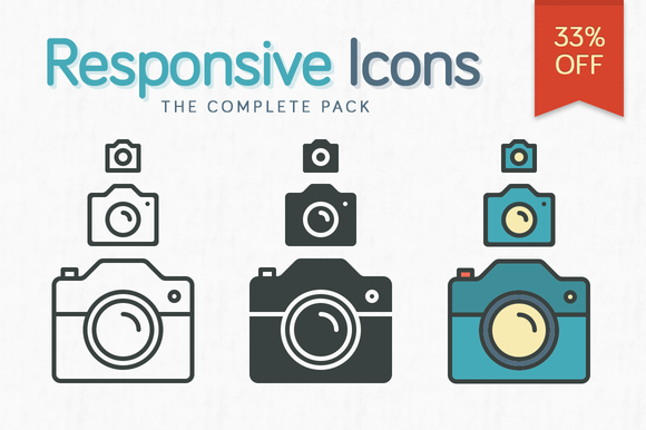
It’s like responsive design, but icons: they look different depending on their size. Icons8 released a free responsive icons library that is fun to play with. Also, it comes with a free tool to generate your own responsive icons.
Also, enter the contest to win 9 license from Icons8, that includes SVG icons and feature packed apps for Web, Mac and Windows.
By now, you’ve probably got this responsive thing mastered. You know all about responsive web design, media queries, and fluid grids. Your websites look great on every screen and you’re dang proud of it. But how are your icons doing? Are they responsive? What are responsive icons, you ask? Today we’ll dive into that very topic.
A New Kind of Icon
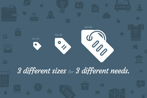
The idea behind responsive images is fairly simple: you serve up the same images in different sizes to different screens. Perhaps even more than with something like a photo though, you’ll find that this practice doesn’t always work great with icons. A given icon design might look great at its original size, but terrible once scaled down due to too much detail being squished into such a tight space.
The answer? Responsive icons. These shape shifters do more than change size, they actually change their design to accommodate the size at which they’re being served.
Like other kinds of responsive design, responsive icons are a reaction to the need for more diverse web design and programming. Use of mobile devices is growing, and their screen size is smaller than the computers and laptops popular in the past, so the design needs to be radically different. Otherwise, mobile users, who are a major portion of all web traffic today, will struggle with confusing controls, pages requiring scrolling and shrinking, and other annoying design elements that will run them off.
Designing Responsive Icons
Designers often create responsive icons in packs. These are almost like animated GIFs or other complex images, in that they have different versions that can be substituted for one another. For example, as the user zooms in or out, the icon will change from one model to another. In many cases, the largest icons have more features and details, where the smaller icons are simply stripped down, diminutive versions. Regardless of their visual design, though, they have to stay consistent so that the smallest one still looks like the largest size to provide continuity across devices.
Responsive icons also play a vital role in terms of web function. Even when they’re small, they must be recognizable because they are so often the major controls for a site. Icons are often the items that users have to click on to go someplace or do something. For example, designers have experimented with simple line drawings to show a list box or drop-down, but they have to design something that the average user will understand intuitively, without a lot of special instructions. Along with that, designers still have to apply all of those ideas about color scheme, typography, layout and overall branding that produce a consistent and clean look for an entire site.
Interesting Links for More on Responsive Icons
Responsive icons are a design trend that is just starting to catch on, so the vast majority of icons that you’ll find on the market will not be responsive. If you’re interested in seeing more, here are a few resources you can check out (lots and lots of credit to Joe Harrison, who built some of the demos below and was one of the first designers to start exploring responsive icons):
Making Iconic Responsive (a look at how the popular web icon set Iconic has implemented responsive design)
ResponsiveLogos.co.uk (a cool demo expanding the responsive icon idea to logo design)
Responsive Icons on Creative Market
In addition to the two awesome icon packs already shown earlier in this article, here are a few more that you might want to grab. Props to Pixel Bazaar especially for making so many awesome responsive icon packs!