Showing posts with label Logo. Show all posts
Showing posts with label Logo. Show all posts
Tuesday, June 23, 2015

Tuesday, June 16, 2015
Jeb vs. Hillary: Which Logo is Worse?
OK, let’s get this out of the way: this isn’t a political blog, and we’re not pundits trying to sway your decision one way or the other. But what we are is a design site, and when politics and design collide, we’ve got to talk about it, right?
Two of the popular candidates for the 2016 election are Hillary Clinton and Jeb Bush — Jeb, being the brother of the last republican President, George Bush Jr., and the son of former President George Bush Sr., and Hillary being the former United States Secretary of State as well as the wife of former President Bill Clinton. Needless to say, both candidates are extremely well known and need a strong brand to represent them through the upcoming campaign.
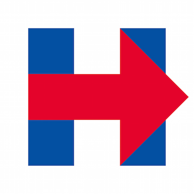
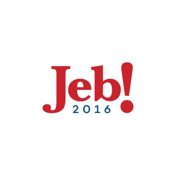
Now the two have shown off their official logos, and both are trying to beat out (in a design sense, anyway) the Obama logo that set the bar high 8 years ago. And there’s one other key point: while Hilary’s logo is brand new, Jeb has been using a variation of his logo for the past 20 years. So what do you think? Which logo works, and which one is a dud? Or do they both suck?
Hilary Clinton
Jeb Bush
Kevin Whipps is a writer and editor based in Phoenix, Arizona. When he’s not working on one of the many projects in his queue, he’s looking for fun and irreverent things online to share with his friends.
Jeb vs. Hillary: Which Logo is Worse?
Thursday, June 11, 2015
Animated Logo Evolutions From Apple, Nike, Coca-Cola, and More
You know what I love? GIFs. I can watch a short movie in a GIF. I can see cats blow up other cats with their laser beam eyes with GIFs. And, should I so choose, I can look at company logos changing throughout the years.
Now that may sound less than exciting, but take a look before you make a judgement call. Apple’s logo alone has gone through some dramatic changes, and they’ve been around less than 40 years. And when you factor in companies that have been around even longer — Coca Cola and Pepsi come to mind — the changes are even more momentous.
Of course, this leads us to the obvious question: what will these logos look like in the future? I’ve got a crisp fiver that says that Walmart’s new logo will incorporate cats with laser eyes. Think I’m wrong? We’ll see … We’ll see …












via AdWeek
Kevin Whipps is a writer and editor based in Phoenix, Arizona. When he’s not working on one of the many projects in his queue, he’s looking for fun and irreverent things online to share with his friends.
Animated Logo Evolutions From Apple, Nike, Coca-Cola, and More
Thursday, June 4, 2015
IHOP"s New Logo Makes Little Children Cry
Let’s take a moment to talk about the new IHOP logo, shall we? Here it is in all its glory:
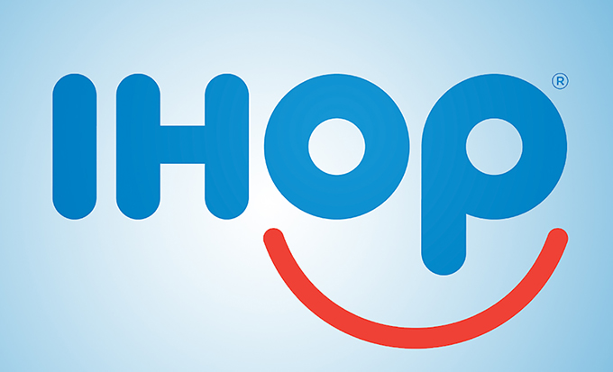
On first blush, I think we can see what the company was aiming for. It’s putting a friendly face on a franchise that sells comfort food, and, as such, we should all feel just hunky dory about their stuff. OK, got that.
But the first thing I take umbrage with is the color pallette. White, blue and red may seem to evoke thoughts of ‘Merica, but there’s so much blue that instead it makes me go down the clown route, and although I don’t have a fear of this country’s carnies, I do think that 50% of them carry a knife in their back pocket just in case they have to shank someone (and you know they can fit like 40 people in a Mini Cooper, which means that’s 20 sharp pointy things on hand).
Then there’s the lowercase “p.” I’ll let your imagination do the talking on that one. As Airbnb proved last year, the Internet simply isn’t mature enough to let these things go.
What Do You Think?
Overall, this is a solid attempt, and I can see their logic. But I also know that the next time the kids want to go to grab pancakes, I might think twice about the one with the scary and possibly inappropriate clown face.
What are your thoughts on the new logo? Does it hit the mark or make you wonder what went wrong? Leave a comment and let us know.
Kevin Whipps is a writer and editor based in Phoenix, Arizona. When he’s not working on one of the many projects in his queue, he’s looking for fun and irreverent things online to share with his friends.
IHOP"s New Logo Makes Little Children Cry
Friday, May 22, 2015
20 Minimal Logo Templates for Premium Members
There’s more new goodies for Access All Areas members to download this week. Worn Out Media Co. has kindly donated a pack of 20 minimal logo templates with a clean and simplistic Scandinavian style. All these logo designs make use of freely available fonts, so you can easily customise them for use in your own designs. They’re perfect for quickly creating merchandise such as t-shirt designs, or for any product or project where you need to knock up a quick logo.

Worn Out Media Co. is a Creative Market store dedicated to providing design templates for designers to easily create stylish brands. If you love the minimal style, you might be interested in their 115 minimal logo templates bundle, which is currently on offer at 68% off.
Find out more about Worn Out Media Co.
20 Minimal Logo Templates for Members

Access All Areas members can download these 20 minimal logo templates as part of their membership. Each design is editable and resizeable, fully layered and only uses free fonts (package contains download links). Open up the Photoshop PSD or Illustrator AI files to customise the designs for use in your own projects.
The post 20 Minimal Logo Templates for Premium Members appeared first on Blog.SpoonGraphics.


20 Minimal Logo Templates for Premium Members
Saturday, May 9, 2015
Test: Can You Pick The Apple Logo Out of a Lineup?
Pop quiz hot shot: which of the images below is the Apple logo? Give yourself about five seconds to choose, with no cheating! Which one do you pick?
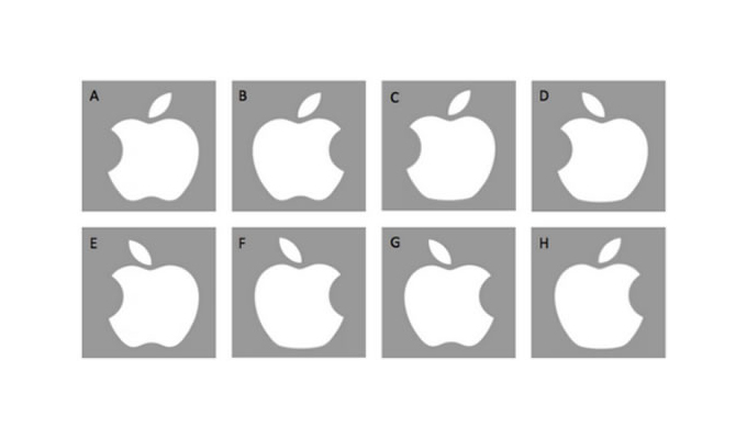
It sounds simple enough right? Apple is one of the most ubiquitous companies on the planet, and most of us see this logo in some form or another. However, a study involving 85 UCLA students (75 of which owned Apple products), a stunning 84 of them got it wrong! You read that right, only one person got it right! The ultimate conclusion of the study is that our visual memory pretty much sucks.
As an Apple blogger and graphic designer, I can proudly say that I had no trouble picking out the right logo, and in fact thought this whole thing was total bull. After asking a few other people though, not only did they take a long time to venture a guess, they actually got it wrong.
Did You Guess It Right?
The correct answer is of course “B”. Is that what you guessed? Let us know in the comments below. And be honest!
Via Spring.org
Products Seen In This Post:


Test: Can You Pick The Apple Logo Out of a Lineup?
Tuesday, May 5, 2015
Introducing logo123.com – A Crowd-Sourced Online Logo Maker
As a serial Internet entrepreneur, I have created countless logos for my new businesses. I hired professional logo design companies, launched logo design contests, and even tried online logo generators if I feel the logo I need is simple enough. However, logo123 seems to offer something interesting – an online logo maker that’s powered by real designers.
Order custom logo concepts for each
So instead of creating your own logo online, you will need to place a quick order for the logo concepts you’d like to see. First you must decide how many custom logo concepts you’d like to order for your project. At each, you can order just 1 or up to 10 logo concepts at a time. After entering a simply design brief, and choosing some sample designs you like from their logo library, your logo design project is ready to go.
Get your logo in less than 30 minutes
Doesn’t matter when, or in what time zone you have submitted your logo order, there are always designers online and ready to work on your project. In fact, when you open the website home page, it tells you exactly how many designers are online. According to the website, their average design turnaround time is 25 minutes. That means you don’t have to wait for hours or even days to see your logo. You can in fact submit your logo order, then browse internet for half hour while you wait for your custom design logo to come back.

Pay just for the design copyright
If you are happy with the design concepts you received and want use the logo, you must purchase the design copyright for an additional ( if you need further design revisions). This flat pricing offered by logo123 is very much in line with the online logo makers where they charge a fixed fee if you want to download and use the logo you created. And for an exclusive copyright of the logo is definitely a bargain in my opinion.

Crowdsourcing 2.0
logo123.com was launched by the same team behind 48hourslogo, a popular logo contest website. Because of their large designer base, anytime when a logo order is submitted, there are always designers online and ready to work on the project. Compare to the traditional logo contest model, logo123 offers more flexibility where instead of paying the full contest prize upfront; client can choose how many logo concepts they like to see and only pay a small fee upfront. However, it’s the super fact design turnaround that makes logo123 most attractive for busy entrepreneurs. If you need a business logo fast, besides online logo makers, you can give logo123 a try and have yourself a custom design logo in less than an hour.

Ps. As a special offer for creativeoverflow readers, when you like logo123 Facebook page, you’ll get on extra logo concepts when you order. So don’t forget to give that a try.

Introducing logo123.com – A Crowd-Sourced Online Logo Maker
Thursday, April 30, 2015
Why The Ugly New Microsoft Edge Logo Is Genius
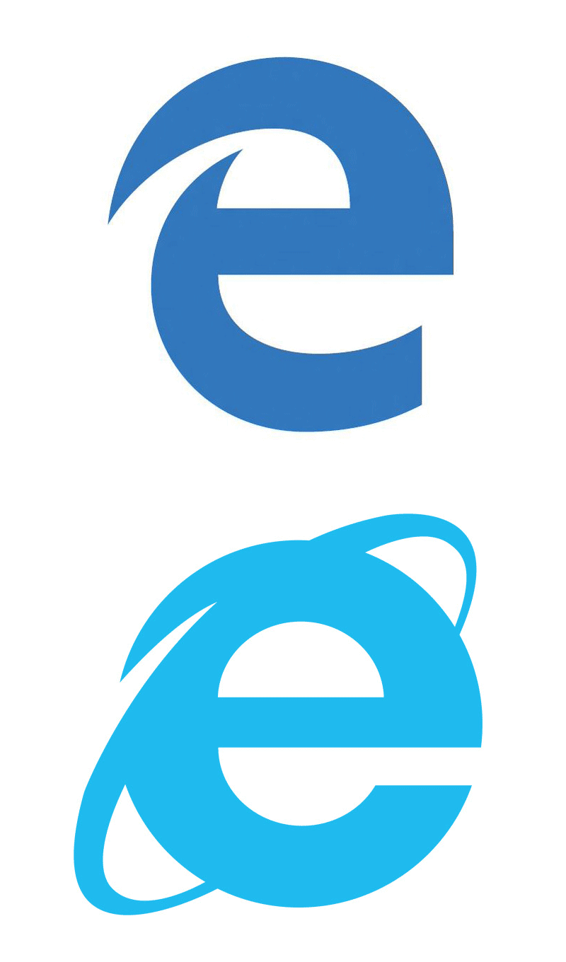
Microsoft wants to shed years of baggage and bad reputation by killing Internet Explorer and launching the new Microsoft Edge. So if they want to leave the past behind, why the heck does the new Edge logo look almost just like the old Internet Explorer logo?
Yep, It’s Ugly
For starters, I’ll say that, on its own, I think the logo is actually pretty ugly. It’s oddly proportioned and awkward. It’s obviously not going to win any logo design awards (at least I hope not).
Familiar Is Good For Users
Now, aesthetic appeal aside, the fact that the Edge logo looks an awful lot like the IE one is actually a great thing from the average user’s perspective. I’ll use my dad as an example. He knows nothing of IE’s bad reputation in the developer world, nor does he care. All he knows is that “e” is the icon that he clicks to get to the Internet. The next time he buys a computer, the first thing he’ll look for is that familiar “e” icon, welcoming him like an old friend. I’m betting that when he sees the new Edge icon, he won’t miss a beat.
It sounds like such a small benefit, but remember that typical users hate change. Every time Facebook moves a pixel, there are riots in the streets. Microsoft is making a bold move by introducing a new browser, and no matter how much it pleases the dev nerds like you and me, they need to make this transition as easy as possible for the rest of the world who just wants to know where the Internet went.
As designers, we too often want design to be about making things pretty. Quite often, what’s prettiest and what’s best for the user are at odds with each other. Our job is to reconcile that and always make sure the user experience takes center stage.
What Do You Think?
So there’s my opinion. The logo is ugly and far too similar, but it’s probably a good move anyway. Do you disagree? Should Microsoft drop lowercase “e” logos and move on? I’d love to hear your thoughts.
Why The Ugly New Microsoft Edge Logo Is Genius
Thursday, April 16, 2015
Hillary Clinton’s Logo Sucks — Who Cares? Everyone, Apparently
In case you weren’t on social media over the weekend (we’re looking at you, Bob), you may have missed the news: Hillary Clinton has officially decided to run for president. And with that announcement, came a logo — and a whole bunch of fuss.
First, let’s take a look at the logo in question:
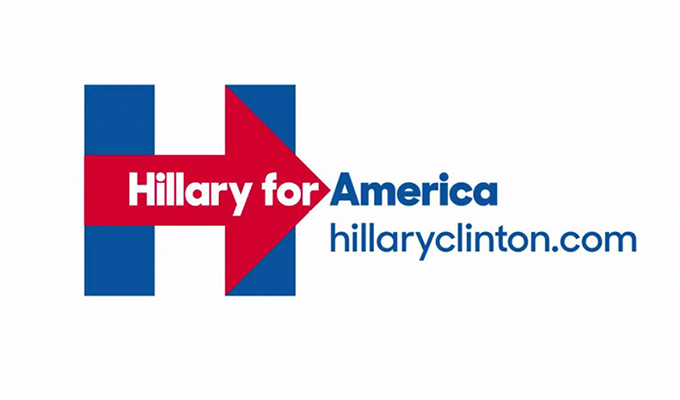
Alrighty, so it’s not particularly inspired, and maybe it was drafted using a ruler and a copy of MacPaint. Does that mean that it’s bad? Let’s check in on Twitter:
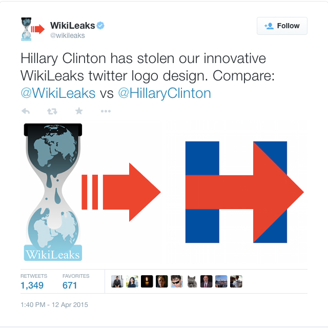
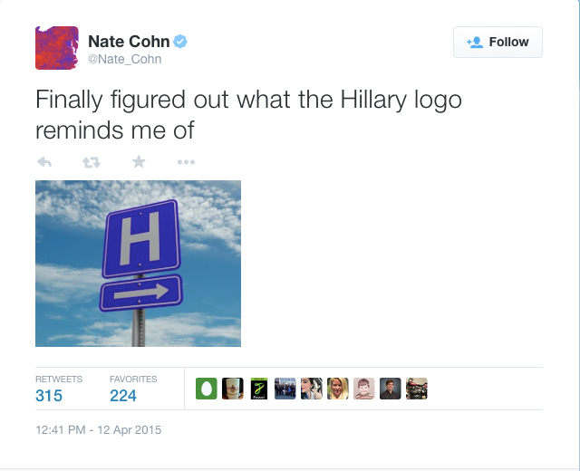
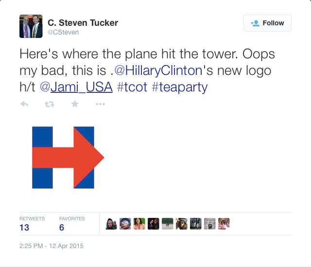
Yeah, that last one isn’t just a stretch, it’s in bad taste, but whatever.
Oh, and the best one yet:
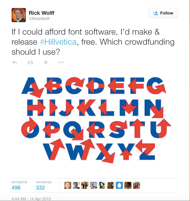
That’s right folks, Hillvetica. Brilliant.
And then there are multiple posts on various websites about the same thing. So who cares? Everyone, apparently.
Why It Does/Doesn’t Matter
Ultimately, none of this should matter. Hillary Clinton is doing something historic: she’s the second woman to run for the office of president (and let’s not forget that she ran in 2008), and some are saying that she has a real shot. What should matter here is her politics, not what her design team built. Judge her on her stance on the issues, not whether or not her designers know how to use a French Curve.
But then there’s the Obama logo. Remember this?
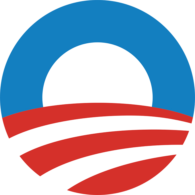
or this?
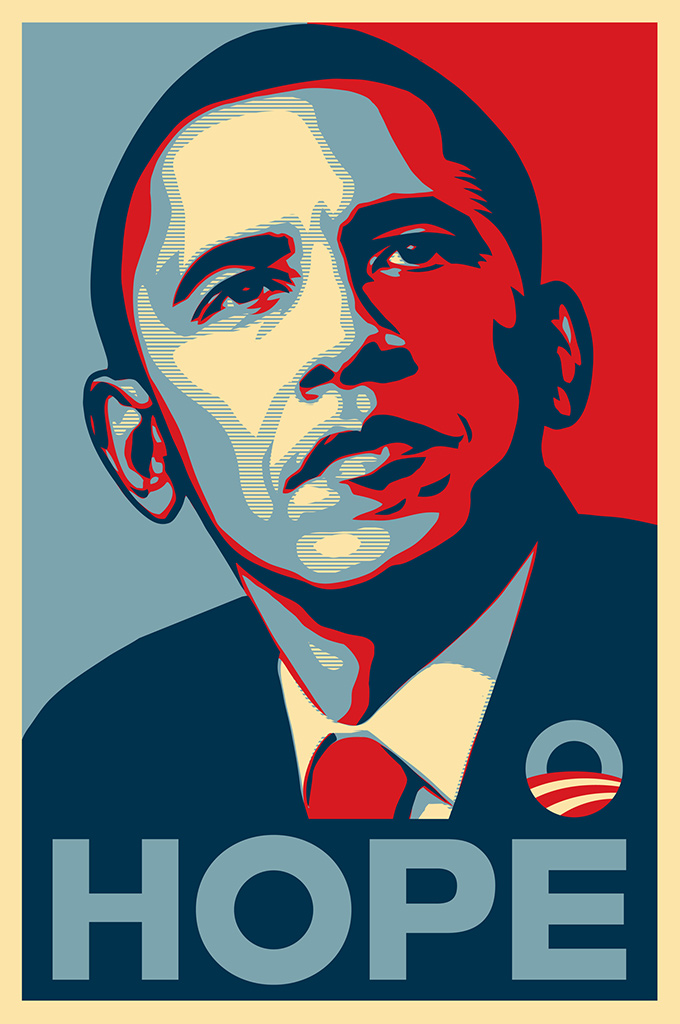
Whether you like Obama or not, he certainly set a new standard for political branding. His logo, and the subsequent Shepard Fairey poster, became icons of the 2008 campaign. Would he have won without that design team behind him? Who knows.
The point is, Hillary’s logo matters because she has to at least meet the standards of the sitting president. But it shouldn’t matter, because it’s her politics that should count, right? Maybe?
I guess we’ll all find out come next year.
Or, maybe we’ll find out sooner when she puts out a new logo that’s a hologram with a cat in it or something. Maybe that’ll make the Internet happy.
Kevin Whipps is a writer and editor based in Phoenix, Arizona. When he’s not working on one of the many projects in his queue, he’s looking for fun and irreverent things online to share with his friends.
Hillary Clinton’s Logo Sucks — Who Cares? Everyone, Apparently
Monday, April 13, 2015
20 Free Logo Mockup PSDs to Present your Designs
Logo mockup templates are clever PSD files that allow you to easily place your logo onto various surfaces to create realistic simulations of how your design would look as a real life print. These logo mockups are especially useful for presenting your designs to clients, or showing off your work in your portfolio. Seeing a design mocked up as a luxurious print helps give the design a tangible quality that isn’t represented in a logo’s basic black and white design.
Leather Stamping Logo Mockup

Download this logo mockup template
Spot UV Logo Mockup

Embossed Paper Logo Mockup

Download this logo mockup template
Silver Stamping Logo Mockup

Download this logo mockup template
Gold Stamping Logo Mockup

Download this logo mockup template
Leather Stamping Logo Mockup

Download this logo mockup template
Natural Paper Printed Logo Mockup

Download this logo mockup template
Logo Mockups Paper Edition

Download this logo mockup template
Leather Stamping Logo Mockup

Download this logo mockup template
Linen Logo Mockup Template

Download this logo mockup template
Logo Mockups PSD

Download this logo mockup template
Embroidered Logo Mockup

Download this logo mockup template
Letterpress Logo Mockup PSD

Download this logo mockup template
Letterpress Logo Mockup

Download this logo mockup template
Pressed Cardboard Logo Mockup

Download this logo mockup template
Vintage Metal Emblem Mockup

Download this logo mockup template
Close-Up Logo Mock-ups

Download this logo mockup template
Rubber Stamp PSD Mockup

Download this logo mockup template
Rubber Stamp PSD Mockup

Download this logo mockup template
Engraved Wood Mockup

Download this logo mockup template
The post 20 Free Logo Mockup PSDs to Present your Designs appeared first on Blog.SpoonGraphics.


20 Free Logo Mockup PSDs to Present your Designs
Subscribe to:
Posts (Atom)