Showing posts with label Ugly. Show all posts

Friday, May 8, 2015

Ugly Dogs Create Beautiful Art

So I have two dogs. One is old and fat, the other is old and … not quite as fat, I suppose. The other day, I put them into the tub to give them baths, which resulted in me getting soaked and my dogs being clean for all of thirty minutes, until they ran outside and rolled around in the dirt. I love my dogs.


Which is why when I found this story on the web I just knew I had to tell someone about it. Canismo is, as they put it, “… an artistic movement created by a group of dogs that aims to help with the support and adoption of sheltered animals.” Basically, someone puts non-toxic paint onto the fur of these dogs, making them wet in the process. The dogs want to shake off the paint, so they do, applying the paint to the surrounding canvases. 18 of these paintings are going up for sale soon, but, assuming you’re not in São Paulo, you can also donate to Canismo today.


Man, I wish my dogs were this talented.


And now, the art:


But Why?


So why the heck are they pouring paint over these poor dogs? It turns out the answer is to get them adopted. Each “artist” is a shelter pet that is up for adoption. According to the project’s site, “The combination of different colours in the paintings shows the mixture of breeds, as random and as beautiful as each mongrel dog.” Visit the website to adopt one today.


Kevin Whipps is a writer and editor based in Phoenix, Arizona. When he’s not working on one of the many projects in his queue, he’s looking for fun and irreverent things online to share with his friends.
Ugly Dogs Create Beautiful Art

Thursday, April 30, 2015

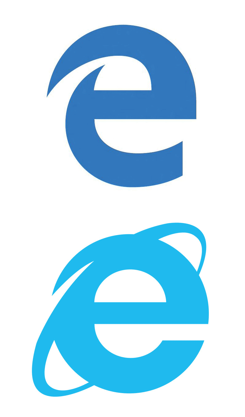
Why The Ugly New Microsoft Edge Logo Is Genius

Microsoft wants to shed years of baggage and bad reputation by killing Internet Explorer and launching the new Microsoft Edge. So if they want to leave the past behind, why the heck does the new Edge logo look almost just like the old Internet Explorer logo?


Yep, It’s Ugly


For starters, I’ll say that, on its own, I think the logo is actually pretty ugly. It’s oddly proportioned and awkward. It’s obviously not going to win any logo design awards (at least I hope not).


edge-logo2


Familiar Is Good For Users


Now, aesthetic appeal aside, the fact that the Edge logo looks an awful lot like the IE one is actually a great thing from the average user’s perspective. I’ll use my dad as an example. He knows nothing of IE’s bad reputation in the developer world, nor does he care. All he knows is that “e” is the icon that he clicks to get to the Internet. The next time he buys a computer, the first thing he’ll look for is that familiar “e” icon, welcoming him like an old friend. I’m betting that when he sees the new Edge icon, he won’t miss a beat.


It sounds like such a small benefit, but remember that typical users hate change. Every time Facebook moves a pixel, there are riots in the streets. Microsoft is making a bold move by introducing a new browser, and no matter how much it pleases the dev nerds like you and me, they need to make this transition as easy as possible for the rest of the world who just wants to know where the Internet went.


As designers, we too often want design to be about making things pretty. Quite often, what’s prettiest and what’s best for the user are at odds with each other. Our job is to reconcile that and always make sure the user experience takes center stage.


What Do You Think?


So there’s my opinion. The logo is ugly and far too similar, but it’s probably a good move anyway. Do you disagree? Should Microsoft drop lowercase “e” logos and move on? I’d love to hear your thoughts.


Why The Ugly New Microsoft Edge Logo Is Genius