Branding is a funny thing. Do it right, and people worship what you’ve done. Do it wrong — or what people perceive as wrong — and you’ll get crucified. Now let me introduce you to Spotify.
You’ve heard of Spotify, right? They’re a streaming music service, and they’ve been in the news a lot recently, since Apple’s setting up to take them on with Apple Music. It turns out that Spotify decided to do a little rebranding as well, and tweaked their logo slightly. The issue seems to be the green.
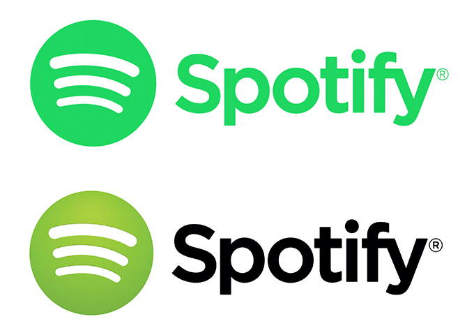
The old version — referred to as “broccoli” green by Spotify themselves — was a gradient of colors. Using Sip, I’m guessing that the original logo was a gradient from #AACE4B to #7BB546 or thereabouts. As for the new version, that’s #23CF5F all day long.
What have people had to say about it? Well here you go:
Cannot deal with the new shade of green of the #Spotify icon #50shadesofgreen
— Annabelle (@Kanabel_Kardash) June 15, 2015
Apple announced Apple music and then spotify was like “quick! We need to change our widget to a different shade of green!”
— Jimmy Tatro (@JimmyTatro) June 15, 2015
the new spotify green is so unsettling
— anti colonial(is)t (@motherjohnmisty) June 16, 2015
If you have spotify, look at the color of the icon… It’ll drive you insane. #50ShadesOfGreen
— Kervin Flores (@kervinflo90) June 17, 2015
If you have spotify, look at the color of the icon… It’ll drive you insane. #50ShadesOfGreen
— Kervin Flores (@kervinflo90) June 17, 2015
New Spotify Icon Color #50shadesofgreen #Spotify http://t.co/rAOvtvtBL9 pic.twitter.com/r2K2vsRTVE
— plasmosis (@plasmosis) June 17, 2015
It just seems radioactive and not in a good way. #spotify #50shadesofgreen pic.twitter.com/h9UjzaNiam
— Erin_NegleyLNP (@Erin_Negley) June 16, 2015
What’re your thoughts about the color change?
Kevin Whipps is a writer and editor based in Phoenix, Arizona. When he’s not working on one of the many projects in his queue, he’s looking for fun and irreverent things online to share with his friends.
Spotify"s New Green: Better or Worse?