Let’s take a moment to talk about the new IHOP logo, shall we? Here it is in all its glory:
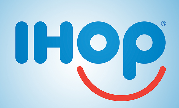
On first blush, I think we can see what the company was aiming for. It’s putting a friendly face on a franchise that sells comfort food, and, as such, we should all feel just hunky dory about their stuff. OK, got that.
But the first thing I take umbrage with is the color pallette. White, blue and red may seem to evoke thoughts of ‘Merica, but there’s so much blue that instead it makes me go down the clown route, and although I don’t have a fear of this country’s carnies, I do think that 50% of them carry a knife in their back pocket just in case they have to shank someone (and you know they can fit like 40 people in a Mini Cooper, which means that’s 20 sharp pointy things on hand).
Then there’s the lowercase “p.” I’ll let your imagination do the talking on that one. As Airbnb proved last year, the Internet simply isn’t mature enough to let these things go.
What Do You Think?
Overall, this is a solid attempt, and I can see their logic. But I also know that the next time the kids want to go to grab pancakes, I might think twice about the one with the scary and possibly inappropriate clown face.
What are your thoughts on the new logo? Does it hit the mark or make you wonder what went wrong? Leave a comment and let us know.
Kevin Whipps is a writer and editor based in Phoenix, Arizona. When he’s not working on one of the many projects in his queue, he’s looking for fun and irreverent things online to share with his friends.
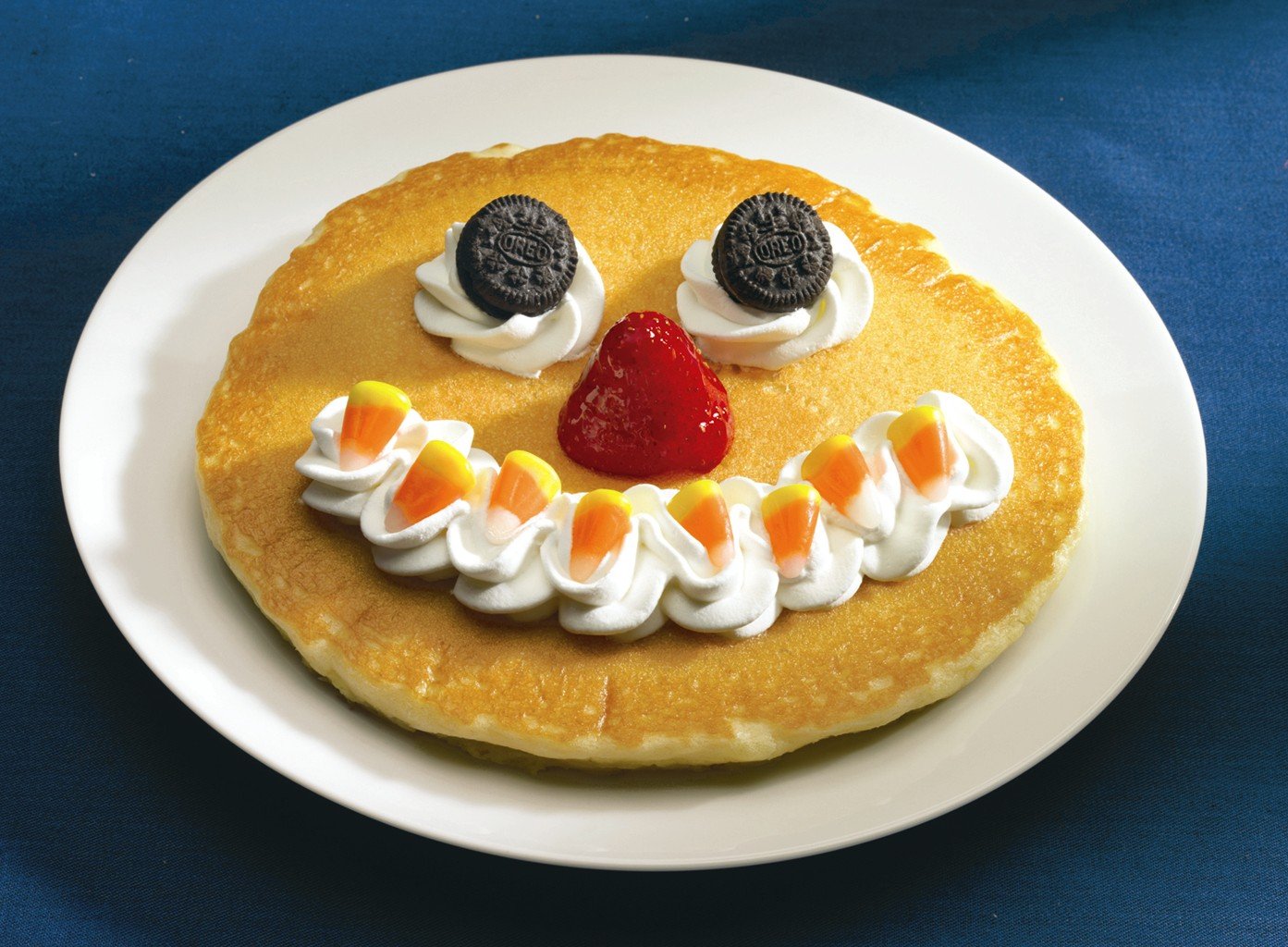
IHOP"s New Logo Makes Little Children Cry
No comments:
Post a Comment
Note: Only a member of this blog may post a comment.