Showing posts with label Test. Show all posts

Saturday, May 9, 2015

Test: Can You Pick The Apple Logo Out of a Lineup?

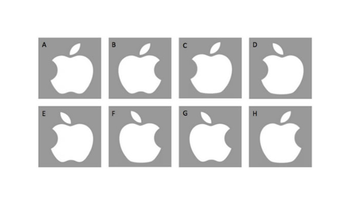
Pop quiz hot shot: which of the images below is the Apple logo? Give yourself about five seconds to choose, with no cheating! Which one do you pick?


apple_logo-lineup


It sounds simple enough right? Apple is one of the most ubiquitous companies on the planet, and most of us see this logo in some form or another. However, a study involving 85 UCLA students (75 of which owned Apple products), a stunning 84 of them got it wrong! You read that right, only one person got it right! The ultimate conclusion of the study is that our visual memory pretty much sucks.


As an Apple blogger and graphic designer, I can proudly say that I had no trouble picking out the right logo, and in fact thought this whole thing was total bull. After asking a few other people though, not only did they take a long time to venture a guess, they actually got it wrong.


Did You Guess It Right?


The correct answer is of course “B”. Is that what you guessed? Let us know in the comments below. And be honest!


Via Spring.org


Products Seen In This Post:


getpaidtowrite-banner
Test: Can You Pick The Apple Logo Out of a Lineup?

Friday, April 17, 2015

9 Tools to Test and Preview Your Newsletter

Marketing campaign by various big organizations rely heavily on emails that are sent to the target customers and audience. It is really important to preview these emails before sending them out because email protocols are not adequately intelligent enough. Different email clients on different devices display emails using their own standards. The result is an email with an unpredictable and dissociated appearance reaching the inboxes of many. To avoid this, we need to test it rigorously.


There are various email testing and rendering services that come with different features, sizes and pricing plans. These tools allow for emails to be previewed in various popular environment and inboxes to get an idea of how they would look. Here are 9 premium services to help you get started. Pricing plans, where listed, are included.


1. Email on Acid


Email on acid is a famous email testing and previewing software which allows users to preview an email on over 112 combinations of popular email clients and mobile phones. Also included is a spam test to identify which emails go to the spam folder, and code analysis to check the support of email clients for each line of code.


Email marketers will also be able to benefit from their library of tips and tricks where they also address identified bugs and their solutions.


[Price: 7-day free trial; Premium plans starting from /mth]


2. Litmus


Litmus comes with an interactive and real-time design with all required email previewing tools. It runs comprehensive testing on various aspects such as color blindness test, no-image view, plain text check, mobile preview and more.


This tool also runs link validation, code analysis, optimizes your email subject line for you and works well with your existing emailing software.


[Price:7-day free trial; Premium plans start from /mth]


3. Inbox Inspector


Inbox Inspector is a service offered by mailchimp. By using Inbox Inspector, one can compose an email and create campaigns by sending the email to mailchimp using a provided email address, without logging in. The email is previewed before it is sent out.


Inbox Inspector allows A/B testing to test the day, time of day and most effective subject line that may grab the attention of maximum audience. It also sends emails automatically based on time zones.


[Price: Mailchimp is free for up to 2000 subscribers with some feature limitations. Reports from Inbox Inspector cost /report for both paid and free plans.]


4. IBM Email Optimization


IBM Email Optimization (formerly known as Unica email optimization) is a noteworthy service to design and measure the efficiency of emails to be sent. Aside from previewing emails in environments such as AOL, yahoo, Gmail and mobile devices, IBM email optimization also lets you know if your IPs are blacklisted on any of the email server.


It also lets you test how the images in the email will appear at the receiving side. Though this software is premium but it could not be purchased online.


[Price: Not Listed]


5. previewmyemail


An email testing and previewing service which supposedly takes real screenshots of emails in different email clients both mobile and desktop then stores them in a central database hence ensuring no data gets lost.


The service enables to preview an email over 19 desktop email apps, 25 web based email apps and 4 mobile email apps.


[Price: Premium plans start from /mth]


6. Email Reach


This is an integrated email service software that provides email testing and rendering solutions. Email Reach helps you to know the exact status of a sent email whether it is delivered successfully into the inbox, rejected or received in the junk folder.


It has a built-in email verifier which cleanss mailing lists to make them ISP-friendly alongside real-time blacklist monitoring of IP addresses at various email servers.


[Price: 24-hour Free Trial; Premium plans start at 5/mth plus a signup fee.]


7. Contactology


Contactology is the simplest to use service in this list because at the site, you are presented with a 3-step guide for the email simulation feature of the complete software package. The full-fledged service covers email creation, analytics and optimization.


Alongside email preview on more than 30 different clients (including mobile), Contactology also has features to help you determine the quality score for your email contents, automatic (triggered) messaging and more.


[Price: Free Trial; Premium plans start at .95/mth]


8. Inbox Preview – CampaignMonitor


Inbox Preview is a cost-effective email previewing service with an interesting costing strategy. But before we get to that, do know that with Inbox Preview, one can preview the email on more than 20 email clients including web-based, desktop and mobile.


It also comes with rigorous spam testing, a no-image view, and testing on different browser variations. Used by more than 400,000 companies, Campaign Monitor lets you try all its features and will only charge you once you start an email campaign.


[Price: Pay when you send – /campaign +.01/user; Monthly plans start from: /mth for 500 users.]


9. Lyris hq


Lyris HQ is a cloud-based integrated email software featuring email testing as one of the tools in the package. The product is built for enterprise scale digital marketing and have advanced delivery management console to optimize email reach and engagement.


The tool is really allows previews of emails in more than 30 different clients and cell phones, to check blacklisting of sender’s IP, and shows the results of past emails reaching the receiver’s inbox.


[Price: Not Listed]


Now Read:
9 Tricks to Design The Perfect HTML Newsletter


9 Tools to Test and Preview Your Newsletter

9 Tools to Test and Preview Your Newsletter

Marketing campaign by various big organizations rely heavily on emails that are sent to the target customers and audience. It is really important to preview these emails before sending them out because email protocols are not adequately intelligent enough. Different email clients on different devices display emails using their own standards. The result is an email with an unpredictable and dissociated appearance reaching the inboxes of many. To avoid this, we need to test it rigorously.


There are various email testing and rendering services that come with different features, sizes and pricing plans. These tools allow for emails to be previewed in various popular environment and inboxes to get an idea of how they would look. Here are 9 premium services to help you get started. Pricing plans, where listed, are included.


1. Email on Acid


Email on acid is a famous email testing and previewing software which allows users to preview an email on over 112 combinations of popular email clients and mobile phones. Also included is a spam test to identify which emails go to the spam folder, and code analysis to check the support of email clients for each line of code.


Email marketers will also be able to benefit from their library of tips and tricks where they also address identified bugs and their solutions.


[Price: 7-day free trial; Premium plans starting from /mth]


2. Litmus


Litmus comes with an interactive and real-time design with all required email previewing tools. It runs comprehensive testing on various aspects such as color blindness test, no-image view, plain text check, mobile preview and more.


This tool also runs link validation, code analysis, optimizes your email subject line for you and works well with your existing emailing software.


[Price:7-day free trial; Premium plans start from /mth]


3. Inbox Inspector


Inbox Inspector is a service offered by mailchimp. By using Inbox Inspector, one can compose an email and create campaigns by sending the email to mailchimp using a provided email address, without logging in. The email is previewed before it is sent out.


Inbox Inspector allows A/B testing to test the day, time of day and most effective subject line that may grab the attention of maximum audience. It also sends emails automatically based on time zones.


[Price: Mailchimp is free for up to 2000 subscribers with some feature limitations. Reports from Inbox Inspector cost /report for both paid and free plans.]


4. IBM Email Optimization


IBM Email Optimization (formerly known as Unica email optimization) is a noteworthy service to design and measure the efficiency of emails to be sent. Aside from previewing emails in environments such as AOL, yahoo, Gmail and mobile devices, IBM email optimization also lets you know if your IPs are blacklisted on any of the email server.


It also lets you test how the images in the email will appear at the receiving side. Though this software is premium but it could not be purchased online.


[Price: Not Listed]


5. previewmyemail


An email testing and previewing service which supposedly takes real screenshots of emails in different email clients both mobile and desktop then stores them in a central database hence ensuring no data gets lost.


The service enables to preview an email over 19 desktop email apps, 25 web based email apps and 4 mobile email apps.


[Price: Premium plans start from /mth]


6. Email Reach


This is an integrated email service software that provides email testing and rendering solutions. Email Reach helps you to know the exact status of a sent email whether it is delivered successfully into the inbox, rejected or received in the junk folder.


It has a built-in email verifier which cleanss mailing lists to make them ISP-friendly alongside real-time blacklist monitoring of IP addresses at various email servers.


[Price: 24-hour Free Trial; Premium plans start at 5/mth plus a signup fee.]


7. Contactology


Contactology is the simplest to use service in this list because at the site, you are presented with a 3-step guide for the email simulation feature of the complete software package. The full-fledged service covers email creation, analytics and optimization.


Alongside email preview on more than 30 different clients (including mobile), Contactology also has features to help you determine the quality score for your email contents, automatic (triggered) messaging and more.


[Price: Free Trial; Premium plans start at .95/mth]


8. Inbox Preview – CampaignMonitor


Inbox Preview is a cost-effective email previewing service with an interesting costing strategy. But before we get to that, do know that with Inbox Preview, one can preview the email on more than 20 email clients including web-based, desktop and mobile.


It also comes with rigorous spam testing, a no-image view, and testing on different browser variations. Used by more than 400,000 companies, Campaign Monitor lets you try all its features and will only charge you once you start an email campaign.


[Price: Pay when you send – /campaign +.01/user; Monthly plans start from: /mth for 500 users.]


9. Lyris hq


Lyris HQ is a cloud-based integrated email software featuring email testing as one of the tools in the package. The product is built for enterprise scale digital marketing and have advanced delivery management console to optimize email reach and engagement.


The tool is really allows previews of emails in more than 30 different clients and cell phones, to check blacklisting of sender’s IP, and shows the results of past emails reaching the receiver’s inbox.


[Price: Not Listed]


Now Read:
9 Tricks to Design The Perfect HTML Newsletter


9 Tools to Test and Preview Your Newsletter

Tuesday, April 14, 2015

Nucleo – Free test pack

Nucleo - Free test pack


A test pack of 50 icons from Nucleo library. Icons are provided in 2 versions (glyph & outline) and 6 formats (.png, .sketch, .ai, .pdf, .svg, .csh).


The post Nucleo – Free test pack appeared first on Freebiesbug.


Nucleo – Free test pack

Saturday, April 4, 2015

How to Test Web Navigation with Card Sorting and Tree Testing

Websites, apps, software, any product with a menu needs a way to get around. While your navigation can be fun, creative, or at times unorthodox, it always needs to be functional first. When discussing usability testing for information architecture, you’ll often hear about the two most effective tests: card sorting and tree testing.


IMAGE: NetFuel


Both tests are simple and easy to conduct, and both tests yield vital data to maximize the organization of your site. Card sorting comes before you create your structure, so you can understand how your users naturally organize your site. Tree testing comes after, as a way to validate your success or point out room for improvement.


More on Hongkiat:


Card Sorting


The beauty of card sorting is in its simplicity. All you do is write the different elements of your product on note cards or Post-It notes, then have your participants organize them in a way that makes the most sense to them.


If that’s even too much to handle, you you can also go with a usability testing tool like OptimalSort, which can analyze the data for you. Either way, the result gives you a solid understanding of how your target users would intuitively navigate your product.


IMAGE: Smashing Magazine


Card Sorting Variations


There are a few different strategies to card sorting, depending on your needs. Donna Spencer, card sorting expert and Founder of Maadmob, shares her personal experience in an article for Boxes and Arrows. For such a simple activity, there’s plenty of variation and controls that will affect the kind, and validity, of data you receive.


The initial distinction to make is open or closed, explained below:


Open Sorting – Users are provided only with the elements cards, and then are left to group them however they see fit. Once grouped, users are asked to give names to the groups themselves. This is recommended for generating new ideas since you can work backwards from the users’ natural thought processes.


Closed Sorting – As with open sorting, users are given the elements cards; however, they are asked to categorize them into predefined groups. This is recommended if you’re working within the restrictions of pre-existing categories, as with updating an already developed website structure. 


Open vs. closed is the primary decision, but there are other methods for varying your results:


Groups vs. Individuals – Groups allow users to work collaboratively, for better or worse, and can help you learn about multiple users at once; however, group dynamics might affect your results. 


Remote vs. On-location – Online software tools allow you to test more users in a faster time, yet you’re unable to directly observe their decision-making processes. On-location gives you a fuller understanding of how your users came to their decisions, but requires more planning and scheduling.


Card Sorting Guidelines


Of course there’s room for customizing your card sorting, but William Hudson, UX Strategist and Consultant, lists some general benchmarks that can apply to any method you choose. Most useful, he lists the approximate times you can expect people to sort a given number of elements:


  • ~20 minutes for 30 elements

  • ~30 minutes for 50 elements

  • ~60 minutes for 100 elements

Using this time structure, you can plan out in advance how long the tests will take to administer, once the cards are written or the software established. However, in our personal experience, these guidelines are a bit generous one of our closed card sorts involved 47 cards and four categories, but only required an average of three minutes to complete.


Another universal rule is to avoid complex language on the cards. Big words – at least words with many syllables – and technical jargon run the risk of confusing the test-takers, or them misinterpreting the meaning. While simple wording is good advice in general for the language usage of a product, it’s essential for card sorting since overly complex labeling will disrupt the natural thought processes.


A lot of experts agree on the merits of card sorting. Pierre Croft, IA and UX expert for Decibel Digital encourages card sorting because it can help deflect the bad ideas of HIPPOS (highest paid people in the room) who might not know how to build a good website. He also lists out some pointers to keep in mind when preparing your test:


(1) Don’t mix parent and child categories – In other words, use categories from the same level, or else you will confuse your participants.


(2) Have blank cards and pens handy – While this is standard procedure for open card sorting, it’s also quite useful for closed card sorting. After the formal testing is done, you can provide a couple blank cards for participants to write down additional categories. While the information might be “off-the-record,” it could bring to light some useful insights.


(3) Don’t intervene – Intervention will obscure the data, so avoid the temptation. Of course give the test-takers some guidance if they’re confused, but only for issues not related to the results.


(4) It’s OK if users don’t group everything – A lack of grouping can be just as telling as a fully complete one. If this happens, make sure you ask the user why. If you’re running a closed sort and not everything is sorted, you can also provide blank cards to see why the existing categories weren’t chosen.


(5) Set time limits beforehand – This makes scheduling easier in general, and gives the participants an idea of how much time to spend on their tasks.


(6) Limit your cards – If your website has hundreds or even thousands of pages, you can choose only first and second-level pages to keep things manageable. For example, “Contact Us,” “Terms of Agreement,” and other utility pages can be omitted since they can be found on almost all websites out there (so you wouldn’t really be testing anything unique to your site).


Tree Testing


On the opposite spectrum of card sorting, tree testing allows you to test the information architecture after its designed. Tree testing works by stripping out the visual elements of your navigation system to see how the basic structure fares on its own. With a tree test, you examine only the labelling and hierarchy of your content.


Martin Rosenmejer of Webcredible calls tree testing one of the most important steps early in the design process. In a nutshell, a tree test involves participants finding different information on a clickable sitemap (or “tree”).


Using a usability testing tool like Treejack, you then record task success (clicking to the correct destination) and task directness (certainty of users that they found what was needed). It’s a foolproof method for seeing how well your users can find their way around your product.


Description: tree5.png


As displayed above, when we redesigned Yelp’s website, we provided a tree representing the support site and then gave users 10 tasks (for example, finding information on what to do with bad reviews). Because the overall task success rate was 53% and directness was 46%, we knew that the IA needed changing – but we knew exactly where to make those changes.


Simply put, a site search bar (or a three-line hamburger menu) is just not enough if the navigation is poor because users won’t know what is available to search. The rule of thumb for web design is to make the user think as little as possible, because searching requires users to recall from memory, it negatively affects the UX.


If we’ve sold the idea of tree testing on you already, Jeff Sauro, Founding Principal of MeasuringU, goes into details about how to properly run them. He explains that tree testing is used primarily for two reasons:


(1) Determine a product’s searchability – How well can users navigate the site, and what areas cause the most problems with navigation?


(2) Validate a change – Did a recent update correctly fix the problem, or are further revisions necessary?


Tree testing is, at heart, a statistical test. As with other quantitative tests, the data will be more accurate with more participants. How accurate? Check out this chart to find the smallest margin of error within your means; we recommend aiming for 20% error or better.


Conclusion


We can’t stress enough the importance of information architecture – if the content isn’t structured logically with a simple flow, it might as well not exist. That’s why these early tests can help identify and solve the problems before they actually become problems.


The strength of tests like these is that the data is modeled after the users’ natural behavior, and when it comes to testing your IA, no tests do it better than these two.


Editor’s note: This is written for Hongkiat.com by Jerry Cao. Jerry is a content strategist at UXPin where he develops in-app and online content for the wireframing and prototyping platform. For advice and case studies on 30 different types of usability tests, check out The Guide to Usability Testing.


Now Read:
7 Steps to Better Website Feedback


How to Test Web Navigation with Card Sorting and Tree Testing
Friday, April 3, 2015

How to Test Web Navigation with Card Sorting and Tree Testing

Websites, apps, software, any product with a menu needs a way to get around. While your navigation can be fun, creative, or at times unorthodox, it always needs to be functional first. When discussing usability testing for information architecture, you’ll often hear about the two most effective tests: card sorting and tree testing.


IMAGE: NetFuel


Both tests are simple and easy to conduct, and both tests yield vital data to maximize the organization of your site. Card sorting comes before you create your structure, so you can understand how your users naturally organize your site. Tree testing comes after, as a way to validate your success or point out room for improvement.


More on Hongkiat:


Card Sorting


The beauty of card sorting is in its simplicity. All you do is write the different elements of your product on note cards or Post-It notes, then have your participants organize them in a way that makes the most sense to them.


If that’s even too much to handle, you you can also go with a usability testing tool like OptimalSort, which can analyze the data for you. Either way, the result gives you a solid understanding of how your target users would intuitively navigate your product.


IMAGE: Smashing Magazine


Card Sorting Variations


There are a few different strategies to card sorting, depending on your needs. Donna Spencer, card sorting expert and Founder of Maadmob, shares her personal experience in an article for Boxes and Arrows. For such a simple activity, there’s plenty of variation and controls that will affect the kind, and validity, of data you receive.


The initial distinction to make is open or closed, explained below:


Open Sorting – Users are provided only with the elements cards, and then are left to group them however they see fit. Once grouped, users are asked to give names to the groups themselves. This is recommended for generating new ideas since you can work backwards from the users’ natural thought processes.


Closed Sorting – As with open sorting, users are given the elements cards; however, they are asked to categorize them into predefined groups. This is recommended if you’re working within the restrictions of pre-existing categories, as with updating an already developed website structure. 


Open vs. closed is the primary decision, but there are other methods for varying your results:


Groups vs. Individuals – Groups allow users to work collaboratively, for better or worse, and can help you learn about multiple users at once; however, group dynamics might affect your results. 


Remote vs. On-location – Online software tools allow you to test more users in a faster time, yet you’re unable to directly observe their decision-making processes. On-location gives you a fuller understanding of how your users came to their decisions, but requires more planning and scheduling.


Card Sorting Guidelines


Of course there’s room for customizing your card sorting, but William Hudson, UX Strategist and Consultant, lists some general benchmarks that can apply to any method you choose. Most useful, he lists the approximate times you can expect people to sort a given number of elements:


  • ~20 minutes for 30 elements

  • ~30 minutes for 50 elements

  • ~60 minutes for 100 elements

Using this time structure, you can plan out in advance how long the tests will take to administer, once the cards are written or the software established. However, in our personal experience, these guidelines are a bit generous one of our closed card sorts involved 47 cards and four categories, but only required an average of three minutes to complete.


Another universal rule is to avoid complex language on the cards. Big words – at least words with many syllables – and technical jargon run the risk of confusing the test-takers, or them misinterpreting the meaning. While simple wording is good advice in general for the language usage of a product, it’s essential for card sorting since overly complex labeling will disrupt the natural thought processes.


A lot of experts agree on the merits of card sorting. Pierre Croft, IA and UX expert for Decibel Digital encourages card sorting because it can help deflect the bad ideas of HIPPOS (highest paid people in the room) who might not know how to build a good website. He also lists out some pointers to keep in mind when preparing your test:


(1) Don’t mix parent and child categories – In other words, use categories from the same level, or else you will confuse your participants.


(2) Have blank cards and pens handy – While this is standard procedure for open card sorting, it’s also quite useful for closed card sorting. After the formal testing is done, you can provide a couple blank cards for participants to write down additional categories. While the information might be “off-the-record,” it could bring to light some useful insights.


(3) Don’t intervene – Intervention will obscure the data, so avoid the temptation. Of course give the test-takers some guidance if they’re confused, but only for issues not related to the results.


(4) It’s OK if users don’t group everything – A lack of grouping can be just as telling as a fully complete one. If this happens, make sure you ask the user why. If you’re running a closed sort and not everything is sorted, you can also provide blank cards to see why the existing categories weren’t chosen.


(5) Set time limits beforehand – This makes scheduling easier in general, and gives the participants an idea of how much time to spend on their tasks.


(6) Limit your cards – If your website has hundreds or even thousands of pages, you can choose only first and second-level pages to keep things manageable. For example, “Contact Us,” “Terms of Agreement,” and other utility pages can be omitted since they can be found on almost all websites out there (so you wouldn’t really be testing anything unique to your site).


Tree Testing


On the opposite spectrum of card sorting, tree testing allows you to test the information architecture after its designed. Tree testing works by stripping out the visual elements of your navigation system to see how the basic structure fares on its own. With a tree test, you examine only the labelling and hierarchy of your content.


Martin Rosenmejer of Webcredible calls tree testing one of the most important steps early in the design process. In a nutshell, a tree test involves participants finding different information on a clickable sitemap (or “tree”).


Using a usability testing tool like Treejack, you then record task success (clicking to the correct destination) and task directness (certainty of users that they found what was needed). It’s a foolproof method for seeing how well your users can find their way around your product.


Description: tree5.png


As displayed above, when we redesigned Yelp’s website, we provided a tree representing the support site and then gave users 10 tasks (for example, finding information on what to do with bad reviews). Because the overall task success rate was 53% and directness was 46%, we knew that the IA needed changing – but we knew exactly where to make those changes.


Simply put, a site search bar (or a three-line hamburger menu) is just not enough if the navigation is poor because users won’t know what is available to search. The rule of thumb for web design is to make the user think as little as possible, because searching requires users to recall from memory, it negatively affects the UX.


If we’ve sold the idea of tree testing on you already, Jeff Sauro, Founding Principal of MeasuringU, goes into details about how to properly run them. He explains that tree testing is used primarily for two reasons:


(1) Determine a product’s searchability – How well can users navigate the site, and what areas cause the most problems with navigation?


(2) Validate a change – Did a recent update correctly fix the problem, or are further revisions necessary?


Tree testing is, at heart, a statistical test. As with other quantitative tests, the data will be more accurate with more participants. How accurate? Check out this chart to find the smallest margin of error within your means; we recommend aiming for 20% error or better.


Conclusion


We can’t stress enough the importance of information architecture – if the content isn’t structured logically with a simple flow, it might as well not exist. That’s why these early tests can help identify and solve the problems before they actually become problems.


The strength of tests like these is that the data is modeled after the users’ natural behavior, and when it comes to testing your IA, no tests do it better than these two.


Editor’s note: This is written for Hongkiat.com by Jerry Cao. Jerry is a content strategist at UXPin where he develops in-app and online content for the wireframing and prototyping platform. For advice and case studies on 30 different types of usability tests, check out The Guide to Usability Testing.


Now Read:
7 Steps to Better Website Feedback


How to Test Web Navigation with Card Sorting and Tree Testing

How to Test Web Navigation with Card Sorting and Tree Testing

Websites, apps, software, any product with a menu needs a way to get around. While your navigation can be fun, creative, or at times unorthodox, it always needs to be functional first. When discussing usability testing for information architecture, you’ll often hear about the two most effective tests: card sorting and tree testing.


IMAGE: NetFuel


Both tests are simple and easy to conduct, and both tests yield vital data to maximize the organization of your site. Card sorting comes before you create your structure, so you can understand how your users naturally organize your site. Tree testing comes after, as a way to validate your success or point out room for improvement.


More on Hongkiat:


Card Sorting


The beauty of card sorting is in its simplicity. All you do is write the different elements of your product on note cards or Post-It notes, then have your participants organize them in a way that makes the most sense to them.


If that’s even too much to handle, you you can also go with a usability testing tool like OptimalSort, which can analyze the data for you. Either way, the result gives you a solid understanding of how your target users would intuitively navigate your product.


IMAGE: Smashing Magazine


Card Sorting Variations


There are a few different strategies to card sorting, depending on your needs. Donna Spencer, card sorting expert and Founder of Maadmob, shares her personal experience in an article for Boxes and Arrows. For such a simple activity, there’s plenty of variation and controls that will affect the kind, and validity, of data you receive.


The initial distinction to make is open or closed, explained below:


Open Sorting – Users are provided only with the elements cards, and then are left to group them however they see fit. Once grouped, users are asked to give names to the groups themselves. This is recommended for generating new ideas since you can work backwards from the users’ natural thought processes.


Closed Sorting – As with open sorting, users are given the elements cards; however, they are asked to categorize them into predefined groups. This is recommended if you’re working within the restrictions of pre-existing categories, as with updating an already developed website structure. 


Open vs. closed is the primary decision, but there are other methods for varying your results:


Groups vs. Individuals – Groups allow users to work collaboratively, for better or worse, and can help you learn about multiple users at once; however, group dynamics might affect your results. 


Remote vs. On-location – Online software tools allow you to test more users in a faster time, yet you’re unable to directly observe their decision-making processes. On-location gives you a fuller understanding of how your users came to their decisions, but requires more planning and scheduling.


Card Sorting Guidelines


Of course there’s room for customizing your card sorting, but William Hudson, UX Strategist and Consultant, lists some general benchmarks that can apply to any method you choose. Most useful, he lists the approximate times you can expect people to sort a given number of elements:


  • ~20 minutes for 30 elements

  • ~30 minutes for 50 elements

  • ~60 minutes for 100 elements

Using this time structure, you can plan out in advance how long the tests will take to administer, once the cards are written or the software established. However, in our personal experience, these guidelines are a bit generous one of our closed card sorts involved 47 cards and four categories, but only required an average of three minutes to complete.


Another universal rule is to avoid complex language on the cards. Big words – at least words with many syllables – and technical jargon run the risk of confusing the test-takers, or them misinterpreting the meaning. While simple wording is good advice in general for the language usage of a product, it’s essential for card sorting since overly complex labeling will disrupt the natural thought processes.


A lot of experts agree on the merits of card sorting. Pierre Croft, IA and UX expert for Decibel Digital encourages card sorting because it can help deflect the bad ideas of HIPPOS (highest paid people in the room) who might not know how to build a good website. He also lists out some pointers to keep in mind when preparing your test:


(1) Don’t mix parent and child categories – In other words, use categories from the same level, or else you will confuse your participants.


(2) Have blank cards and pens handy – While this is standard procedure for open card sorting, it’s also quite useful for closed card sorting. After the formal testing is done, you can provide a couple blank cards for participants to write down additional categories. While the information might be “off-the-record,” it could bring to light some useful insights.


(3) Don’t intervene – Intervention will obscure the data, so avoid the temptation. Of course give the test-takers some guidance if they’re confused, but only for issues not related to the results.


(4) It’s OK if users don’t group everything – A lack of grouping can be just as telling as a fully complete one. If this happens, make sure you ask the user why. If you’re running a closed sort and not everything is sorted, you can also provide blank cards to see why the existing categories weren’t chosen.


(5) Set time limits beforehand – This makes scheduling easier in general, and gives the participants an idea of how much time to spend on their tasks.


(6) Limit your cards – If your website has hundreds or even thousands of pages, you can choose only first and second-level pages to keep things manageable. For example, “Contact Us,” “Terms of Agreement,” and other utility pages can be omitted since they can be found on almost all websites out there (so you wouldn’t really be testing anything unique to your site).


Tree Testing


On the opposite spectrum of card sorting, tree testing allows you to test the information architecture after its designed. Tree testing works by stripping out the visual elements of your navigation system to see how the basic structure fares on its own. With a tree test, you examine only the labelling and hierarchy of your content.


Martin Rosenmejer of Webcredible calls tree testing one of the most important steps early in the design process. In a nutshell, a tree test involves participants finding different information on a clickable sitemap (or “tree”).


Using a usability testing tool like Treejack, you then record task success (clicking to the correct destination) and task directness (certainty of users that they found what was needed). It’s a foolproof method for seeing how well your users can find their way around your product.


Description: tree5.png


As displayed above, when we redesigned Yelp’s website, we provided a tree representing the support site and then gave users 10 tasks (for example, finding information on what to do with bad reviews). Because the overall task success rate was 53% and directness was 46%, we knew that the IA needed changing – but we knew exactly where to make those changes.


Simply put, a site search bar (or a three-line hamburger menu) is just not enough if the navigation is poor because users won’t know what is available to search. The rule of thumb for web design is to make the user think as little as possible, because searching requires users to recall from memory, it negatively affects the UX.


If we’ve sold the idea of tree testing on you already, Jeff Sauro, Founding Principal of MeasuringU, goes into details about how to properly run them. He explains that tree testing is used primarily for two reasons:


(1) Determine a product’s searchability – How well can users navigate the site, and what areas cause the most problems with navigation?


(2) Validate a change – Did a recent update correctly fix the problem, or are further revisions necessary?


Tree testing is, at heart, a statistical test. As with other quantitative tests, the data will be more accurate with more participants. How accurate? Check out this chart to find the smallest margin of error within your means; we recommend aiming for 20% error or better.


Conclusion


We can’t stress enough the importance of information architecture – if the content isn’t structured logically with a simple flow, it might as well not exist. That’s why these early tests can help identify and solve the problems before they actually become problems.


The strength of tests like these is that the data is modeled after the users’ natural behavior, and when it comes to testing your IA, no tests do it better than these two.


Editor’s note: This is written for Hongkiat.com by Jerry Cao. Jerry is a content strategist at UXPin where he develops in-app and online content for the wireframing and prototyping platform. For advice and case studies on 30 different types of usability tests, check out The Guide to Usability Testing.


Now Read:
7 Steps to Better Website Feedback


How to Test Web Navigation with Card Sorting and Tree Testing