OK, let’s get this out of the way: this isn’t a political blog, and we’re not pundits trying to sway your decision one way or the other. But what we are is a design site, and when politics and design collide, we’ve got to talk about it, right?
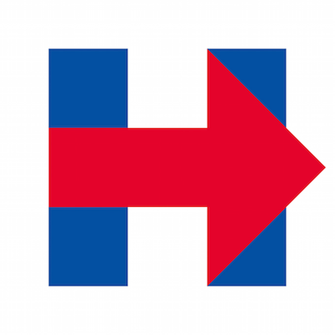
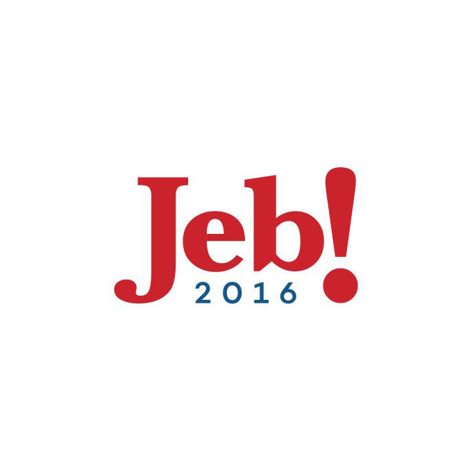
Two of the popular candidates for the 2016 election are Hillary Clinton and Jeb Bush — Jeb, being the brother of the last republican President, George Bush Jr., and the son of former President George Bush Sr., and Hillary being the former United States Secretary of State as well as the wife of former President Bill Clinton. Needless to say, both candidates are extremely well known and need a strong brand to represent them through the upcoming campaign.
Now the two have shown off their official logos, and both are trying to beat out (in a design sense, anyway) the Obama logo that set the bar high 8 years ago. And there’s one other key point: while Hilary’s logo is brand new, Jeb has been using a variation of his logo for the past 20 years. So what do you think? Which logo works, and which one is a dud? Or do they both suck?
Hilary Clinton
Jeb Bush
Kevin Whipps is a writer and editor based in Phoenix, Arizona. When he’s not working on one of the many projects in his queue, he’s looking for fun and irreverent things online to share with his friends.
Jeb vs. Hillary: Which Logo is Worse?
No comments:
Post a Comment
Note: Only a member of this blog may post a comment.