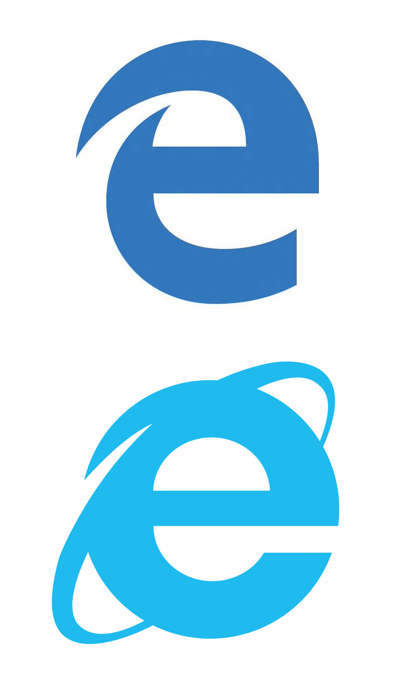
Microsoft wants to shed years of baggage and bad reputation by killing Internet Explorer and launching the new Microsoft Edge. So if they want to leave the past behind, why the heck does the new Edge logo look almost just like the old Internet Explorer logo?
Yep, It’s Ugly
For starters, I’ll say that, on its own, I think the logo is actually pretty ugly. It’s oddly proportioned and awkward. It’s obviously not going to win any logo design awards (at least I hope not).

Familiar Is Good For Users
Now, aesthetic appeal aside, the fact that the Edge logo looks an awful lot like the IE one is actually a great thing from the average user’s perspective. I’ll use my dad as an example. He knows nothing of IE’s bad reputation in the developer world, nor does he care. All he knows is that “e” is the icon that he clicks to get to the Internet. The next time he buys a computer, the first thing he’ll look for is that familiar “e” icon, welcoming him like an old friend. I’m betting that when he sees the new Edge icon, he won’t miss a beat.
It sounds like such a small benefit, but remember that typical users hate change. Every time Facebook moves a pixel, there are riots in the streets. Microsoft is making a bold move by introducing a new browser, and no matter how much it pleases the dev nerds like you and me, they need to make this transition as easy as possible for the rest of the world who just wants to know where the Internet went.
As designers, we too often want design to be about making things pretty. Quite often, what’s prettiest and what’s best for the user are at odds with each other. Our job is to reconcile that and always make sure the user experience takes center stage.
What Do You Think?
So there’s my opinion. The logo is ugly and far too similar, but it’s probably a good move anyway. Do you disagree? Should Microsoft drop lowercase “e” logos and move on? I’d love to hear your thoughts.
Why The Ugly New Microsoft Edge Logo Is Genius
No comments:
Post a Comment
Note: Only a member of this blog may post a comment.