Showing posts with label Guide. Show all posts

Wednesday, June 24, 2015

App Store Optimization: A Hands-On Guide for App Developers

You’ve just made your first iPhone app and published it into the App Store. Great! But the app installs aren’t going through the roof. Now what? You will need to get some optimization done.


IMAGE: Cristiano Betta

App Store Optimization (ASO) are the tactics you can use to rank your app higher in the App Store. Ranking governs which apps are listed as the Top 25 and Top 100 in the App Store, both in the Overall ranking and in individual categories. An app’s ranking greatly influences how many people install it.


This article will explain and teach you how to use ASO to your benefit, in a hands-on manner.


What Is App Store Optimization?


App Store Optimization is the process of improving the visibility of an app in the app stores (iOS App Store, Google Play, etc.), with the goal of ranking higher in search results and top rankings. A higher ranking means that more potential users might download and install the app.


In this sense, App Store Optimization is similar to Search Engine Optimization (SEO), but for app stores.


Generally speaking, App Store Optimization means that you’re making an effort to expose your app to a bigger number of potential users, and increase your chances of acquiring those users. Of course, the quality of these users matter. Ultimately the conversion counts, both from potential user to acquired user, as from acquired user to paying customer. In this sense, app engagement and user retention matters too.


App Store Optimization doesn’t directly involve increasing engagement and retention, but acquiring the right users does help determine the success of an app. When a user steps through the door, the user story isn’t over. Although App Store Optimization makes sure more users install your app, the end goal is to attract paying customers.


Throughout the article the iOS App Store is used as an example for App Store Optimization. However, every ASO tactic will also apply to Google Play and other app stores.


The Main Aspects Of App Store Optimization


The determining aspects of App Store Optimization are:


  • App title, and whether it includes keywords.

  • App icon, a single representative graphic that’s used to identify the app both in the App Store and on a user’s home screen.

  • App screenshots (and video), the several graphic assets that depict the app’s functionality when browsing the App Store.

  • App ratings and reviews, the subjective voice of a user that’s already using your app.

  • App downloads, the number of users that have downloaded your app.

  • App description and localization, the text that’s shown in the App Store alongside the app icon and screenshots.

Several tools can track these factors and determine their influence on an apps ranking. Popular tools are: AppAnnie (market insight and analytics), Google Analytics for Mobile (analytics and tracking), SensorTower (insight and analytics). Apple has published its own App Analytics platform in April 2015, and it is the only tool that can measure inbound traffic for your App Store app page.


Optimizing Your App’s Assets


Let’s first start by optimizing the assets your app has: its title, icon, screenshots and keywords.


App Title & Keywords


What’s in a name? The title of an app is a verbal hook your users identify your app with. It’s visible on your app’s website (outside the App Store), inside the App Store itself and below the app icon on a user’s home screen.


Ideating a good app title is an art on its own. In general, an app name should address two things:


  • Does it include a brand or product name?

  • Does it include relevant keywords?

The name of an app, together with its icon, is often the first trigger for a user to check it out in the App Store.


When browsing the top lists, a user only sees an app’s icon, title and category. When searching (i.e. using the search function) a user sees the app icon, title, the name of the publisher and 2 screenshots.


As for relevant keywords, you can ask yourself: "When a user searches for my product, what kind of keywords would he or she use?" It’s often not enough to come up with a search term you think is relevant. You need to test what kind of words your target audience associates your service with.


A good way of researching that is using along-tail keyword generator. These tools return search queries based on keyword ideas you put in. Such search queries are used by real-world users, which makes it a good representation of how a potential customer searches for your product.


When you’ve established both the app’s brand name and its keywords, put the two together. Keep in mind that Apple sometimes rejects apps that include a slogan or catchphrase. You can only include keywords in the title when they’re relevant for the app, or explain the app title in a more complete way than just the brand name.


Examples of Good app titles


"Moleskine Timepage – Calendar for iCloud, Google and Exchange"

Moleskine is obviously the brand name, but "Calendar" and "iCloud" etc. are relevant search keywords.


"Ultimate Guitar Tabs – largest catalog of songs with guitar and ukulele chords, tabs, lyrics and guitar lessons"

"Ultimate Guitar Tabs" isn’t enough, because potential customers might search for "chords" or "ukelele lessons).


"Sleep Cycle alarm clock"

Although the product is known as a "sleep cycle app", it’s function is that of an "alarm clock".


Examples of Bad App Titles


"US PayPal Fees"

This is a fee calculator for PayPal, but it omits relevant keywords: calculator, share, etc.


"Iconzoomer"

Unfortunately, this app title doesn’t tell one bit about what it is. And no, it does not zoom icons.


"mPage"

This is an app for a popular online learning system, Moodle. Unfortunately, the app name only includes the ambiguous "mPage" name.


App Icon


If the app title is the most important textual hook point for a user, then the app icon must be the most important visual hook. The icon of your app is used everywhere, both inside and outside the App Store. Just like a logo represents a brand, your app icon represents your app.


Graphic design is an art and industry on its own, but within the realms of App Store Optimization, take note of the following app icon heuristics:


  1. Use one centered graphic element, that has no overlapping pieces.

  2. Keep it simple: don’t use complex, photo-like graphics, and keep to simple surfaces and basic colors.

  3. Use conventional and recognizable iconography. Think about the universal "Save" icon, the floppy disk. Although people born today don’t know what it is, they know itsaves stuff. Do the same for your app icon, don’t reinvent the wheel. The good app title examples above all have good icons too, respectively a notepad icon, a guitar pick, and a clock icon.

  4. Use a duo-tone or tri-tone color setting. That means: two or three complementary basic colors. Many good app icons use white as the base color, because the App Store app itself is white.

  5. Stick to the trend. Back when iOS 6 got replaced by the flat-design iOS 7, iOS 6-style app icons immediately stood out as old and obsolete. During that time app icons that appeared to "pop out" were popular, these days almost all well-performing app icons are flat duo-tone illustrations.

You might want to get some ideas and inspiration from these app icon showcases:


One more thing: your app icon also represents your app on a user’s home screen. Keep that in mind during its design, and make sure you pick an app name (below the icon, on the homescreen) that captures your app’s function in one word.


Screenshots


With screenshots you can give a potential user a peek inside your app, before they’ve installed it. In the App Store, 2 screenshots are shown when using the search function, but no screenshots are shown when browsing a top list. When opening the app page in the App Store, all screenshots are shown (2 at a time). Of course, the appropriate screenshots are shown on individual device models. A screenshot is often an image of the UI of several in-app screens, which isn’t optimal.


See, when a user sees your app in the App Store, they’re asking three questions:


  1. What is this app for?

  2. What’s in it for me? (Or, Why should I use it?)

  3. How can I use this app?

When one question results in a negative decision, i.e. "This app isn’t for me", the next questions aren’t asked. That’s why it’s so important to have a solid app title.


The question "What’s this app for?" is answered by the title of your app, and especially by the keywords inside its title.


The screenshots of the UI of your app answer question 3. A user will try to understand the user interface design of your app, and ascertain whether or not your app can be used to get to the goal they have in mind.


Unfortunately, this leaves question 2 unanswered. A potential customer has to find out on its own how they can use your app, and often doesn’t see the benefit of using your app.


Fortunately, there’s a solution. Instead of showing screenshots of the user interface of your app, create images that include the UI but puts one or two sales copy lines above it. You may have seen it before: an image that shows an iPhone with the app’s UI, and above it tells you something about the app itself. Including key benefits as text inside an app screenshot allows you to explain your app and sell its UI at the same time.


When deciding on what text to put above the app screenshot, keep the following heuristics in mind:


1. Use your Keywords.


By now you know what words a potential user uses to describe your app, so make sure the same keywords are visible in the screenshot text too.


2. List Benefits of your App, not Features.


Many apps use texts like "Store unlimited to-do’s" or "Play over a 1000 levels!". Such messages don’t answer the "What’s in it for me?" question, they only bluntly list features. Instead of features, list benefits: "Cashflow planning for startups", or "Intuitive task management that gets out of your way", or "See your account balance at a glance".


3. Don’t Distract.


When using extra graphics in the image, don’t distract the user from the main message. Use solid color background, not photographs, and do not include extra graphic elements such as fancy text boxes or icons. When using an actual smartphone image, do not use the real photos of it, but instead use a simple recognizable vector illustration.


You can include one video too. It’s shown alongside the app screenshots and it’s a great way to portray the functionality of your app, and build trust with the user. In your video, include the key benefits of your app and use a voice-over to explain them. Again, don’t distract the user with too much graphics and keep it under 20 seconds.


Expanding The Reach Of Your App


Now that you’ve optimized the primary assets of your app, it’s time to leverage the actual users of it. Of course, this is also the time to find marketing channels outside the App Store to make potential customers aware of your product.


Such marketing channels can include:


  • Making use of In-App Deeplinking, a technology that’s used to create links to native content of your app in the same way a web page hyperlinks to another web page.

  • Getting featured by news and review channels such as TechCrunch, Mashable, Gizmodo and CNET.

  • Integrating your app with content on Pinterest (so-called App Pins) and Twitter (so-called App Cards), mixing it with native platform conversations.

  • Using conventional marketing strategies, such as social media content marketing, advertising, and working with an affiliate network.

The goal of using these strategies is to get more people to see your App Store page and potentially install your app. With App Store Optimization you’ve made sure that more people will install your app, but when nobody sees your app page in the first place you’re still not getting any installs. By driving more traffic towards your app page, you’ll leverage App Store Optimization to generate more installs.


App Reviews And Customer Relations


The last and final key point of App Store Optimization is app ratings and reviews. The amount of positive ratings and the amount of app downloads greatly influences your ranking in the App Store. Now that you’ve gained some initial traction for your app, it’s time to use those first installers to your advantage.


Research indicates that users that had a negative experience in your app are 33% more likely to leave a review. Of course, such a review will have a negative effect on the ranking of your app. The same research concluded that 59% of potential customers usually or always check the rating of an app before they download an app.


Recently, dating app Tinder introduced a paid upgrade for their app for functionality that was previously free. Customers didn’t take well to the change and left thousands of negative reviews, demoting the app from 5 stars to 1.5 and cutting the app’s ranking in half (55th to 105th). Simply put: ratings matter, not only for ranking but also for acquiring users.


Getting positive ratings and reviews for your app involves 2 key points:


  • Asking for a rating at the right time

  • Avoiding negative reviews by building a relation with the customer

You’ve probably seen it before: after you’ve used the app for a while, it asks if you want to rate the app. This mechanic is very effective for getting positive reviews from users that are less likely to write a review on their own.


To ensure success of the feature, make sure you ask for a review at the right time. Don’t ask for a review when a user hasn’t had enough time to use and evaluate your app. Ideally, you want to ask for a review when a user has just completed a positive step or task within your app: ticking off a couple of to-do’s, completing a game level or when experiencing an emotional high.


Users that have had a negative experience with an app are more likely to leave a review, compared to users who have had a positive experience with your app. It makes sense: a frustrated user is more inclined to voice their frustration, than a user whose app is working just fine. To avoid negative feedback in the form of an app review, it is important to give the unhappy user another way to get in touch with you.


Using a Message and Support Center in your app is a great way to lower the barrier for the user to get in touch with you. When you implicitly make it clear to a user that it is easier to contact you and get an issue resolved, than throwing dirt in an app review, you’re hitting two birds with one stone: the user doesn’t write a negative review, and you have a chance to start a conversation and make things right. It’s more expensive to acquire a new user, than it is to keep a current one.


Several companies offer products with a customer relations Support Center, including Intercom, AppTentive, Urban Airship and Zendesk.


Conclusion


Now you know how to hit user acquisition out of the park, by benefiting from App Store Optimization tactics.


To summarize:


  • Optimize the front-end: app title, icon, screenshots and keywords.

  • Leverage inbound traffic: get more people to try your app.

  • Attract positive reviews and protect the downside: ask a user for a review at the appropriate time, and avoid negative reviews by starting a conversation with an unhappy user.

Editor’s Note: This is written by Reinder de Vries for Hongkiat.com. Reinder is an entrepreneur and app developer, who believes that there are not enough app makers in the world. He has developed 50+ apps and his code is used by millions of users all over the globe. When he’s not coding, he teaches aspiring developers how to make their own apps at LearnAppMaking.com.


App Store Optimization: A Hands-On Guide for App Developers

Thursday, June 11, 2015

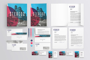
Our Free Ebook is Here: The Beginner"s Guide to Branding

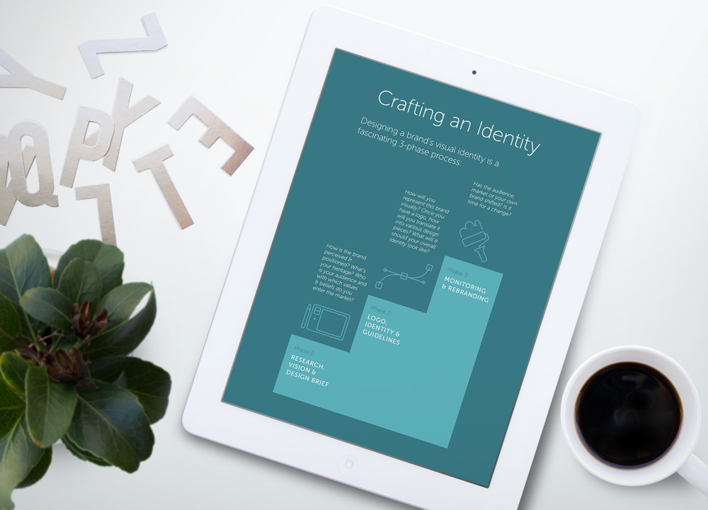
Why do some brands take a piece of our heart? What is it about their design that makes us feel connected, amused… delighted? Most importantly, how can we create such a brand? We asked the same questions, and gathered dozens of useful tips from top designers to collect their very best advice in this free ebook.


Download it now →


What you’ll find inside


We’ve prepared six chapters complete with inspiring examples and handy templates. By the time you’re done reading The Beginner’s Guide to Branding, you’ll know exactly:


1. What is branding


You probably hear the term branding being tossed around a lot. But, what exactly does it mean? This chapter includes insider advice for developing strong branding elements.


identitychapter


2. How to figure out an effective name


Struggling to come up with a name for your new product or service? Learn how to brainstorm potential name ideas and choose well with these actionable tips.


3. How to design a strong visual brand identity


One of the most interesting projects that a graphic designer can take on is designing a logo. This chapter helps you understand the difference (and relationship) between a brand, an identity and a logo.


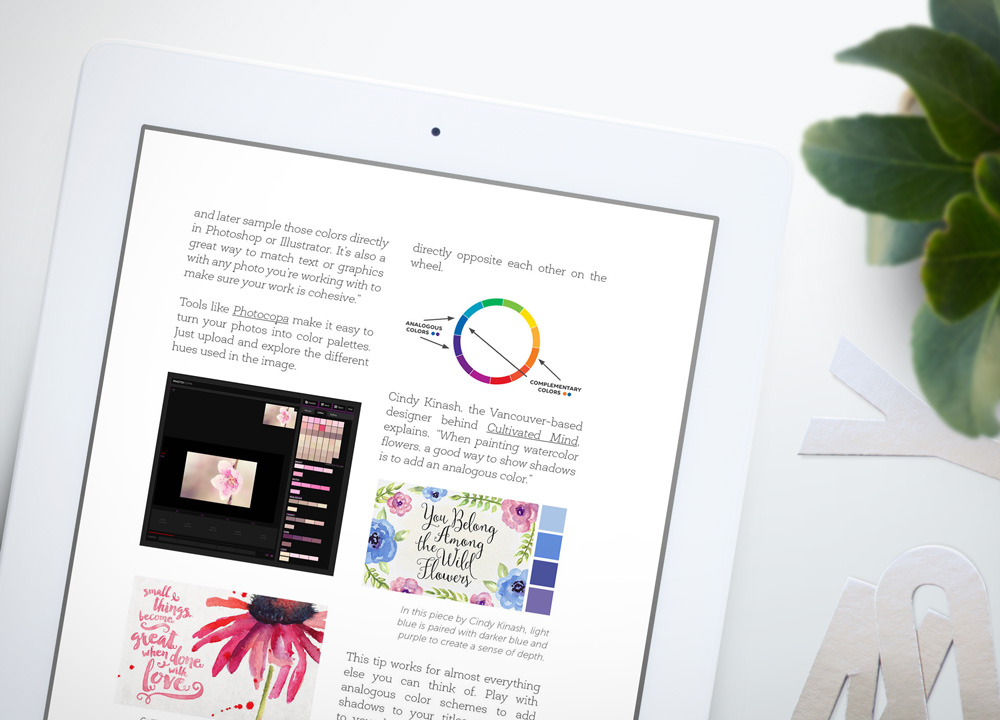
4. How to choose ideal color palettes & typography


Select brand-appropriate color schemes and fonts that help convey your message. Certain hues carry powerful associations that send certain signals to your users. Learn essential color tricks from top designers.


colorchapter


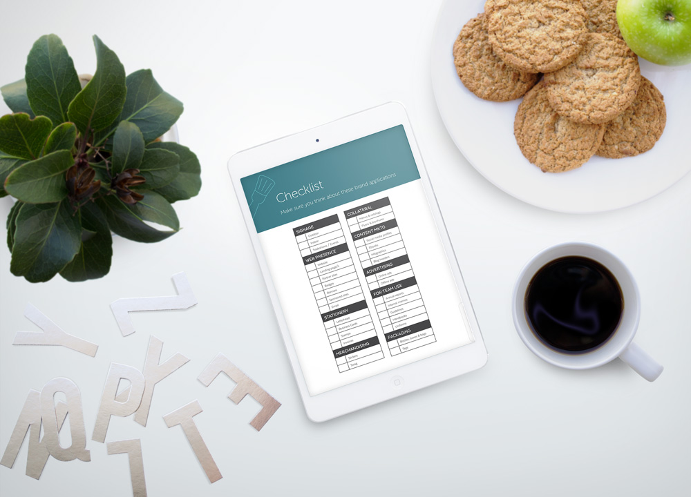
5. How to create memorable brand applications


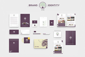
Leave a lasting impression with impactful letterhead, brochures, business cards and other applications. This chapter features dozens of tips to cut down design time and share your story with compelling marketing materials.


6. How to bring in your brand’s voice in design pieces


Ready to go live? Differentiate your brand from competitors with a unique personality. Learn how to incorporate a genuine voice and turn your online presence around in no time.


applicationschapter


But wait… there’s more! (9 free resources)


We are also thrilled to share 9 free resources that will help you get started with your brand’s style guide in no time. We’ve included mockup kits, stationery sets, brand manual templates and other exciting assets to speed up your brand development process. All you need to do is share this free ebook with your friends, family & colleagues using the link over at creativemarket.com/ebooks/branding.


We hope you enjoy this free ebook and let us know your thoughts below. Ever tried creating your own brand identity? Found something in this guide that you didn’t know before? Comment away!


Products Seen In This Post:


getpaidtowrite-banner
Our Free Ebook is Here: The Beginner"s Guide to Branding

Tuesday, June 9, 2015

Beginner’s Guide to Regular Expression (Regex)

A regular expression is a set of characters forming a pattern that can be searched in a string. Regex can be used for validation such as to validate credit card numbers, for search i.e. via complex text matches, and for replacing matched text with another string. It also has great multiple language support – learn it once and you can use it across many programming languages.


I"ve seen few people take a first look at regex, and ignore it completely. I don’t blame them; regex"s syntax is complex and will make many cringe just like those command line languages, only worse. But then every new thing is scary and seem impossible to learn at first. So, borrowing Horatius" words I"ll say this; Begin, be bold, and venture to be wise.


About Regex


Regex had its roots in neuroscience and mathematics and was only implemented in programming in 1968 by Ken Thompson in QED text editor for text search. Now it"s part of many programming languages like Perl, Java, Python, Ruby, and JavaScript.


Let’s look at some examples on how regex works.


I"ll be using JavaScript in my examples. Now, to pass beginner level, you need to learn all the characters, classes, quantifiers, modifiers and methods used in regex. Here"s a link to Mozilla Developer Network"s Regular Expression page where you can view a table containing all those. You can also refer to the cheatsheet at the end of this post with most used characters.


Let’s see a simple example with an explanation. This is a regex.


This is what the above regex will look for in a line, a character "B" followed by at least one of any character between (and including) "a" to "z", "A" to "Z" and numbers 0 to 9.


Here"s a sample of matches in a line highlighted:


Basket, bulb, B12 vitamin, BaSO4, N BC company


The above regex will stop the search at
Basket
and return a positive response. That"s because the global modifier "g" has to be specified if you want the regex to look into all the possible matches.


Now, let"s see how to use this expression in JavaScript. The test method goes: if found a match return true, else false.


 var input = "your test string", regex = /B[a-zA-Zd]+/; if(!regex.test(input)) alert("No match is found"); else alert("A match is found");

Let"s try another method: match returns the matches found in an array.


 var input = "your test string", regex = /B[a-zA-Zd]+/g, /*I"ve added the global modifier "g" to the regex to get all the matches*/ ary = input.match(regex); if(ary===null) alert("No match is found"); else alert("matches are: " + ary.toString());

How about string replace? Let"s try that with regex now.


 var input = "your test string", regex = /B[a-zA-Zd]+/g; alert(input.replace(regex, "#"));


Below is a codepen for you to tweak. Click the "JavaScript" tab to view the JS code.


Exercises


For exercises, you can google “regex exercises” and try solving them. Here’s what to expect when attempting these exercises, according to difficulty levels.


Basic


To me being able to validate a password is enough for starters. So, validate a password for 8 to 16 character length, alphanumeric with your choice of special characters allowed.


Intermediate


This is where you should practice with more real world data and learn few more regex points like lookahead, lookbehind assertions and matching groups;


  • Validate PIN codes, hexadecimals, dates, email ID, floating point.

  • Replace trailing zero, whitespaces, a set of matching words

  • Extract different parts of a URL

Advanced


You can optimize the above exercises" solutions – the most optimum regex for email has thousands of characters in it – so take it as far as you feel comfortable with and that"s enough. You can also try:


  • Parsing HTML or XML (eventhough in the real world it is discouraged to do so because using regular expression to parse non-regular language like HTML will never make it foolproof. Plus XML parsing is a difficult task, more suitable for advanced level users)

  • Replacing tags

  • Removing comments (except the IE conditional comments)

Tools


Tools to visualize regex are one of the coolest things out there for me. If you ever come across a long complex regex, just copy paste them into one of those tools and you"ll be able to view the flow clearly. Besides that, there are many tools that you can use to fiddle with the regex code. They also showcase examples and cheatsheets along with share features.


  • Debuggex – It draws a regex diagram as per your input and you can make a quick share to StackOverflow right from there.

  • RegExr – You can test your regex with this one. It also got reference, a cheatsheet and examples to help you out.

  • Refiddle – At the moment, other than JavaScript, you can also fiddle with Ruby and .NET versions of regex in it.

Regex Cheatsheet


TokenDefinition
[abc]Any single character a, b or c
[^abc]Any character other than a, b or c
[a-z]Character between(including) a to z
[^a-z]Character except from a to z
[A-Z]Character between(including) A to Z
.Any single character
sAny whitespace character
SAny non-whitespace character
dAny digit 0 to 9
DAny non-digit
wAny word character (letter, number & underscore)
WAny non-word character
(…)Capture everything enclosed
(a|b)Match either a or b
a?Character a is either absent or present one time
a*Character a is either absent or present more times
a+Character a is present one or more times
a33 occurences of character a consecutively
a3,3 or more occurences of character a consecutively
a3,63 to 6 occurences of character a consecutively
^Start of string
$End of string
bA word boundary. If a character is a word’s last or first word character or If a character is between a word or non-word character
BNon-word boundary

Now Read:
Regular Expressions: 30 Useful Tools and Resources


Beginner’s Guide to Regular Expression (Regex)

Monday, June 8, 2015

Beginner’s Guide to Regular Expression (Regex)

A regular expression is a set of characters forming a pattern that can be searched in a string. Regex can be used for validation such as to validate credit card numbers, for search i.e. via complex text matches, and for replacing matched text with another string. It also has great multiple language support – learn it once and you can use it across many programming languages.


I"ve seen few people take a first look at regex, and ignore it completely. I don’t blame them; regex"s syntax is complex and will make many cringe just like those command line languages, only worse. But then every new thing is scary and seem impossible to learn at first. So, borrowing Horatius" words I"ll say this; Begin, be bold, and venture to be wise.


About Regex


Regex had its roots in neuroscience and mathematics and was only implemented in programming in 1968 by Ken Thompson in QED text editor for text search. Now it"s part of many programming languages like Perl, Java, Python, Ruby, and JavaScript.


Let’s look at some examples on how regex works.


I"ll be using JavaScript in my examples. Now, to pass beginner level, you need to learn all the characters, classes, quantifiers, modifiers and methods used in regex. Here"s a link to Mozilla Developer Network"s Regular Expression page where you can view a table containing all those. You can also refer to the cheatsheet at the end of this post with most used characters.


Let’s see a simple example with an explanation. This is a regex.


This is what the above regex will look for in a line, a character "B" followed by at least one of any character between (and including) "a" to "z", "A" to "Z" and numbers 0 to 9.


Here"s a sample of matches in a line highlighted:


Basket, bulb, B12 vitamin, BaSO4, N BC company


The above regex will stop the search at
Basket
and return a positive response. That"s because the global modifier "g" has to be specified if you want the regex to look into all the possible matches.


Now, let"s see how to use this expression in JavaScript. The test method goes: if found a match return true, else false.


var input = "your test string", regex = /B[a-zA-Zd]+/;
if(!regex.test(input))
alert("No match is found");
else
alert("A match is found");

Let"s try another method: match returns the matches found in an array.


var input = "your test string",
regex = /B[a-zA-Zd]+/g,
/*I"ve added the global modifier "g" to the regex to get all the matches*/
ary = input.match(regex);
if(ary===null)
alert("No match is found");
else
alert("matches are: " + ary.toString());

How about string replace? Let"s try that with regex now.


 var input = "your test string", 
regex = /B[a-zA-Zd]+/g;
alert(input.replace(regex, "#"));


Below is a codepen for you to tweak. Click the "JavaScript" tab to view the JS code.


Exercises


For exercises, you can google “regex exercises” and try solving them. Here’s what to expect when attempting these exercises, according to difficulty levels.


Basic


To me being able to validate a password is enough for starters. So, validate a password for 8 to 16 character length, alphanumeric with your choice of special characters allowed.


Intermediate


This is where you should practice with more real world data and learn few more regex points like lookahead, lookbehind assertions and matching groups;


  • Validate PIN codes, hexadecimals, dates, email ID, floating point.

  • Replace trailing zero, whitespaces, a set of matching words

  • Extract different parts of a URL

Advanced


You can optimize the above exercises" solutions – the most optimum regex for email has thousands of characters in it – so take it as far as you feel comfortable with and that"s enough. You can also try:


  • Parsing HTML or XML (eventhough in the real world it is discouraged to do so because using regular expression to parse non-regular language like HTML will never make it foolproof. Plus XML parsing is a difficult task, more suitable for advanced level users)

  • Replacing tags

  • Removing comments (except the IE conditional comments)

Tools


Tools to visualize regex are one of the coolest things out there for me. If you ever come across a long complex regex, just copy paste them into one of those tools and you"ll be able to view the flow clearly. Besides that, there are many tools that you can use to fiddle with the regex code. They also showcase examples and cheatsheets along with share features.


  • Debuggex – It draws a regex diagram as per your input and you can make a quick share to StackOverflow right from there.

  • RegExr – You can test your regex with this one. It also got reference, a cheatsheet and examples to help you out.

  • Refiddle – At the moment, other than JavaScript, you can also fiddle with Ruby and .NET versions of regex in it.

Regex Cheatsheet


TokenDefinition
[abc]Any single character a, b or c
[^abc]Any character other than a, b or c
[a-z]Character between(including) a to z
[^a-z]Character except from a to z
[A-Z]Character between(including) A to Z
.Any single character
sAny whitespace character
SAny non-whitespace character
dAny digit 0 to 9
DAny non-digit
wAny word character (letter, number & underscore)
WAny non-word character
(…)Capture everything enclosed
(a|b)Match either a or b
a?Character a is either absent or present one time
a*Character a is either absent or present more times
a+Character a is present one or more times
a33 occurences of character a consecutively
a3,3 or more occurences of character a consecutively
a3,63 to 6 occurences of character a consecutively
^Start of string
$End of string
bA word boundary. If a character is a word’s last or first word character or If a character is between a word or non-word character
BNon-word boundary

Now Read:
Regular Expressions: 30 Useful Tools and Resources


Beginner’s Guide to Regular Expression (Regex)

Thursday, May 14, 2015

Charge Your Worth: The Complete Guide to Getting Paid

Energy, inspiration, emotion, talent, experience. Creating powerful design concepts takes everything we’ve got. You would think that clients would run to reward such a rare combination of hard work, momentary enlightenment and painfully acquired know-how. You would think. Instead, this is how it usually goes:


  1. Client calls creative with urgent need

  2. Creative invests it all in satisfying said need

  3. Client has no urgency to pay

Many of us are being treated as firefighters. We must come through with consistently impressive design concepts in exchange for completely uncertain pay. When clients approach us to solve their most pressing creative problems things run amazingly smoothly. They are eager to commit, negotiate a rate, agree on deadlines (now those are important to them), and get started ASAP (which is yesterday, of course). Once the fire goes away, however, everything seems to run more slowly. So, how exactly do we speed up the payment process, show our true value, and ensure that our creativity doesn’t starve?


Collecting payment will never be easy, but with the right tactics it can become bearable and even fulfilling. Here’s what you do to increase your chances of getting paid fairly and on time:


GuidetoGettingPaid


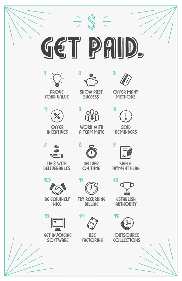
Print out a poster version of these tips.


1. Prove your value in economic terms.


Will your work boost brand recognition? What does that do for sales and revenue? How does that impact market share (broadly)? Arm yourself with research that proves the business value of design, and make sure that you communicate it to your client succinctly. Your business proposal is an ideal place to include these facts.


2. Show that you’ve been paid before.


Social proof can decrease the amount of risk that clients feel when they are about to pay for your services. Hey, if others have bet on your talent in the past, why would they miss out on it? In showing that your clients consistently pay for work, and do so on time, you will give a clear picture of what your expectations look like. I saw clients delay my agency’s payment while being completely on time with other types of suppliers, and had always wondered what they were doing right (or what we were doing wrong). Here’s what that was: other suppliers established that on-time payment was the minimum standard to carry on any type of relationship with them, and that this rule applied to absolutely everyone.


3. Offer more than one payment method.


Cash is not necessarily king when clients need convenience. Explore online payment tools that allow you to expand your clients’ payment options. Stripe offers credit and debit card payments, while Paypal allows for additional methods like real-time and delayed bank transfers. For in-office payments try Square.


4. Provide several payment schedules.


Don’t wait until they ask or default. Structure a tiered payment policy where those who pay first pay less (Early Payment Discount). Also show how a late payment can make them incur in unwanted penalties. While some designers cringe at the sound of “late fee”, including it up front does insulate you (and your team) from a budget-crushing delay. There’s no reason for a late fee to feel like a threat. It is the very least you can do to pass on the message that your waiting time is worth some real money (versus, you know, hot air). And don’t be fooled: a dollar today is worth much more than a dollar tomorrow. For every minute that your hard-earned cash spends in someone else’s wallet, there are several profitable investments that you could be engaging in instead.


5. Work with a teammate.


Listening to several voices asking for the same thing can increase the sense of shame for nonpayment. Ask someone from your team, or hire a third party, to contact the client on behalf of your company. While risky, hiring out a freelancer to make these types of calls might be a low-cost alternative. To hire a professional collections agency, check out point 15.


6. Send out automated email or SMS reminders.


As much as I struggled with this idea, not all clients are purposely trying to skip your payment. Sometimes memory fails and there are no systems in place for reminding themselves of upcoming dues. In this case, make sure that you do prepare to warn them about dates and fees. While a personalized email or call might seem the best way to go about it, these take valuable time away from the actual work that you are supposed to be doing for the client. After all, he/she hired you because of your design talent, not your ability to collect payment over the phone. Setup automated reminders with software packages like Quickbooks, Zoho Invoice, Xero or Freshbooks.


7. Tie key deliverables to payment.


Though this is a double-sided sword (i.e. you will miss payment whenever you miss a deadline), it’s a good business practice and will generally benefit the creator. Sometimes we ask for an advance upfront and a final payment after we’ve delivered everything the client has required. A smarter way to approach this is to condition key deliverables to paying different (smaller) percentages of the total bill. A key deliverable is something that is highly valuable in the eyes of the client: a finalized site launch, logo concept, or business card design are all good examples. If the client really wants to get a hold of his/her company’s new logo, attach a specific percentage of the total bill to that delivery. 30% upfront, 30% upon logo delivery and 40% at the end of all remaining work is an example of such types of agreements.


8. Deliver on time.


In the end, every design project is a transaction. You exchange currency (i.e. amazing work) for dollars. Make sure that you are holding up your end of that deal, and clients will feel the need to be reciprocal. To reinforce the idea that you are complying to what was signed, use wording like “as promised” or “as we agreed” in emails & other types of communications. These subtle pointers signal commitment, trust and reliability. Now, if we’re being super reliable, how could anyone want to disappoint us? (They don’t want to, but end up doing it anyway. Read on for more tactics).


9. Have them sign up to a payment plan with specific installments.


Some contracts include a specific space for signatures on the project payment plan. The advantage of having clients agree to this specific plan in advance is that they are committing to honoring your fees properly at the time when they need your services the most. With time, their initial urgency fades and can result in the firefighter effect that I discussed before. Hi! Excited to work with me? So am I. Now let’s agree on a payment promise while we’re both happy :)


10. Be genuinely nice.


When I first founded an agency in 2008, we gave out seasonal corporate gifts that reminded clients of how important our relationship was to us. I soon realized that we were not alone. This Corporate Gifting Survey, conducted by the Advertising Specialty Institute, concludes that businesses spend approximately on a single client’s gift. Top goals include showing appreciation, developing relationships and generating goodwill. Think about it: if corporate gifts weren’t effective business tools they wouldn’t be a billion market (in the US only). And reciprocity, my friends, can be a powerful thing.


11. Try recurring billing.


Is your client paying for a product or service on a monthly basis? Perhaps you have set up a continuous design service package, or you sell web design as a service (yes, this is a thing). In this case, you can set up a monthly billing plan with platforms like Paypal or Stripe. Your client’s card will automatically be charged each month, removing the stress associated with collecting your fees.


12. Establish authority in your communications pieces.


Think about how you can position yourself (or your team) as an expert in brand stationery, websites, proposals, contracts and other pieces. Do you belong to a professional organization? Has your business been certified by a partner? Has the agency won any awards? These are things that your client needs to know. In an environment of respect and admiration, it becomes harder to elude responsibilities.


13. Find and use robust timesheet/invoicing software.


Oh, let’s face it. Sometimes we’re not getting paid because we forgot to send that invoice. Whatever comes next is on us. To avoid delays that arise from our end of things, make sure to try an agile invoicing platform. If your fees are based on an hourly rate, there are amazing tools that will also help you keep track of the amount of work invested and calculate your bill automatically. For painless time tracking and invoicing, try Harvest, Ballpark, Ding, Toggl, Timely or Everhour.


14. Use factoring.


Factoring is a simple procedure where your outstanding invoices become cash in exchange for a specific fee. There are many banks and financial companies that will literally buy your accounts receivable (everything your clients still owe you) and turn it into cash. Their commission can go anywhere from 15 to 30% of your invoices, but conditions may vary depending on your annual revenue and other factors. For freelancer-friendly invoice advance options, try Fundbox and Bluevine.


15. Everything else failed? Outsource collections.


OK, we’ve reached that point. This negligent jerk simply won’t pay and nobody’s got time for that anymore. Outsource the struggle. For effective debt recovery services, try TrueAccord or InvoiceCare.


Is there anything worse than begging for something that’s yours? As creators, we invest our very best to solve our client’s problems, and should expect a minimum level of appreciation from them. This appreciation comes in various forms, but only one can literally feed us: payment. At the very least, we should expect them to hold up to their end of the deal and pay the right fees on the right dates. Try these tactics and let us know if they work out for you. (Oh, and feel free to print out a poster version of these tips!)


GuidetoGettingPaid_Poster


Know any other secrets to get paid on time? By all means share!


Products Seen In This Post:


getpaidtowrite-banner
Charge Your Worth: The Complete Guide to Getting Paid

Wednesday, April 22, 2015

Using and Styling HTML5 Meter [Guide]

If you’re familiar with the HTML progress bar, which shows how much of an activity has been performed, you will find that the meter element is similar to that – both show a current value out of a maximum value. But unlike the progress bar, the meter bar is not to be used to show progress.


It is used to show a static value in a specific range, for example you can indicate the storage space used in a disk storage by showing how much of the storage space is filled and how much is not.


On top of that, the meter element can also be used to visualize up to three regions within its range. Reusing the storage space example, instead of only showing how much space is occupied, you can also visually indicate whether the occupied space is only sparsely filled (lets say below 30%) or near half full (between 30 to 60%) or more than half full (above 60%) using different colors. This helps the users know when they are reaching the storage limit.


In this post, we’ll show you how to style the meter bar for both purposes mentioned i.e. a simple gauge (with no indicated regions) and two examples of gauges with 3 color-indicated regions. For the latter, we will work on creating a "marks" gauge for showing poor, average and good marks, and a "pH" gauge for showing acidic, neural and alkaline pH values.


Attributes


Before we start with the examples and go in-depth, let us take a quick look into its list of attributes below, more about these attributes like their defaults, etc. will be covered in the examples.


  • value – The value of the meter element

  • min – The minimum value of the range of the meter

  • max – The maximum value of the range of the meter

  • low – Indicates the low boundary value

  • high – Indicates the high boundary value

  • optimum – The optimum point in the range

1. Styling A Simple Gauge


Here’s a very simple example using only one attribute, the value. Before we proceed, we need to know three things first:


(1) There is a default min and max value defining the range of meter, which is 0 and 1 respectively.
(2) If the user-specified value does not fall within the meter range, it will take the value of either min or max, whichever it is closest to.
(3) The Ending tag is mandatory.


Here is the syntax:


<meter value="0.5">0.5</meter>

Alternatively, we can also add min and max attributes thus providing a user defined range like so:


<meter min="10" max="100" value="30"></meter>

2. Styling The "Marks" Gauge


First, we need to divide the range into three regions (left/low, middle, right/high). This is were low and high attributes come into play. This is how the three regions are divided.


The three regions are formed between min & low , low & high and high & max.


Now it is obvious that there are certain conditions low and high values should follow for the three regions to be formed:


  • low cannot be less than min and greater than high & max

  • high cannot be greater than max and less than low & min.

  • And when a criteria is broken both low and high will take on the value of the other variable in the criteria which is not satisfied, i.e. if low value is found lower than min which it shouldn’t be, low will get the min value.

In this example, we will consider our three regions from left to right to be:


  • Poor: (0-33)

  • Average: (34-60)

  • Good: (61-100)

Hence, the following are values for the attributes; min="0" low="34" high="60" max="100".


Here is an image visualizing the regions.


Even though there are three regions in the meter we created just now, it will indicate only two "kinds" of regions in only two colors at the moment. Why? Because optimum is in the mid-region.


Optimum Point


In whichever region (of the three) the optimum point falls in, it is considered as an "optimal region" colored green by default. The region(s) immediately next to it is called the "sub-optimal region" and it is colored orange. The one farthest away is a "not-much-of-an-optimal region", colored red.


So far in our example we have not assigned a value for optimum. Hence, the default value becomes 50, making the mid-region the "optimal region" and the ones right next to it (both on the left and right) as "sub-optimal regions".


In short in the above case, any value to the meter element that falls into the mid-region is indicated by green; the rest orange.


That’s not what we want. We want it colored this way: Poor (red), Average (orange), Good (green)


Since the right-region is to be considered our optimal region, we will give optimum a value that will fall into the right-region (any value between 61-100, including 61 & 100).


We’re taking 90 for this example. This will make the right-region "optimal", the middle (its immediate next region) "sub-optimal" and the far left the "not-much-of-an-optimal" region.


This is what we will get on our gauge.


2. Styling The "pH" Gauge


First, a breather on pH values. An acidic solution has a pH of less than 7, an alkaline solution has a pH of greater than 7 and if you land on 7, that’s a neutral solution.


Thus, we will use the following values and attributes:


low="7" , high="7", max="14", and the min will take the default value of zero.


Before we add the rest of the attributes to complete the code, let us decide on colors: Acidic (red), Neutral (white) and Alkaline (blue). Let us also consider the acidic region (left-region below 7) as "optimal"


Here are the CSS pseudo elements we will target to get the desired visual in firefox. (For the webkit meter pseudo elements and more, refer to the links listed under "reference".)


.ph_meter
background: lightgrey;
width: 300px;

.ph_meter:-moz-meter-optimum::-moz-meter-bar
background:indianred;

.ph_meter:-moz-meter-sub-optimum::-moz-meter-bar
background: antiquewhite;

.ph_meter:-moz-meter-sub-sub-optimum::-moz-meter-bar
background: steelblue;


Here is the complete html code and the final result of the pH gauge.


<meter class="ph_meter" low="7" high="7" optimum="2" max="14" value="6"></meter>
<meter class="ph_meter" low="7" high="7" optimum="2" max="14" value="7"></meter>
<meter class="ph_meter" low="7" high="7" optimum="2" max="14" value="8"></meter>

References


More on Hongkiat: Creating & Styling Progress Bar With HTML5


Editor’s note: This is written for Hongkiat.com by Preethi R. Preethi is a .NET Web developer with a Java past and a bias for Firefox, Windows & DC Comic movies.


Using and Styling HTML5 Meter [Guide]

Using and Styling HTML5 Meter [Guide]

If you’re familiar with the HTML progress bar, which shows how much of an activity has been performed, you will find that the meter element is similar to that – both show a current value out of a maximum value. But unlike the progress bar, the meter bar is not to be used to show progress.


It is used to show a static value in a specific range, for example you can indicate the storage space used in a disk storage by showing how much of the storage space is filled and how much is not.


On top of that, the meter element can also be used to visualize up to three regions within its range. Reusing the storage space example, instead of only showing how much space is occupied, you can also visually indicate whether the occupied space is only sparsely filled (lets say below 30%) or near half full (between 30 to 60%) or more than half full (above 60%) using different colors. This helps the users know when they are reaching the storage limit.


In this post, we’ll show you how to style the meter bar for both purposes mentioned i.e. a simple gauge (with no indicated regions) and two examples of gauges with 3 color-indicated regions. For the latter, we will work on creating a "marks" gauge for showing poor, average and good marks, and a "pH" gauge for showing acidic, neural and alkaline pH values.


Attributes


Before we start with the examples and go in-depth, let us take a quick look into its list of attributes below, more about these attributes like their defaults, etc. will be covered in the examples.


  • value – The value of the meter element

  • min – The minimum value of the range of the meter

  • max – The maximum value of the range of the meter

  • low – Indicates the low boundary value

  • high – Indicates the high boundary value

  • optimum – The optimum point in the range

1. Styling A Simple Gauge


Here’s a very simple example using only one attribute, the value. Before we proceed, we need to know three things first:


(1) There is a default min and max value defining the range of meter, which is 0 and 1 respectively.
(2) If the user-specified value does not fall within the meter range, it will take the value of either min or max, whichever it is closest to.
(3) The Ending tag is mandatory.


Here is the syntax:


 <meter value="0.5">0.5</meter> 

Alternatively, we can also add min and max attributes thus providing a user defined range like so:


 <meter min="10" max="100" value="30"></meter> 

2. Styling The "Marks" Gauge


First, we need to divide the range into three regions (left/low, middle, right/high). This is were low and high attributes come into play. This is how the three regions are divided.


The three regions are formed between min & low , low & high and high & max.


Now it is obvious that there are certain conditions low and high values should follow for the three regions to be formed:


  • low cannot be less than min and greater than high & max

  • high cannot be greater than max and less than low & min.

  • And when a criteria is broken both low and high will take on the value of the other variable in the criteria which is not satisfied, i.e. if low value is found lower than min which it shouldn’t be, low will get the min value.

In this example, we will consider our three regions from left to right to be:


  • Poor: (0-33)

  • Average: (34-60)

  • Good: (61-100)

Hence, the following are values for the attributes; min="0" low="34" high="60" max="100".


Here is an image visualizing the regions.


Even though there are three regions in the meter we created just now, it will indicate only two "kinds" of regions in only two colors at the moment. Why? Because optimum is in the mid-region.


Optimum Point


In whichever region (of the three) the optimum point falls in, it is considered as an "optimal region" colored green by default. The region(s) immediately next to it is called the "sub-optimal region" and it is colored orange. The one farthest away is a "not-much-of-an-optimal region", colored red.


So far in our example we have not assigned a value for optimum. Hence, the default value becomes 50, making the mid-region the "optimal region" and the ones right next to it (both on the left and right) as "sub-optimal regions".


In short in the above case, any value to the meter element that falls into the mid-region is indicated by green; the rest orange.


That’s not what we want. We want it colored this way: Poor (red), Average (orange), Good (green)


Since the right-region is to be considered our optimal region, we will give optimum a value that will fall into the right-region (any value between 61-100, including 61 & 100).


We’re taking 90 for this example. This will make the right-region "optimal", the middle (its immediate next region) "sub-optimal" and the far left the "not-much-of-an-optimal" region.


This is what we will get on our gauge.


2. Styling The "pH" Gauge


First, a breather on pH values. An acidic solution has a pH of less than 7, an alkaline solution has a pH of greater than 7 and if you land on 7, that’s a neutral solution.


Thus, we will use the following values and attributes:


low="7" , high="7", max="14", and the min will take the default value of zero.


Before we add the rest of the attributes to complete the code, let us decide on colors: Acidic (red), Neutral (white) and Alkaline (blue). Let us also consider the acidic region (left-region below 7) as "optimal"


Here are the CSS pseudo elements we will target to get the desired visual in firefox. (For the webkit meter pseudo elements and more, refer to the links listed under "reference".)


 .ph_meter background: lightgrey; width: 300px; .ph_meter:-moz-meter-optimum::-moz-meter-bar background:indianred; .ph_meter:-moz-meter-sub-optimum::-moz-meter-bar background: antiquewhite; .ph_meter:-moz-meter-sub-sub-optimum::-moz-meter-bar background: steelblue; 

Here is the complete html code and the final result of the pH gauge.


 <meter class="ph_meter" low="7" high="7" optimum="2" max="14" value="6"></meter> <meter class="ph_meter" low="7" high="7" optimum="2" max="14" value="7"></meter> <meter class="ph_meter" low="7" high="7" optimum="2" max="14" value="8"></meter> 

References


More on Hongkiat: Creating & Styling Progress Bar With HTML5


Editor’s note: This is written for Hongkiat.com by Preethi R. Preethi is a .NET Web developer with a Java past and a bias for Firefox, Windows & DC Comic movies.


Using and Styling HTML5 Meter [Guide]