Showing posts with label Branding. Show all posts

Thursday, June 11, 2015

Our Free Ebook is Here: The Beginner"s Guide to Branding

Why do some brands take a piece of our heart? What is it about their design that makes us feel connected, amused… delighted? Most importantly, how can we create such a brand? We asked the same questions, and gathered dozens of useful tips from top designers to collect their very best advice in this free ebook.


Download it now →


What you’ll find inside


We’ve prepared six chapters complete with inspiring examples and handy templates. By the time you’re done reading The Beginner’s Guide to Branding, you’ll know exactly:


1. What is branding


You probably hear the term branding being tossed around a lot. But, what exactly does it mean? This chapter includes insider advice for developing strong branding elements.


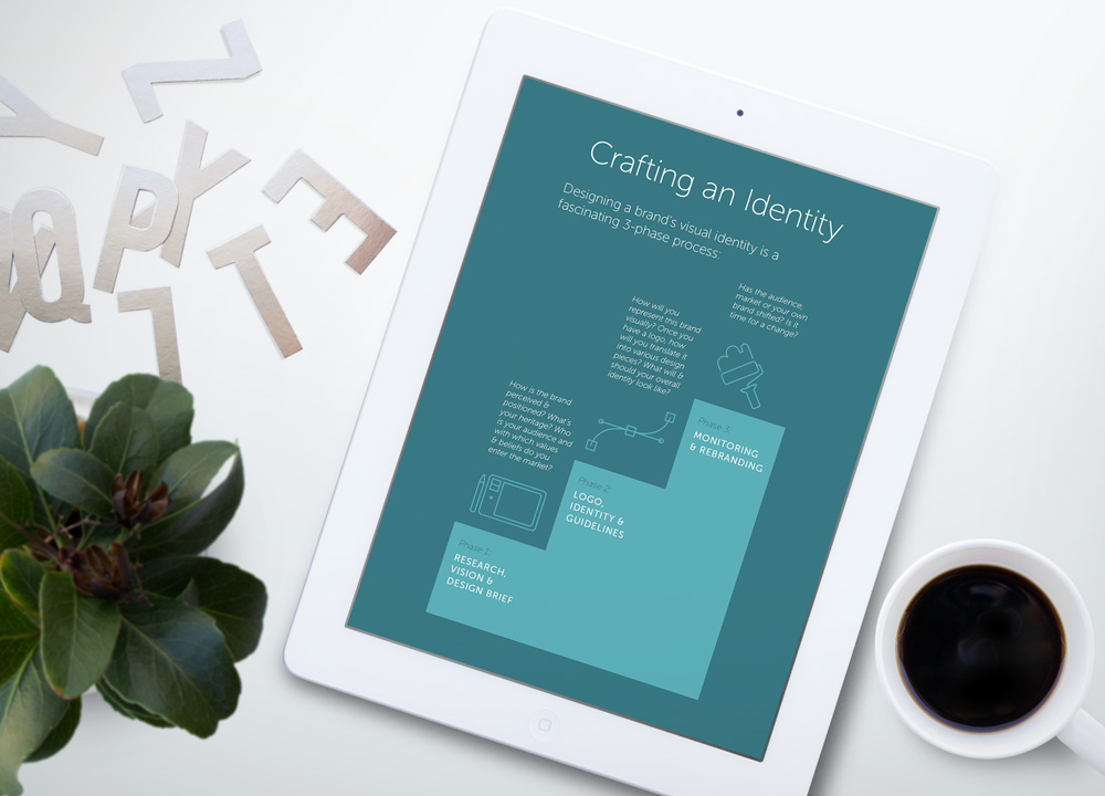
identitychapter


2. How to figure out an effective name


Struggling to come up with a name for your new product or service? Learn how to brainstorm potential name ideas and choose well with these actionable tips.


3. How to design a strong visual brand identity


One of the most interesting projects that a graphic designer can take on is designing a logo. This chapter helps you understand the difference (and relationship) between a brand, an identity and a logo.


4. How to choose ideal color palettes & typography


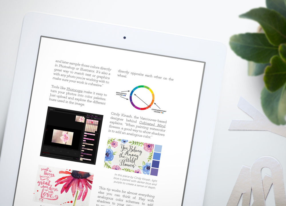
Select brand-appropriate color schemes and fonts that help convey your message. Certain hues carry powerful associations that send certain signals to your users. Learn essential color tricks from top designers.


colorchapter


5. How to create memorable brand applications


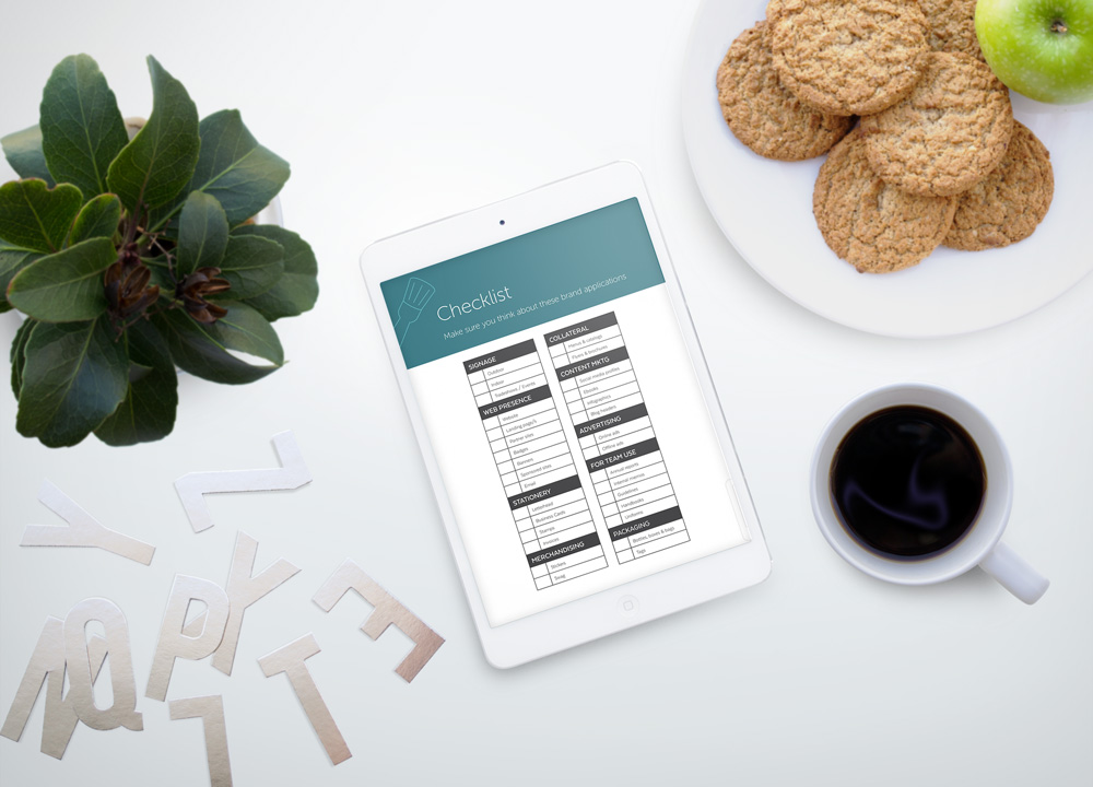
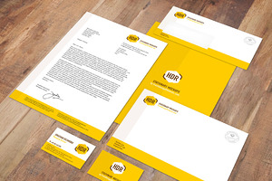
Leave a lasting impression with impactful letterhead, brochures, business cards and other applications. This chapter features dozens of tips to cut down design time and share your story with compelling marketing materials.


6. How to bring in your brand’s voice in design pieces


Ready to go live? Differentiate your brand from competitors with a unique personality. Learn how to incorporate a genuine voice and turn your online presence around in no time.


applicationschapter


But wait… there’s more! (9 free resources)


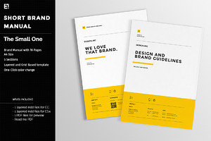
We are also thrilled to share 9 free resources that will help you get started with your brand’s style guide in no time. We’ve included mockup kits, stationery sets, brand manual templates and other exciting assets to speed up your brand development process. All you need to do is share this free ebook with your friends, family & colleagues using the link over at creativemarket.com/ebooks/branding.


We hope you enjoy this free ebook and let us know your thoughts below. Ever tried creating your own brand identity? Found something in this guide that you didn’t know before? Comment away!


Products Seen In This Post:


getpaidtowrite-banner
Our Free Ebook is Here: The Beginner"s Guide to Branding

Wednesday, May 20, 2015

The 5 Steps to Visual Branding

There are tons of different ways to define a brand. Enterpreneur’s John Williams calls it “your promise to your customer.” Copywriting legend David Ogilvy described it as “the intangible sum of a product’s attributes.” re:Design’s Paul Biedermann gets a little more philosophical, defining it as “the essence of one’s unique story.”


In my opinion, it’s everything. Your whole company is your brand, from the lowest-ranking employees’ uniforms to how the CEO communicates. But one of the most important aspects is visual branding: the overall appearance of your company.


We’ve written about how to design a brand identity before, but today, we’re going to break the process down to the basics, analyzing each major component and how they fit into the whole.


Let’s start with…


1. Colors


Your color palette should be the first thing you pick out. Colors are the best starting point towards conveying the mood you want. And make sure you keep the common meanings of each color in your mind so that you can tap into them: bold, bright colors symbolize energy and dynamism. More subdued pastels calm the viewer. Warm colors and earth tones radiate down-to-earth comfort. Cool colors calm the viewer and subliminally inspire trust. Pinks and purples can symbolize sensuality and opulence.


Once you have an idea what general colors you want to use, you need to figure out what shades of them will best complement each other. There are tons of online generators, like Adobe Color CC, Palleton, and Color Hunter, that you can use, or you can pick out a pre-made library from a searchable database via a site like COLOURlovers.


As a final tip, once you’ve selected your colors, arrange them with the ones you expect to use the most first. These will serve as your base colors, and the rest will go to complement them.
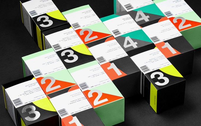

tumblr_nn7mpn69uu1qji3xao9_1280
This brand proposal for nutrition supplement company Nativetech makes brilliant use of bold colors arranged in simple, geometric shapes.


2. Iconography


In the words of Peter Gould, the logo is not the brand, it is the gateway to the brand. It should hopefully offer a preview of the kind of experience the customer will get from using your products. Generally, you also want to keep your iconography as clean and simple as possible, with a distinctive and bold design that can be easily identified from far away. In an increasingly media-saturated world, design is trending toward the simple, the easy-to-read, and the straight-to-the-point.
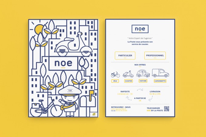

tumblr_nmjsulVM0a1tdhc2to3_1280


For a stunning example of hard-hitting and focused design achieved through simplicity, check out this concept ad campaign for the French Postal Service.


However, don’t take these as universal commands. Plenty of businesses, especially ones that pride themselves on luxury and craftsmanship, are still able to draw customers into their detail-oriented worlds with lush and ornate design.
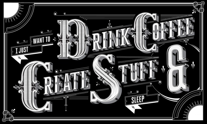

tumblr_ncoq7rkfff1qkxrtro3_1280
Designer Ben Johnston is making quite a name for himself with his stunningly detailed and intricate illustrations and ad campaigns.


3. Typography


Like iconography, typography should also symbolize your company’s overall “feel.” Look at Caterpillar, with their solid, no-nonsense logo.


2000px-Caterpillar_logo.svg


Then, contrast that with Hallmark’s script font that suggests handcrafting, sensitivity, and sentimentality.


2000px-Hallmark_logo.svg


Once you’ve picked out your header text, you’ll need to choose tasteful body fonts that complement it while continuing to contribute to your brand image, as well. A thorough guide to that can be found here. The short version, though, is that while you want your header text to be big, bold, and jump out at you, body text is meant to stay subdued and in the background.


4. Product and Environment Design


Web design is primarily made of shapes, colors, and type, so that is essentially covered by the last three entries. Where design enters the real world, however, is a whole different animal, requiring the consideration of layouts, textures, and three-dimensional shapes as well.


If your business sells the kind of products that need to be designed, it goes without saying that this is a crucial component to your brand, and you should go out of your way to make sure that the aesthetics of the product are in line with both the experience that you want to suggest the customer will get by using them and the overall feel of your brand.
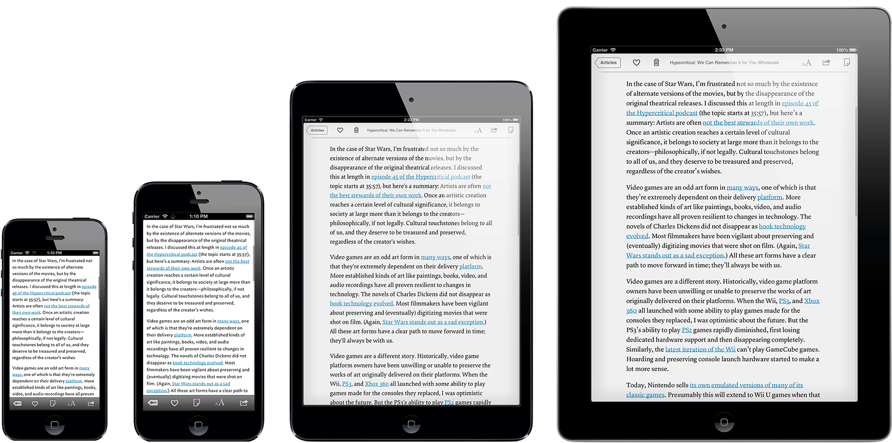

iphoneplus-all-models-extrawide
Apple’s products are clearly all designed with sleek simplicity in mind. From The Week


The same goes for your brick-and-mortar store, if you’re the kind of business that requires one. Where possible, everything from the furniture to the lighting to the way the customers move through the store should go to enhance their brand experience and get them into the “mood of the company.”


Angelo-Coppola-Diffusion-flagship-store-Arketipo-Design-10


This concept shoe store turns a mundane shopping experience into a futuristic escape from reality.


That leads us to our final entry, the element that doesn’t quite fit with the others, but makes them all fit together…


5. Cohesiveness


As we mentioned in the brand identity article, the first step towards creating an identity is to come up with a brief that sums up what you’re trying to achieve in your design scheme. That’s because, in order to be effective, all your design elements have to work together to tell the same message, and should look like they all part of the same whole.


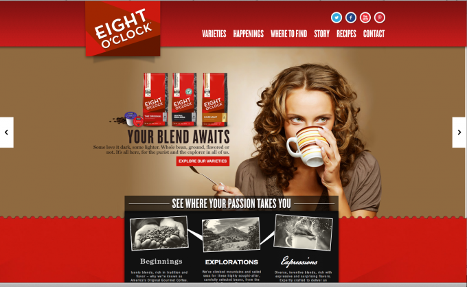
One of my favorite examples of harmony in design is in Eight O’Clock Coffee, whose website, packaging, and advertising are bold, modern, and lively. Just like the product.

Screen Shot 2013-08-19 at 7.58.01 PM
From Double Take Studios


Finally, feel free to break any of these rules in the name of interesting design, but you should at least know them beforehand so you can break them with a purpose.


Any further advice you want to add? Leave us a comment.


The 5 Steps to Visual Branding
Saturday, April 11, 2015

Calligraphy Meets Branding: 10 Beautiful Examples

Calligraphy is a beautiful discipline that everyone loves but few have mastered. The craftsmanship and personal style that it takes to write every word, can’t be reproduced on rigid, geometrically perfect typefaces. On the other hand, branding is usually associated with clean and minimalistic ideal shapes and solid colors, which are very far away from the calligraphic style.


But when you are brave enough to combine calligraphic elements to create a solid branding, good things can happen. To inspire here are a few examples of beautiful calligraphy work on branding and stationery:


7
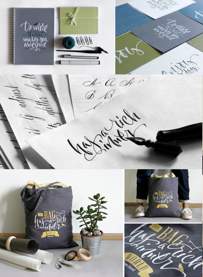
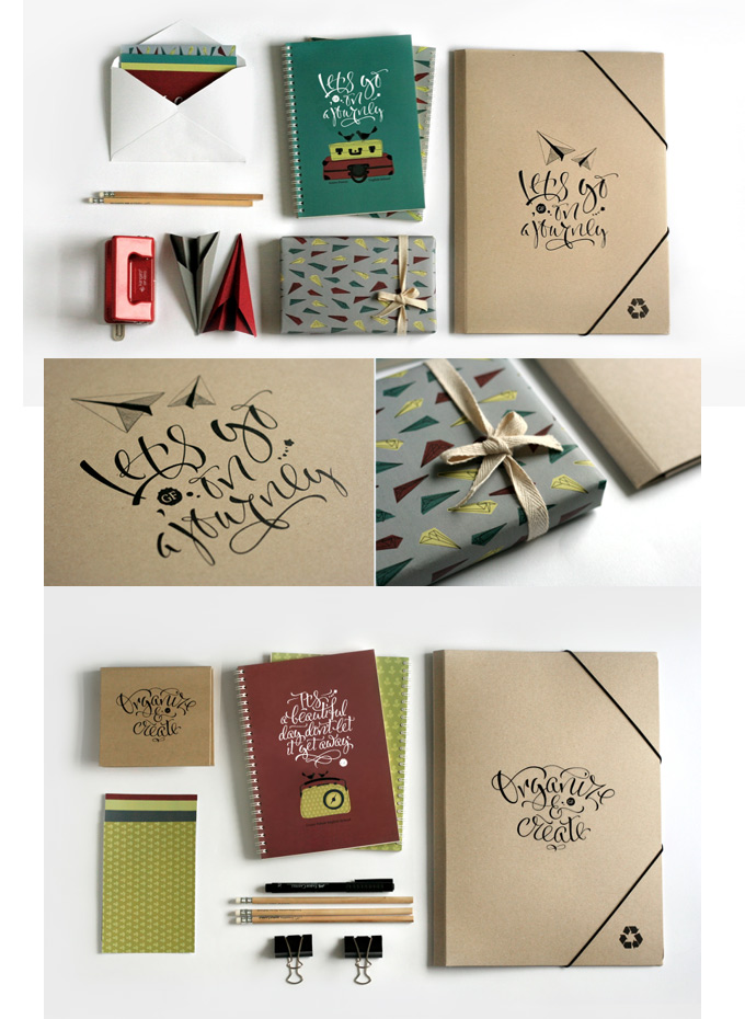
Tote Bags by Dasha Levchuk


8
Stationery by Dasha Levchuk


5
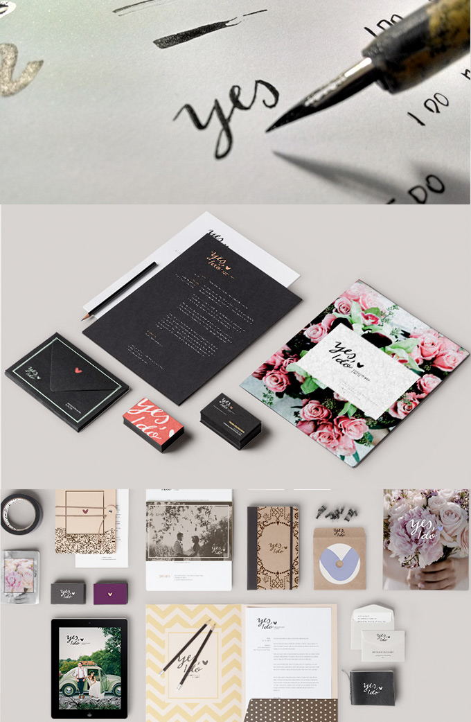
Yes I Do Branding by Nayane Nathalie & Cristiane Amaral


9
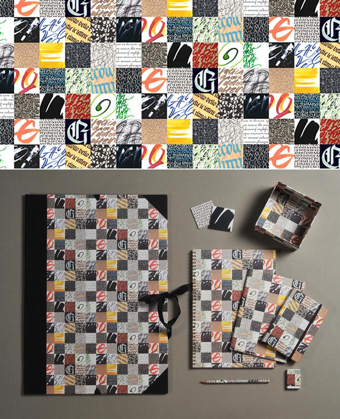
Memorie Calligrafiche by Anna Schettin


1
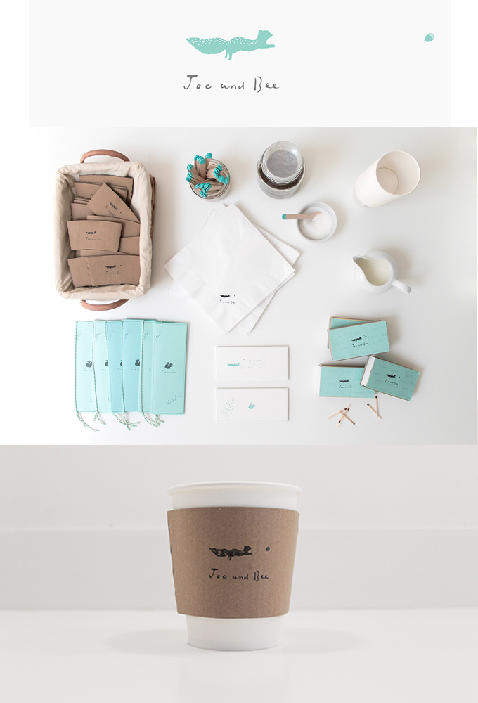
Joe and Bee’s Wedding Invitation by Belinda Love Lee


2
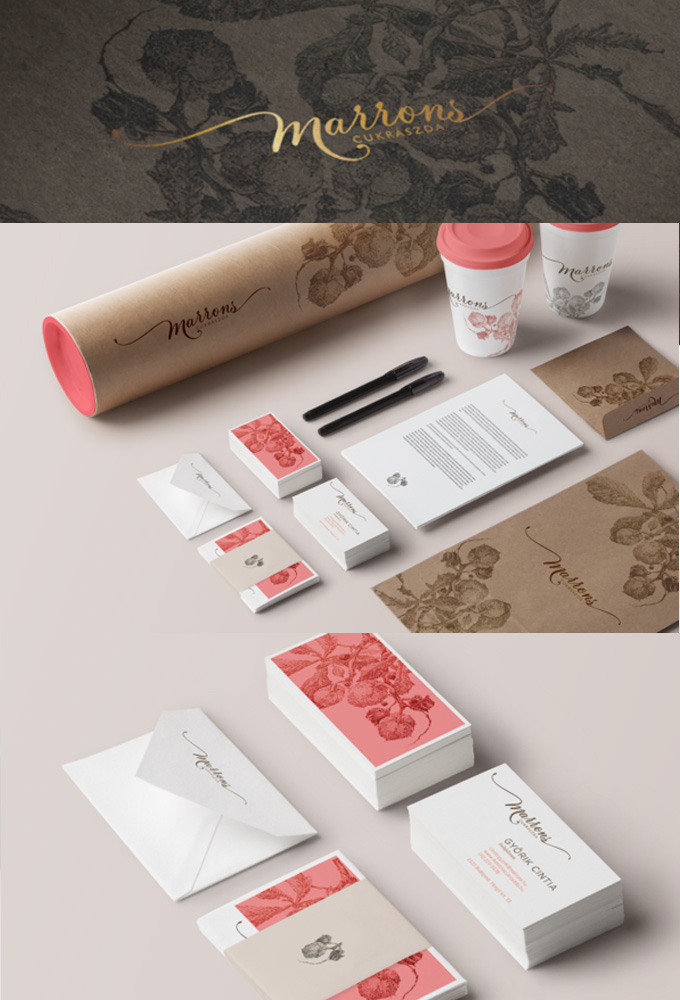
Marrons by Gilányi Nóra


3
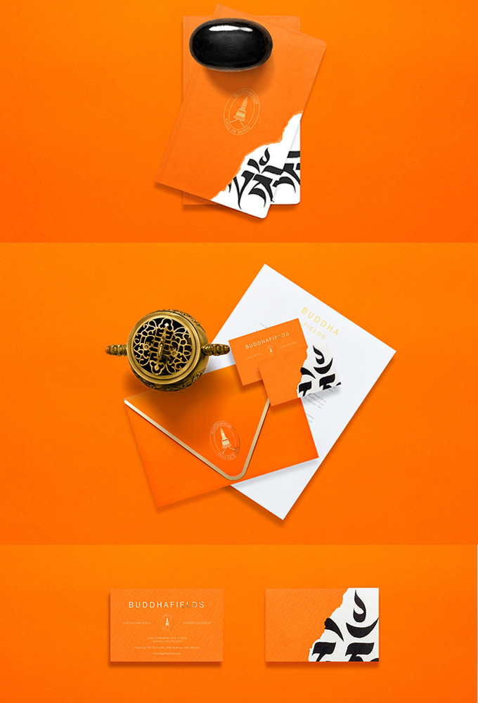
Buddhafields by Anagrama


4
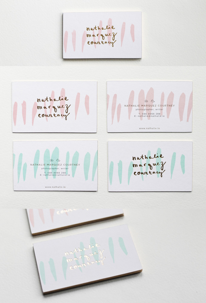
Nathalie Marquez Courtney Branding by Belinda Love Lee

6
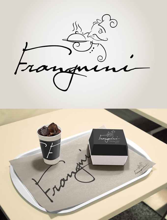
Franguini by Gonçalo Soares


11
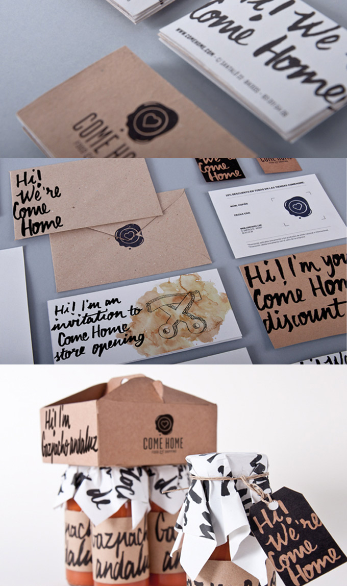
Come Home by Javier Jabalera


12
Kawakami Woodware by Lisa Taniguchi


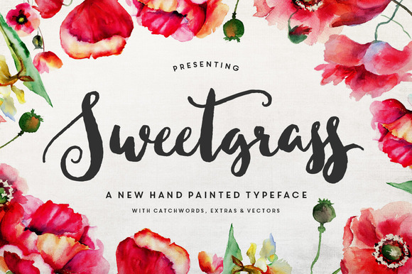
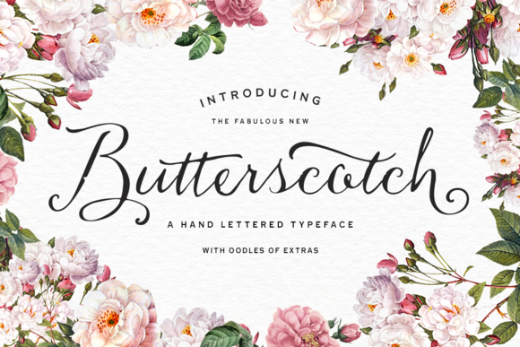
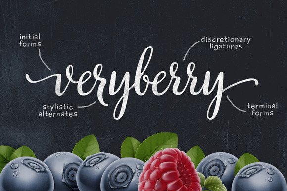
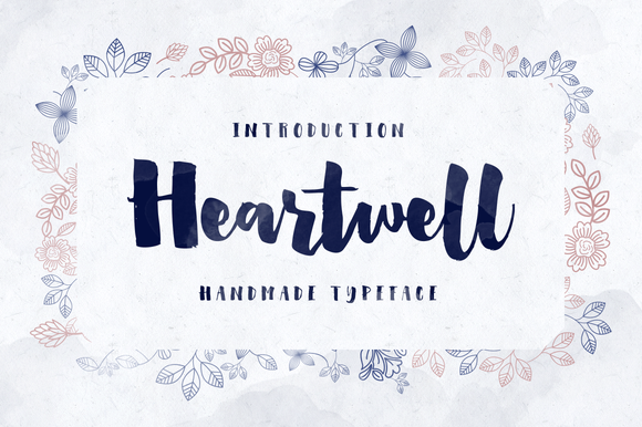
And the last tip: There is good news for those who are fans of calligraphy but really sucks on writing it. There are plenty of handwritten fonts that imitates a lot of calligraphic styles: brush pen, copperplate, simple handwriting, etc. And right now seems to be a big trend on releasing this kind of fonts. You can check the plethora of choices here on Creative Market.


Calligraphy Branding Tips
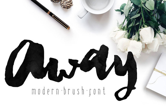

Calligraphy adds a human touch to the design. The freehand strokes can evoke human empathy or even luxury craftsmanship to a product, take this in mind and use it with caution. Products that are artisan, handmade, or even organic are some good possible targets for this technique.


With Calligraphy, it’s easy to create contrast. You can take advantage of the imperfect and non-geometrical strokes and combine them with solid colors and really big margins or a few pixel-perfect forms.


Great Calligraphy and Hand-Drawn Fonts


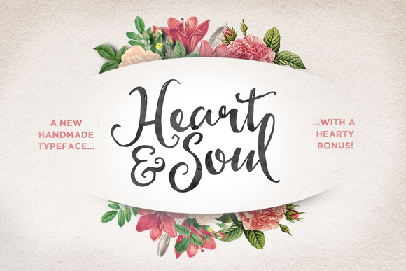
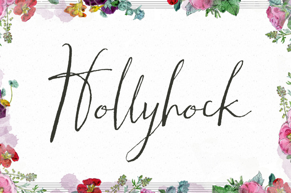
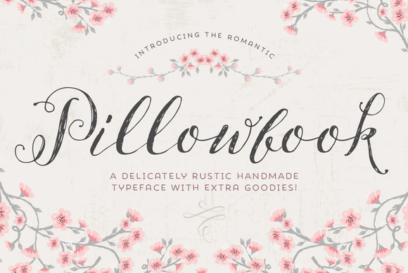
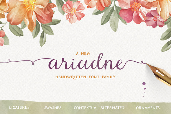
Not a master calligrapher? No worries. We’ve got you covered with these awesome fonts:


Share on Pinterest
Share on Pinterest
Share on Pinterest
Share on Pinterest
Share on Pinterest
Share on Pinterest
Share on Pinterest
Share on Pinterest
Share on Pinterest
Share on Pinterest


Byron Galán is a graphic designer from San Salvador who founded Betype a Tumblr blog with more than 200k lovers of typography. He’s also the owner of other graphic design related blogs: Graphic Design Blog , Good Typography and You & Saturation. That’s a lot blogs for a single person but with a lot of passion is posible.
Calligraphy Meets Branding: 10 Beautiful Examples