During this installment in our series of articles about Adobe’s “Capture” apps, we’ll learn how to extract color schemes from real life moments using the native camera on an iOS device and Adobe Color CC. While the app is available for both iPhone and iPad, we’ll be using the iPad to reference examples in this tutorial.
In the first article, we learned how to capture vectors with Adobe Shape CC, and in the second, we used a similar workflow to capture Photoshop brushes with Adobe Brush CC. Both times we learned how to store these resources in Creative Cloud and use them in desktop apps such as Photoshop, Illustrator and InDesign. Adobe Color CC is a little different. While the iOS app was released as a companion to Shape and Brush in late-2014, it was in fact formerly known as Adobe Kuler (before CC), but only as a web-app for manually creating and storing color schemes.
Making Your First Capture
When you open the application for the first time, you’ll be on-boarded immediately and encouraged to make a capture. Adobe Color uses smart intuition to insert five “capture spots” on the screen where it thinks the most desired colors are – this is live and the spots can shift around if your balance is jittery, but luckily you can tap the screen to “freeze frame” and manually fine-tune the capture spots yourself.
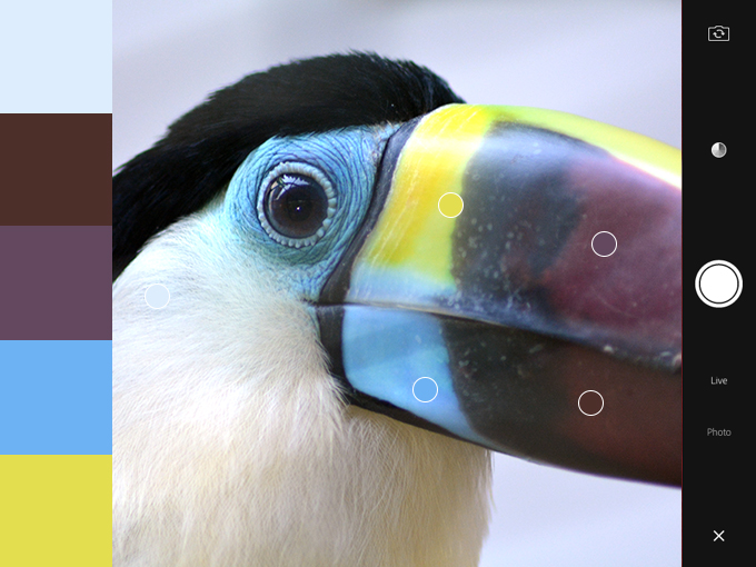
For the best results, I’d recommend making sure that you’re either outdoors or in a room that’s well-lit with natural light; this will ensure that the captured colors are accurate, however it’s normal to want to intensify the colors, add a complimentary color to the scheme, or simply or output results that weren’t in the original capture. If you’re happy with your capture, tap the big, round camera/capture icon to continue.
Exercising More Control
If you’re incredibly choosy (like most of us designers are!), you’ll want to tap the “color wheel” icon next. This will offer more technical control, such as the ability to alter colors by their HEX or RGB values. In the bottom-right corner of the screen, the “color scheme type” icon will let you choose to convert your color scheme to something more Analogous, Monochromatic, Triad, Complementary or Compound , this is the best way to try out and ultimately achieve effective color schemes based on a “rough” capture.
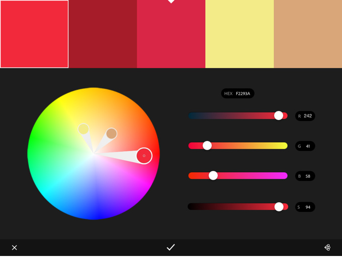
In short, Adobe Color is a useful application because it lets you exercise as much control as you like. It’s not uncommon to capture the desired color scheme in a single try, but more complex options are instantly available if you need them.
Press the “check” icon when you’re ready to save it.
I’ve Made a Color Scheme, Now What?
We’re almost done. At this stage you’ll be asked to name your theme, add comma-separated tags, optionally share it on social media channels…and all that jazz. Tap “Done” on the keyboard when you’re ready. For the first time, you’ll be shown “My Library” and your first color scheme will be clearly visible.
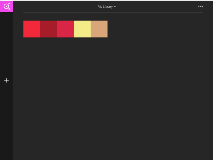
You can select the color scheme to either delete or make changes to it, or otherwise tap the “+” icon to create a new scheme, but for now we’ll explore the ways in which Adobe Color CC integrates with the Creative Cloud. At the top (middle) of the screen you’ll be able to tap “My Library” and create a new one, or if you’ve used the web-app version of Adobe Color before, you can explore the themes from that in a separate library. The three-dot “more” icon in the top-right corner of the screen lets you rename, delete, or setup a collaboration for the library currently selected; this is useful if you work in teams.
Finding Creative Cloud Libraries in Desktop Apps
You can now use these color schemes in Photoshop, Illustrator and InDesign by navigating to Window → Extensions → Adobe Color Themes in any of those desktop applications. Adobe’s lesser-known code editor, Brackets, also has native Adobe Color CC functionality, so your color schemes can be easily imported into web designs too. When the time comes to choose a color, Adobe Color CC will be available as an option.
Conclusion
Adobe has come so far in the last 12 months in terms of mobile, continuity and cloud-based software, and this means big things not only for designers, but for Creative Market shop owners too. It’s now even easier to capture real life elements such as brushes, vectors and colors all within an Adobe workflow.
Employing the use of digital SLR cameras and scanners to import hand-crafted material is no longer needed, and I for one am deeply excited to see Creative Market resources being created with these new mobile apps. I have a couple in the works myself!
Products Seen In This Post:
Share on Pinterest
Share on Pinterest
Share on Pinterest

Use Your iPad To Generate Gorgeous Color Schemes