A Codrops tutorial about creating a little slideshow with a color palette creation effect using CSS Filters and Vibrant.js.
The post Color extraction effect with Vibrant.js appeared first on Freebiesbug.

Color extraction effect with Vibrant.js
A Codrops tutorial about creating a little slideshow with a color palette creation effect using CSS Filters and Vibrant.js.
The post Color extraction effect with Vibrant.js appeared first on Freebiesbug.
A special pack containing 312 free SVG icons by Icons8, a very large archive of pixel-perfect icons.
The post 300+ flat color icons SVG appeared first on Freebiesbug.
During this installment in our series of articles about Adobe’s “Capture” apps, we’ll learn how to extract color schemes from real life moments using the native camera on an iOS device and Adobe Color CC. While the app is available for both iPhone and iPad, we’ll be using the iPad to reference examples in this tutorial.
In the first article, we learned how to capture vectors with Adobe Shape CC, and in the second, we used a similar workflow to capture Photoshop brushes with Adobe Brush CC. Both times we learned how to store these resources in Creative Cloud and use them in desktop apps such as Photoshop, Illustrator and InDesign. Adobe Color CC is a little different. While the iOS app was released as a companion to Shape and Brush in late-2014, it was in fact formerly known as Adobe Kuler (before CC), but only as a web-app for manually creating and storing color schemes.
When you open the application for the first time, you’ll be on-boarded immediately and encouraged to make a capture. Adobe Color uses smart intuition to insert five “capture spots” on the screen where it thinks the most desired colors are – this is live and the spots can shift around if your balance is jittery, but luckily you can tap the screen to “freeze frame” and manually fine-tune the capture spots yourself.
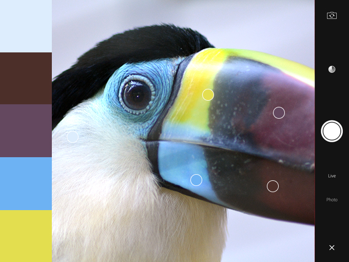
For the best results, I’d recommend making sure that you’re either outdoors or in a room that’s well-lit with natural light; this will ensure that the captured colors are accurate, however it’s normal to want to intensify the colors, add a complimentary color to the scheme, or simply or output results that weren’t in the original capture. If you’re happy with your capture, tap the big, round camera/capture icon to continue.
If you’re incredibly choosy (like most of us designers are!), you’ll want to tap the “color wheel” icon next. This will offer more technical control, such as the ability to alter colors by their HEX or RGB values. In the bottom-right corner of the screen, the “color scheme type” icon will let you choose to convert your color scheme to something more Analogous, Monochromatic, Triad, Complementary or Compound , this is the best way to try out and ultimately achieve effective color schemes based on a “rough” capture.
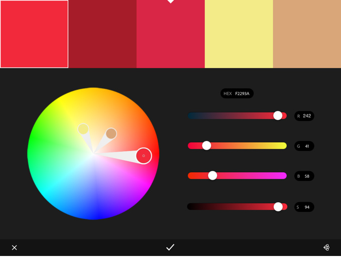
In short, Adobe Color is a useful application because it lets you exercise as much control as you like. It’s not uncommon to capture the desired color scheme in a single try, but more complex options are instantly available if you need them.
Press the “check” icon when you’re ready to save it.
We’re almost done. At this stage you’ll be asked to name your theme, add comma-separated tags, optionally share it on social media channels…and all that jazz. Tap “Done” on the keyboard when you’re ready. For the first time, you’ll be shown “My Library” and your first color scheme will be clearly visible.
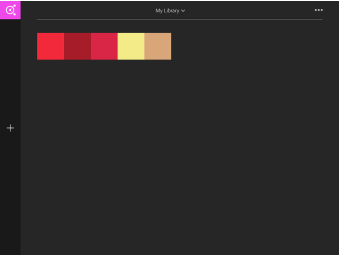
You can select the color scheme to either delete or make changes to it, or otherwise tap the “+” icon to create a new scheme, but for now we’ll explore the ways in which Adobe Color CC integrates with the Creative Cloud. At the top (middle) of the screen you’ll be able to tap “My Library” and create a new one, or if you’ve used the web-app version of Adobe Color before, you can explore the themes from that in a separate library. The three-dot “more” icon in the top-right corner of the screen lets you rename, delete, or setup a collaboration for the library currently selected; this is useful if you work in teams.
You can now use these color schemes in Photoshop, Illustrator and InDesign by navigating to Window → Extensions → Adobe Color Themes in any of those desktop applications. Adobe’s lesser-known code editor, Brackets, also has native Adobe Color CC functionality, so your color schemes can be easily imported into web designs too. When the time comes to choose a color, Adobe Color CC will be available as an option.
Adobe has come so far in the last 12 months in terms of mobile, continuity and cloud-based software, and this means big things not only for designers, but for Creative Market shop owners too. It’s now even easier to capture real life elements such as brushes, vectors and colors all within an Adobe workflow.
Employing the use of digital SLR cameras and scanners to import hand-crafted material is no longer needed, and I for one am deeply excited to see Creative Market resources being created with these new mobile apps. I have a couple in the works myself!
Products Seen In This Post:
Share on Pinterest
Share on Pinterest
Share on Pinterest

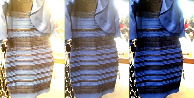
Let’s start with the dress. If you’ve been online in the last 48 hours, we’re sure you don’t need it explained to you. There have been countless theories about why our perception of its coloring is so split: some scientific, some not.
Of particular note was Wired.com’s, which, when stripped to its essence, is fascinating for both its simplicity and the complexity of the brain process it implies. Basically, some people—most likely those who spend more time in the sun—have “daylight-balanced” sight. As such, their brains interpret the dress’s blue hue as an unwanted color cast and “correct” it to white, just like a camera with the same settings would. This happens instantly, subconsciously, and in many cases, entirely against their will.
The meme’s popularity lies in how shocking this revelation is to a lot of us: we assume everyone without vision disorders sees colors the same way we do, and most of us have been given no reason to believe otherwise. But it’s not so. As this article from LiveScience explains, an experiment with monkeys suggests that color perceptions are an adaptive behavior: they form in our brains as a response to the experiences with the outside world.
“Color is a private sensation,” says University of Wisconsin color scientist Joseph Carroll. “I think we can say for certain that people don’t see the same colors.”
This intrigued us, so we called him for more information.
“You can tweak perceptual white balance,” he explains, “[and] there’s some evidence that your environment can calibrate your color perception.” Basically, when the composition of the lights people are regularly exposed to is changed, their entire spectrum of color perception is changed. “The same way you can induce an afterimage by staring at a light for ten seconds,” but over the long term.
After that, a funny thing happens when we look at an image that seems to be lit in a subtly-colored light. “Whatever our brain’s guess is about the illuminant, and it is a guess” he says, “it’s going to then subtract that out from any determination about the color of the object.”
He also explained another, more well-known phenomenon: In many cases, the colors of objects are dictated to us by our surroundings. This is called “color constancy.”
Our brain can’t compensate for small sections of a scene cast in a colored light, but it’s “very good at ignoring uniform changes in illumination.” He explains. “If you had an actually white and gold dress, and you took a small bluish transparency and laid it over one of the dress’s white stripes, this white stripe would look bluish. If you took a giant transparency and covered the entire dress, it would still look white and gold.”

In the left image, the second card from the left looks like a stronger shade of pink than in the right image. In reality, they’re the same.
From Wikimedia Commons
We won’t, however, continue with the dress. Enough people have done that. As photographers and designers, we’re more interested in how color illusions can be created.
There are other optical illusions that you can pull off in photography, and we recommend you try them at home. As alluded to in Carroll’s quote, we will perceive shades as lighter or darker depending on how light or dark the background around them is: objects on light-colored backgrounds look darker, ones on dark-colored backgrounds look lighter. One simple trick you can pull is photographing the same-colored object against light and dark-colored backgrounds, then putting the pictures next to each other. Plenty of people will be surprised to learn that they’re both the same color.
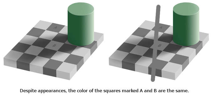
It’s also been proven, by the Cornsweet Illusion among others, that humans perceive color and shade in different ways based on where the lighting is supposed to be coming from. It should be possible to create an effect like this by setting up a situation in which one object should logically be lit and the other cast in shadow, much like this image, and then lighting the bottom one.

The Cornsweet Illusion: The flat part of both squares are the same shade of gray. To test it, cover the border between them with a finger
From IllusionPedia
And as the Checker Shadow Illusion proves, our mind automatically corrects for shade as well as hue – this can also be duplicated in photography.
Finally, why not try photographing identically-colored objects against split backgrounds within the same photo, and seeing if there’s a difference in the perceived color of the object itself?
A list of other illusions like this can be found in Scientific American.
In addition, shining a colored light on a finished photograph can radically alter how viewers will perceive the colors within the photograph, and a lot of it can be down to individual perception and color correction. In a gallery showing, it’s possible that you could encourage visitors to see completely different things by lighting the photos with subtly discolored lights, then testing their individual perception of the photos’ real colors.
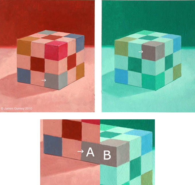
The Colored Cube Illusion: The two squares highlighted by the arrows are the same color.
By James Gurney
Unfortunately, however, those individual differences are a subject that scientists don’t know much about. That brings us to the question we were most interested in answering:
Now that we know it’s possible for an image to create a drastic split in how some people see it vs. others, we’re sure a lot of artists and photographers are going to be trying to figure out how to do it intentionally.
Multiple experiments have shown that this is a result of a perfect combination of white balance, saturation, and the exact colors present in the image: for many viewers, nudging the levels just a little bit in Photoshop makes the image change right in front of their eyes. So, by experimenting with the same subject on different colored backgrounds, with different colored lights, photographed at different color temperatures and levels of saturation, it should be possible to create images just like this. Right?
We asked Carroll about it. “I’m not aware of ways in which people intentionally do that to create an effect” he says, but concedes that it can be done. And although he couldn’t offer a solid explanation on how, he gave some advice to people who want to start experimenting with it. “Maybe something as simple as setting the white balance to a blue piece of paper instead of a white piece of paper.”
One Vine account is already giving it a shot with impressive results:
A Vine that shows the apparent color shift in action.
And as for the question that might be most pressing in your mind right now?
“I see it as white and gold.” he replied.
Let’s start with the dress. If you’ve been online in the last 48 hours, we’re sure you don’t need it explained to you. There have been countless theories about why our perception of its coloring is so split: some scientific, some not.
Of particular note was Wired.com’s, which, when stripped to its essence, is fascinating for both its simplicity and the complexity of the brain process it implies. Basically, some people—most likely those who spend more time in the sun—have “daylight-balanced” sight. As such, their brains interpret the dress’s blue hue as an unwanted color cast and “correct” it to white, just like a camera with the same settings would. This happens instantly, subconsciously, and in many cases, entirely against their will.
The meme’s popularity lies in how shocking this revelation is to a lot of us: we assume everyone without vision disorders sees colors the same way we do, and most of us have been given no reason to believe otherwise. But it’s not so. As this article from LiveScience explains, an experiment with monkeys suggests that color perceptions are an adaptive behavior: they form in our brains as a response to the experiences with the outside world.
“Color is a private sensation,” says University of Wisconsin color scientist Joseph Carroll. “I think we can say for certain that people don’t see the same colors.”
This intrigued us, so we called him for more information.
“You can tweak perceptual white balance,” he explains, “[and] there’s some evidence that your environment can calibrate your color perception.” Basically, when the composition of the lights people are regularly exposed to is changed, their entire spectrum of color perception is changed. “The same way you can induce an afterimage by staring at a light for ten seconds,” but over the long term.
After that, a funny thing happens when we look at an image that seems to be lit in a subtly-colored light. “Whatever our brain’s guess is about the illuminant, and it is a guess” he says, “it’s going to then subtract that out from any determination about the color of the object.”
He also explained another, more well-known phenomenon: In many cases, the colors of objects are dictated to us by our surroundings. This is called “color constancy.”
Our brain can’t compensate for small sections of a scene cast in a colored light, but it’s “very good at ignoring uniform changes in illumination.” He explains. “If you had an actually white and gold dress, and you took a small bluish transparency and laid it over one of the dress’s white stripes, this white stripe would look bluish. If you took a giant transparency and covered the entire dress, it would still look white and gold.”
In the left image, the second card from the left looks like a stronger shade of pink than in the right image. In reality, they’re the same.
From Wikimedia Commons
We won’t, however, continue with the dress. Enough people have done that. As photographers and designers, we’re more interested in how color illusions can be created.
There are other optical illusions that you can pull off in photography, and we recommend you try them at home. As alluded to in Carroll’s quote, we will perceive shades as lighter or darker depending on how light or dark the background around them is: objects on light-colored backgrounds look darker, ones on dark-colored backgrounds look lighter. One simple trick you can pull is photographing the same-colored object against light and dark-colored backgrounds, then putting the pictures next to each other. Plenty of people will be surprised to learn that they’re both the same color.
It’s also been proven, by the Cornsweet Illusion among others, that humans perceive color and shade in different ways based on where the lighting is supposed to be coming from. It should be possible to create an effect like this by setting up a situation in which one object should logically be lit and the other cast in shadow, much like this image, and then lighting the bottom one.
The Cornsweet Illusion: The flat part of both squares are the same shade of gray. To test it, cover the border between them with a finger
From IllusionPedia
And as the Checker Shadow Illusion proves, our mind automatically corrects for shade as well as hue – this can also be duplicated in photography.
Finally, why not try photographing identically-colored objects against split backgrounds within the same photo, and seeing if there’s a difference in the perceived color of the object itself?
A list of other illusions like this can be found in Scientific American.
In addition, shining a colored light on a finished photograph can radically alter how viewers will perceive the colors within the photograph, and a lot of it can be down to individual perception and color correction. In a gallery showing, it’s possible that you could encourage visitors to see completely different things by lighting the photos with subtly discolored lights, then testing their individual perception of the photos’ real colors.
The Colored Cube Illusion: The two squares highlighted by the arrows are the same color.
By James Gurney
Unfortunately, however, those individual differences are a subject that scientists don’t know much about. That brings us to the question we were most interested in answering:
Now that we know it’s possible for an image to create a drastic split in how some people see it vs. others, we’re sure a lot of artists and photographers are going to be trying to figure out how to do it intentionally.
Multiple experiments have shown that this is a result of a perfect combination of white balance, saturation, and the exact colors present in the image: for many viewers, nudging the levels just a little bit in Photoshop makes the image change right in front of their eyes. So, by experimenting with the same subject on different colored backgrounds, with different colored lights, photographed at different color temperatures and levels of saturation, it should be possible to create images just like this. Right?
We asked Carroll about it. “I’m not aware of ways in which people intentionally do that to create an effect” he says, but concedes that it can be done. And although he couldn’t offer a solid explanation on how, he gave some advice to people who want to start experimenting with it. “Maybe something as simple as setting the white balance to a blue piece of paper instead of a white piece of paper.”
One Vine account is already giving it a shot with impressive results:
A Vine that shows the apparent color shift in action.
And as for the question that might be most pressing in your mind right now?
“I see it as white and gold.” he replied.
With the prominence of flat web design Singapore, we’re seeing a return to bold, beautifully-colored logos. Crafting a great logo color scheme can be tricky though, so we’ve grabbed some of the most beautifully colorful logos around for your inspiration. Enjoy!
Quick Note: Stated hex values are the best approximation of the main color of an object. Designers can put in a lot of time shading and overlaying a graphic, so the color value is not necessarily the same for the whole logo.
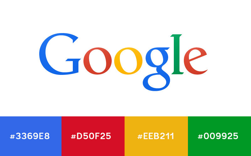
One of the most important colorful logos of our time is of course the Google logo. There are slight gradients that make it difficult to call out individual colors for the letters, but these will get you in the ball park.
You can see variants of these colors used in most of their highly stylized Google doodles as well. The web design Singaporeers seem to have a little freedom to explore each hue in their doodles and not stick to a tight color palette.

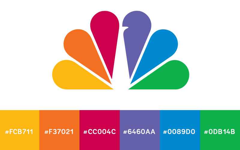
While their logo has seen a lot of change over the 80-plus years NBC has been in business, the color scheme has always been similar: bright, bold colors used in unison. It speaks to the diversity of not only its programming, but of its target audience.
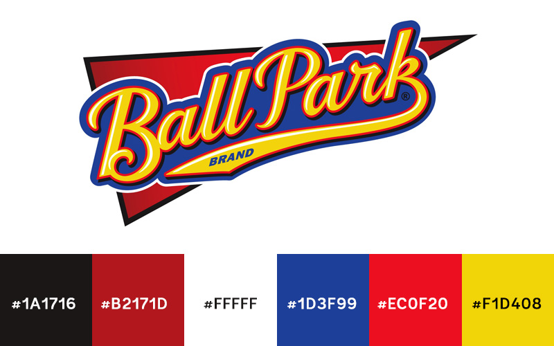
There’s a lot of hot dogs on the market, but Ball Park’s logo really plays to the American pastime, baseball. Early games were one of the rare places to find tasty franks. To help keep that connection, the logo’s bold blues, golds, and reds stay reminiscent of classic baseball logos.
The National Football League doesn’t hide any of its patriotic pride with its logo. Its red, white, and blue combination draws a direct connection to the star-spangled banner of its home country.

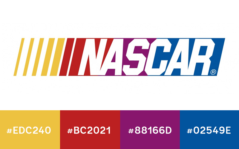
The NASCAR logo uses multiple colors much differently than the other ones mentioned in this article. They each have their own distinct break from the next, but the slant of the graphic creates an even transition that blurs the colors together—much like the cars whizzing by in a race.
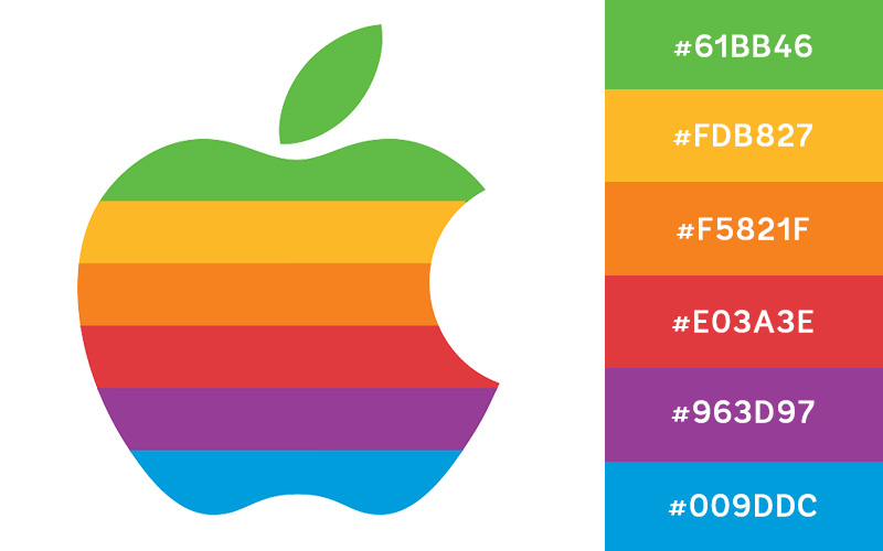
The colorful 1980s Apple logo has an excellent color scheme that hearkens back to the generation when it was created. The exciting color choices let you in on the revolutionary product the company was promoting.
We hope you’re inspired by these famous logo color schemes. Now get out there and make some bold color choices in the logos you create! Also be sure to leave a comment below and let us know about your favorite colorful logo. Are there any great ones that we missed?