Showing posts with label Famous. Show all posts

Saturday, June 13, 2015

8 Controversial Redesigns of Famous Logos

Millennials love remixes. From the surge of movie remakes making millions to a cappella mash-ups topping the charts, creative spinoffs and redesigns are more popular than ever. Add that to the increasing availability of design software and online education and you’ve set the stage for some pretty impressive logo spoofs. Consumers are taking it in their own hands to rebrand some of the most iconic logos on the market. Why? Well, because the otherwise bland branding space could really use some parody. Here are some of the most controversial redesigns to date.


The Pringles Guy Just Ate Them


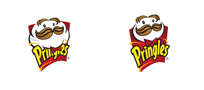
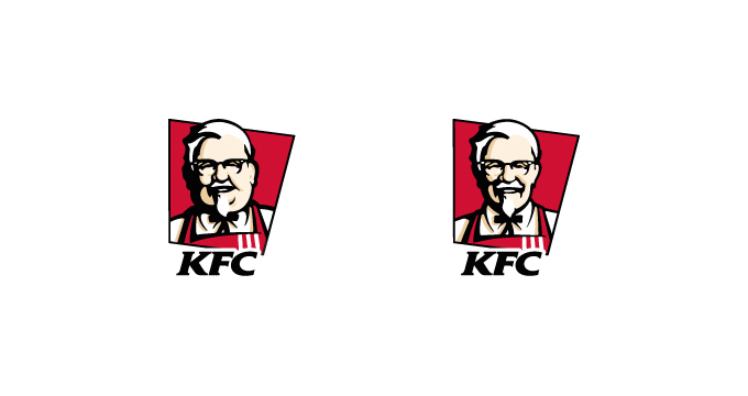
This is what happens when a graphic designer loses an enormous amount of weight and can’t stand junk food anymore. Would Pringles Guy look so slim and dapper if all he ate was chips? (That goes to you too, Mr. KFC)
e72f7ca157ca730bc277bb9d8a49863d-2


fatkfc


Getting McFancy


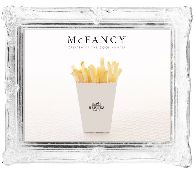
So, how do we feel about designer fries? Hermes fries, to be precise. The McFancy project, by Access Agency, imagined what would happen if McDonald’s set up an upmarket temporary store at Fashion Weeks around the globe.

MCFANCYbyTCHh1(1)


Hipster Branding


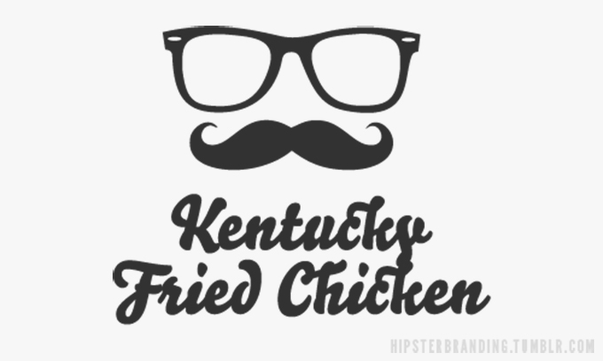
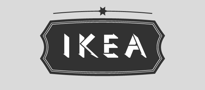
What’s more ironic than branding KFC for organic, gluten-free, vegan twenty-somethings? Nothing. Which is why this trendy logo is the first on the list. It epitomizes the goal of Tumblr blog Hipster Branding. They spoof the logo design trends that are all over small, hip businesses by using the same style for multinational corporations.
logoparody3


ikea-hipster


Not again, UPS!


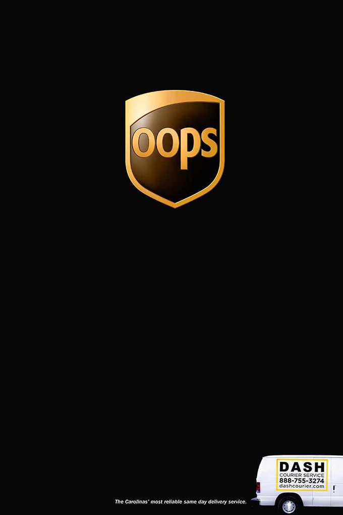
Dash Courier, a logistics company based in North Carolina, reimagined the UPS logo to remind potential customers of past frustrations with their main competitor. The campaign featured a new “OOps” logo with punchy copy that reads “The Carolinas’ most reliable same day delivery service.” (Take that UPS?)

DashCourierOOPS


Adidas Anti-FIFA Logo


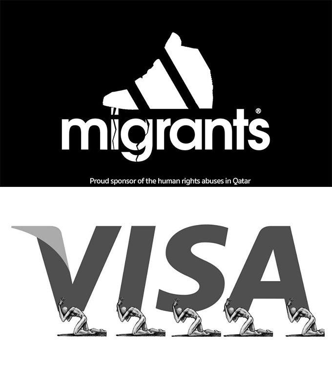
Top FIFA officials are facing huge charges for alleged corruption and even slavery in the world of soccer. Graphic designers around the world who are passionate for human rights have protested making satirical logos of many of the corporate sponsors behind the World Cup.

logoparody5


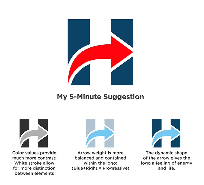
A Five-Minute Hillary Makeover


It’s not just the candidates in the presidential primary that are getting a lot of internet heat, so are their logos. Hillary’s logo may not be popular with the design community, so maybe their campaign should take some free advice from the internet. This one featured on Creative Bloq is a great alternative.

logoparody6


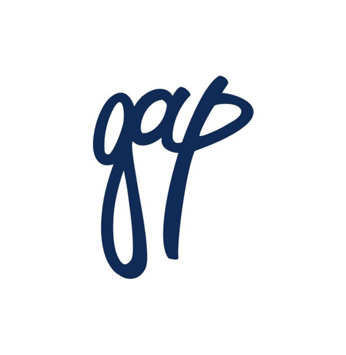
99designs’ Gap Contest


99designs is a great place for design contests. They had a bit of a controversial one when Gap released its new logo. The point of the contest was “Everyone hates the new Gap logo. Let’s show them how it’s done!” And, in many ways, they did:

attachment_6080963


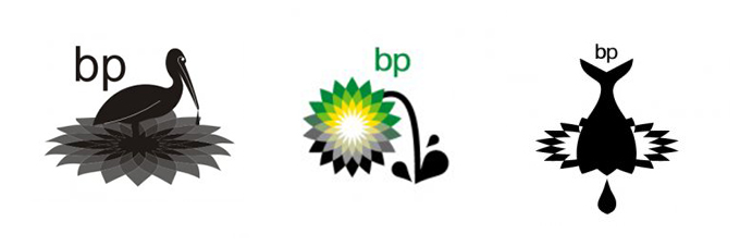
BP Oil Spill Logo


The gulf coast oil spill was an environmental disaster and, much like with the current FIFA crisis, graphic designers spoke out by redesigning BP’s Logo to reflect their low regard for the impact of drilling. These are some of the most interesting compositions:

logoparody7


Thinking about how to revamp or redesign something iconic–whether for a specific purpose or pure aesthetic exploration–is a great exercise in creativity. Who knows? Maybe a corporate bigwig somewhere will be surfing the net and fall in love with your re-imagining of his or her company’s logo.


Which of these did you like the most? Have you ever rebranded an iconic company? Show us below!


Products Seen In This Post:


getpaidtowrite-banner
8 Controversial Redesigns of Famous Logos

Friday, February 20, 2015

20 Neon-Styled and Chinese Translated Famous Trademarks


Mehmet Gozetlik has recently created a series of posters that depicts 20 world famous trademarks that have been translated into Chinese and have all been designed in a graphical, neon-style. The self-initaied series is simply entitled Chinatown.


Mehmet has said that the project ‘pushes viewers to ask themselves what it means to see, hear, and become fully aware‘ and that it ‘demonstrates our strangeness to 1.35 billion people in the world, when you can’t read Chinese.’ Honestly, we just think they look really cool.


Have a look for yourselves and how many logos can you actually name?


Chinatown Trademarks by Mehmet Gozetlik


Chinatown Trademarks by Mehmet Gozetlik


Chinatown Trademarks by Mehmet Gozetlik


Chinatown Trademarks by Mehmet Gozetlik


Chinatown Trademarks by Mehmet Gozetlik


Chinatown Trademarks by Mehmet Gozetlik


Chinatown Trademarks by Mehmet Gozetlik


Chinatown Trademarks by Mehmet Gozetlik


Chinatown Trademarks by Mehmet Gozetlik


Chinatown Trademarks by Mehmet Gozetlik


Chinatown Trademarks by Mehmet Gozetlik


Chinatown Trademarks by Mehmet Gozetlik


The post 20 Neon-Styled and Chinese Translated Famous Trademarks appeared first on Speckyboy Web Design Magazine.


20 Neon-Styled and Chinese Translated Famous Trademarks

Wednesday, December 10, 2014

Fonts In Use on Famous Websites

Web type is fascinating. Long ago, we only had a handful of typefaces to choose from, but these days, web designers use as many diverse fonts as print designers. That being said, if you take a look at some of the top sites on the web, you still see the old standards in use like Helvetica, Arial, and Georgia. Today we’ll take a look at sites like Facebook, Google, and Wikipedia to see what fonts they use in headings and body copy.


1. Helvetica


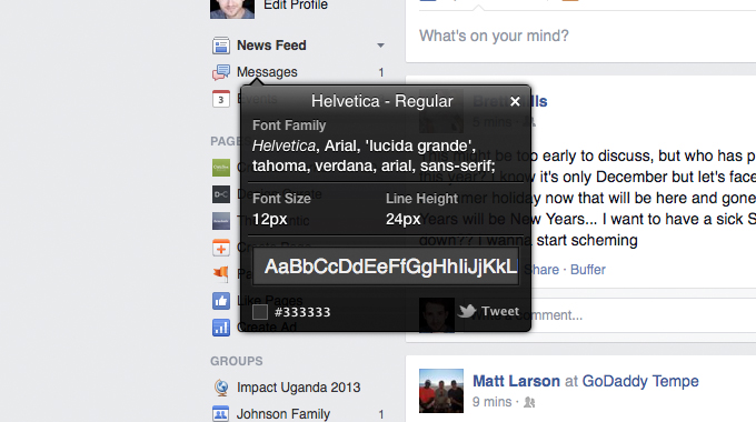
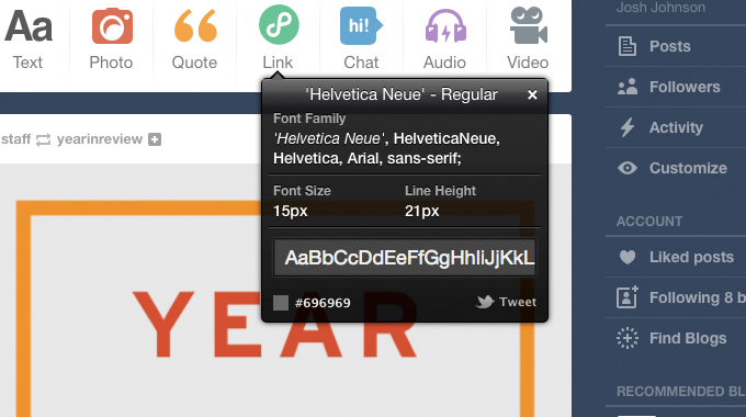
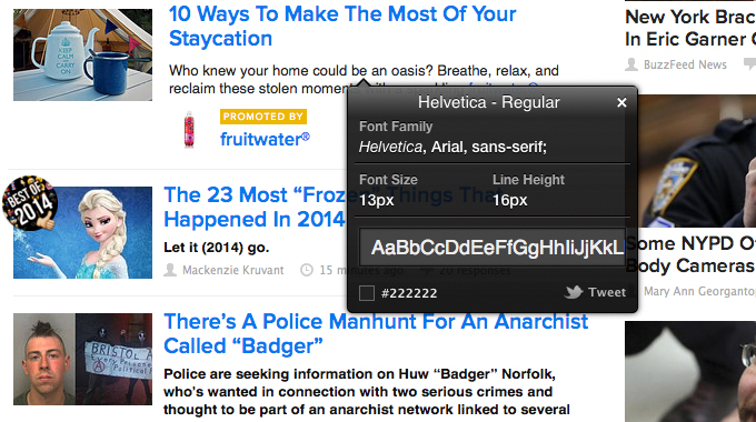
It’s not surprising that the social media giant Facebook uses Helvetica, an immensely popular sans serif font, for almost all of its content choices. The font doesn’t change between your mobile and desktop interface, as its one of the most common fonts out there. Facebook is displaying its role as the standard of social media in an age where new start-ups abound. Pinterest and Tumblr are also Helvetica lovers, and Buzzfeed uses it for the body font on its homepage in snippets of featured articles and lists.


famous-fonts
Facebook


famous-fonts
Tumblr


famous-fonts
Buzzfeed


2. Arial


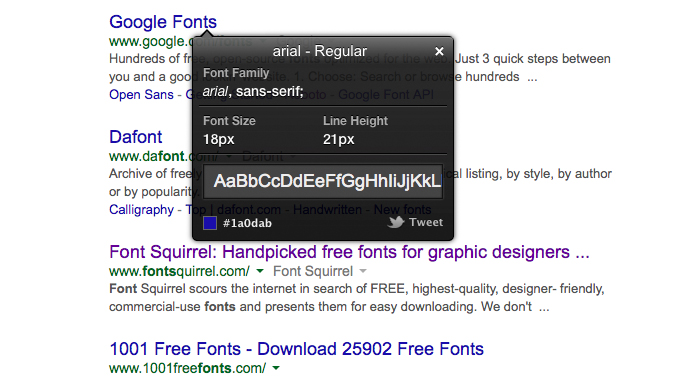
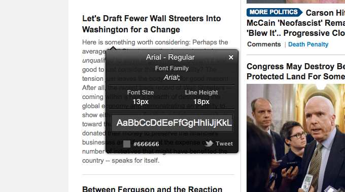
Like Helvetica, Arial is a basic font that is easy to read. Twitter and Google both use Arial for all their copy and content. The Huffington Post also uses Arial on its front page but uses the Georgia font for full articles. Arial’s origins actually stem from the aforementioned standard font, Helvetica. Arial had the same heights and widths as Helvetica to work as a placeholder for designers who couldn’t afford the rights to Helvetica but wanted to keep their font choices open to change in the future.


famous-fonts
Google


famous-fonts
Huffington Post


3. Georgia


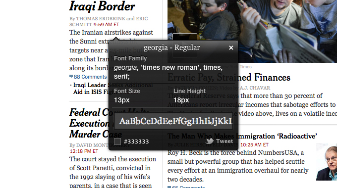
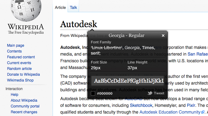
News giants like The New York Times and Huffington Post want to keep the feeling of paper on the screen, so they use Georgia, the sibling serif font of Verdana, in both their headers and body fonts for full articles. The font was conceived to maintain style and legibility even when scaled down, so it looks as great on the desktop as on it does on mobile devices. Wikipedia is another website that likes to keep the old-world feeling of printed press for its titles, but it uses a standard sans serif for body text. Tumblr uses Georgia to add a classic touch to quotes when re-blogged.


famous-fonts
The New York Times


famous-fonts
Wikipedia


4. Proxima Nova


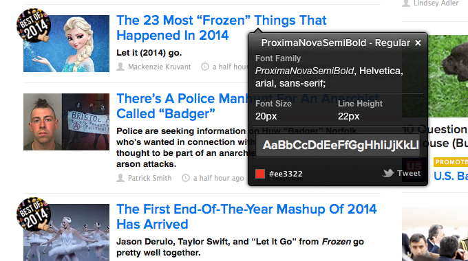
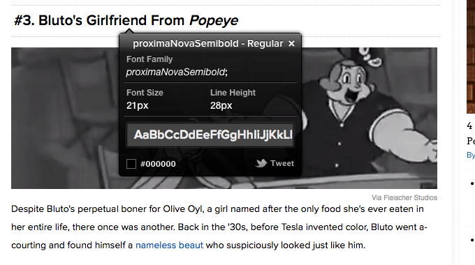
Hip news needs an equally hip font to make it pop. Buzzfeed uses Proxima Nova, a new Futura-like font created by designer Mark Simmons. It features many different weights and alternative characters, so it is extremely versatile whenever and wherever it is used. Buzzfeed shakes up the standards with other bold font choices on its homepage: Helvetica for a body font in snips of featured articles and Tahoma, a humanist sans serif, for footers. Cracked also features Proxima Nova in its body font, simple headlines and footers, but it also uses Arvo for its mind-blowing headlines.


famous-fonts
Buzzfeed


famous-fonts
Cracked


5. Arvo


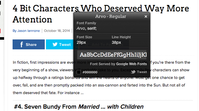
Like Buzzfeed, Cracked uses Proxima Nova for some of its body, but it uses a sleek, new font called Arvo to catch your attention in the headers. It’s close to Egyptian with it’s slab-serifs, and it is very geometric. Arvo is a free font available through Google, so it’s becoming quite popular.


famous-fonts
Cracked


What Fonts Are Used On Your Favorite Sites?


What sites have inspired you lately and what fonts do they use? Leave a comment below and let us know.


Screenshots created using WhatFont.


Fonts In Use on Famous Websites

Wednesday, December 3, 2014

6 Famous Logos with Great Color Schemes
With the prominence of flat web design Singapore, we’re seeing a return to bold, beautifully-colored logos. Crafting a great logo color scheme can be tricky though, so we’ve grabbed some of the most beautifully colorful logos around for your inspiration. Enjoy!


Quick Note: Stated hex values are the best approximation of the main color of an object. Designers can put in a lot of time shading and overlaying a graphic, so the color value is not necessarily the same for the whole logo.


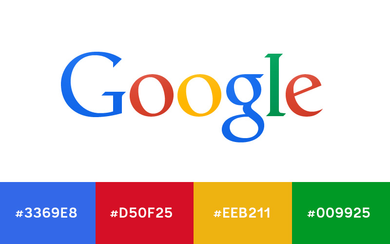
1. Google


famous-logo-colors


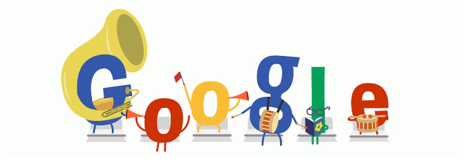
One of the most important colorful logos of our time is of course the Google logo. There are slight gradients that make it difficult to call out individual colors for the letters, but these will get you in the ball park.


You can see variants of these colors used in most of their highly stylized Google doodles as well. The web design Singaporeers seem to have a little freedom to explore each hue in their doodles and not stick to a tight color palette.


famous-logo-colors


2. NBC


famous-logo-colors


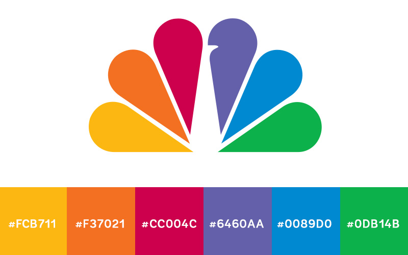
While their logo has seen a lot of change over the 80-plus years NBC has been in business, the color scheme has always been similar: bright, bold colors used in unison. It speaks to the diversity of not only its programming, but of its target audience.


3. Ball Park Franks


famous-logo-colors


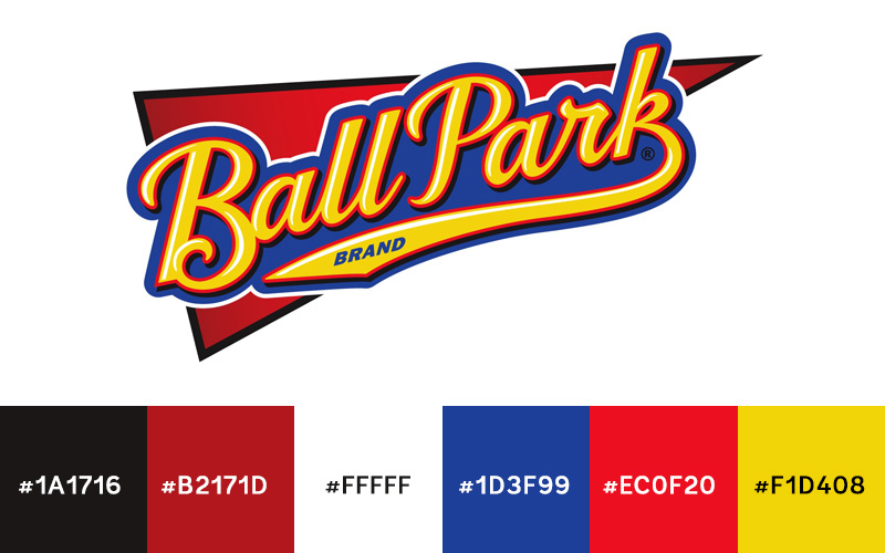
There’s a lot of hot dogs on the market, but Ball Park’s logo really plays to the American pastime, baseball. Early games were one of the rare places to find tasty franks. To help keep that connection, the logo’s bold blues, golds, and reds stay reminiscent of classic baseball logos.


4. NFL


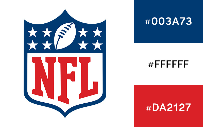
The National Football League doesn’t hide any of its patriotic pride with its logo. Its red, white, and blue combination draws a direct connection to the star-spangled banner of its home country.


famous-logo-colors


5. NASCAR


famous-logo-colors


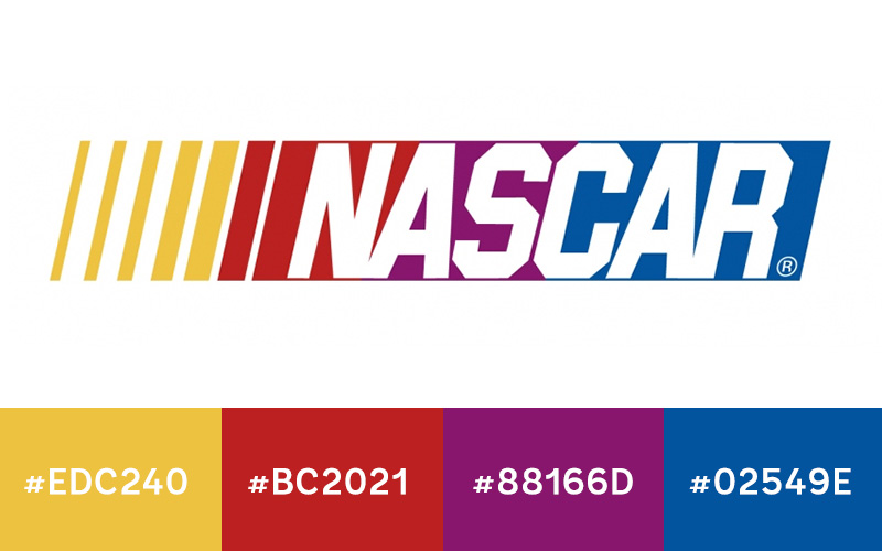
The NASCAR logo uses multiple colors much differently than the other ones mentioned in this article. They each have their own distinct break from the next, but the slant of the graphic creates an even transition that blurs the colors together—much like the cars whizzing by in a race.


6. Apple


famous-logo-colors


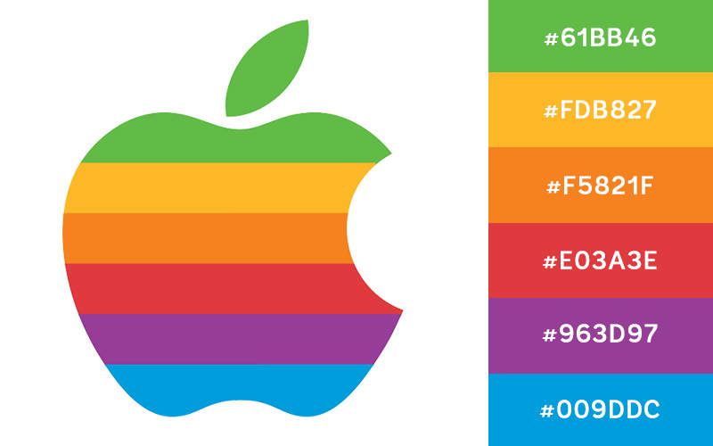
The colorful 1980s Apple logo has an excellent color scheme that hearkens back to the generation when it was created. The exciting color choices let you in on the revolutionary product the company was promoting.


What’s Your Favorite Colorful Logo?


We hope you’re inspired by these famous logo color schemes. Now get out there and make some bold color choices in the logos you create! Also be sure to leave a comment below and let us know about your favorite colorful logo. Are there any great ones that we missed?


6 Famous Logos with Great Color Schemes