By now, you’ve probably got this responsive thing mastered. You know all about responsive web design, media queries, and fluid grids. Your websites look great on every screen and you’re dang proud of it. But how are your icons doing? Are they responsive? What are responsive icons, you ask? Today we’ll dive into that very topic.
A New Kind of Icon
The idea behind responsive images is fairly simple: you serve up the same images in different sizes to different screens. Perhaps even more than with something like a photo though, you’ll find that this practice doesn’t always work great with icons. A given icon design might look great at its original size, but terrible once scaled down due to too much detail being squished into such a tight space.
The answer? Responsive icons. These shape shifters do more than change size, they actually change their design to accommodate the size at which they’re being served.
Like other kinds of responsive design, responsive icons are a reaction to the need for more diverse web design and programming. Use of mobile devices is growing, and their screen size is smaller than the computers and laptops popular in the past, so the design needs to be radically different. Otherwise, mobile users, who are a major portion of all web traffic today, will struggle with confusing controls, pages requiring scrolling and shrinking, and other annoying design elements that will run them off.
Designing Responsive Icons
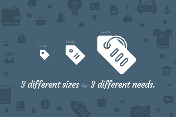
Designers often create responsive icons in packs. These are almost like animated GIFs or other complex images, in that they have different versions that can be substituted for one another. For example, as the user zooms in or out, the icon will change from one model to another. In many cases, the largest icons have more features and details, where the smaller icons are simply stripped down, diminutive versions. Regardless of their visual design, though, they have to stay consistent so that the smallest one still looks like the largest size to provide continuity across devices.
Responsive icons also play a vital role in terms of web function. Even when they’re small, they must be recognizable because they are so often the major controls for a site. Icons are often the items that users have to click on to go someplace or do something. For example, designers have experimented with simple line drawings to show a list box or drop-down, but they have to design something that the average user will understand intuitively, without a lot of special instructions. Along with that, designers still have to apply all of those ideas about color scheme, typography, layout and overall branding that produce a consistent and clean look for an entire site.
Interesting Links for More on Responsive Icons
Responsive icons are a design trend that is just starting to catch on, so the vast majority of icons that you’ll find on the market will not be responsive. If you’re interested in seeing more, here are a few resources you can check out (lots and lots of credit to Joe Harrison, who built some of the demos below and was one of the first designers to start exploring responsive icons):
- Making Iconic Responsive (a look at how the popular web icon set Iconic has implemented responsive design)
- ResponsiveIcons.co.uk (a simple responsive icon demo)
- ResponsiveLogos.co.uk (a cool demo expanding the responsive icon idea to logo design)
Responsive Icons on Creative Market
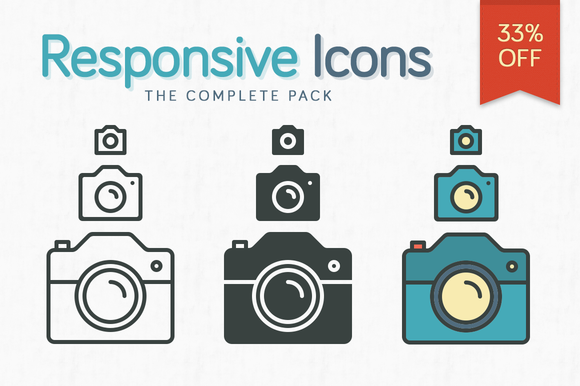
In addition to the two awesome icon packs already shown earlier in this article, here are a few more that you might want to grab. Props to Pixel Bazaar especially for making so many awesome responsive icon packs!


What Are Responsive Icons?
No comments:
Post a Comment
Note: Only a member of this blog may post a comment.