Showing posts with label Impact. Show all posts

Thursday, May 21, 2015

"Make It Pop!" Five Ways to Up Design Impact and Make Clients Happy

“Make it Pop” is probably the most feared, incomprehensible and downright horrible phrases in the English language. Designer English, that is. Clients often use the phrase “make it pop” when a logo or marketing design is close, but not quite at the level of “punch” they are looking for. “Make it pop” generally refers to making a logo or design brighter, larger, more prominent or giving it higher levels of contrast. In short, the client is looking for more impact from the design. While designers know what “making it pop” means, they may not always be sure about the most effective and efficient route to making it happen. Here are five targeted ways to make designs “pop” and ultimately make clients happy.


1. Dial up the color intensity


“Making it pop” may require minimal work, especially if the client indicates that they are pleased with the overall design and font choices. If this is the case, play with existing color hues and intensities. Try more saturated and vibrant tones, being mindful of bringing out contrast in key areas to draw the eye around the design appropriately.
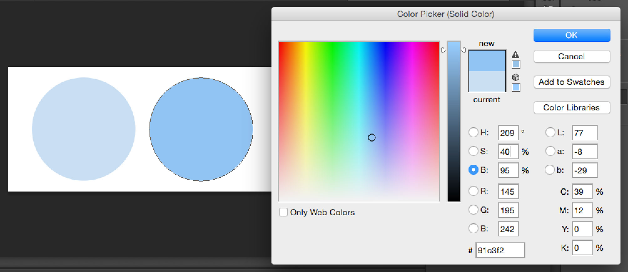

hsb


Available in the Adobe color picker, the HSB (hue, saturation, and brightness) color model is based on the way the human eye sees color. Try increasing the S (saturation) percentage next time you are trying to dial up a color’s intensity.


2. Try different color combinations


If the client is less satisfied with the overall color direction, change it up; take the logo or design in three or four completely different color directions for the client’s review.
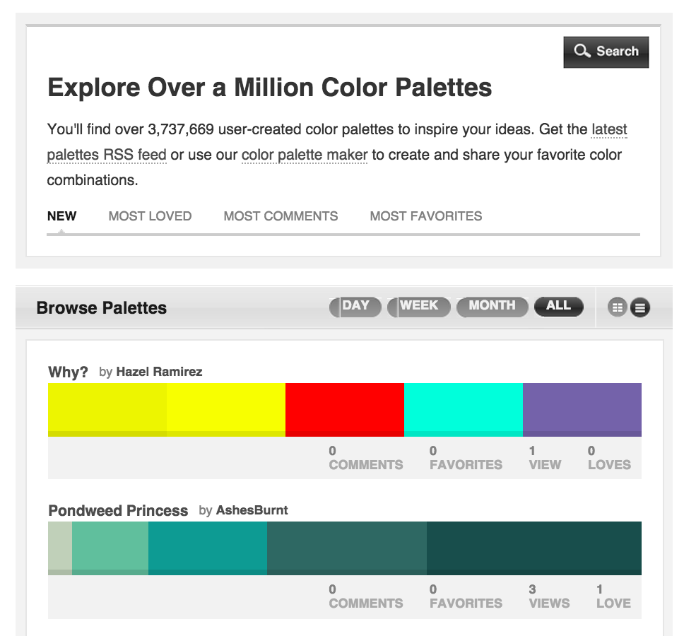


Browse_Palettes____COLOURlovers


Colourlovers.com can help any designer find an attractive palette while sourcing inspiration from thousands of designers around the world.


3. Play with text hierarchy


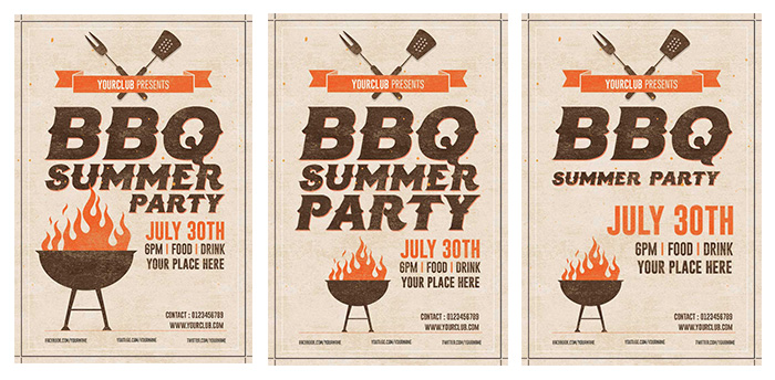
When a client asks a designer to “make it pop” they may actually just want part of the included text to appear more prominent than others. Try changing around the font sizes in the piece to experiment with text hierarchy; doing so could be just what’s needed to bring the perfect amount of “pop.”

bbqflyers


Don’t be afraid to experiment. Gauge the importance of specific words in your design and play around with their size and prominence. In this example, we’re experimenting with a summer flyer by shifting emphasis on the words BBQ, summer, party and the event date.


4. Try out a different typographic scheme


It’s possible that the current font selection just isn’t the right fit for the information or message the piece is trying to convey.
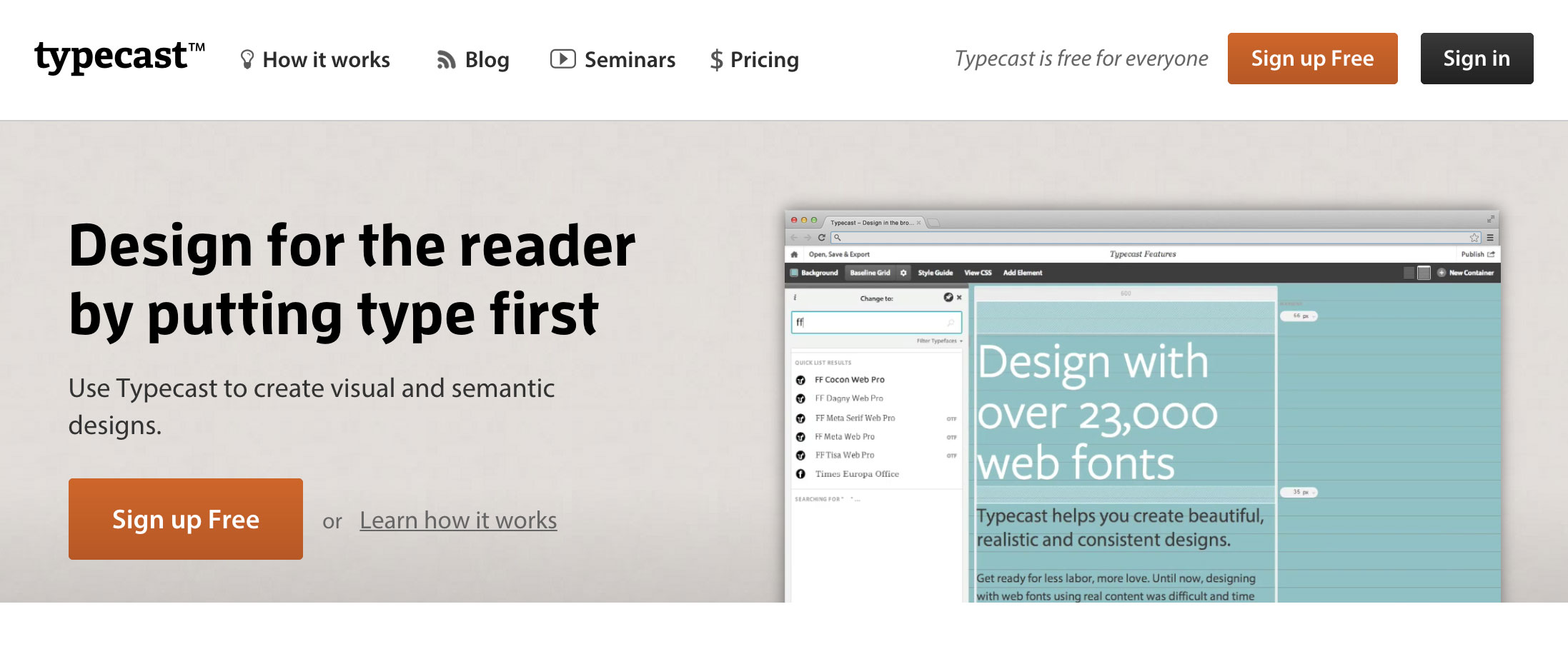

typecast


Try using Typecast.com to experiment with different font combinations and see how the changes affect the message being shared.


5. Introduce mockups


Sometimes a really great piece just doesn’t impact the client because it looks flat and unconvincing on the page or computer screen. Fortunately, designers can play with their imagination by inserting designs on a mockup product or scene to help give it a real-world context. Creative Market designers have created an amazing collection of mockup templates that can help make any logo or design really “pop.” Here are some of our top sellers:


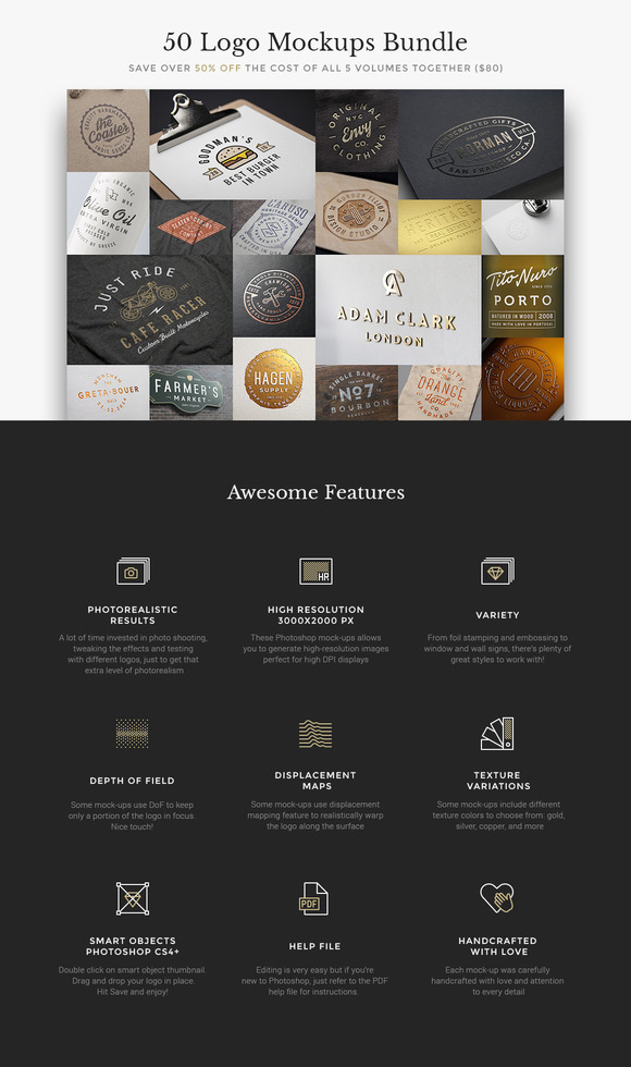
50 Logo Mockups Bundle


The mockup templates in the 50 Logo Mockups Bundle allow designers to show their logos on real-life products like clothing, bottles, signage settings and more.


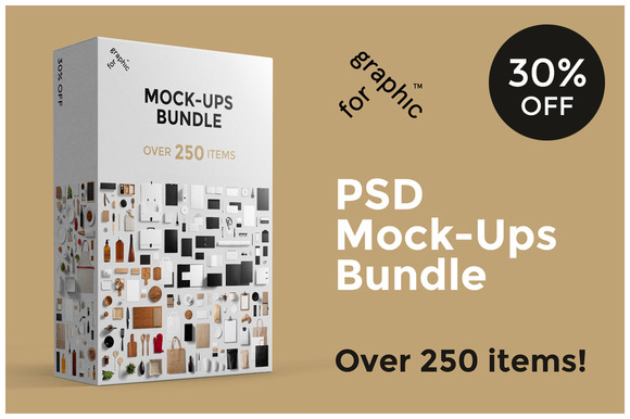
Branding Mockups Bundle


The professional photos in these templates allow designers to make their designs and logos truly pop with over 250 items and a variety of angles and perspectives to punch up the realism.


Magazine Mockup Pack


The Magazine Mockup Pack includes 12 standard view scenes along with seven close view scenes that can be fully customized for view, proportion, shadows, background texture and lighting.


100 Signs & Facades Mockups


For designers specializing in outdoor sign design, this pack of templates allows signage to be viewed from a variety of angles on glass, awnings, brick, marquee-style signs and more.


Helping an existing design “pop” can be a simple task; however, becoming more efficient at finding the best route for the optimal amount of “pop” takes practice. The use of intuition along with gaining experience in the design world will help. Try these five key techniques and let us know if they help overcome your next “make it pop” situation.


Products Seen In This Post:


getpaidtowrite-banner
"Make It Pop!" Five Ways to Up Design Impact and Make Clients Happy

Thursday, November 27, 2014

These Fonts Made a Big Impact on World History

Typography is instrumental to many forms of communication in daily life, being used in modern advertisements and designs that we encounter every day. Typographers have practiced their craft for centuries, relaying different concepts and feelings through the intricacies of our species’ form of communication. Along the way, typography has played interesting and vital roles in culture, history, and of course, politics. Here are a few fonts that have left their mark on history.


Futura Makes a Stand Against Hitler’s Third Reich


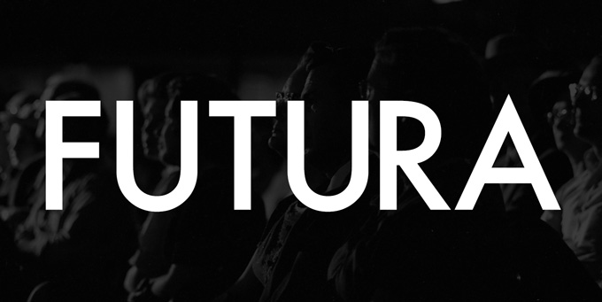
German typeface designer Paul Renner found himself in a tough spot when the Nazi party rose to power. His position as a designer gave him influence over Germany and its surrounding nations, making him perfect for Hitler’s propaganda machine. However, instead of using the frequently used Blackletter typeface, Renner was inspired to go against the grain and create a new typeface in 1927 – Futura. Influenced by Bauhaus’ use of Roman characters, Renner’s Futura rejected the prevalent culture of stark German nationalism being currently represented by Blackletter.


Note: The details of Renner’s loyalties and intentions are still debated. You can see some discussion on the matter in the comments on this article from Typophile. Either way you look at it, Futura is a font that played a substantial role in the story of Germany during this time.


type-in-history-6


Helvetica Plays It Safe During the Cold War


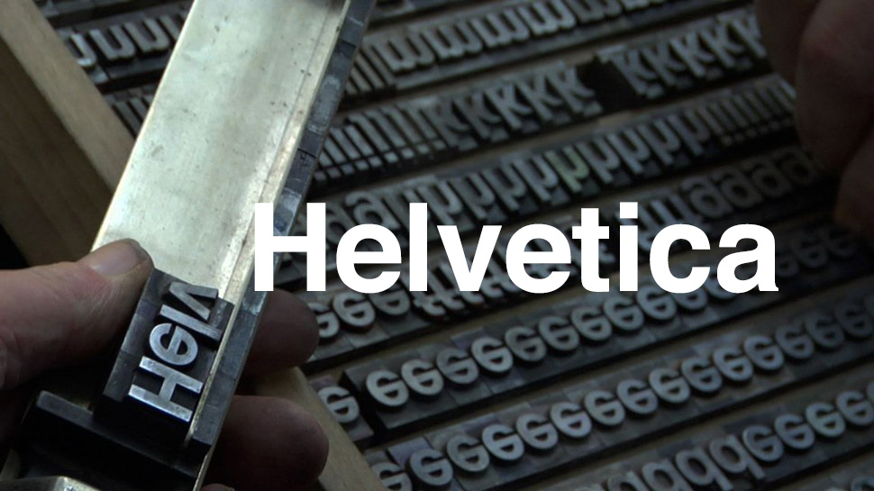
Helvetica was introduced in 1957 under its original name, Neue Haas Grotesk. It was first known for its clarity, though later would become associated with treading carefully during The Cold War. After World War II, distrust festered between nations, so Hoffman chose to use the name Helvetica over Helvetia (the latter meaning Switzerland) to avoid nationalism. This decision made Helvetica acceptable to the world rather than in the clutches of a single nation, freeing it from any ideological issues fueling national distrust during The Cold War. Though a common criticism of Helvetica arose claiming that it lacked personality, the 2007 documentary “Helvetica” made an argument for the font, describing it as “ubiquitous” and “timeless.”


type-in-history-1


Johnston Sans in the London Underground Railway Combats German Innovation


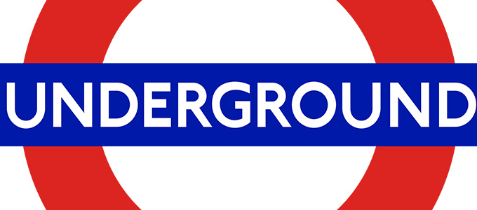
Edward Johnston created the self-named Johnston Sans during The Great War. Commonly known as Underground Railway Block-Letter, Johnston’s design was part of the war effort in that it fought against a perceived threat of cultural invasion by Germany. To this end, Johnston drew from imperialist foundations to emphasize Britain’s strength. During the time, imperialism wasn’t associated as much with negative connotations as it is today. It was actually quite the opposite: The London Underground’s strong typography reassured its citizens that Britain would prevail against outside influence of Nazism and fascist design alike.


type-in-history-2


Gotham Attempts to Bring Hope Back to America


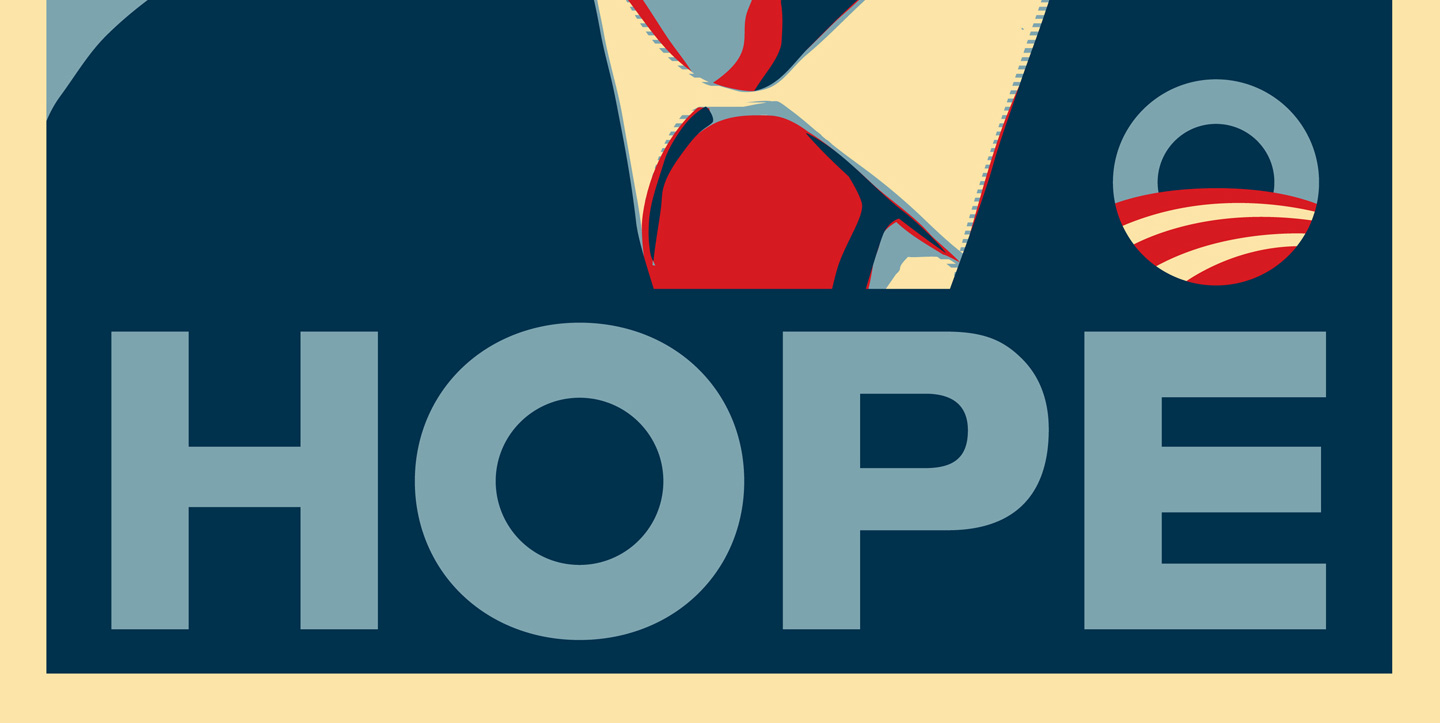
Inspired by the lettering on the Port Authority, Gotham is described by Tobias Frere-Jones as “the type of letter that an engineer would make.” Frere-Jones is one half of the duo who designed Gotham (the other being Jonathan Hoefler). In addition to appearing on cultural icons such as Coca-Cola, Netflix, and even in the Museum of Modern Art, Gotham was used by the Obama during his 2008 campaign for presidency. Being associated with New York City and its post-September 11th search for hope, Gotham affected the same optimistic aesthetic for Obama’s campaign when it was used in conjunction with “Change We Can Believe In.” Now, the beloved typeface’s creators are embittered in a million conflict, with Frere-Jones suing partner Hoefler for “cheating” him out of half of the business. However, the typeface remains strong.


obama hope


What Other Fonts Have Left Their Mark on The World?


When we think about world history, we don’t usually jump straight to the topic of type. But it’s always there, doing its duty, proclaiming the good news, spreading the bad news, and pushing agendas. What other fonts can you think of that have played a role in a historical event?


Header image created using Letter Land I.


These Fonts Made a Big Impact on World History