Millennials love remixes. From the surge of movie remakes making millions to a cappella mash-ups topping the charts, creative spinoffs and redesigns are more popular than ever. Add that to the increasing availability of design software and online education and you’ve set the stage for some pretty impressive logo spoofs. Consumers are taking it in their own hands to rebrand some of the most iconic logos on the market. Why? Well, because the otherwise bland branding space could really use some parody. Here are some of the most controversial redesigns to date.
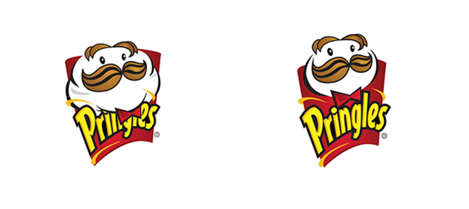
The Pringles Guy Just Ate Them
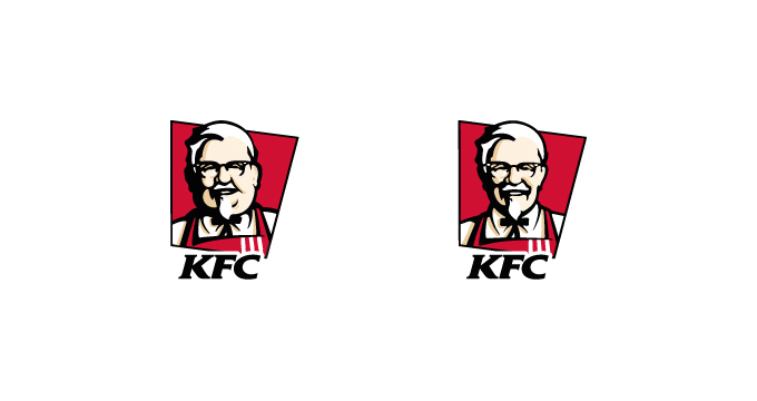
This is what happens when a graphic designer loses an enormous amount of weight and can’t stand junk food anymore. Would Pringles Guy look so slim and dapper if all he ate was chips? (That goes to you too, Mr. KFC)
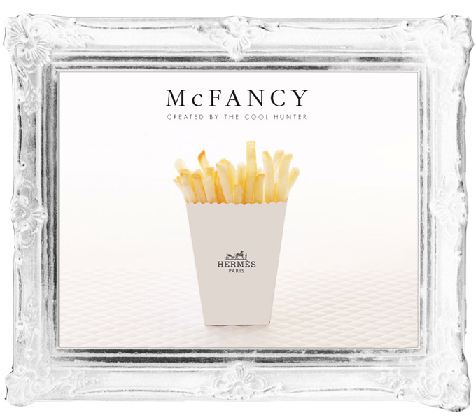
Getting McFancy
So, how do we feel about designer fries? Hermes fries, to be precise. The McFancy project, by Access Agency, imagined what would happen if McDonald’s set up an upmarket temporary store at Fashion Weeks around the globe.
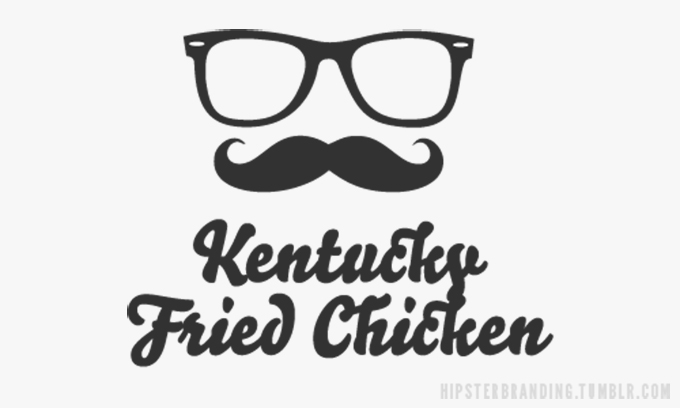
Hipster Branding
What’s more ironic than branding KFC for organic, gluten-free, vegan twenty-somethings? Nothing. Which is why this trendy logo is the first on the list. It epitomizes the goal of Tumblr blog Hipster Branding. They spoof the logo design trends that are all over small, hip businesses by using the same style for multinational corporations.
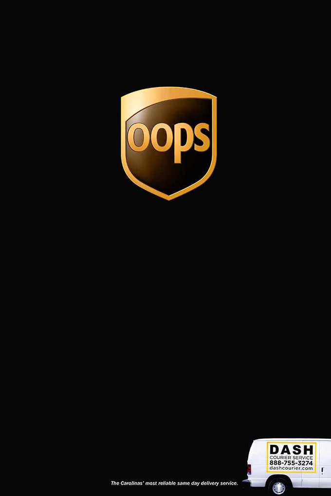
Not again, UPS!
Dash Courier, a logistics company based in North Carolina, reimagined the UPS logo to remind potential customers of past frustrations with their main competitor. The campaign featured a new “OOps” logo with punchy copy that reads “The Carolinas’ most reliable same day delivery service.” (Take that UPS?)
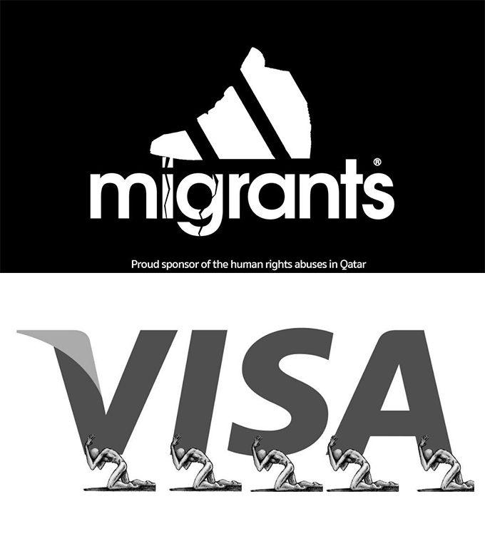
Adidas Anti-FIFA Logo
Top FIFA officials are facing huge charges for alleged corruption and even slavery in the world of soccer. Graphic designers around the world who are passionate for human rights have protested making satirical logos of many of the corporate sponsors behind the World Cup.
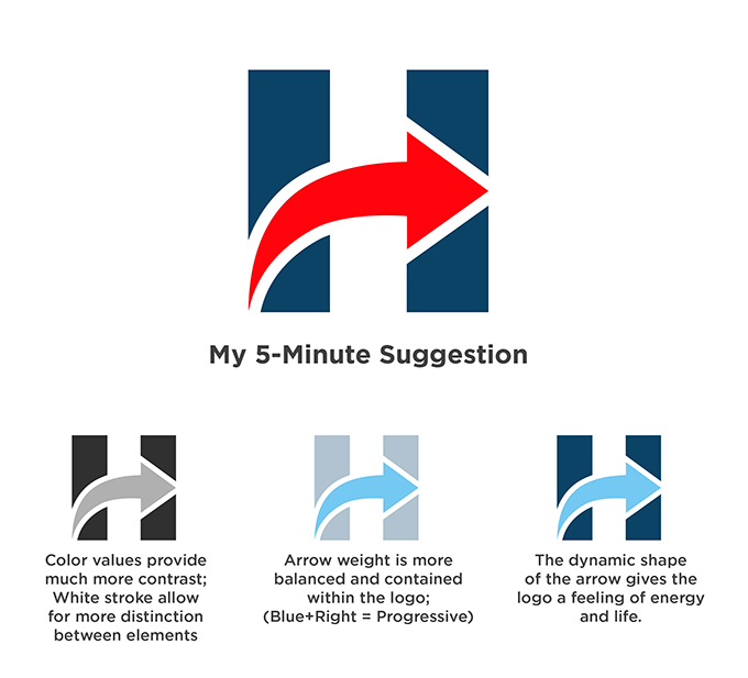
A Five-Minute Hillary Makeover
It’s not just the candidates in the presidential primary that are getting a lot of internet heat, so are their logos. Hillary’s logo may not be popular with the design community, so maybe their campaign should take some free advice from the internet. This one featured on Creative Bloq is a great alternative.
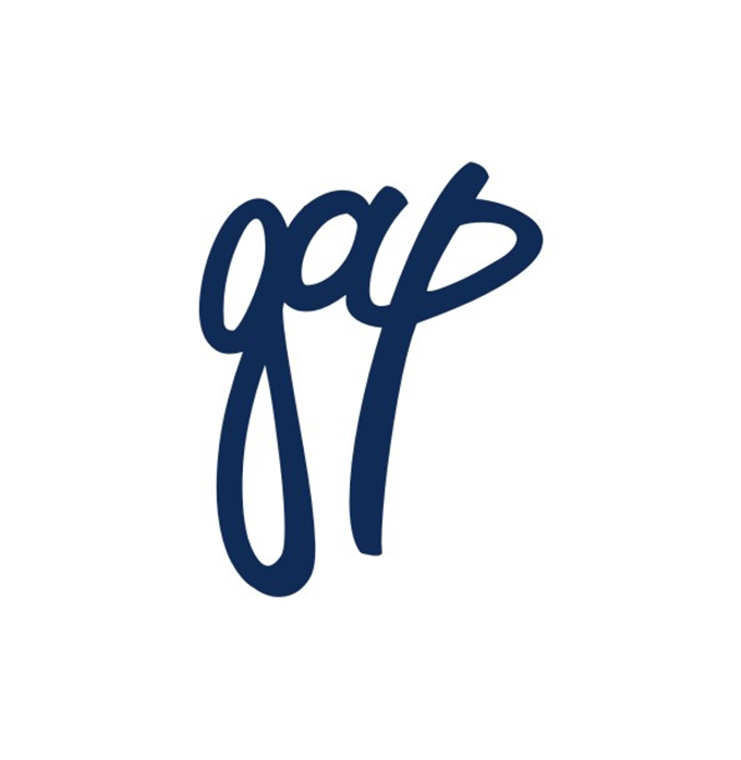
99designs’ Gap Contest
99designs is a great place for design contests. They had a bit of a controversial one when Gap released its new logo. The point of the contest was “Everyone hates the new Gap logo. Let’s show them how it’s done!” And, in many ways, they did:
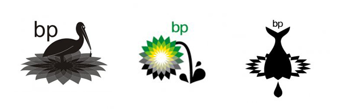
BP Oil Spill Logo
The gulf coast oil spill was an environmental disaster and, much like with the current FIFA crisis, graphic designers spoke out by redesigning BP’s Logo to reflect their low regard for the impact of drilling. These are some of the most interesting compositions:
Thinking about how to revamp or redesign something iconic–whether for a specific purpose or pure aesthetic exploration–is a great exercise in creativity. Who knows? Maybe a corporate bigwig somewhere will be surfing the net and fall in love with your re-imagining of his or her company’s logo.
Which of these did you like the most? Have you ever rebranded an iconic company? Show us below!
Products Seen In This Post:


.jpg)

8 Controversial Redesigns of Famous Logos
No comments:
Post a Comment
Note: Only a member of this blog may post a comment.