Web type is fascinating. Long ago, we only had a handful of typefaces to choose from, but these days, web designers use as many diverse fonts as print designers. That being said, if you take a look at some of the top sites on the web, you still see the old standards in use like Helvetica, Arial, and Georgia. Today we’ll take a look at sites like Facebook, Google, and Wikipedia to see what fonts they use in headings and body copy.
1. Helvetica
It’s not surprising that the social media giant Facebook uses Helvetica, an immensely popular sans serif font, for almost all of its content choices. The font doesn’t change between your mobile and desktop interface, as its one of the most common fonts out there. Facebook is displaying its role as the standard of social media in an age where new start-ups abound. Pinterest and Tumblr are also Helvetica lovers, and Buzzfeed uses it for the body font on its homepage in snippets of featured articles and lists.
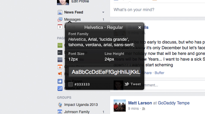
Facebook
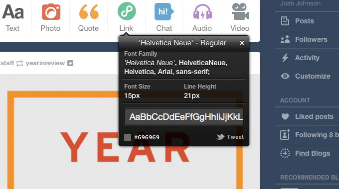
Tumblr
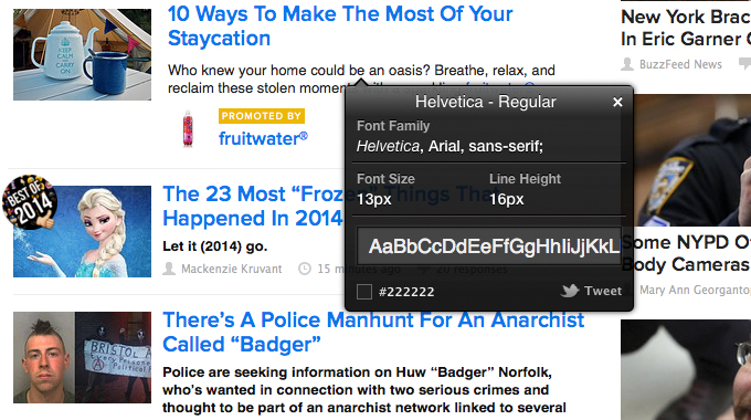
Buzzfeed
2. Arial
Like Helvetica, Arial is a basic font that is easy to read. Twitter and Google both use Arial for all their copy and content. The Huffington Post also uses Arial on its front page but uses the Georgia font for full articles. Arial’s origins actually stem from the aforementioned standard font, Helvetica. Arial had the same heights and widths as Helvetica to work as a placeholder for designers who couldn’t afford the rights to Helvetica but wanted to keep their font choices open to change in the future.
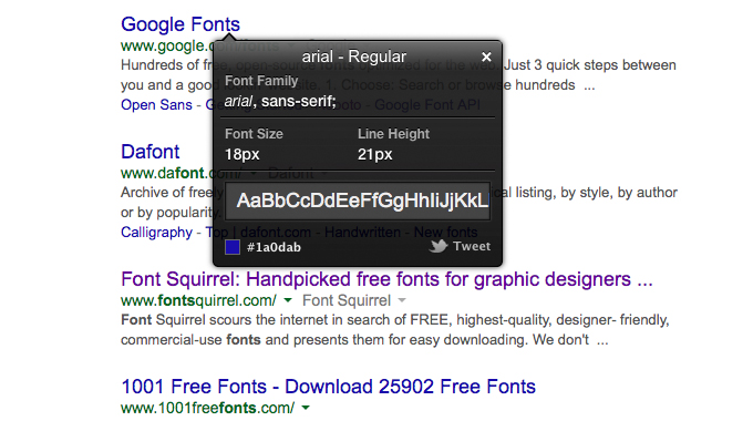
Google
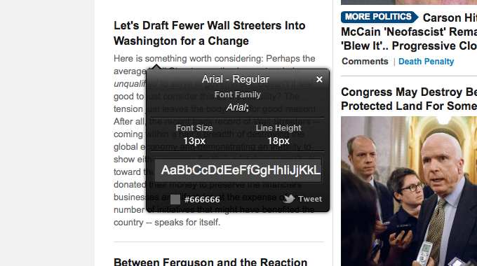
Huffington Post
3. Georgia
News giants like The New York Times and Huffington Post want to keep the feeling of paper on the screen, so they use Georgia, the sibling serif font of Verdana, in both their headers and body fonts for full articles. The font was conceived to maintain style and legibility even when scaled down, so it looks as great on the desktop as on it does on mobile devices. Wikipedia is another website that likes to keep the old-world feeling of printed press for its titles, but it uses a standard sans serif for body text. Tumblr uses Georgia to add a classic touch to quotes when re-blogged.
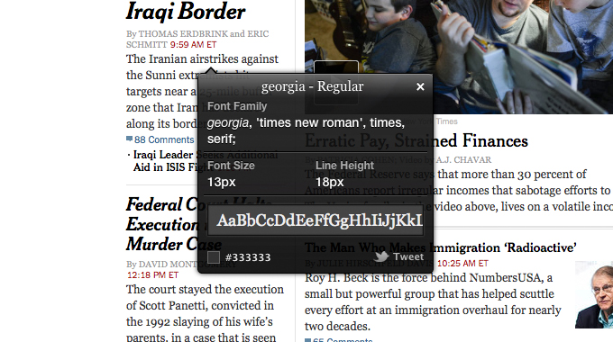
The New York Times
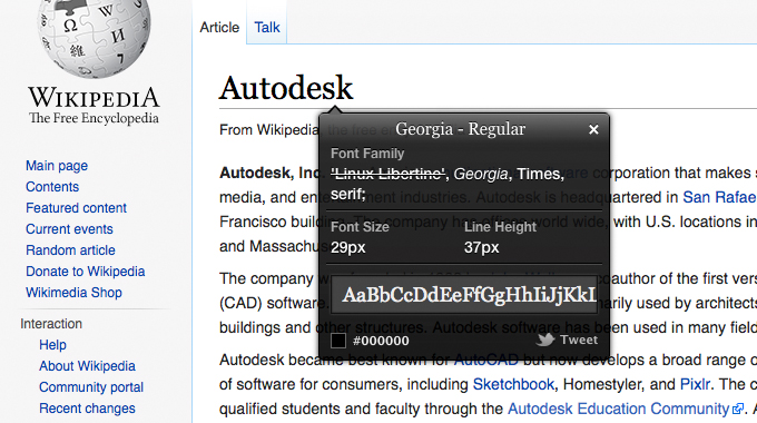
Wikipedia
4. Proxima Nova
Hip news needs an equally hip font to make it pop. Buzzfeed uses Proxima Nova, a new Futura-like font created by designer Mark Simmons. It features many different weights and alternative characters, so it is extremely versatile whenever and wherever it is used. Buzzfeed shakes up the standards with other bold font choices on its homepage: Helvetica for a body font in snips of featured articles and Tahoma, a humanist sans serif, for footers. Cracked also features Proxima Nova in its body font, simple headlines and footers, but it also uses Arvo for its mind-blowing headlines.
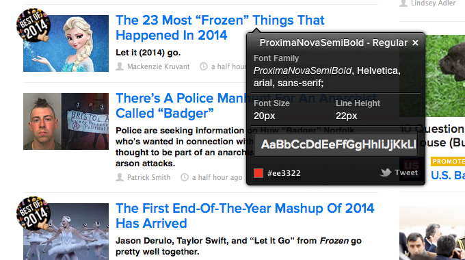
Buzzfeed
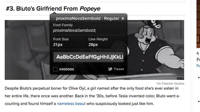
Cracked
5. Arvo
Like Buzzfeed, Cracked uses Proxima Nova for some of its body, but it uses a sleek, new font called Arvo to catch your attention in the headers. It’s close to Egyptian with it’s slab-serifs, and it is very geometric. Arvo is a free font available through Google, so it’s becoming quite popular.
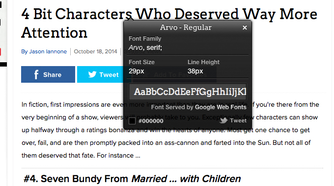
Cracked
What Fonts Are Used On Your Favorite Sites?
What sites have inspired you lately and what fonts do they use? Leave a comment below and let us know.
Screenshots created using WhatFont.
Fonts In Use on Famous Websites
No comments:
Post a Comment
Note: Only a member of this blog may post a comment.