iPixel Creative is a Singapore web design and development Company. At iPixel Creative, we provides web design solution which helps your company stand out from the competitors. Our Solutions includes web design, website development, cms development, ecommerce solution and hosting solutions.
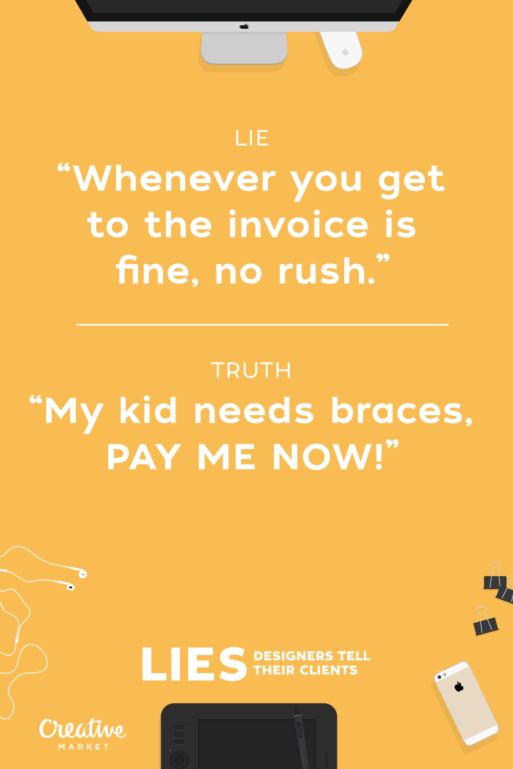
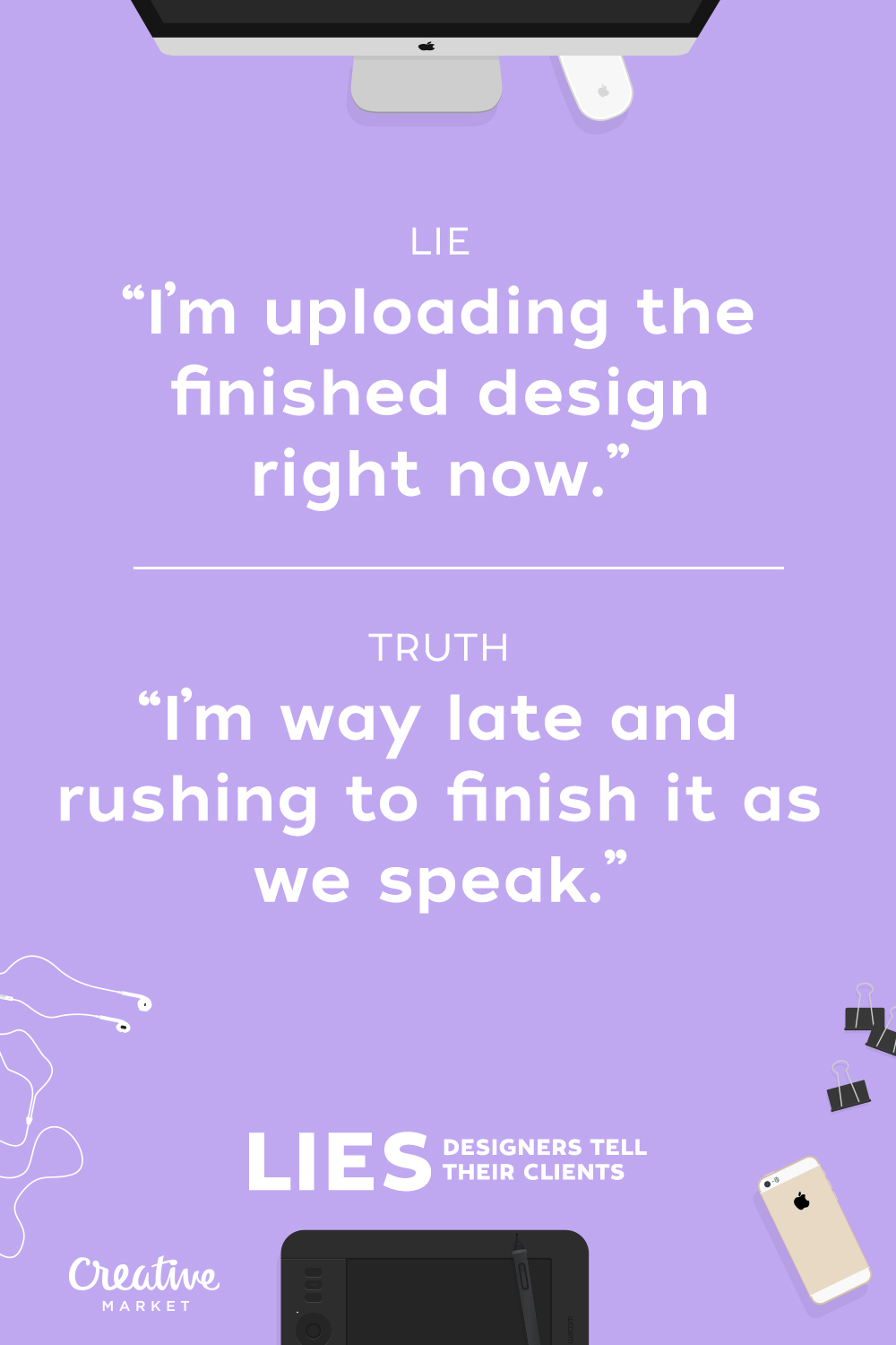
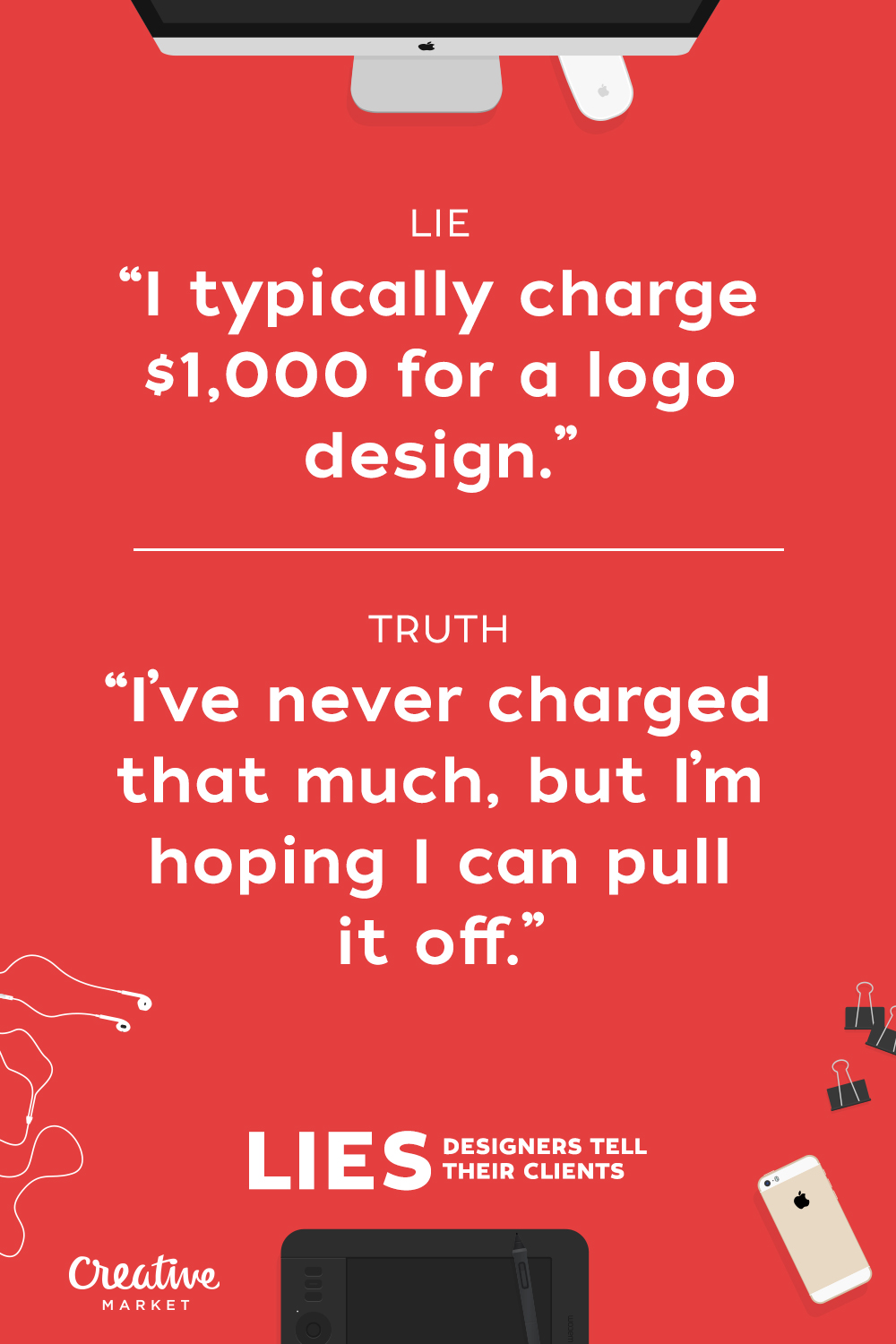
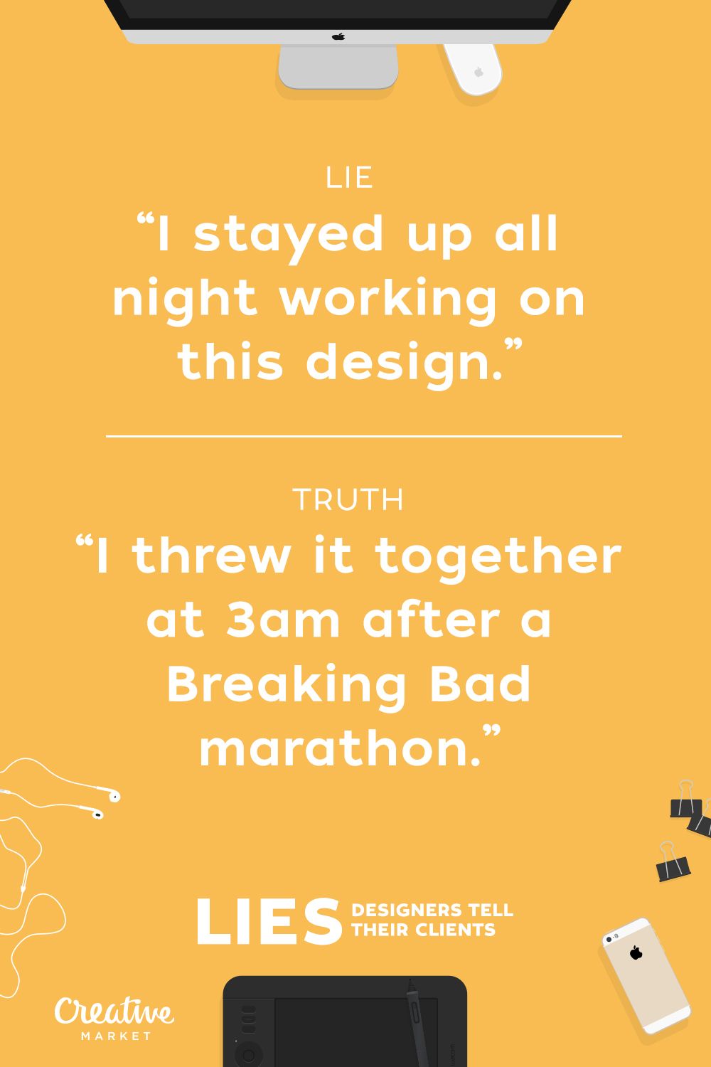
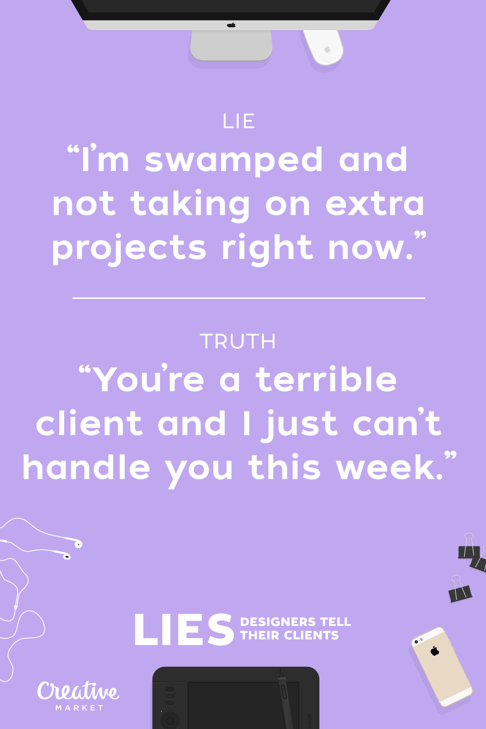
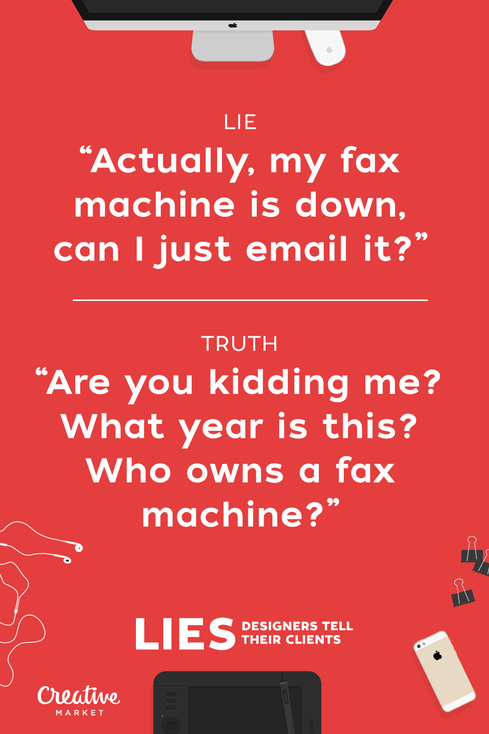
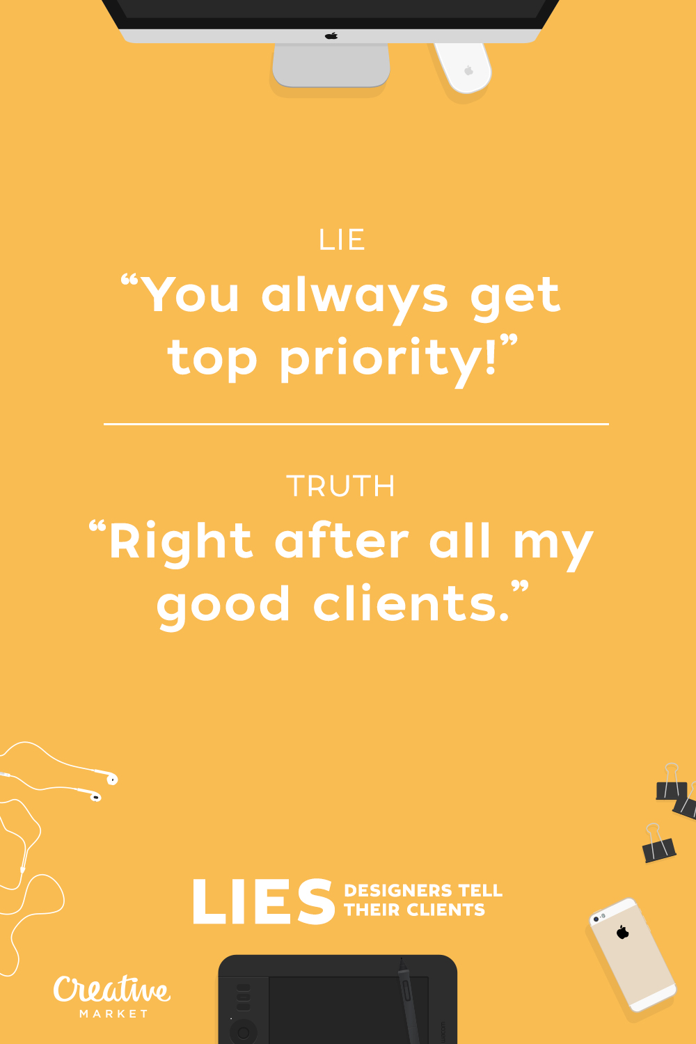
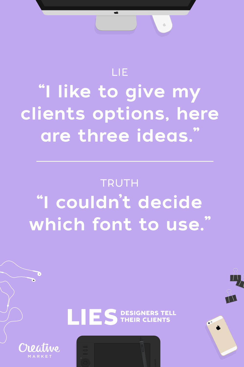
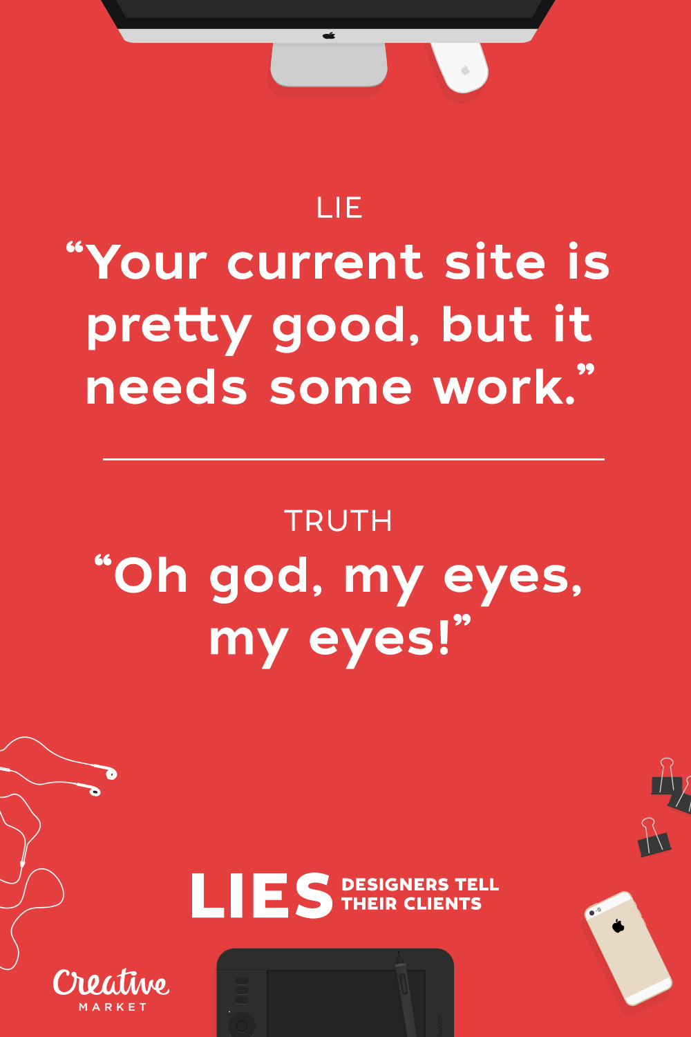
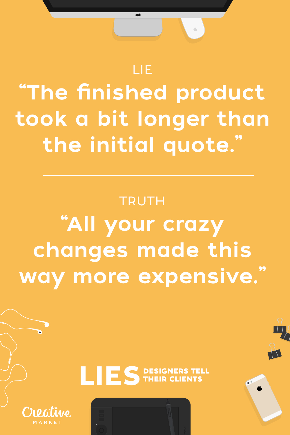
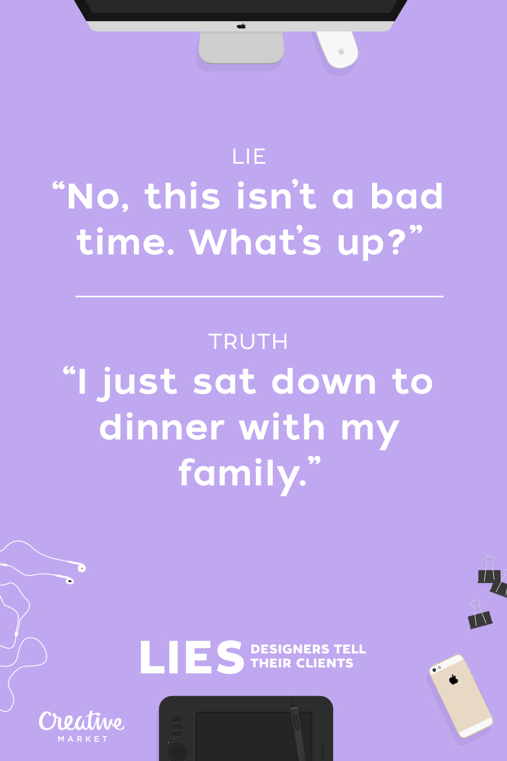
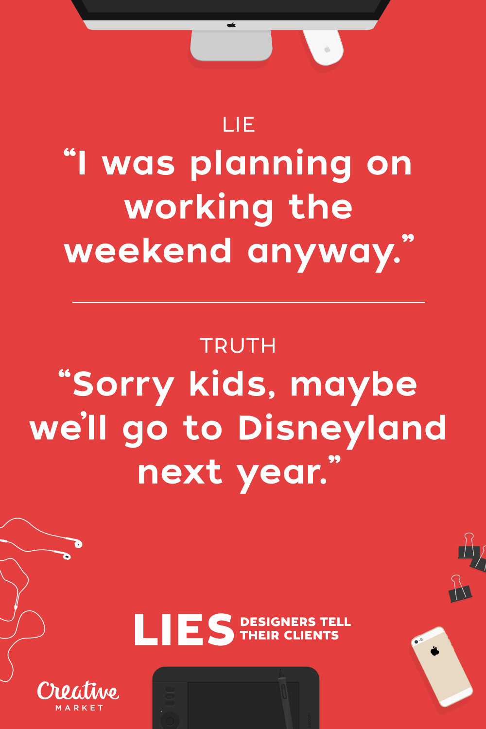
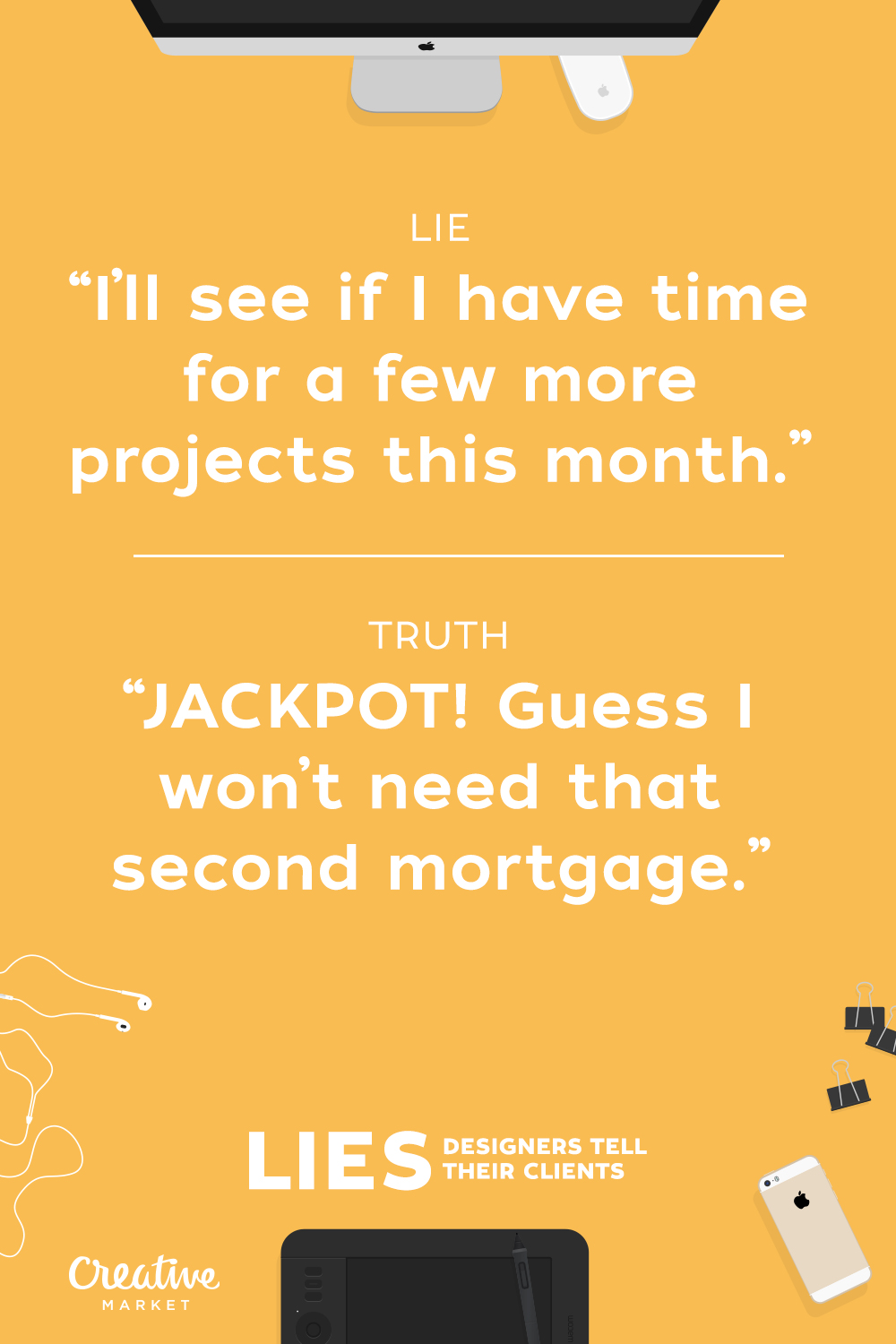
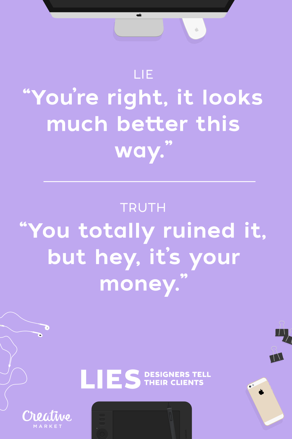
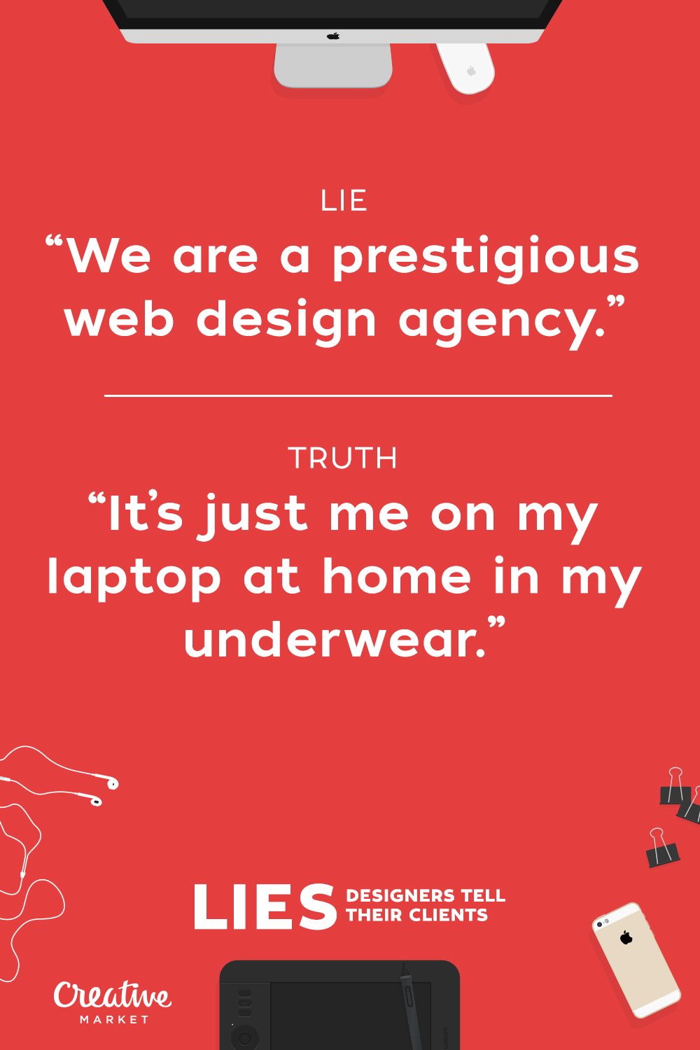
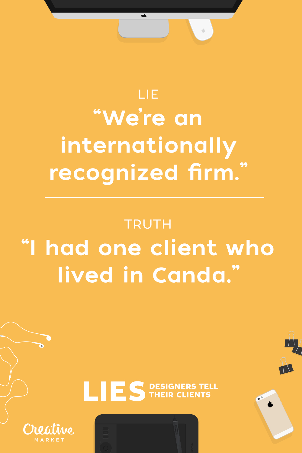
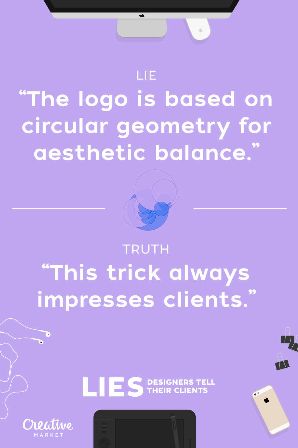
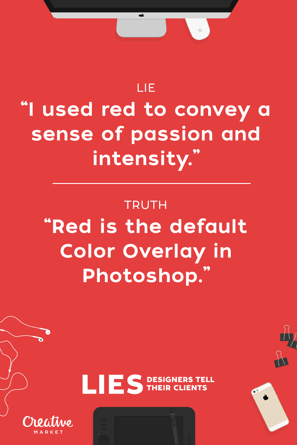
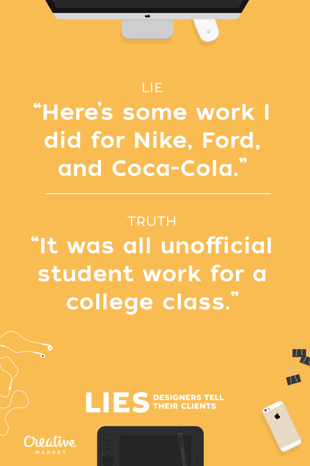
Some clients are amazing, others, not so much. No matter who your clients are though, I’m willing to bet you’ve told a few little white lies to them over the years. Nothing big, just a harmless little fib here and there. To prove it, we created a series of funny posters that show some typical designer lies and “half-truths.”
If you see a lie you’re guilty of telling, Pin, Tweet, or otherwise share it out. If you don’t see one that you relate to, write a new one and share it out on social media with the hashtag #designerLies. Remember, a little confession goes a long way!
One of the joys of being a freelancer is that, if you do your job, you’ll have clients who stay with you year after year. It really is nice to know that people appreciate your hard work and that you have built a trusting relationship.
After awhile, you might start to notice that some of those clients may be in desperate need of a site redesign. No, it’s not that the site you designed is that bad. But, after several years and several advancements in technology, a site may simply become outdated.
Personally, I feel like with each passing year I become better at what I do as both a designer and developer. A site I designed 5-10 years ago usually won’t measure up to the standards I have today.
Heck, there are times when I look at something I did one or two years ago and say "Wow, I wish I knew then what I know now. I may have added feature X or used script Y".
So, there are definitely selfish reasons for discussing a redesign. Both in terms of putting your best work out there and, of course, bringing in more revenue. That said, there are also times when outdated websites can have bad consequences for your clients.
Outdated websites leaves your client susceptible to:
Being bypassed by the competition.
Wasting precious time and money updating an old static HTML site or one with a clunky CMS from 2001.
SEO penalties from algorithm Google updates.
Possible security holes from outdated software or scripts.
Missing out on social media integration.
Failing to serve mobile visitors with a device-friendly version of their site.
Lack of browser compatibility.
What To Do About It
Perhaps the best way to approach your client on the subject of a redesign is to schedule some time to talk in person. You might even go that extra mile and buy them lunch.
When the subject of their website is brought up, tell them that you really believe they could benefit from a new website. List the benefits, including:
Save money and become more efficient with a new CMS such as WordPress.
The ability to create a custom template and functionality for mobile devices.
Take advantage of newer technologies to add new features.
Social media usage to increase the awareness of their brand.
Of course, the list can go on and on. The idea is to whet their appetite for what they are missing out on. From there, show them examples of some of your recent work. Point out specific features or layouts that you think may truly benefit your client. Explain how your other clients are using new technologies and how it has helped their business.
Keeping Their Budget In Mind
Your client may just be thrilled to hear about the latest and greatest you have to offer. Selling them on your skills is essential. But even more important to your client is how much the project will cost. Convincing them to spend money is always the bigger challenge.
One of the ways I like to present the idea of a redesign is to think of it as an investment in my client’s business. The investment isn’t just about a fancy-looking new site, it’s also about functionality and how it can potentially increase sales and make life easier.
Particularly for clients who spend a good bit of resources updating their site (whether they do it or pay you to do it), it’s a good idea to point out the cost savings of using WordPress, etc. This may not be as relevant to a client who just redesigned their site a couple of years ago. But, if we’re talking about clients who have gone 5+ years without a redesign, the cost savings argument can really convince them to go ahead with the project.
Most everyone you deal with will eventually ask you "How much does this cost?". It may be a good idea to have a rough draft proposal on hand. That way, you can give them a ballpark figure and still give yourself wiggle room depending on what the client wants to do.
In Conclusion
When you have a free moment, take a look at your portfolio. Study some of your older work and pick out a client or two who you feel could really benefit from a redesign. Go over their sites with a fine-toothed comb and figure out what it is they’re missing out on. Then, schedule some time to chat.
If you’ve built a trusting relationship, then they are more likely to really listen and consider your proposal. Be confident in what you say and don’t make promises you know you can’t keep. Just give them your best, most honest pitch. You just may end up with more work than you know what to do with (which could always be the subject of another post). Good luck!
When it’s time to be honest with a client, every designer gets a little nervous. If we ignore the truth about the website, we risk the consequences that will come from a bad design. If we approach it the wrong way, we may insult the client and jeopardize the relationship. So how can we deliver the bad news that our client’s website isn’t up to snuff? Here are a few ways to handle the tricky predicament.
1. Open up and be honest
In the professional world, the truism “Honesty is the best policy” is a necessity. Although designers don’t have to insult the client’s taste, they should be as upfront as possible. Try to use honest phrases like:
“The website design would be so much better if we tried (this).”
“Although I’m sure you like your website, users may click away because of the unfriendly design.”
“The website isn’t clean and will confuse the end user.”
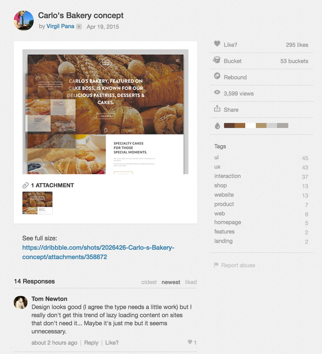
To get an idea about the types of respectful, objective comments that you can share with your client, take a look at the conversations that take place beneath every Dribbble shot.
2. Use data to convince the client
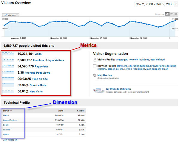
Designers should ask for access to Google Analytics (or similar analytics platforms) and use the numbers for their argument. Try looking at bounce rates, time spent on the page and how many pages visitors view per visit in order to try to come up with a solid argument against the unattractive website.
At the beginning of the project, ask the client what they hope to achieve with the new website. Use data to showcase how modifying the site’s design will help them achieve these goals. Take things a step further and find other case studies online that encourage an improved design to back up the rationale for change.
A metric is a numeric summary of users’ behavior as they visit your client’s website. The bounce rate, for instance, summarizes the percentage of single-page sessions to the site.
3. Discuss current best practices
Getting the client to change their website may mean helping them become more informed about best practices.
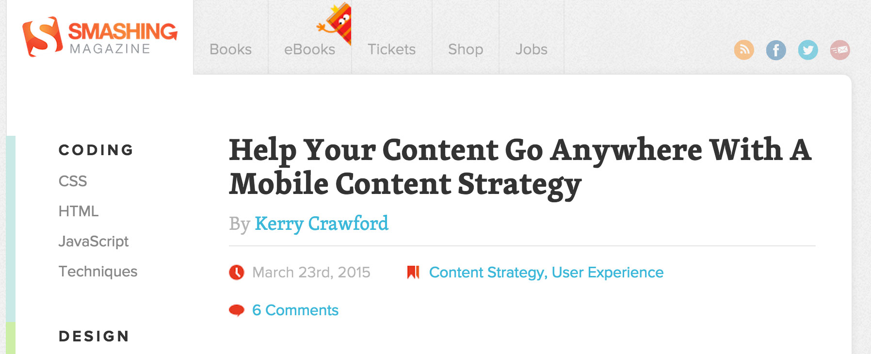
One great point: Google’s search results will demand a mobile-friendly website for SERP results. If the client does not have a mobile-friendly website, use this opportunity to argue the importance of having a responsive website (and modern design). Website has too many menus? Show the client a clean, updated website that simplifies navigation.
Sometimes, inspiring a scattered client with a competitors’ new website could make them consider what their own site could look like. This can make closing the deal much easier for the designer.
4. Use examples of better designs to point out flaws
Sometimes bad news are better when delivered with a solution. If the client is stuck on the hideous website, try to find similar designs that would be an upgraded makeover. Point out the flaws in their current design, but be prepared with a few mockups to make the transition smoother. If a designer has a client who is still amused by their current design, ask why they’re attached to it. Compromise by incorporating a few of those features in the mockups. Eventually, you will be able to come up with a design that works for everyone.
Sites like Awwwards and Dribbble constantly feature the best web design concepts out there. Follow them to feed your inspiration daily.
5. Play the expert card
Designers may feel uneasy about reminding their client of their expertise, but they were hired for a reason. Try to explain that paying for website upgrades is an investment, not a waste of money. The ROI will prove it. Show examples of similar websites that have had usability or search engine problems and compare the client’s websites to those. Use previous projects in your portfolio to provide evidence that your judgment and skill-set have succeeded in the past. If you are honest and open about your areas of expertise everyone will be better off.
To make it easier to share your expertise without sounding arrogant, build a personal portfolio site that displays previous successful projects. The following are great templates to get started:
A client who is resistant to change may frustrate everyone involved in the project. Clients can get attached to the status quo, and if your goal is to bring truly impactful change, then learning how to communicate what isn’t working will be an essential skill to master. How do you handle telling your client the bad news?
The online gaming industry is huge. I got pulled into it in 2009 by a friend of mine and haven’t looked back since. However, more recently I’ve been getting a little carried away on the way the online casino’s are gearing their websites towards their customers. They are mostly focusing on themselves and revenue they are generating and not on the well being or advice of their customers.
Therefore I decided to put together a short article outlining a few tips for the online casino’s out there.
Redesign and refocus
When you look at the most Casino sites online, you find that they are still geared the same as they were a couple of years ago. They are mostly focused on generated revenue and seldom worry about what their web presence actually look like. These online casino’s do run major marketing campaigns to get more attention and people interested, but at the end of the day it comes down to the basics. If it looks beautiful, more people will come back to it.
Mobile Friendly
With Google rolling out new updates pretty soon it’s important that Casino’s focus on getting their websites mobile-friendly. I’m not talking about mobile applications though, that’s another topic for another day. I’m talking about the website itself. If Google sees that the website isn’t mobile compatible, they will push down its ranking.
Faster Site Speed
Site speed is essential to their ranking on Google too. A lot of online casino websites load pretty slow because they aren’t fully optimized. Without optimization not only rankings will lack, but having a returning user base will too. People are impatient and don’t like to wait.
Minimalistic approach
Having an over cluttered website isn’t a good approach if you are looking to attract more customers, you need to slim down and focus on producing a minimalistic look that works well for your online casino. Minimalism is one of the trends a lot of companies are focusing on and the users are loving it. It’s wise to say that if an online casino were to follow suit, it would work in their favor.
Consumer in mind
Any company, doesn’t matter whether it’s a casino or not that only focuses on themselves and what they like are definitely not making a wise choice for their company future. It’s important that online casino’s start putting their customer happiness on the top of their priority list and that means developing their website geared towards customer happiness, usability and engagement.
I can’t stress enough how many online casino websites I’ve seen are out of date and they are going to have to pull up their socks to get into the game. It’s 2015 and their competitors are going to start to outrun them. I’m yet to see a casino that went completely minimalistic. If and when that happens, I’m sure they will win over a lot of customers from other online casino’s.
Designers and artists are pretty fashionable folks, as you may know. They like to get creative from the clothes they wear to how they organize their desks. If you’ve always wondered about what designers carry in their bags as well, you definitely want to pay attention to this.
Mijlo, a Dutch-based collective which has a backpack project you can back on Kickstarter, has reached out to a group of creatives from all over the world, asking them the essentials they have in their bags. On their site you can find about 100 of these designer bag exposés, so what we have here is just a sneak peek into what you can probably find in a designer’s bag.
Juani Lu is a designer, photographer and bookbinder from Toronto, who currently lives in Dubai. It is evident just how passionate she is about her craft with the particular items she uses for her craft like thread and the paper cutter. The camera, and a set of pens and markers in her bag complete her artistic endeavours.
Fabrizio Querida
Fabrizio Querida is a designer at a graphic design bureau based in Barcelona called Querida (which means lover in Spanish). The array of things featured in the picture display a quirky sense of style as well as humor. The subtle nods to pop culture are pretty cool as well.
Leta Sobierajski
Leta Sobierajski is a designer and Creative Director based in New York city, which explains the mug. What makes this display unique is the different combinations of item that seem to go together such as the radical pineapple with sunglasses and the lipstick holding figurine.
Amanda Cole
Amanda Cole is a graphic designer and illustrator from Newcastle, Australia. She is also co-founder of the Shorthand design studio. Instead of going the conventional route and taking a picture of her items, Amanda went with what she knew. You can really tell that she dials it back down to the real essentials.
Justin Broadbent
Justin Broadbent is an artist based in Canada. Judging by his collection of items military bag, Justin is a fan of coffee and skateboarding. It’s highly likely that he’s 32 years old and dabbles with different mediums of art.
Jordan Blyth
Jordan Blyth is the owner of a small design studio, JB Studio, that specializes in identity design and brand development. His fairly minimalistic style is depicted here by his choices which are black and white in color.
Ed Nacional
Ed Nacional is a freelance designer and illustrator from Brooklyn, New York. As you see, Ed is a fan of trade marks and symbols. He also uses the stylish field notes notebook and only takes a few things along with him.
Daniel Brokstad
What really strikes a person about this photograph is the arrangement of the stuff Daniel has. As a freelance graphic designer that also works in photography and illustration, the Norwegian has a particular elegant style that’s depicted by his accessories.
Kasia Kurek
Kasia is a Melbourne based freelance graphic designer. She is inspired by various people like Wes Anderson and Saul Bass and loves to experiment with different creative elements. Her playful and creative nature comes alive through her things in this photo.
Calen Knauf
Calen Knauf makes up half of the Knauf and Brown studio based in Vancouver, Canada. The contents of his bag are kind of weird: a pocket camera, notebook, sunglasses, a handy pocket knife and an old cell phone.
Adam Gray
A quick glance at the contents inside the bag and you can tell that Adam Gray is someone who loves the outdoors. The artist from San Francisco has a huge imagination as indicated by his selection. Definitely someone with a wide range of interests.
Polly Stanton
Polly uses photography, videos and sounds to reflect her view of the way human’s experience the world with all its features. In addition to her art, she also works in film and television which is reflected in the items that she carries in her bag.
Thorbjorn Gudnason
Originally from Denmark, Thorbjorn Gudnason is a New York based designer. He has a fondness for creating ideas that combine both Scandanavian simplicity and New York mentality which we can see. The contrast between his passport and the rest of his items which are black in color really highlight his taste.
Levi van Veluw
Levi van Veluw is a Dutchman who has produced varying artworks in a combination of different disciplines. The powertools displayed here showcases just how much he plays around with all sorts of materials.
Thibault Zimmermann
French artist Thimbault Zimmermann is a part of the Zim&Zou brand. Their specialty lies in creating wonderful installations out of phsycial objects although their preferred medium is paper. Thimbault’s vibrant personality comes through below.
Joe Perez
Joe Perez is a creative director and graphic artist based in Los Angeles, California. His clients consist of a lot of well-known musicians if you didn’t guess by the guitar and his general style.
Yah-Leng Yu
Yah-Leng Yu has worked with some renowned names in fashion. Currently she is one of the co-founder’s and a creative director at Foreign Policy Design, which is based in Singapore. You can sense the tropical vibe by the garments pictured below and the particular rustic sense of asthetic.
Adriana Barros
Adriana is a founder and award-winning designer of Scene 360’s Illusion. Scene 360 is a magazine featuring art, design, and films. As one would expect, as someone who is in charge, she needs a lot of tools in her bags, be it make up or artistic tools.
Amy Woodside
Amy Woodside is an artist and founder of OKREAL, a site which features stories of everyday women from all over the globe. Her own story unfolds her before our eyes. She comes across as down to earth and someone who appreicates the simple things in life.
Davy Rudolph
As the current Interactive Art Director at Apple, Davy Rudolph is someone who understands what the company is about. His Californian roots are showcased here in the form of the sunglasses and shoes. A fusion of elegance and simplicity.
Share with us what you have in yours in the comments below.