When it’s time to be honest with a client, every designer gets a little nervous. If we ignore the truth about the website, we risk the consequences that will come from a bad design. If we approach it the wrong way, we may insult the client and jeopardize the relationship. So how can we deliver the bad news that our client’s website isn’t up to snuff? Here are a few ways to handle the tricky predicament.
1. Open up and be honest
In the professional world, the truism “Honesty is the best policy” is a necessity. Although designers don’t have to insult the client’s taste, they should be as upfront as possible. Try to use honest phrases like:
- “The website design would be so much better if we tried (this).”
- “Although I’m sure you like your website, users may click away because of the unfriendly design.”
- “The website isn’t clean and will confuse the end user.”
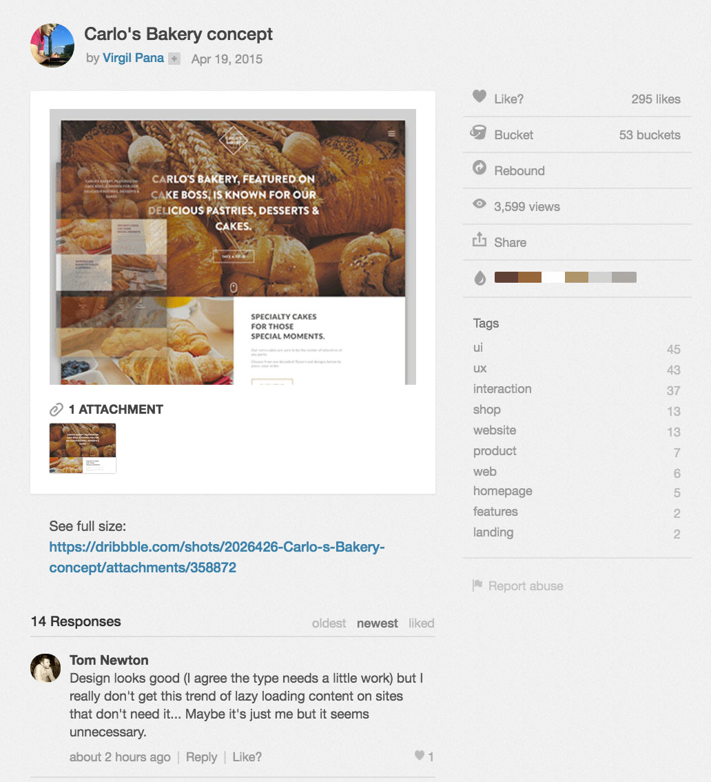
To get an idea about the types of respectful, objective comments that you can share with your client, take a look at the conversations that take place beneath every Dribbble shot.
2. Use data to convince the client
Designers should ask for access to Google Analytics (or similar analytics platforms) and use the numbers for their argument. Try looking at bounce rates, time spent on the page and how many pages visitors view per visit in order to try to come up with a solid argument against the unattractive website.
At the beginning of the project, ask the client what they hope to achieve with the new website. Use data to showcase how modifying the site’s design will help them achieve these goals. Take things a step further and find other case studies online that encourage an improved design to back up the rationale for change.
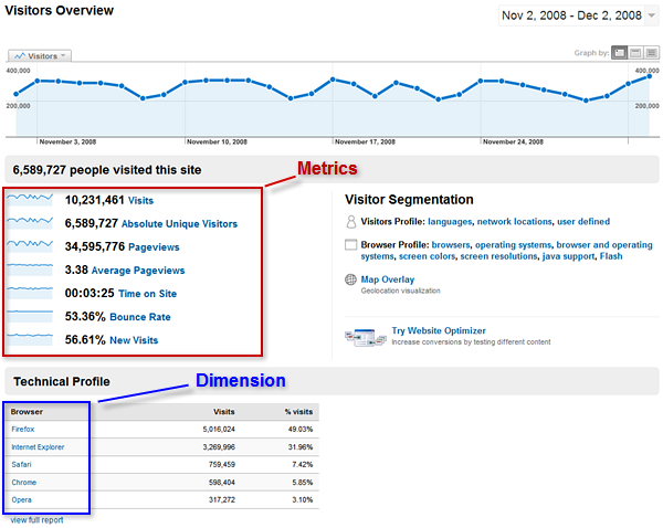
A metric is a numeric summary of users’ behavior as they visit your client’s website. The bounce rate, for instance, summarizes the percentage of single-page sessions to the site.
3. Discuss current best practices
Getting the client to change their website may mean helping them become more informed about best practices.
One great point: Google’s search results will demand a mobile-friendly website for SERP results. If the client does not have a mobile-friendly website, use this opportunity to argue the importance of having a responsive website (and modern design). Website has too many menus? Show the client a clean, updated website that simplifies navigation.
Sometimes, inspiring a scattered client with a competitors’ new website could make them consider what their own site could look like. This can make closing the deal much easier for the designer.
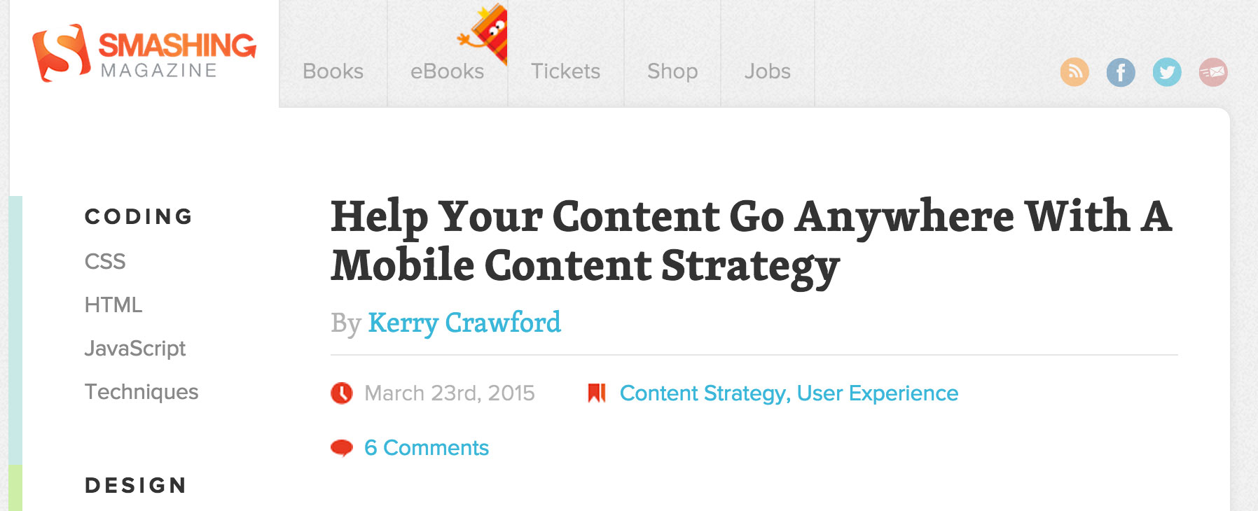
To stay informed about the newest best practices in the web design industry, follow sites like Smashing Magazine, Designer News, Web Designer Depot, and the Creative Market blog.
4. Use examples of better designs to point out flaws
Sometimes bad news are better when delivered with a solution. If the client is stuck on the hideous website, try to find similar designs that would be an upgraded makeover. Point out the flaws in their current design, but be prepared with a few mockups to make the transition smoother. If a designer has a client who is still amused by their current design, ask why they’re attached to it. Compromise by incorporating a few of those features in the mockups. Eventually, you will be able to come up with a design that works for everyone.
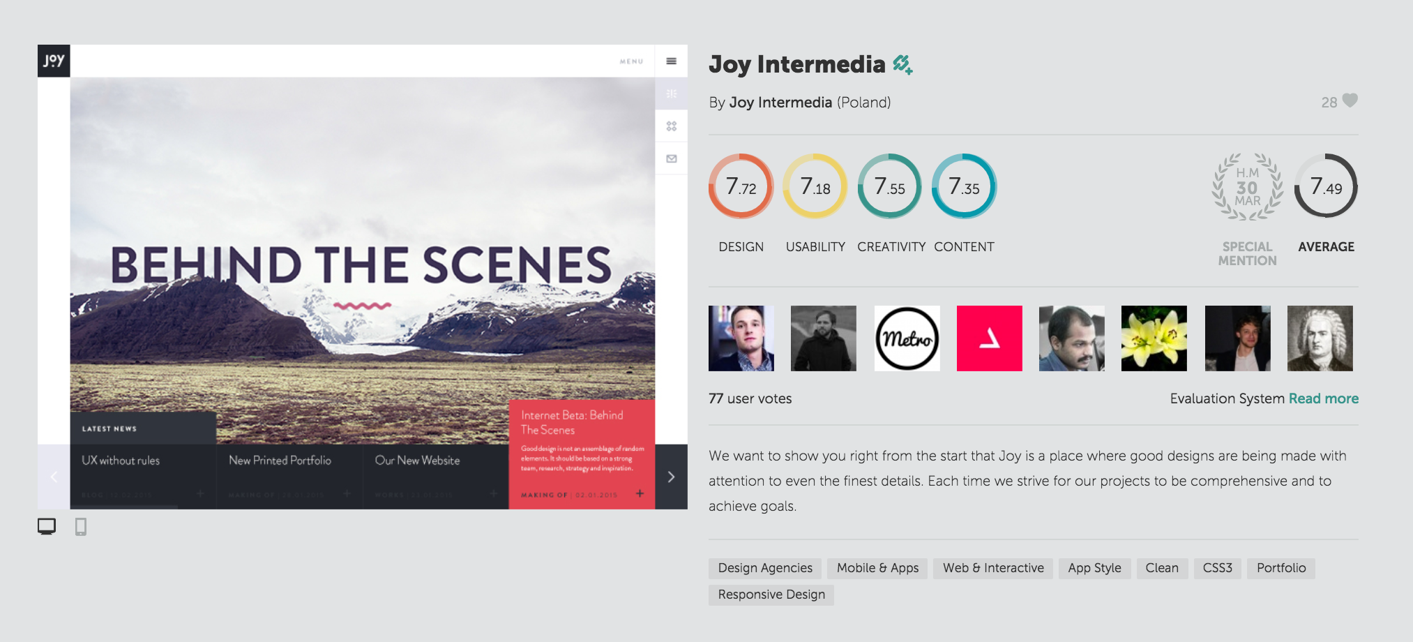
Sites like Awwwards and Dribbble constantly feature the best web design concepts out there. Follow them to feed your inspiration daily.
5. Play the expert card
Designers may feel uneasy about reminding their client of their expertise, but they were hired for a reason. Try to explain that paying for website upgrades is an investment, not a waste of money. The ROI will prove it. Show examples of similar websites that have had usability or search engine problems and compare the client’s websites to those. Use previous projects in your portfolio to provide evidence that your judgment and skill-set have succeeded in the past. If you are honest and open about your areas of expertise everyone will be better off.
To make it easier to share your expertise without sounding arrogant, build a personal portfolio site that displays previous successful projects. The following are great templates to get started:
A client who is resistant to change may frustrate everyone involved in the project. Clients can get attached to the status quo, and if your goal is to bring truly impactful change, then learning how to communicate what isn’t working will be an essential skill to master. How do you handle telling your client the bad news?
Products Seen In This Post:

5 Ways to Tell Your Clients Their Website is Hideous


No comments:
Post a Comment
Note: Only a member of this blog may post a comment.