iPixel Creative is a Singapore web design and development Company. At iPixel Creative, we provides web design solution which helps your company stand out from the competitors. Our Solutions includes web design, website development, cms development, ecommerce solution and hosting solutions.
In the final quarter of 2014, Adobe released a number of new apps on the Apple iOS App Store. One of those was Adobe Shape CC. In this article, we’ll explore the ways in which we can capture and edit high-fidelity vectors from real-life moments using the device camera on either an iPhone or iPad. We’ll also be able to save these captures in our Adobe Creative Cloud for further use in Photoshop, Illustrator, InDesign or the new Illustrator Draw.
Capturing the Light
Before we even open the app, it’s important to be in a well-lit area; this will improve the quality of our capture and save us a lot of time trying to edit rubbish vectors. Clear and concise shapes work best, this means that clouds in the sky won’t look as elegant as say a hand-sketched illustration with a fine liner. In fact, I’d still recommend using a digital SLR camera and image tracing the result in Adobe Illustrator for photo-realistic captures.
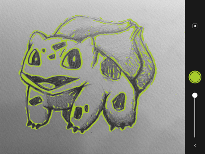
When you’re ready, take a snapshot.
Step 1: take a snapshot with the device camera
Altering Our Capture
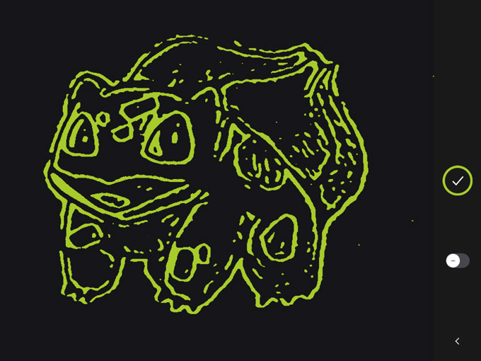
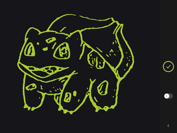
Before Adobe Shape converts our image to vector, we have two options that we can tweak to improve the capture. First, there is an icon that switches between Shape on light background and Shape on dark background. Dark background works more closely with the outline of our hand-drawn capture, whereas light background converts the areas we actually sketched — you can observe the differences in the two resulting images below.
Step 2: capture on a dark background
Step 3: capture on a light background
In the second option, we have a scrubber that will alter the threshold of the capture. Photoshop has this setting under Image>Adjustments>Threshold, and Illustrator can accomplish this with Image Trace, but Adobe Shape CC will let us alter the threshold directly after the capture.
Don’t be too disappointed by the result at this stage. Remember, the shape hasn’t been refined yet, the real magic is still to come.
Removing Unwanted Elements
When you’re done altering the image threshold, tap the green circle to continue. In this next screen, you’ll be offered the chance to remove any unwanted aspects of the shape before the vector is refined, which you can do by simply selecting the undesired blemish on the canvas.
If there’s only a tiny aspect of the shape that you require, switch the toggle button to “+” — this means “yes, we’ll keep only this part” instead of “yes, we’ll delete this part”. Tap the circle/tick icon when you’re ready to continue.
Refining Our Vector Shape
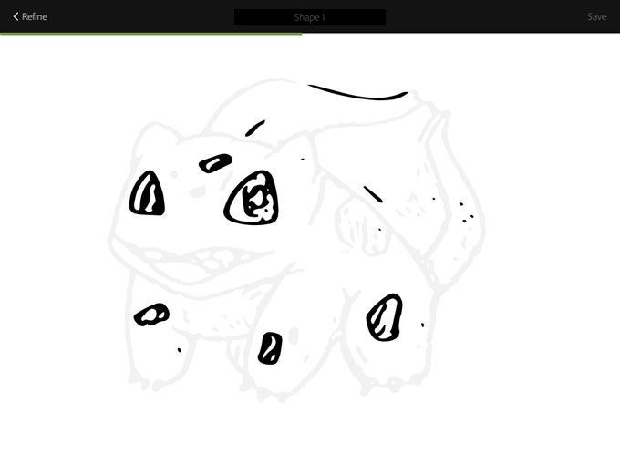
Now sit back while Adobe Shape refines our vector. It’s actually quite entertaining to watch, and it’s hard to resist the temptation to capture random shapes just so we can watch them being drawn.
Step41: refining our vector shape
When the refinement is complete, you’ll notice a drastic improvement in quality; Adobe Shape will also ask you to name this vector, and when you do so, it’ll be available in your Creative Cloud account under Libraries.
Great, What Now?
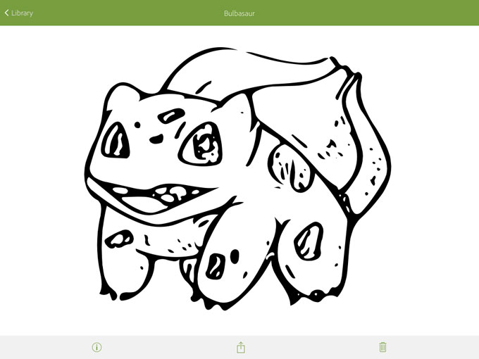
You’ll automatically be taken to the library and your first vector should be inside it. Here, you can look at your vector in more detail, create another vector, or invite other Creative Cloud members to collaborate in your library. Now select your vector and lets see what we can do with it.
Step 5: using our vector in Photoshop
We have three options: Rename, Share and Trash. Although we can share our vector via email, iMessage, Twitter and so on, it will be a JPG version. I was quite disappointed, but not shocked by this. Creative Cloud is, after all, a subscription-based service, and this is Adobe’s way of ensuring that the free mobile apps are being used by subscribers and not freeloaders.
In any Adobe desktop application like Photoshop, InDesign or Illustrator, you can open a file stored in the Creative Cloud library by navigating to Window>Libraries and dragging the vector onto the canvas. Just make sure that your application is running the newest Creative Cloud updates, because Libraries and SVG support are both new features.
Photoshop? SVG? Huh?
Photoshop CC has supported SVG files since its last update on the 6th October 2014. If we wanted to use our vector in a non-Adobe application (for example Sketch App 3) we could make use of Photoshop’s new Extract Assets feature to export the SVG onto our desktop. Illustrator of course fully supports opening, editing and exporting SVG files splendidly.
Conclusion
Adobe Shape CC is an excellent, time-saving mobile app for designers that work with vector, especially for Creative Market shop owners that seek inspiration from anywhere and everywhere. If you’re ever away from the computer and you come across a shape that inspires you, or you’ve drawn something and you’re not near a scanner, use Adobe Shape, capture your moment, and it’ll be waiting for you in the Creative Cloud later.
CSS3 elevates the feasibility of what we can build on websites using just HTML and CSS. You can find amazing examples that we have previously featured. But let’s not get too far ahead of ourselves, a complicated design will need codes that may give you a headache.
Instead, we are going to create something simple to help you understand shapes and positioning with CSS first, before venturing to more advanced designs. Since Valentine’s day is just around the corner, let’s create a heart shape using HTML and CSS.
Basically, we can create a new shape by joining one or more basic shapes, like rectangles and circles. If we examine a heart shape we can find that it is made up of two circles and a rectangle combined. HTML elements are essentially a square or rectangle. Thanks to CSS3 border radius we can transform a rectangle into a circle easily.
Begin by adding a <div> element as the foundation of our heart shape.
<div class="heart-shape"></div>
Then, we make it a square by specifying the width and the height equally. Choose a background color you like.
Rather than add new elements, we will make use of the pseudo-elements, :before and :after. We first set the :before pseudo-elements as our first circle. We make it a square with equal size on the width and height just like we did with the div. We then transform it into a circle by giving it border-radius of 50% and put it on the left side of the square.
Together with the square we will have a result like this:
After that, we create the second circle with the pseudo-element :after with the same styles as the first circle we created. Then, we also position it on the top of the square.
Ta-da! We have a heart shape, although it’s not in the right direction yet. To straighten it up, we will use CSS3 Transformation.
Transformation can be given to the main elements of shape; here, that means the square. When transformed, the pseudo-element will automatically change its position following the main element.
Here we will rotate the heart so it is seen "standing".
Notice that we now set the alpha channel of the rgba(250,184,66, 1) in the background to 1 to remove the transparency. Now this is what our Heart looks.
Now that we have a perfect heart shape, we can replace the background to another color (e.g. pink or red) with ease. The only downside here is that we could not add a border to the shape due to the stacked elements. Adding a border line will make the heart look weird.
Conclusion
With CSS3 creating a shape like a Heart shape is now easily doable. The border-radius property allows us to make elements or even a pseudo-element into a circle. With CSS3 transformation, we can rotate or move the coordinates of the object with ease.
You are limited only by your creativity and imagination!
CSS3 elevates the feasibility of what we can build on websites using just HTML and CSS. You can find amazing examples that we have previously featured. But let’s not get too far ahead of ourselves, a complicated design will need codes that may give you a headache.
Instead, we are going to create something simple to help you understand shapes and positioning with CSS first, before venturing to more advanced designs. Since Valentine’s day is just around the corner, let’s create a heart shape using HTML and CSS.
Basically, we can create a new shape by joining one or more basic shapes, like rectangles and circles. If we examine a heart shape we can find that it is made up of two circles and a rectangle combined. HTML elements are essentially a square or rectangle. Thanks to CSS3 border radius we can transform a rectangle into a circle easily.
Begin by adding a <div> element as the foundation of our heart shape.
<div class="heart-shape"></div>
Then, we make it a square by specifying the width and the height equally. Choose a background color you like.
Rather than add new elements, we will make use of the pseudo-elements, :before and :after. We first set the :before pseudo-elements as our first circle. We make it a square with equal size on the width and height just like we did with the div. We then transform it into a circle by giving it border-radius of 50% and put it on the left side of the square.
Together with the square we will have a result like this:
After that, we create the second circle with the pseudo-element :after with the same styles as the first circle we created. Then, we also position it on the top of the square.
Ta-da! We have a heart shape, although it’s not in the right direction yet. To straighten it up, we will use CSS3 Transformation.
Transformation can be given to the main elements of shape; here, that means the square. When transformed, the pseudo-element will automatically change its position following the main element.
Here we will rotate the heart so it is seen "standing".
Notice that we now set the alpha channel of the rgba(250,184,66, 1) in the background to 1 to remove the transparency. Now this is what our Heart looks.
Now that we have a perfect heart shape, we can replace the background to another color (e.g. pink or red) with ease. The only downside here is that we could not add a border to the shape due to the stacked elements. Adding a border line will make the heart look weird.
Conclusion
With CSS3 creating a shape like a Heart shape is now easily doable. The border-radius property allows us to make elements or even a pseudo-element into a circle. With CSS3 transformation, we can rotate or move the coordinates of the object with ease.
You are limited only by your creativity and imagination!