Showing posts with label Creating. Show all posts

Wednesday, June 10, 2015

Creating A Local Server Accessible From A Public Address

I’ve been developing websites for the better part of 10 years and one of my biggest issues was always local development and syncing local sites to live tests. Using a local environment is great because it is fast, but it isn’t viewable from afar and transfering somewhere means database operation, renaming tables, values and so on.


In this article, I’ll show you an easy way to run a local server which you can access from your phone and other mobile devices natively, and also broadcast over the Internet, which means sharing your work with clients, without leaving good ol’ localhost.


Using Vagrant To Create A Local Environment


A short while ago I wrote an article here on Hongkiat about using Vagrant so I’ll only go over the basics here. For more info, take a look at the article!


To get started, you’ll need to grab and install VirtualBox and Vagrant. Both are free and used to create a virtual machine which will run your server.


Now, create a folder to store your websites in. Let’s use a directory named “Websites” within our main user directory. That would be /Users/[username]/Websites on OS X and C:/Users/[username]/Websites on Windows.


Create a new folder named wordpress. This is where I’ll create the virtual machine. The idea is that each folder within Websites houses a separate virtual machine. While you can put as many websites on one virtual machine as you’d like, I do like to group them out by platforms — eg: WordPress, Laravel, Custom


For the purposes of this tutorial I’ll be creating a WordPress website.


Inside the WordPress folder we’ll need to create two files, Vagrantfile and install.sh. These will be used to set up our virtual machines. Jeffrey Way has created two great starter files; you can grab his Vagrantfile and install.sh files.


Next, using the terminal, navigate to the WordPress directory and type vagrant up. This will take a while, since the box needs to be downloaded and then installed. Grab a cup of coffee and check out this post on 50 WordPress tips while you wait.


Once the process is complete you should be able to go to 192.168.33.21 and see a properly served page. You content folder should be the html folder within the WordPress directory. You can now start adding files, install WordPress, or anything else you’d like.


Don’t forget to read the full Vagrant guide for more info on creating virtual hosts, mapping domains like mytest.dev and so on.


Opening Local Sites On The Same Network Using Gulp


While building a site you should be thinking about responsiveness. Small screens can be emulated to some extent by narrowing the browser window, but it’s just not the same experience, especially if you throw retina screens in the mix.


Ideally you’ll want to open your local website on your mobile devices. This is not too difficult to do, provided your devices are on the same network.


To get this done we’ll be using Gulp and Browsersync. Gulp is a tool for the automation of development, Browsersync is a great tool that can not only create a local server but syncronize scrolling, clicks, forms and more across devices.


Installing Gulp


Installing Gulp is very easy. Head on over to the Getting Started page for the instructions. One pre-requisite is NPM (Node Package Manager). The easiest way to get this is to install Node itself. Head on down to the Node Website for instructions.


Once you’ve used the npm install --global gulp command to install gulp globally, you need to add it to your project. The way to do this is to run npm install --save-dev gulp in the root folder of your project, then add a gulpfile.js file there.


At the moment let’s add a single line of code inside that file which indicates that we will be using Gulp itself.


var gulp = require("gulp");

If you’re interested in all the cool things Gulp can do like concatenating scripts, compiling Sass and LESS, optimizing images and so on, read our Guide To Gulp. In this article we’ll be focusing on creating a server.


Using Browsersync


Browsersync has a Gulp extension which we can install in two steps. First, let’s use npm to download it, then we add it to our Gulpfile.


Issue the npm install browser-sync gulp --save-dev command in the project root in the terminal; this will download the extension. Then, open the Gulpfile and add the following line to it:


var browserSync = require("browser-sync").create();

This lets Gulp know that we’ll be using Browsersync. Next we’ll define a task which controls how Browsersync will work.


gulp.task("browser-sync", function() browserSync.init( proxy: "192.168.33.21" ); );

Once added, you can type gulp browser-sync into the terminal to start a server. You should see something like the image below.


There are four separate URLs there, here’s what they mean:


  • Local: The local URL is where you can reach the server on the machine you’re running it on. In our cases you can use 192.168.33.21 or you can use the one provided by Borwsersync.

  • External: This is the URL you can use on any device connected to the network to reach the website. It will work on your local machine, your phone, tablet and so on.

  • UI: This URL points to the options for the currently running server. You can see connections, set up network throttling, view history or sync options.

  • External UI: This is the same as the UI, but accessible from any device on the network.

Why Use Browsersync?


Now that we’re done with this phase you might be thinking: why use Browsersync at all? The URL 192.168.33.21 can also be reached from any device. While this is so, you would need to install WordPress to this URL.


I usually use virtualhosts and have domains like wordpress.local or myproject.dev. These resolve locally so you can’t visit wordpress.local on your mobile phone and see the same result as on your local computer.


So far so good, we now have a test site which can be accessed from any device on the network. Now it’s time to go global and broadcast our work over the internet.


Using ngrok To Share Our Localhost


ngrok is a tool you can use to create secure tunnels to your localhost. If you sign up (still free) you get password protected tunnels, TCP and multiple simultaneous tunnels.


Installing ngrok


Go to the ngrok download page and grab the version you need. You can run it from the folder it is in or move it to a location that allows you to run it from anywhere. On Mac/Linux you can run the following command:


sudo mv ngrok /usr/local/bin/ngrok

If you get an error that this location doesn’t exist, simply create the missing folders.


Using ngrok


Thankfully this part is extremely simple. Once you’re running your server via Gulp, take a look at the port it is using. In the example above, the local server is running at http://localhost:3000 which means it is using port 3000. In a new terminal tab, run the following command:


ngrok http 3000

This will create an accessible tunnel to your localhost, the result should be something like this:


The URL you see next to “Forwarding” is what you can use to access your website from anywhere.


Conclusion


At the end of the day we can now do three things:


  • View and work on our project locally

  • View our website via any device on the network

  • Let others view our work anywhere with a simple link

This will allow you to focus on development instead of racing to keep local and test servers in sync, migrating databases and other worrisome tasks.


If you have a different method of working locally and sharing the result, let us know!


Creating A Local Server Accessible From A Public Address

Creating A Local Server Accessible From A Public Address

I’ve been developing websites for the better part of 10 years and one of my biggest issues was always local development and syncing local sites to live tests. Using a local environment is great because it is fast, but it isn’t viewable from afar and transfering somewhere means database operation, renaming tables, values and so on.


In this article, I’ll show you an easy way to run a local server which you can access from your phone and other mobile devices natively, and also broadcast over the Internet, which means sharing your work with clients, without leaving good ol’ localhost.


Using Vagrant To Create A Local Environment


A short while ago I wrote an article here on Hongkiat about using Vagrant so I’ll only go over the basics here. For more info, take a look at the article!


To get started, you’ll need to grab and install VirtualBox and Vagrant. Both are free and used to create a virtual machine which will run your server.


Now, create a folder to store your websites in. Let’s use a directory named “Websites” within our main user directory. That would be /Users/[username]/Websites on OS X and C:/Users/[username]/Websites on Windows.


Create a new folder named wordpress. This is where I’ll create the virtual machine. The idea is that each folder within Websites houses a separate virtual machine. While you can put as many websites on one virtual machine as you’d like, I do like to group them out by platforms — eg: WordPress, Laravel, Custom


For the purposes of this tutorial I’ll be creating a WordPress website.


Inside the WordPress folder we’ll need to create two files, Vagrantfile and install.sh. These will be used to set up our virtual machines. Jeffrey Way has created two great starter files; you can grab his Vagrantfile and install.sh files.


Next, using the terminal, navigate to the WordPress directory and type vagrant up. This will take a while, since the box needs to be downloaded and then installed. Grab a cup of coffee and check out this post on 50 WordPress tips while you wait.


Once the process is complete you should be able to go to 192.168.33.21 and see a properly served page. You content folder should be the html folder within the WordPress directory. You can now start adding files, install WordPress, or anything else you’d like.


Don’t forget to read the full Vagrant guide for more info on creating virtual hosts, mapping domains like mytest.dev and so on.


Opening Local Sites On The Same Network Using Gulp


While building a site you should be thinking about responsiveness. Small screens can be emulated to some extent by narrowing the browser window, but it’s just not the same experience, especially if you throw retina screens in the mix.


Ideally you’ll want to open your local website on your mobile devices. This is not too difficult to do, provided your devices are on the same network.


To get this done we’ll be using Gulp and Browsersync. Gulp is a tool for the automation of development, Browsersync is a great tool that can not only create a local server but syncronize scrolling, clicks, forms and more across devices.


Installing Gulp


Installing Gulp is very easy. Head on over to the Getting Started page for the instructions. One pre-requisite is NPM (Node Package Manager). The easiest way to get this is to install Node itself. Head on down to the Node Website for instructions.


Once you’ve used the npm install --global gulp command to install gulp globally, you need to add it to your project. The way to do this is to run npm install --save-dev gulp in the root folder of your project, then add a gulpfile.js file there.


At the moment let’s add a single line of code inside that file which indicates that we will be using Gulp itself.


var gulp = require("gulp");

If you’re interested in all the cool things Gulp can do like concatenating scripts, compiling Sass and LESS, optimizing images and so on, read our Guide To Gulp. In this article we’ll be focusing on creating a server.


Using Browsersync


Browsersync has a Gulp extension which we can install in two steps. First, let’s use npm to download it, then we add it to our Gulpfile.


Issue the npm install browser-sync gulp --save-dev command in the project root in the terminal; this will download the extension. Then, open the Gulpfile and add the following line to it:


var browserSync = require("browser-sync").create();

This lets Gulp know that we’ll be using Browsersync. Next we’ll define a task which controls how Browsersync will work.


gulp.task("browser-sync", function() 
browserSync.init(
proxy: "192.168.33.21"
);
);

Once added, you can type gulp browser-sync into the terminal to start a server. You should see something like the image below.


There are four separate URLs there, here’s what they mean:


  • Local: The local URL is where you can reach the server on the machine you’re running it on. In our cases you can use 192.168.33.21 or you can use the one provided by Borwsersync.

  • External: This is the URL you can use on any device connected to the network to reach the website. It will work on your local machine, your phone, tablet and so on.

  • UI: This URL points to the options for the currently running server. You can see connections, set up network throttling, view history or sync options.

  • External UI: This is the same as the UI, but accessible from any device on the network.

Why Use Browsersync?


Now that we’re done with this phase you might be thinking: why use Browsersync at all? The URL 192.168.33.21 can also be reached from any device. While this is so, you would need to install WordPress to this URL.


I usually use virtualhosts and have domains like wordpress.local or myproject.dev. These resolve locally so you can’t visit wordpress.local on your mobile phone and see the same result as on your local computer.


So far so good, we now have a test site which can be accessed from any device on the network. Now it’s time to go global and broadcast our work over the internet.


Using ngrok To Share Our Localhost


ngrok is a tool you can use to create secure tunnels to your localhost. If you sign up (still free) you get password protected tunnels, TCP and multiple simultaneous tunnels.


Installing ngrok


Go to the ngrok download page and grab the version you need. You can run it from the folder it is in or move it to a location that allows you to run it from anywhere. On Mac/Linux you can run the following command:


sudo mv ngrok /usr/local/bin/ngrok

If you get an error that this location doesn’t exist, simply create the missing folders.


Using ngrok


Thankfully this part is extremely simple. Once you’re running your server via Gulp, take a look at the port it is using. In the example above, the local server is running at http://localhost:3000 which means it is using port 3000. In a new terminal tab, run the following command:


ngrok http 3000

This will create an accessible tunnel to your localhost, the result should be something like this:


The URL you see next to “Forwarding” is what you can use to access your website from anywhere.


Conclusion


At the end of the day we can now do three things:


  • View and work on our project locally

  • View our website via any device on the network

  • Let others view our work anywhere with a simple link

This will allow you to focus on development instead of racing to keep local and test servers in sync, migrating databases and other worrisome tasks.


If you have a different method of working locally and sharing the result, let us know!


Creating A Local Server Accessible From A Public Address

Sunday, May 31, 2015

5 Things I Learned from Creating My Own Fonts

Fact: There are over 1.2 gazillion fonts in the world. Well, maybe that’s not an exact figure (or a real one at that), but if you’ve recently looked online in a hunt after the perfect serif, sans, display, or dingbat, you’ll have noticed that there are countless options.


The perfect typeface can make the difference between a good design and a great one (though I can’t say that it will bring a mediocre piece to greatness). The wrong typeface, however, can make an otherwise great design suffer.


I’ll spare you the smug jokes about Comic Sans and Papyrus, but in today’s fast-paced design world, using notoriously over-used typefaces is a thing of the past. With easily accessible font-creation software, and online seller markets like Creative Market, practically anyone can design and create their own fonts. Today, I’d like to share with you my own experience, and some of the things I’ve learned over the last year.


1. Try it, You Might Like It


When I opened my Creative Market shop a little over a year ago, my intention was to create and share things that I love, and that would be useful to other designers. I was drawn to creating clip art and patterns, and had never thought about the seemingly daunting task of creating a font! It wasn’t long before I was overcome with inspiration and itching to try my hand at typeface design.


image 1


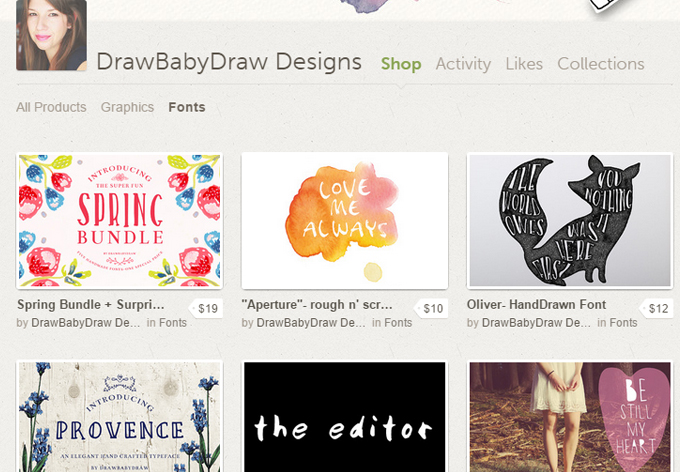
A peek at some of the fonts I’ve created since opening my Creative Market shop.


A quick Google search led me Paintfont.com, an admittedly amateurish program made to let anyone draw and scan their characters, upload their printable, and install their own font in minutes!


image 5


PaintFont’s printable template


Let me be the first to tell you: it’s far from perfect. Once scanned, the program will slightly smooth and simplify your scanned characters, and you don’t get any say in the kerning, and as for any tweaks you want to make, you’ll need to start over… it’s basically hit or miss.


I made these slight imperfections work for me, by creating purposely awkward, hand-drawn fonts, and have been really pleased with the positive feedback that came my way.


If it sounds unappealing, perhaps you’ll reconsider when I tell you that professional font creation software (called font editors) can cost hundreds of dollars, and PaintFont is free. I would definitely recommend trying it out, just to test out if type design is for you.


2. Find your Style


It can be intimidating to try and dip your toe in what is a super-saturated market. But remember, you’re the best person at being you, so instead of trying to mimic what’s already out there, find your voice as a designer and share it with the rest of us!


image 4
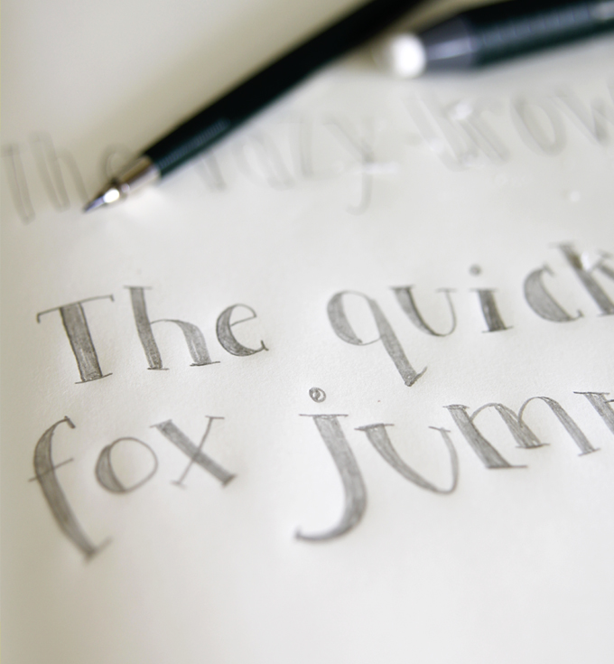
Your sketchbook is the perfect place to start brainstorming ideas for a new typeface


A good place to start is creating your own handwriting into a font (as long as it’s legible) people love unique hand-drawn styles.


3. Be Willing to Spend the Big Bucks


I recently splurged on Fontlab Studio, one of the more well-known font editors. By splurged I mean I cried as I typed in my credit card number. (Just kidding. I only cried when I actually opened FontLab for the first time, more on that in a moment.)


But I considered it an investment: as I make better fonts, I can feel comfortable charging more for them, and eventually it will pay off.


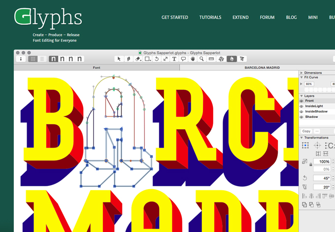
Another popular font editor is Glyphs Mini, but there are many more options out there, so do some research to find which editor is right for you.


image 3
Glyphs is just one of many font editors out there


4. There’s A Steep Learning Curve


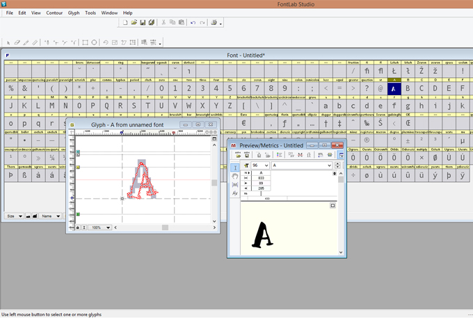
As I mentioned, I was taken aback by all the menu options in the program. I thought that knowing what ‘kerning’ and ‘leading’ meant was enough. Boy was I wrong!


Luckily, you don’t have to utilize all (or even most) of the options, but you will have to take the time to learn quite a few of the basics.


image 2
FontLab Studio


You’ll find plenty of resources to help you learn the ropes, and many forums and friendly advice from fellow type designers are available on the Internet.


5. Have Fun and Always Grow


Creating a font is a labor of love. From finding a way to make all your characters work cohesively, to slowly but surely fine tuning them in illustrator, and finally painstakingly perfecting the kerning, seeing a typeface through from idea to fruition can take weeks and months.


Is that a long time? In my opinion, yes. Is it awesome to see some of your fonts adorning some amazing designs and products out in the world, and to know that you’re a part of it? Big yes.


I’d love to know, have you given typeface design a try? Did you like it? What tips would you share with someone who’s eager to give it a go?


Shelly Laslo is a graphic designer and illustrator. She is the owner of DrawBabyDraw Designs, where she sells handmade design resources which give your work a unique, one-a-kind charm. You can also check out her work on Instagram.

Products Seen In This Post:


getpaidtowrite-banner
5 Things I Learned from Creating My Own Fonts

Friday, May 8, 2015

Learn The Trick to Creating Seamless Patterns in Illustrator

We’re teaming up with Skillshare to bring you some fantastic premium design tutorials. In this post, you’ll see an excerpt from Bonnie Christine’s class on surface pattern design. She’ll teach you how to quickly and easily create seamless, repeating patterns in Adobe Illustrator.


If you’ve ever tried to make a seamless pattern on your own, you know that it’s a tricky task. Bonnie’s method is so simple though, you won’t believe how quickly you can make awesome vector patterns.


This is just a small sample of Bonnie’s awesome full course on pattern creation. Head over to Skillshare to view the other videos.


Popular Patterns


getpaidtowrite-banner
Learn The Trick to Creating Seamless Patterns in Illustrator

Thursday, April 16, 2015

5 Tips for Creating a Stunning Business Card Design

No matter what kind of business/organisation you run, having a well-designed business card is critically important to your success.


Your business card will often serve as an introduction to your business, and therefore, will be the first thing that potential clients see in regards to you and your company.


They’ll likely see your business card before they see your website, your brochure, your leaflet, or just about any other branded material you might happen to have; yet still, a large percentage of companies choose not to invest in a high quality business card design.


This is crazy. But often, there’s a simple reason for this: it’s hard to know what makes a stunning business card in the first place.


If this is the case for you, then fear no longer, as we’ve created a list of five top business card design tips to get you on your feet. They’re simple, easy to follow, and best of all, easy to implement.


Here you go:


Create a Clear Design Hierarchy


1
Source: http://dot-design.com/

Perhaps the most crucial aspect of any business card is a sense of hierarchy within the design.


But what exactly does this mean? Well, it’s really nothing more than a fancy way of saying, “put more emphasis on the most important points, and less emphasis on the least important”.


You can see a good example of this above (the Dot Design business card). You’ll notice that despite the use of the same typeface throughout, the designer has used a large (ish) bold typeface for the person’s name (Gareth Coxon), whereas the job title (Creative Director) is written in the same sized font, but with a regular font weight.


You’ll notice that this sense of hierarchy continues, with the phone number, mobile number, email address, website URL, and twitter handle all being featured in a regular weighted smaller font size.


This is a simple and elegant way of giving more precedence to the most important information (and least precedence to the least important).


2
Source: https://www.behance.net/gallery/FF-F/4201995

It doesn’t always have to be this obvious though. For example, this business card (Form Feel & Function) uses the same font weight for much of the text, but there is subtle hierarchy in the order of the information (i.e. name first, then job title, then telephone information, and so forth).


3
Source: http://www.blushpublishing.co.uk/

Strangely, not everyone does this, and you’ll often see business cards that make use of the same font weight, size and type throughout, giving no sense of which information is important and which isn’t.


One example of this is above. You’ll notice that initially, the white font colour is used for less important information (i.e. the “an obsessive men’s denim store” subheading), but then further down the card, it’s used for extremely important information such as the person’s name and company website URL.


The problem is that the white text stands out much less than the black text, despite its larger size. It’s also hard to read when compared to the black text.


Make the Business Card an Extension of Yourself (or Your Brand)


Another extremely important aspect of business card design is to ensure that the business card itself as an extension of yourself (or your brand, if your company is particularly large and has many employees).


Your business card will often be the first branded marketing material that potential customers/clients see, so it’s important that it gives them a sense of what you/your company are all about.


Here’s a good example:


4
Source: https://www.behance.net/gallery/PERCONTE-Stationery/9667999

To those with a love for more “flamboyant” design, this might look like a relatively dull and boring business card, but it certainly has a sense of class, luxuriousness, and simplicity. It’s also extremely well designed and professional.


It’s the type of business card that appeals to a certain person and therefore, a certain type of client/customer.


What’s more, it gives a great insight into the brand itself. When you look at this business card, can imagine a team of highly skilled designers, all of whom have a professional work ethic and a passion for minimalism and simplicity.


That’s just the impression it gives, and this is intentional.


5
Source: https://www.behance.net/gallery/PERCONTE-Stationery/9667999

It also fits in with the rest of their branded marketing materials by using the same typography, colours, styling, etc. (see above).


6
Source: http://www.boredpanda.com/creative-business-card-designs/?image_id=creative-business-cards-4-22-3.jpg

Similarly, this business card gives a completely different impression and gives insight into their particular brand.


From this card, you get the sense of a fun, down-to-earth brand that doesn’t take itself too seriously. You get the impression that the owner would be fun to talk to, and likely wouldn’t use big complicated words if he didn’t need to.


It’s also slightly less pretentious than the previous business card.


The bottom line is that your business card should give your customers an insight into your brand by using consistent typography, colours, copy, and overall, giving an impression of the values/traits your company brand has.


Highlight Important Points (with Special Finishes)


Although you’ve already got the basics of your business card design covered (by creating a sense of hierarchy), you can take this even further by highlighting important points even further.


You can use a variety of techniques to do this, but two of the most common are spot UV printing, and the letterpress technique.


Spot UV printing is pretty straightforward: it essentially allows you to highlight certain aspects of your business card using a glossy varnish. It’s a subtle technique and it looks stunning when used wisely.


Here’s an example of spot UV in action:


7
Source: http://www.fastprint.co.uk/business-cards/

You can see that it’s used here to subtly draw attention to the logo (which is black text on a black background), as well as the contact information on the back of the card.


It’s extremely subtle, which is what makes spot UV printing so powerful.


Another technique is to make use of a printing process called letterpress printing. This essentially indents patterns/lettering into your card to create a unique and subtle design.


Here’s an example:


8
Source: http://www.bryondarby.com/

You can see that there is a subtle repeated design pattern etched into the card; the word “photographer” is also written using this technique.


When used wisely (like this), the letterpress technique is a subtle way to attract attention.


So, not only do both of these techniques add to the sense of hierarchy, but they also give your business card an edge over the competition in terms of the design aesthetic, as most of your competitors likely haven’t put as much thought into the presentation of their brand as you have.


Stick to 2-3 Colours (Maximum!)


This is a really straightforward and simple point that you’ve likely seen reiterated hundreds of times across the web, but still, a lot of people don’t stick to it.


If you look at any of the business cards featured so far in this post, you’ll notice that all of them adhere to this rule: none of them use more than 2-3 colours, maximum.


Why? Because utilising any more colours will usually result in a cluttered and confusing design.


Here’s an example:


9
Source: https://wordsonimages.wordpress.com/2013/03/10/bad-business-card/

Now, there’s clearly a lot wrong with this business card (typography, image choices, etc.) but colour is one of the largest issues. There must be at least 5-6 completely different colours in use here and as you can see, it doesn’t look great.


So, stick to 2-3 colours, and not just any 2-3 colours either, but the colours that your brand is known for, like this brand has done:


10
Source: http://inspirationfeed.com/inspiration/35-perfect-examples-of-branding-design/

If you were Facebook, this would be black, blue and white; if you were Apple, well, it would probably just be black and white. If you were you? Well, you are you, so figure it out!


Avoid Using Borders


Last but not least, we want to leave you with an exceptionally simple but often overlooked design tip: try to avoid using borders.


Now, this might sound a bit weird, but let us explain:


11
Source: https://help.market.envato.com/hc/en-us/articles/202821070-Business-Card-Templates

When your business card gets printed, it’s printed with something called bleed and trim areas (shown above).


As the image quite rightly demonstrates, the trim line is where your business card will get trimmed after the printing process. So, anything outside of this line will be physically cut off.


But, this isn’t always 100% accurate (which is why you have a bleed area, to ensure that no “important” information is accidentally trimmed off).


So, if you have a border on your business card, it might end up slightly uneven on each side after the trimming process.


To demonstrate this, here’s how Sarah (from Sarah Yost Design) had envisioned her business cards to look:


12
Source: http://sarahyostdesign.com/blog/category/my-work/

And here’s how they actually looked when she received them:


13
Source: http://sarahyostdesign.com/blog/category/my-work/

Not great, right?


This is all because of the issue with the trimming process and the borders.


If you really do want to use borders in your business card design, it would be best to have a chat with your chosen printing company, and ask for a guarantee that the cards will be produced how you want them (or your money back?).


5 Tips for Creating a Stunning Business Card Design

Thursday, April 2, 2015

Superb Resources for Creating Popular Artistic Effects

There’s a range of effects designers often need to produce in their artwork. Watercolour effects, sketched effects, printed effects and illustrated effects are examples of popular styles that can take considerable amounts of time (and skill) to create manually using traditional tools. Thankfully there are time saving kits that allow us to produce realistic effects without the hassle or the mess. A wide selection of these kits have just become available in one complete bundle over at Design Cuts; The Beautifully Artistic Designer’s Kit contains 23 best selling premium resources that help you create stunning artwork with ease.


The Beautifully Artistic Designer


Photoshop Actions, Smart PSDs, Vectors, Textures and Brushes are just some of the items that make up this entire bundle. 23 best selling premium design products have been combined to produce an all-in-one kit that helps you create a variety of popular design styles. Any effect that leaves you thinking ‘I couldn’t create that!’ or ‘it would take me absolutely ages to create that!’ can be easily achieved with these superb resources. Here’s an overview at some of the coolest results these resources can generate in seconds.


Watercolour Effects


Watercolour effect resources


Creating watercolour effects has never been so easy with the resources included in this bundle. There’s a great mix of products that produce colourful effects in both Photoshop and Illustrator, combining Actions, brushes textures and graphic styles to cover every scenario.


Artistic Hand Drawn Effects


Artistic Hand Drawn effect resources


If you’re a Wacom tablet user these packs of Photoshop Brushes will transform your digital paintings into realistic hand drawn art. This bundle contains loads of sketched, painted and inked effect brushes that are all professionally created to take advantage of the virtues of your Wacom tablet.


Hand Lettering Effects


Hand Lettering resources


Hand lettering is one of the most popular and sought after styles at the moment but it requires a high level of typography skill to produce these designs. That’s without the use of these fantastic hand lettering kits that combine script fonts with additional textures and vector resources that help you easily create realistic hand lettered art of your own.


Custom Scene Builders


Custom Scene resources


Now you’ve created your stunning designs with realistic artistic effects, how do you show them off to the world? How about with a custom scene builder that allows you produce trendy tabletop scenes in seconds? These PSDs contain more mockup elements than we could ever source ourselves, so they complement lots of different design styles.


Even more artistic resources!


The Beautifully Artistic Designer


The full Beautifully Artistic Designer’s Kit contains even more premium resources that I haven’t even mentioned in my review. Check out the full overview to see the vast array of items this bundle contains. The discount of 91%, reducing the cost of all these resources down to , and the inclusion of extended licensing are the two key features to note. This licensing allows you to use these effects in your personal and commercial work, even designs you intend to sell as prints or merchandise.


Buy The Beautifully Artistic Designer’s Kit ()


The post Superb Resources for Creating Popular Artistic Effects appeared first on Blog.SpoonGraphics.


Superb Resources for Creating Popular Artistic Effects