Showing posts with label Animation. Show all posts

Tuesday, May 19, 2015

How To Create SVG Animation Using CSS

Animating SVG can be done through native elements such as <animate> and <animateMotion>. But for those who are more familiar with CSS animation, not to worry, we can also use CSS Animation properties to animated SVGs as well.


CSS Animation could also be an alternative way of using JavaScript library like SnapSVG. In this post we will see what we can possibly deliver with CSS Animation in SVG.


1. Creating the Shapes


First of all, we will need to draw the shapes and objects which we want to animate. You can use applications like Sketch, Adobe Illustrator, or Inkscape to create one.


For this example, I have drawn a cloudy sky as the backdrop, and a rocket ship shooting upwards, flames included:


Once done with the drawing, we need to export each object we’ve created into SVG.


I’m going to use Sketch as an example for this step. Select the object you want to turn into SVG format. At the bottom right of your window, click Make Exportable. Choose SVG format, then click Export object-name. You need to do this one object at a time.


2. Insert the SVG into HTML


When you open the SVG file in a code editor, you’ll find that SVG codes are quite messy. Hence, before we deploy the SVG file, let’s tidy up the code and optimize it with this command line tool called SVGO.


Launch Terminal or Command Prompt, and install SVGO with this command line:


[sudo] npm install -g svgo

Tun the command, svgo, on the SVG file using --pretty to produce readable SVG code:


svgo rocket.svg --pretty

If you have multiple SVGs in a directory, you can optimize them all together, at once. Assuming the directory is named /images, then from the parent directory use this command:


svgo -f images --pretty

Let’s see the difference before and after using SVGO.


Copy the code within the SVG file and paste into an HTML file. We will work on a workspace of 800px by 600px wide, so let’s not forget to define the width on the SVG element.


<svg width="600" height="420" viewBox="0 0 600 600" xmlns="http://www.w3.org/2000/svg">
<g fill="none" fill-rule="evenodd">
<path d="M96.008 ..." fill="#FFF"/>
<path d="M55.53 ..." fill="#75C9EC"/>
<path d="M27.543 ..." fill="#0096D5"/>
</g>
</svg>

The SVG is set in the HTML file. We will need to define an ID for each object, so we can select them in CSS later.


For this tutorial, we need to define the ID for the rocket and the flames, and some of the clouds. In order for the objects to handle the animation stage later on, we need to add id – you can also use class – to each object. At this stage, the code will look like this:


<path id="cloud1" d="M-24.205 ..." opacity=".4" fill="#FFF" fill-rule="evenodd"/>
<path id="cloud2" d="M128.42 ..." opacity=".3" fill="#FFF" fill-rule="evenodd"/>
<path id="cloud3" d="M13.043 ..." opacity=".2" fill="#FFF" fill-rule="evenodd"/>
<path id="cloud4" d="M84.954 ..." opacity=".1" fill="#FFF" fill-rule="evenodd"/>

<g id="rocket" fill="none" fill-rule="evenodd">
<g id="flame" fill="none" fill-rule="evenodd">
<path d="M37.957.898s24.385 ..." fill="#FF5B0D"/>
<path d="M30.482 ..." fill="#FFD03D"/>
</g>
<path d="M96.008 ..." fill="#FFF"/>
<path d="M55.53 ..." fill="#75C9EC"/>
<path d="M27.543 ..." fill="#0096D5"/>
</g>

3. Animate Using CSS


Now let’s have some fun. The plan is to boost the rocket up into space. The rocket is split in two groups; the rocket itself and the flame.


First of all, we position the rocket in the middle of the workspace, as follows:


#rocket
transform: translate(260px,200px);

What you see is this:


Now to make the rocket look like it is going upwards, we need to create the illusion of clouds falling. The CSS that we use for this is:


#cloud1
animation: fall 1s linear infinite;

@keyframes fall
from
transform: translateY(-100px);

to
transform: translateY(1000px)


To make it look even more realistic, let’s animated four clouds, and make them "fall" at different speeds. We’ll also position them differently from the X-axis.


The second cloud will have code like this:


#cloud2
animation: fall-2 2s linear infinite;

@keyframes fall-2
from
transform: translate(200px,-100px);

to
transform: translate(200px,1000px)


Note that we have moved the cloud #2 a bit to the right, by 200px with translate. At this stage, the result should look like this.


Next, let’s make the rocket come to life. We will assign an animation keyframe, as follows:


#rocket
animation: popup 1s ease infinite;

@keyframes popup
0%
transform: translate(260px,200px);

50%
transform: translate(260px,240px);

100%
transform: translate(260px,200px);


And add animation to the rocket flame as well:


#flame
animation: shake .2s linear infinite;

@keyframes shake
0% transform: translate(55px, 135px) rotate(7deg);
20% transform: translate(55px, 135px) rotate(0deg);
40% transform: translate(55px, 135px) rotate(-7deg);
60% transform: translate(55px, 135px) rotate(0deg);
100% transform: translate(55px, 135px) rotate(0deg);


Right! Now that our codes are all set, the animation should be working on our SVG.


Take a look at our rocket blasting into space.


Final Thought


Animation is not the easiest feature in CSS to grasp. But hopefully you will find this tutorial as a good starting point to explore CSS Animation on SVG further; you’d be surprised to know what can be achieved with CSS Animation at hand.


If you want to start with the very basics, you can start here with this post: A Look Into: Scalable Vector Graphics (SVG) Animation or follow the rest of the SVG series.


How To Create SVG Animation Using CSS

How To Create SVG Animation Using CSS

Animating SVG can be done through native elements such as <animate> and <animateMotion>. But for those who are more familiar with CSS animation, not to worry, we can also use CSS Animation properties to animated SVGs as well.


CSS Animation could also be an alternative way of using JavaScript library like SnapSVG. In this post we will see what we can possibly deliver with CSS Animation in SVG.


1. Creating the Shapes


First of all, we will need to draw the shapes and objects which we want to animate. You can use applications like Sketch, Adobe Illustrator, or Inkscape to create one.


For this example, I have drawn a cloudy sky as the backdrop, and a rocket ship shooting upwards, flames included:


Once done with the drawing, we need to export each object we’ve created into SVG.


I’m going to use Sketch as an example for this step. Select the object you want to turn into SVG format. At the bottom right of your window, click Make Exportable. Choose SVG format, then click Export object-name. You need to do this one object at a time.


2. Insert the SVG into HTML


When you open the SVG file in a code editor, you’ll find that SVG codes are quite messy. Hence, before we deploy the SVG file, let’s tidy up the code and optimize it with this command line tool called SVGO.


Launch Terminal or Command Prompt, and install SVGO with this command line:


 [sudo] npm install -g svgo 

Tun the command, svgo, on the SVG file using --pretty to produce readable SVG code:


 svgo rocket.svg --pretty 

If you have multiple SVGs in a directory, you can optimize them all together, at once. Assuming the directory is named /images, then from the parent directory use this command:


 svgo -f images --pretty 

Let’s see the difference before and after using SVGO.


Copy the code within the SVG file and paste into an HTML file. We will work on a workspace of 800px by 600px wide, so let’s not forget to define the width on the SVG element.


 <svg width="600" height="420" viewBox="0 0 600 600" xmlns="http://www.w3.org/2000/svg"> <g fill="none" fill-rule="evenodd"> <path d="M96.008 ..." fill="#FFF"/> <path d="M55.53 ..." fill="#75C9EC"/> <path d="M27.543 ..." fill="#0096D5"/> </g> </svg> 

The SVG is set in the HTML file. We will need to define an ID for each object, so we can select them in CSS later.


For this tutorial, we need to define the ID for the rocket and the flames, and some of the clouds. In order for the objects to handle the animation stage later on, we need to add id – you can also use class – to each object. At this stage, the code will look like this:


 <path id="cloud1" d="M-24.205 ..." opacity=".4" fill="#FFF" fill-rule="evenodd"/> <path id="cloud2" d="M128.42 ..." opacity=".3" fill="#FFF" fill-rule="evenodd"/> <path id="cloud3" d="M13.043 ..." opacity=".2" fill="#FFF" fill-rule="evenodd"/> <path id="cloud4" d="M84.954 ..." opacity=".1" fill="#FFF" fill-rule="evenodd"/> <g id="rocket" fill="none" fill-rule="evenodd"> <g id="flame" fill="none" fill-rule="evenodd"> <path d="M37.957.898s24.385 ..." fill="#FF5B0D"/> <path d="M30.482 ..." fill="#FFD03D"/> </g> <path d="M96.008 ..." fill="#FFF"/> <path d="M55.53 ..." fill="#75C9EC"/> <path d="M27.543 ..." fill="#0096D5"/> </g> 

3. Animate Using CSS


Now let’s have some fun. The plan is to boost the rocket up into space. The rocket is split in two groups; the rocket itself and the flame.


First of all, we position the rocket in the middle of the workspace, as follows:


 #rocket transform: translate(260px,200px); 

What you see is this:


Now to make the rocket look like it is going upwards, we need to create the illusion of clouds falling. The CSS that we use for this is:


 #cloud1 animation: fall 1s linear infinite; @keyframes fall from transform: translateY(-100px); to transform: translateY(1000px) 

To make it look even more realistic, let’s animated four clouds, and make them "fall" at different speeds. We’ll also position them differently from the X-axis.


The second cloud will have code like this:


 #cloud2 animation: fall-2 2s linear infinite; @keyframes fall-2 from transform: translate(200px,-100px); to transform: translate(200px,1000px) 

Note that we have moved the cloud #2 a bit to the right, by 200px with translate. At this stage, the result should look like this.


Next, let’s make the rocket come to life. We will assign an animation keyframe, as follows:


 #rocket animation: popup 1s ease infinite; @keyframes popup 0% transform: translate(260px,200px); 50% transform: translate(260px,240px); 100% transform: translate(260px,200px); 

And add animation to the rocket flame as well:


 #flame animation: shake .2s linear infinite; @keyframes shake 0% transform: translate(55px, 135px) rotate(7deg); 20% transform: translate(55px, 135px) rotate(0deg); 40% transform: translate(55px, 135px) rotate(-7deg); 60% transform: translate(55px, 135px) rotate(0deg); 100% transform: translate(55px, 135px) rotate(0deg); 

Right! Now that our codes are all set, the animation should be working on our SVG.


Take a look at our rocket blasting into space.


Final Thought


Animation is not the easiest feature in CSS to grasp. But hopefully you will find this tutorial as a good starting point to explore CSS Animation on SVG further; you’d be surprised to know what can be achieved with CSS Animation at hand.


If you want to start with the very basics, you can start here with this post: A Look Into: Scalable Vector Graphics (SVG) Animation or follow the rest of the SVG series.


How To Create SVG Animation Using CSS

Sunday, April 19, 2015

Grid item animation layout

Grid item animation layout


A responsive, magazine-like website layout with a grid item animation effect that happens when opening the content.


The post Grid item animation layout appeared first on Freebiesbug.


Grid item animation layout

Monday, March 9, 2015

7 Examples of Subtle Animation in Design

At Creative Market, we love it when designers focus on the little details. Lately, we’ve been coming across great subtle animations in everything from our internal tools, to the many templates and themes in our shops. Designers are utilizing animation more frequently to not only create delight, but also a richer user experience. Check out this list of examples we’ve compiled. Enjoy!


Hipstech


Hipstech combines subtle background movement with a clean animation between text headlines.


animation


Six Rows


Six Rows is a minimal app landing page, but rather than simply displaying all the content at once, the main hero unit slowly fades in as it animates from the left and right. This subtle entrance tells the visitor that he or she is about to witness something impressive, an ideal message to send in your product’s landing page.


animation


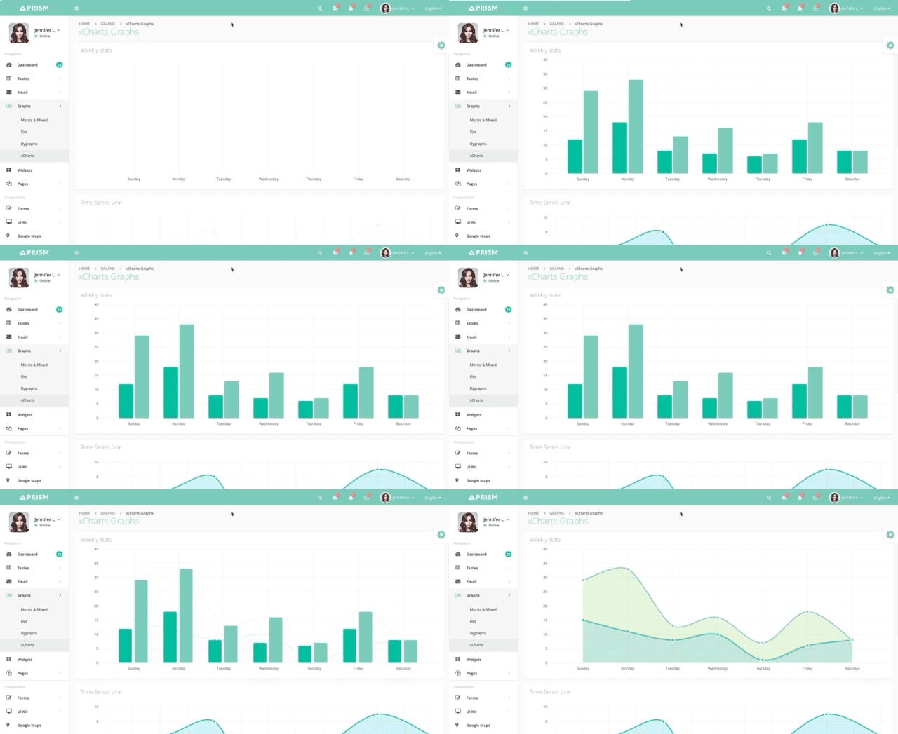
PRISM


PRISM is a beautiful admin template that utilizes animation to emphasize the data and information that is being visualized.


animation


Dragonfly


Dragonfly‘s pricing section is made up of individual cards that imitate more realistic motion. When you hover over the cards, they flip to reveal more details. This animation helps declutter the view for the user and highlights the importance of the product’s price.


animation


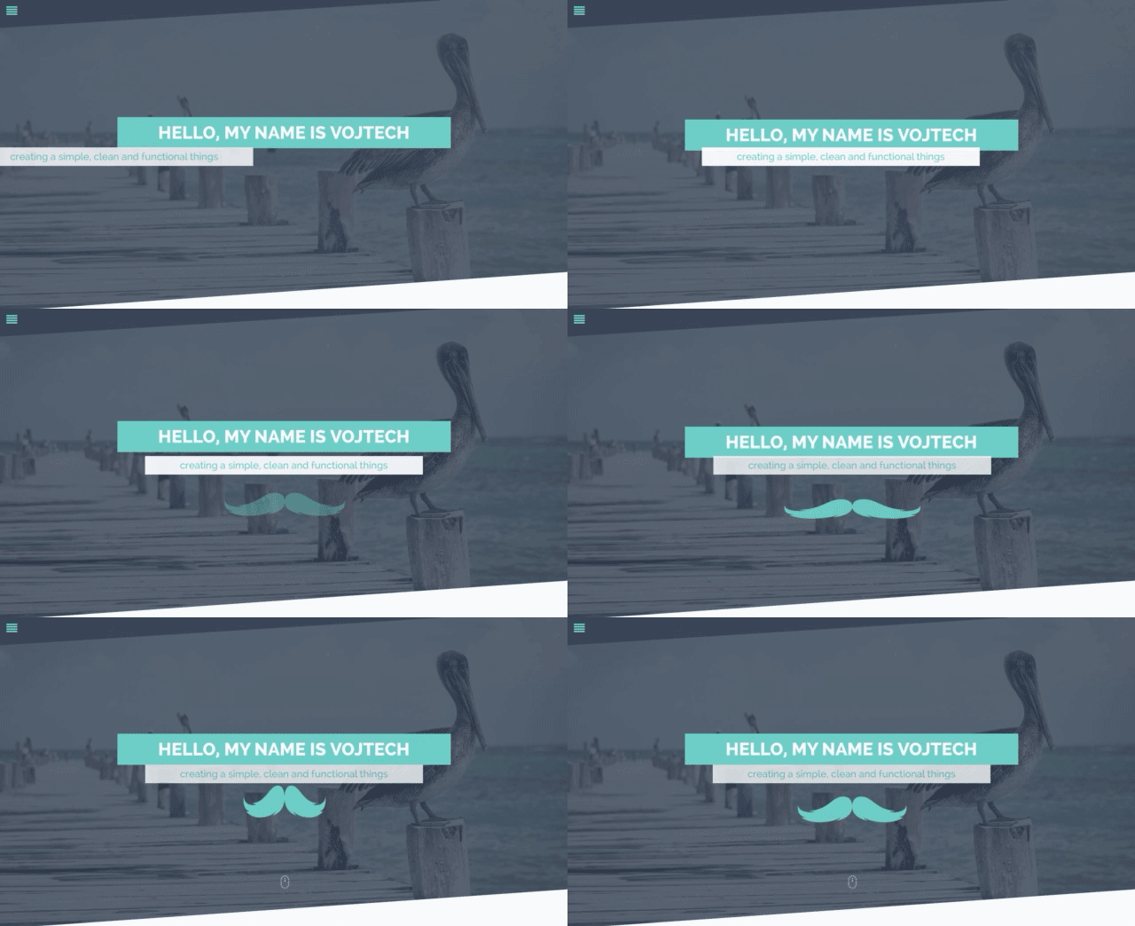
Pure


Pure is an awesome portfolio theme that features more whimsical-style animations. Horizontal and vertical movements combine with a bouncy moustache to create visual interest. The menu animation also helps separate the site’s navigation from the rest of the content.


animation


Nitteo


Nitteo is another simple portfolio that uses a subtle animation to display content initially. The animated down arrow hints that there is more to see below.


animation


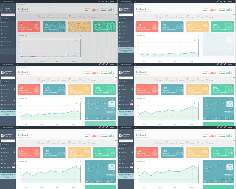
Endless


Endless is an admin template that uses animated charts and dynamically updates data to display useful information. Milestones are shown with an animated counter to emphasize their importance.


animation


Further Reading


Animate all the things!


We hope these examples will provide a bit of inspiration that you can pull from in your own work. Have anything you’d like to share? Please do! We’d love to see work you’ve done, as well as other things that inspire you. Now get to the animating!


7 Examples of Subtle Animation in Design