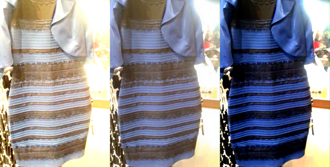
Let’s start with the dress. If you’ve been online in the last 48 hours, we’re sure you don’t need it explained to you. There have been countless theories about why our perception of its coloring is so split: some scientific, some not.
Of particular note was Wired.com’s, which, when stripped to its essence, is fascinating for both its simplicity and the complexity of the brain process it implies. Basically, some people—most likely those who spend more time in the sun—have “daylight-balanced” sight. As such, their brains interpret the dress’s blue hue as an unwanted color cast and “correct” it to white, just like a camera with the same settings would. This happens instantly, subconsciously, and in many cases, entirely against their will.
From Wired
The meme’s popularity lies in how shocking this revelation is to a lot of us: we assume everyone without vision disorders sees colors the same way we do, and most of us have been given no reason to believe otherwise. But it’s not so. As this article from LiveScience explains, an experiment with monkeys suggests that color perceptions are an adaptive behavior: they form in our brains as a response to the experiences with the outside world.
“Color is a private sensation,” says University of Wisconsin color scientist Joseph Carroll. “I think we can say for certain that people don’t see the same colors.”
This intrigued us, so we called him for more information.
“You can tweak perceptual white balance,” he explains, “[and] there’s some evidence that your environment can calibrate your color perception.” Basically, when the composition of the lights people are regularly exposed to is changed, their entire spectrum of color perception is changed. “The same way you can induce an afterimage by staring at a light for ten seconds,” but over the long term.
After that, a funny thing happens when we look at an image that seems to be lit in a subtly-colored light. “Whatever our brain’s guess is about the illuminant, and it is a guess” he says, “it’s going to then subtract that out from any determination about the color of the object.”
He also explained another, more well-known phenomenon: In many cases, the colors of objects are dictated to us by our surroundings. This is called “color constancy.”
Our brain can’t compensate for small sections of a scene cast in a colored light, but it’s “very good at ignoring uniform changes in illumination.” He explains. “If you had an actually white and gold dress, and you took a small bluish transparency and laid it over one of the dress’s white stripes, this white stripe would look bluish. If you took a giant transparency and covered the entire dress, it would still look white and gold.”
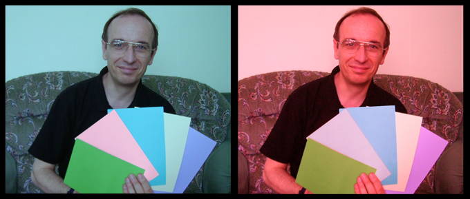
In the left image, the second card from the left looks like a stronger shade of pink than in the right image. In reality, they’re the same.
From Wikimedia Commons
Other Illusions
We won’t, however, continue with the dress. Enough people have done that. As photographers and designers, we’re more interested in how color illusions can be created.
There are other optical illusions that you can pull off in photography, and we recommend you try them at home. As alluded to in Carroll’s quote, we will perceive shades as lighter or darker depending on how light or dark the background around them is: objects on light-colored backgrounds look darker, ones on dark-colored backgrounds look lighter. One simple trick you can pull is photographing the same-colored object against light and dark-colored backgrounds, then putting the pictures next to each other. Plenty of people will be surprised to learn that they’re both the same color.
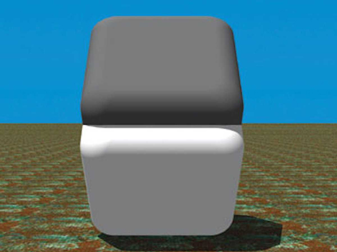
It’s also been proven, by the Cornsweet Illusion among others, that humans perceive color and shade in different ways based on where the lighting is supposed to be coming from. It should be possible to create an effect like this by setting up a situation in which one object should logically be lit and the other cast in shadow, much like this image, and then lighting the bottom one.
The Cornsweet Illusion: The flat part of both squares are the same shade of gray. To test it, cover the border between them with a finger
From IllusionPedia
And as the Checker Shadow Illusion proves, our mind automatically corrects for shade as well as hue – this can also be duplicated in photography.
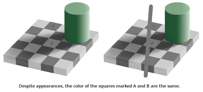
Image from Clipart Finder.
Finally, why not try photographing identically-colored objects against split backgrounds within the same photo, and seeing if there’s a difference in the perceived color of the object itself?
A list of other illusions like this can be found in Scientific American.
In addition, shining a colored light on a finished photograph can radically alter how viewers will perceive the colors within the photograph, and a lot of it can be down to individual perception and color correction. In a gallery showing, it’s possible that you could encourage visitors to see completely different things by lighting the photos with subtly discolored lights, then testing their individual perception of the photos’ real colors.
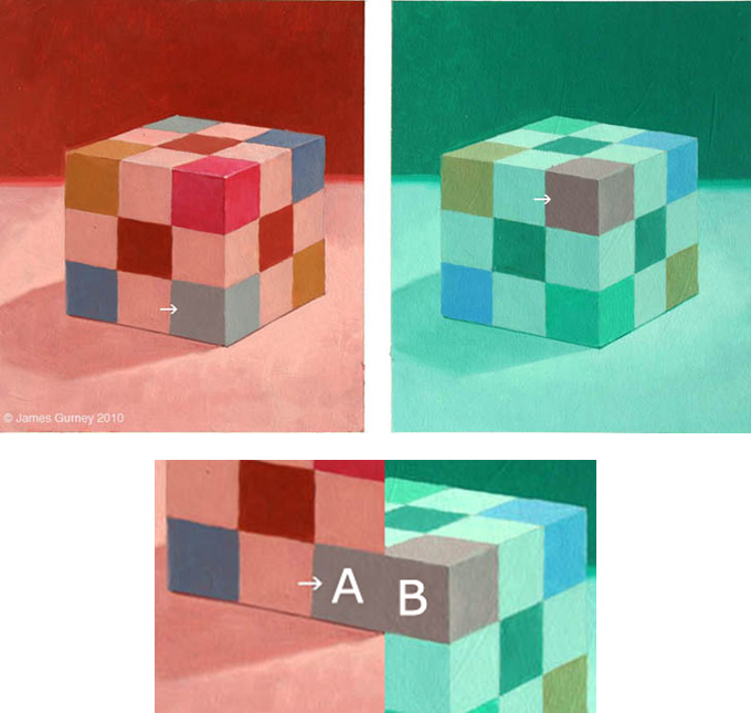
The Colored Cube Illusion: The two squares highlighted by the arrows are the same color.
By James Gurney
Unfortunately, however, those individual differences are a subject that scientists don’t know much about. That brings us to the question we were most interested in answering:
Can You Create An Image Like The Dress?
Now that we know it’s possible for an image to create a drastic split in how some people see it vs. others, we’re sure a lot of artists and photographers are going to be trying to figure out how to do it intentionally.
Multiple experiments have shown that this is a result of a perfect combination of white balance, saturation, and the exact colors present in the image: for many viewers, nudging the levels just a little bit in Photoshop makes the image change right in front of their eyes. So, by experimenting with the same subject on different colored backgrounds, with different colored lights, photographed at different color temperatures and levels of saturation, it should be possible to create images just like this. Right?
We asked Carroll about it. “I’m not aware of ways in which people intentionally do that to create an effect” he says, but concedes that it can be done. And although he couldn’t offer a solid explanation on how, he gave some advice to people who want to start experimenting with it. “Maybe something as simple as setting the white balance to a blue piece of paper instead of a white piece of paper.”
One Vine account is already giving it a shot with impressive results:
A Vine that shows the apparent color shift in action.
And as for the question that might be most pressing in your mind right now?
“I see it as white and gold.” he replied.
How We See Color (And Yes, The Dress)


