Showing posts with label Taking. Show all posts

Monday, June 22, 2015

Taking the Marketing Approach to UX


The key to successful marketing is advertising a solution, and selling the tool that provides it. Put another way, by looking at the jobs people are trying to accomplish, marketers can better interact with their prospects. Now imagine we think about UX in the same way: the key to a successful product is creating a solution (a better way to make a hole), and not just a tool (the drill).


“People don’t want to buy a quarter-inch drill. They want a quarter-inch hole!” – Theodore Levitt, Harvard Business School.


What Does Marketing Have to Do With Anything?


Sales and marketing teams often spend more in-person time with customers than the engineers or product developers do. As a result, the best information about what the user needs may be coming from the people who know those users best: the marketers.


Clayton Christensen, a Harvard Business School professor and author of many books on business and marketing, has studied many successful businesses, and the solutions that made their marketing successful. He theorizes that Theodore Levitt was right: people want to buy a solution.


ux_marketing_01


Fedex and Their “Jobs-To-Be-Done” Philosophy


Imagine how hard it was starting FedEx. The US Postal Service was the main competitor, millions of dollars of startup capital were required and, as with any new business, there was a pretty big risk that it would fail. Imagine yourself in this situation, starting a new company like FedEx with these huge risks. How would you discover what your customers really wanted?


Start by looking at things from the ‘jobs-to-be-done’ perspective. What are people who use the postal service trying to get done?


One thing only: Get their package from one place to another as quickly as possible. The traditional mail service in 1973 was highly unreliable and many packages were lost or damaged in transit. The founder of FedEx provided customers with a solution: FedEx focused on getting a package from one place to another in days, instead of weeks or months.


This illustrates an essential point. What customers do is more important than who they are. Regardless of age, social status, or gender, when you buy a drill, what you want is a hole, and marketers know this.


ux_marketing_03


What Does This Mean For UX?


Selling a solution works well in marketing, but user experience designers aren’t marketers or salespeople. We don’t want to sell a solution – we want to build solutions.


Eric Schmidt, the Executive Chairman of Google describes Google as more than just a tool. In his 2011 speech at D: All Things Digital, he says, “we’re trying to move from answers that are link-based to answers that are algorithmically based, where we can actually compute the right answer.”


A search engine is a tool that responds with links. Google is a solution – a way to provide people with answers. Back in 1999, the best way to do this was providing links to relevant sources, and Google did so. Now, as algorithms make it possible to provide answers directly, Google is moving toward that.


Try typing “London temperature” directly in Google. Before the search results, you’ll see a box where you’re shown the most recent temperature for the city and the temperature predictions for future dates.


Or type “Berlin flights.” Before any results show up, you are shown a summary of flights to Berlin. Better yet, if you turn on location, you’ll be shown flights from your location to that specific city.


In other words, you are being provided a direct answer to what you’re looking for. Google’s ultimate goal is to give you answers to even more complex queries, for example, “the best way to lose weight”. One thing they could possibly do is to intelligently compile the most popular advice on losing weight, compare that against scientific research on what works and display the summary at the top.


How is it that Google understands exactly what visitors are trying to get done, and provide such a successful product to solve visitor’s needs? It all comes down to user research.


Start with User Research


Earlier, I said that what customers do is more important than who they are. Ask yourself a few questions to see if it’s true in your case:


  1. Do you identify more according to your ancestry, or your occupation?

  2. How do you introduce yourself to others?

  3. Are you more likely to ask someone about their activities, or their looks?

User research is about how users spend their time, what they care about, and what actions they take. By learning about your prospective customers before beginning any product development, you can create a truly successful product.


ux_marketing_02


Observe What Your Visitors Already Do


Use available tools or services to get a better understanding of how people interact with your site or application. These are so-called “behavioral tools” which allow you to observe the actual way your users behave.


Before using these tools, write down your own predictions. How do you believe users interact with your site or application?


I cannot emphasize enough how important this is because of the hindsight bias which is basically looking at past events and interpreting them as being predictable. Every time you tell yourself “I knew it all along” after an event occurs, you’re probably a “victim” of this bias. Here are some examples:


  • After some unexpected event occurs (like the 9/11 attacks or the 1986 space shuttle disaster), there were many people that cited Nostradamus and some verse as a “proof” he predicted it was bound to happen.

  • The “analysis” part on news networks after some event occurs. When the Madoff ponzi scheme was busted, you saw all sorts of experts saying “if only this and this was in place, this would not happen”.

  • In one study, several students were asked if a particular person nominated for the Supreme court would be confirmed. 58% said yes. After he was confirmed, the same students were again asked if they thought he would be confirmed. This time, 78% said yes.

That’s why it’s important to try and write your predictions first to stop this bias from occurring and realize the unexpected interactions of your users with whatever it is you’re testing. Stop the “I knew it all along” thought before it’s too late.


Ask Users What They’re Trying To Do After You Observe Them


You can do this after observing what they do using various tools. Specifically, ask them what they are trying to get done by clicking on x and then on y and then on z. There are many usability testing and survey tools to accomplish this, but after all, they’re just tools.


What you’re trying to get done here is ask the right questions and come up with answers that will improve your prospects understanding.


It’s simple: First observe what they do and then try to find why they do what they’re doing by asking questions. What were you trying to accomplish while clicking on x and then on y? Why did you click y after clicking on z? etc.


To give you a good idea about how to get started with this, I recommend you first:


a) Install behavior analysis tool(s) and run it for at least 7 days and make predictions how they’re going to behave before you start running the heatmap tools, as mentioned above.


b) Get at least 10 users and ask them what they are trying to get done with your tool.


If your prospects are close to you, you might consider making in-live interviews. If your prospects are all around the world, then get their contact info and conduct an online survey. I recommend you talk to them directly and not just sending them a generic survey via email.


c) After the heatmap study, see any unexpected occurrences and ask your users what they were trying to get done by clicking on y and then on z.


It’s Simple To Get Started


User testing provides UX designers with the information they need to create successful products. Just as marketing teams learn from speaking with users, so can UXers. And in doing so, you can come away with new insights and lessons that will help you create the perfect solution.


Image Source: Flat Line Icon Set via Shutterstock.


The post Taking the Marketing Approach to UX appeared first on Speckyboy Design Magazine.


Taking the Marketing Approach to UX

Friday, May 22, 2015

Taking the Occam Razor Approach to Design


Did you know that designers can use a tool that mathematicians, philosophers, and other academics have known about for hundreds of years? It’s called Occam’s Razor, and it’s a law that states, essentially, that the simplest solution is usually the best or most correct. For example, if your client is late to a meeting, you would probably assume he or she got stuck in traffic. It’s a simpler and likelier explanation than, say, assuming they got temporarily abducted by aliens and had to fight through an endless maze of plant monsters to get to the meeting on time


That’s a prime example of the kind of over-thinking that many designers are prone to. We’ll go over the importance of ditching the unnecessary when developing design concepts, and why it’s so hard to do in the first place. Not only will you be a stronger designer when you insist on simplicity, but your clients will be much happier with your work as well.


Getting A Close Occam
[Image Source]


Considering New Options


Here’s a scenario that I think perfectly illustrates how designers can use Occam’s Razor to de-clutter their designs. If you know me, you know what I’m about to say: something about food! Okay, so, you and a group of friends go out to eat at a buffet-style restaurant, and you begin piling up a huge assortment of food on your plate. Your friends are giving you funny looks, but you explain that you’re really hungry and will be eating a lot.


However, when you finally sit down to dig in, you get overwhelmed with the variety of options in front of you. Where do you jab your fork first? Decisions, decisions. Your friends are having no trouble polishing off their smaller meals and going to get seconds. It occurs to you that you didn’t have to put everything you were going to eat tonight on your plate at one time. There was a simpler solution right in front of you that you didn’t even consider. Oops.


Design works the exact same way. No matter what you want to accomplish in a design, there is almost always a simpler way to do it that will obtain the same result with less distraction and clutter.


Deconstructing a design concept to its bare elements, while still maintaining the integrity of the design brief allows you to solve clients’ problems with the power of economy. Always go out of your way to make things less complex, because…


Complicating Things Is Natural


I’m not sure why so many people think that simplicity or minimalism in design is easier to do than complexity. But it’s a pretty depressingly common thing for a non-designer to think. I’ve personally worked with many people who just did not understand what it took to create a simple design layout. And I didn’t even try to strangle any of them. They say in entertainment that you can never be too rich or too thin. Well, in the design industry, you can never be too patient.


Getting A Close Occam
[Image Source]


Back when I did the in-house grind, a co-worker once told me that whoever created the SPAM logo was: “just a slacker. I mean, how hard is *that* to pull off?” He was under the impression, like many non-creative professionals, that it was somehow “easier” to create something simple like the SPAM logo, because it wasn’t as complex as, say, directing a customer service staff of 50 people (he was a VP of Operations).


Getting A Close Shave


Having designed “simple” logos and directed staff teams, I can say with a fair amount of authority that, if you’re doing it right, the latter is far easier than the former, and here’s why.


As a designer, the most important thing you can deliver to your clients is a way to funnel their core values into a working system. That includes the visuals, of course, but visuals are almost near the bottom of the list for design requirements. Sure, anybody can put some plain text in a box. But the knowledge of whether or not that’s appropriate for the project your working on is what makes you the design expert, and not your client.


Always remind yourself that design is about solving a problem and communicating a core idea to your user. Whether it’s a squeeze page on a commercial website, or the can opener in your kitchen, all design should strive to use the fewest amount of elements to make the easiest user experience possible.


If you find yourself stuck in a heavy jungle of clutter, walk away for a minute and ask yourself what simpler way you can use to achieve the exact same effect you’re striving for.


Getting A Close Occam
[Image Source]


The DNA Of Clutter


Nature is predisposed toward complexity. That means that, in general, simple things get more complicated over time. Single-celled organisms evolve into multi-celled organisms, and so on. Evolution is not the most efficient designer, and sometimes nature’s solution to a problem is to just evolve something else to solve it.


Then, once the need for it is gone, it just sort of sits there. That’s why we have an appendix, tonsils, and other weird remnants of things we once needed for survival, but now… not so much. And it’s not just us. There are plenty of examples in the animal kingdom of species that have vestigial, or formerly useful, limbs, organs, behaviors, and instincts. They aren’t useful anymore, but, thanks to Mother Nature (also known as the worst art director in the universe), they’re there to stay.


What this all means is that we humans are built from the ground up to take simple things and make them complex. Think about a nomadic people’s village versus a modern metropolis in the West or East Asia. Huge difference in complexity, but all human civilizations started out the same – very simple and basic.


To make something simple from something complex is against our very nature. This is why Occam’s Razor exists in the first place. William of Ockham, the 14th Century English scholar who first came up with the idea, knew that people had a tendency to think up fanciful solutions to problems that only needed a simple fix. Try this explanation the next time you encounter a client who doesn’t think design is a “real” job.


In Conclusion


If you struggle with simplifying your designs, remember that it’s not really your fault. It comes with having a human brain and seeing things in many layers. But through your designs, you can constantly challenge yourself and your users to take the simpler road. You won’t always end up with the world’s most elegant solution, and that’s okay.


But by reminding yourself that there’s always a way to do it simpler, you can ensure you’re always communicating the clearest message.


What Do You Think?


Are there times when you struggle to remind yourself to simplify your designs? In what ways can you take an Occam’s Razor approach and take a less complicated path in your design process? Let us know in the comments.


The post Taking the Occam Razor Approach to Design appeared first on Speckyboy Web Design Magazine.


Taking the Occam Razor Approach to Design

Friday, February 13, 2015

Adelle Charles on Designing for Bitly and Taking That First Jump

Adelle Charles is more than just a master of pixels. In 2009, she co-founded Carbon Ads and was also the managing editor for Fuel Brand Network. These days, she is one of the expert hands guiding Bitly as visual designer. We got the chance to sit down with Adelle about having the courage to start, getting an education, and where she’s headed next.


Creative Spotlight is a series of posts that focuses on highlighting interesting people in and around the greater creative community. We chat with industry professionals that we respect about their passion and recent projects, which we hope serves as great inspiration for you in your own endeavors.


adelle-header3


Can you tell me a little about the creative projects you’re working on right now?


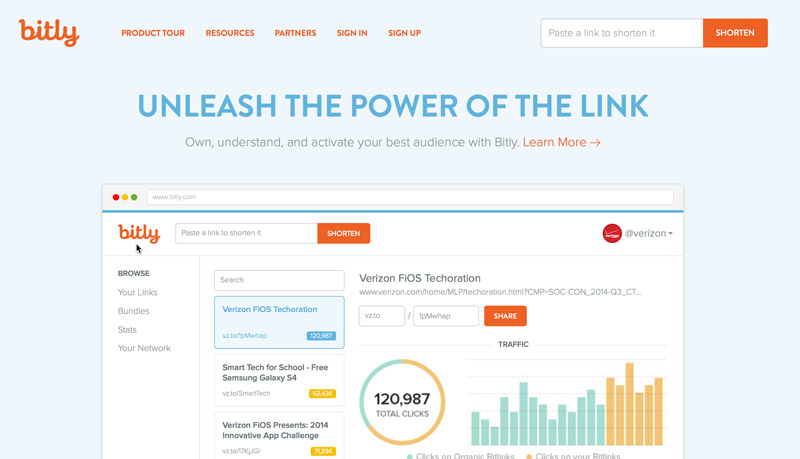
Adelle: I’m a Visual Designer on the product team at Bitly. There, I’m working on a wide variety of projects but one recent release I am very excited about is our new “Your Bitlinks” design. We see more than 250 million clicks on Bitlinks every day, and about 55% of those clicks come from mobile devices. Knowing that our users do more on mobile every day, our new view is a responsive design that provides a consistent experience across desktop, tablet and mobile devices. Some features to support this responsive framework include the multi-pane page layout, infinite scroll, and a third action pane that supports the filter, edit, and share features. Our team is working really hard to bring the same experience to the whole Bitly product.


I am fortunate enough to be able to work on a small amount of freelance projects in my spare time. Aside from design I enjoy cooking, photography and learning new things.


adelle-bitly


Tell me a little bit about your path to being a designer. Did you have any other interests you considered pursuing?


Adelle: Growing up, I was always an artist. Starting in middle school I got into the fine arts and did a lot of drawing and painting. I was finally able to convince my parents to buy a computer in the late 90s and that opened up a whole new world for me in terms of graphic design. That’s what I got my degree in.


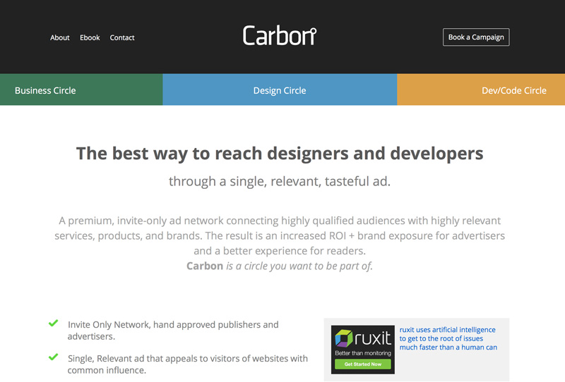
Once I graduated, I was working mainly on print advertising. During this time I started pursuing web design on my own. As I learned about this stuff, I blogged about it on a site I started, Fuel Your Creativity. That type of editorial site just grew from there and before I knew it, the Fuel Brand Network of sites was born. From there I become co-founder of Carbon Ads, an invite-only, targeted Ad network that grew to reach over 20 million creative professionals through over 200 publishers before it was acquired in 2012.


adelle-carbon


Can you remember one of the first things you designed or created that you were proud of?


Adelle: When I was in college, I was the editorial designer at the school’s (Rochester Institute of Technology) internal magazine ‘The Reporter’. It was kind of my first real life experience with something that was distributed out to people. At that moment, I knew choosing graphic design as my path was the right choice!


You have some experience teaching design. Is a college degree is still the right path for designers?


Adelle: I don’t think a formal design education is necessary. I’m glad that was the path that I took but I think that if you have real, raw talent, then you definitely can develop your skills out in the working world just as much (or more) than you would in a classroom.


You are a designer with an entrepreneurial streak and have founded some great brands. Is there any advice you’d give to a designer wanting to start something of their own?


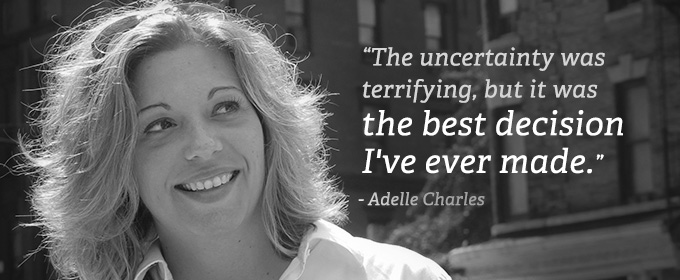
Adelle: Just jump. Just do it. I kept putting it off because “it was never the right time.” But there never seemed to be a right time so one day I just took a deep breath and did it. I quit. The uncertainty was terrifying but it was the best decision I’ve ever made.


Creative bucket list time: is there one creative experience or project you’d love to complete in the next couple years?


Adelle: I want to learn screen printing and maybe from that, I’ll be able to create a tangible line of goods. I don’t know exactly what that would be yet, though!


Thanks, Adelle!


Amanda Hackwith is a writer and editor who regularly blogs about writing, creativity, and other nerdish obsessions over at amandahackwith.com. She has her first modern fantasy novel, Fable Fires, coming out this spring. Say hi and follow her @ajhackwith on Twitter.


Adelle Charles on Designing for Bitly and Taking That First Jump