Showing posts with label Infographics. Show all posts

Thursday, May 28, 2015

5 Infographics That Perfectly Sum Up Life as a Designer

Your life is a complicated mix of things. There’s the dog that has to go to the vet, the significant other that needs attention, and, of course, your work, which is probably more complex than most people suspect from the outside.


Want to commisurate with your peers? Here are 5 infographics that sum up your life as a designer just perfectly.


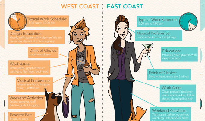
East Coast vs. West Coast: Designers


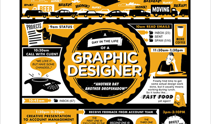
A Day in the Life of a Graphic Designer


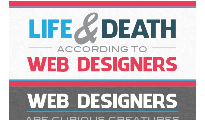
Life and Death According to Web Designers


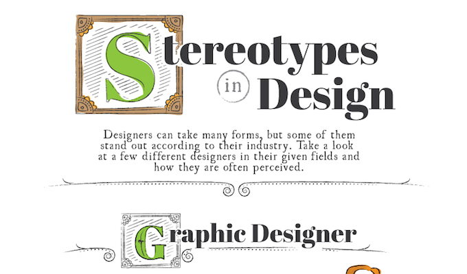
Stereotypes in Design


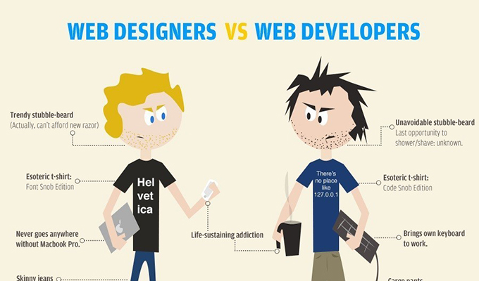
Web Designers vs. Web Developers


Kevin Whipps is a writer and editor based in Phoenix, Arizona. When he’s not working on one of the many projects in his queue, he’s looking for fun and irreverent things online to share with his friends.
5 Infographics That Perfectly Sum Up Life as a Designer

5 Infographics That Perfectly Sum Up Life as a Designer

Your life is a complicated mix of things. There’s the dog that has to go to the vet, the significant other that needs attention, and, of course, your work, which is probably more complex than most people suspect from the outside.


Want to commisurate with your peers? Here are 5 infographics that sum up your life as a designer just perfectly.


East Coast vs. West Coast: Designers


A Day in the Life of a Graphic Designer


Life and Death According to Web Designers


Stereotypes in Design


Web Designers vs. Web Developers


Kevin Whipps is a writer and editor based in Phoenix, Arizona. When he’s not working on one of the many projects in his queue, he’s looking for fun and irreverent things online to share with his friends.
5 Infographics That Perfectly Sum Up Life as a Designer

Tuesday, May 19, 2015

Free PSD Infographics Template

Free PSD infographics template that has got you covered for any project that needs such kind of graphic. This infographic here is the freebie you were looking for, download it now!


Free PSD infographics template designed in a simple and clear style. Our PSD will come in handy for all kind of website designs, brochures and presentations. We’ve made colourful and modern looking infographics and now we give away the PSD sources completely for free!


Nowadays, it’s a matter of great importance to present your statistics, results and data in a clear and easy to understand way. Moreover, when you show your numbers, you’d probably need to impress a client or convince the audience that the thing you are showing worths both the time and the money. And here comes our infographic PSD – it’s a great headstart for your designs, our charts will present your info as clear as possible.


By using our free psd infographics template, your job for displaying data is almost done. Just open the PSD file with Adobe Photoshop CS6+ and adjust the levels, percentages and colors to suit your stats. It’ that easy, no ninja skills required.


Our infographics PSD set contains 8 different shaped and coloured graphics each one of which could present your particular statistic.


Don’t hesitate and grab the free psd infographics template now by clicking on the Free Download button below!


Looking for more eye-catching infographics? Then feel free to check out our Infographic section and take your pick.


FREE PSD Infographics Template

FREE PSD Infographics Template


Size: 1000 x 1500 px
File Format: PSD
File Size: 1,35 KB
Author: Free PSD Files


Note that if you want to spread the word about our freebie, you need to link back to this post. Links to download page or download archive are not allowed.


The post Free PSD Infographics Template appeared first on Free PSD Files.


Free PSD Infographics Template

Tuesday, April 21, 2015

10 Infographics On How to Mix Fonts Like a Pro

When choosing fonts, there’s an unspoken consensus that typefaces should work well together and be consistent. However, mixing fonts in unexpected ways can result in a striking and original effects. In some cases, the more contrast, the better. While there are a few “guidelines” when it comes to pairing fonts — such as being selective and keeping font families together — some rules are clearly meant to be broken. Here are 10 awesome infographics that address the designer conundrum of mixing fonts effectively:


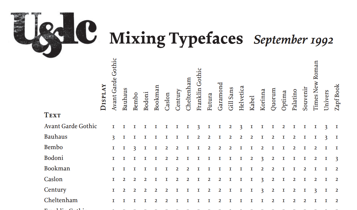
1. Mixing Fonts Cheat Sheet

001


This infographic is a handy cheat sheet listing 22 typefaces. It cross-references them to show how well each combination goes together and provides simple advice in the form of: 1. Combine at will, 2. Not a conservative choice, or 3. Think again.


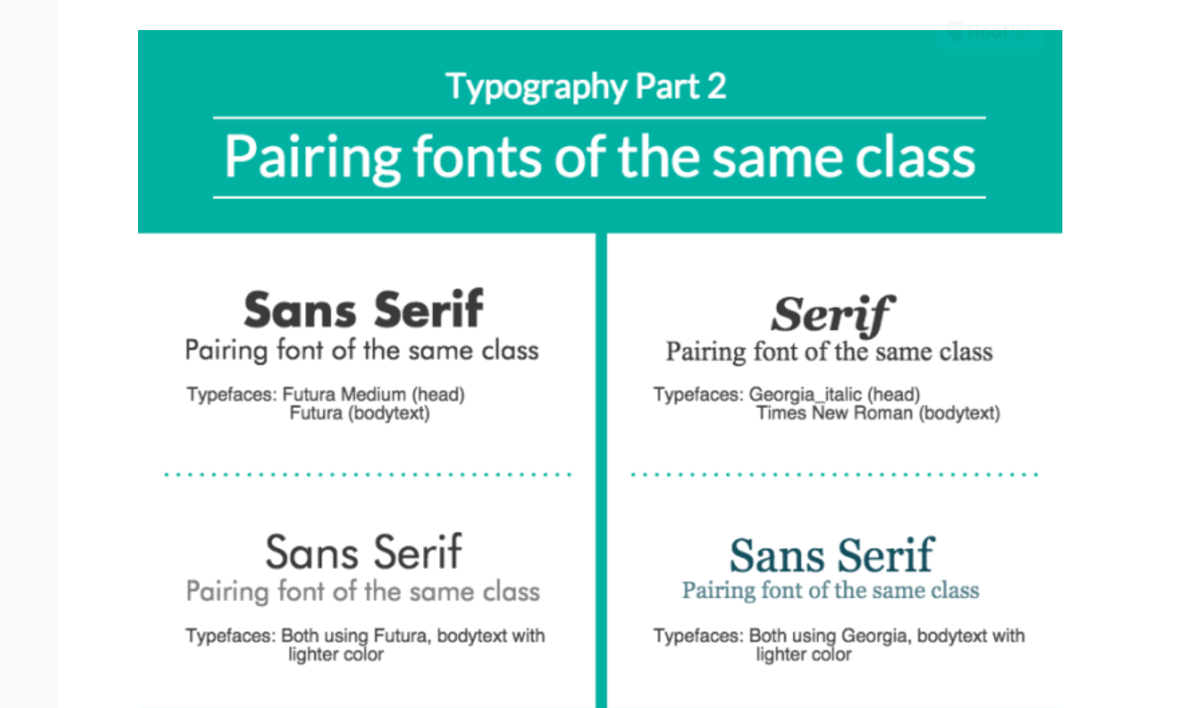
2. Four Things You Need To Know To Pair Fonts Well

002


This 4-part infographic set shows how some basic typography principles go a long way when mixing up fonts. What’s really compelling about this series is how it simplifies advanced concepts like contrast and font classes to help us create stellar combinations.


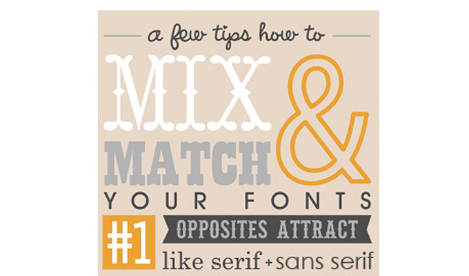
3. Tips on How to Mix & Match Fonts

003


This clever graphic shares some great tips on how to mix fonts properly and avoid the dreaded “font vomit.” Tips include pairing opposites and playing with kerning to achieve balance.


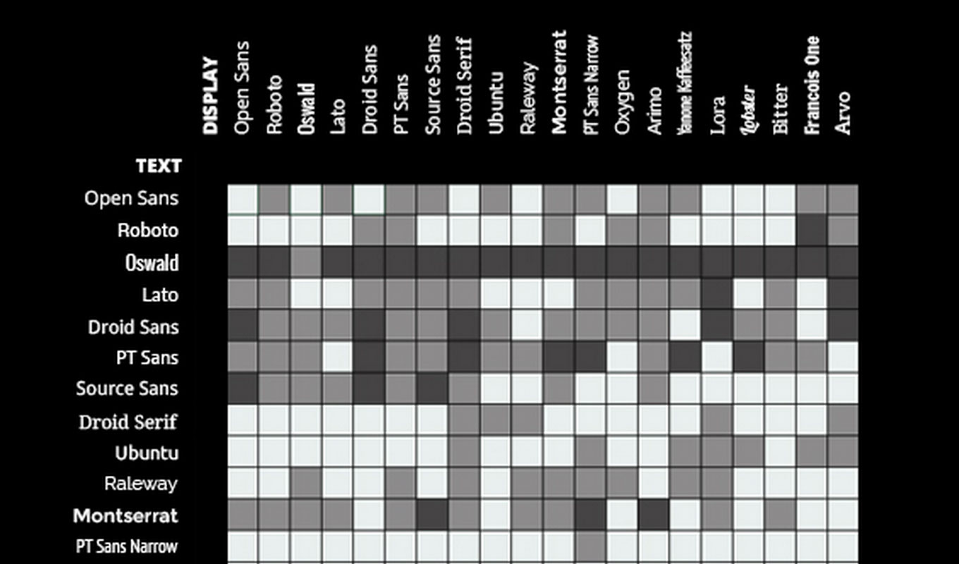
4. The Art of Mixing Typefaces

004


This handy resource assists in the matching of Google fonts, with 20 font options cross-referenced to show which ones tend to mix well in design projects for a total of 400 combinations.


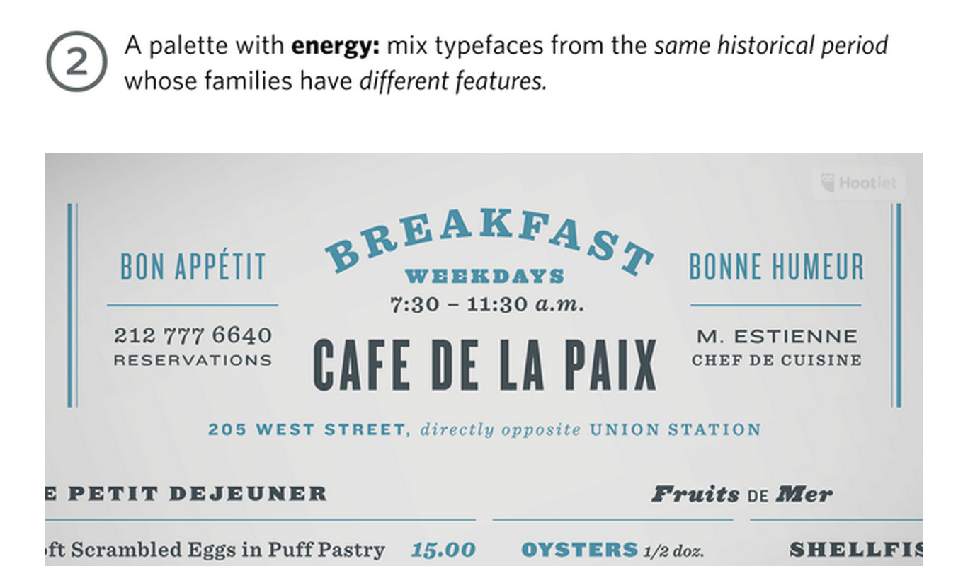
5. A Palette with Wit, Energy, Poise & Dignity

005


This infographic highlights four tips to navigate the typographic ocean, all built around H&FJ’s Highly Scientific First Principle of Combining Fonts: keep one thing consistent, and let one thing vary.


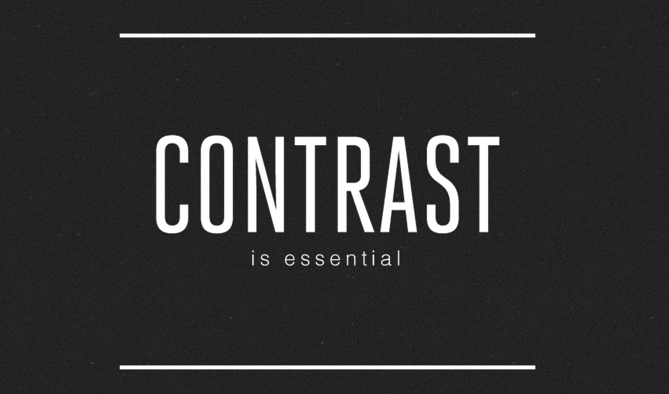
6. The Art of Combining Fonts

006


This helpful graphic breaks it down to the basics, including what to do (or not do) with serif or sans serif text. Charlotte Katelyn, who created the infographic, reminds us to go for tasteful contrast, keeping it simple and being careful about “mixing moods.”


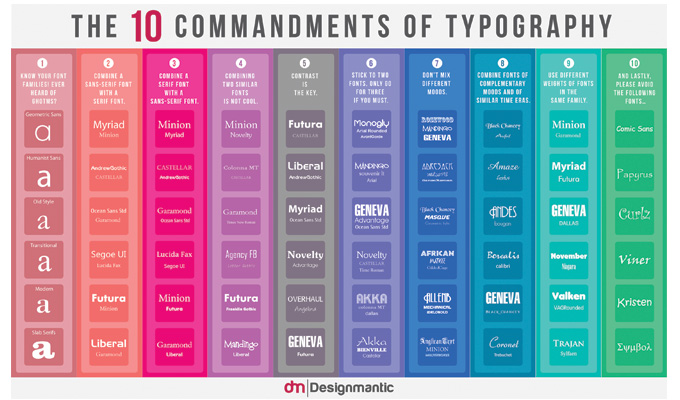
7. The 10 Commandments of Typography

007


This guide reminds you of 10 essential typography principles and suggests guidelines for designers trying to pair fonts effectively. Pairing different font weights within the same family, creating complementary moods, and other ways to make the most of “opposites,” is the focus of this attractive tip sheet.


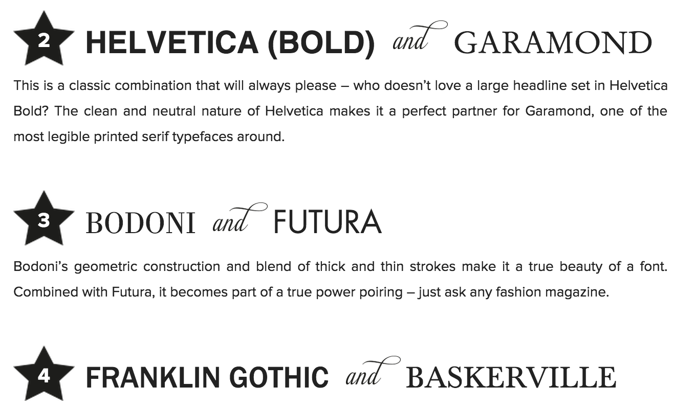
8. For The Classic Designer

008


For those who enjoy timeless typefaces, this infographic is the one to have around. Though widely used and recognized, fonts like Futura, Helvetica, Baskerville and Frutiger will always have a space in every designer’s toolbox. Mixing them up in innovative and conscious ways might deliver just the right amount of wow that your next design is calling for.


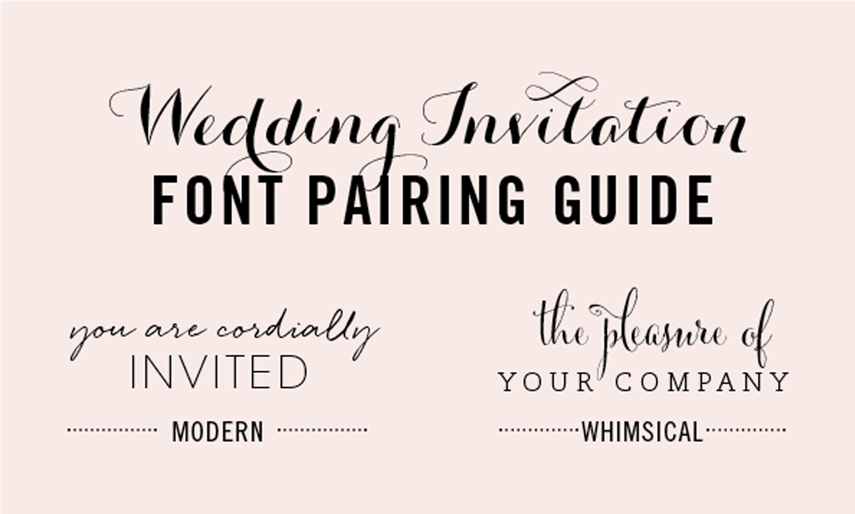
9. Wedding Font Combos

009


If combining fonts artfully is the goal but ordinary just won’t do, this infographic can help. These extremely fancy font ideas are suitable for wedding invitations, or whenever a special and elegant look is called for. The infographic introduces 8 different font pairing styles that go from modern to whimsical.


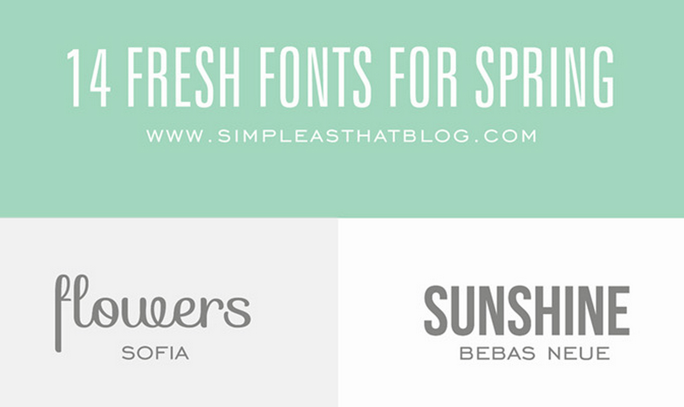
10. Spring Forward with Typography

010


Looking for fresh font combinations for Spring? This graphic features some stunning pairings, inspiring us to bring some seasonal character to our work.


Designers must mix and pair fonts on a daily basis, and inspiration can often run dry. Fortunately, designers are a generous bunch, and infographics like these can be the perfect resource for learning how to mix fonts like a pro.


For more information, check out these helpful guides: A Beginner’s Guide to Font Pairing, The Ultimate Guide to Pairing Fonts, A Dating Game for Fonts and A Fantastic Guide for Picking and Pairing Fonts.


Products Seen In This Post:



getpaidtowrite-banner
10 Infographics On How to Mix Fonts Like a Pro
Tuesday, April 7, 2015

Free PSD Modern Infographics Banner

Free PSD modern infographics banner designed in a trendy flat style. The graphics that we present to your attention are simple, but yet a work of perfection. Feel free to grab our template and use it on your next web or print projects.


Free psd modern infographics banner made in a clean graphic style. These infographics will make your statistics stand out from the others.  Even if you didn’t have the intention to use these kinds of graphics right now, don’t miss to grab our free psd modern infographics banner to save yourself time and money.


However, nowadays infographics are often used. You never know when our freebie would come in handy! Do not miss the chance to present our globe in free psd modern infographics banner in your unique way!


To customize our free psd modern infographics banner you need base skills in Adobe Photoshop CS6+. The psd layers are tidy and clean which means that there’s nothing merged or messed. Moreover, we’ve made it pretty easy to add hover effects. Just play with the color overlay option and you’re ready to go.


Use our modern infographics banner on:


  • Banners;

  • Website designs;

  • Flyers;

  • Posters;

  • Presentations;

  • Brochures.

Don’t hesitate and grab the free psd modern infographics banner now by clicking on the Free Download button below!


Need more nice infographics? Then feel free to check out our Infographic section and take your pick.


FREE PSD Modern Infographics Banner

FREE PSD Modern Infographics Banner


Resolution: 1332×1185px
File Format: PSD
File Size: 770 MB
Author: Free PSD Files


Note that if you want to spread the word about our freebie, you need to link back to this post. Links to download page or download archive are not allowed.


The post Free PSD Modern Infographics Banner appeared first on Free PSD Files.


Free PSD Modern Infographics Banner

Tuesday, December 30, 2014

7 Infographics To Help You Make Sense of Serial

I often see a trend and actively run in the opposite direction, firmly planting myself in the “against” category just to be different. With Serial though, I fell victim to the trend, hard. I was hooked from the first minute, hanging on every word, running every piece of evidence through my brain again and again. Once the insanely popular podcast wrapped up season one, I was left wanting more. If you’re in the same boat, you’ll want to check out these infographics, which cover everything from cell phone tower locations to MailChimp mispronunciations.


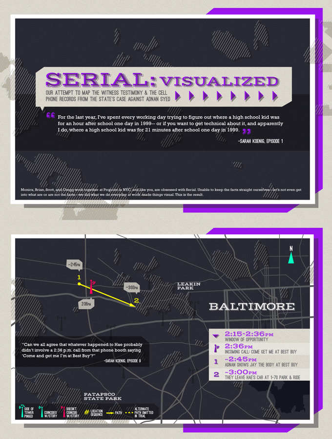
Serial Visualized


This is perhaps the best visual overview of the case you can find. It’s a series of maps with overlays that include timelines, travels, quotes, and cell towers. If you’re a visual person all wound up in the confusing details in the podcast, this is a huge help.


serial-infographic


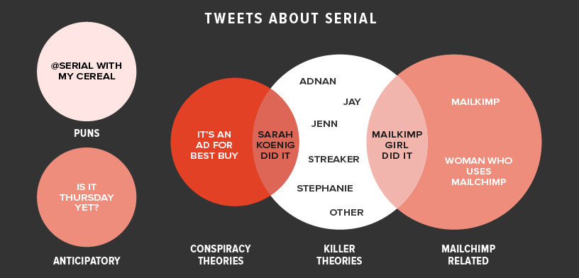
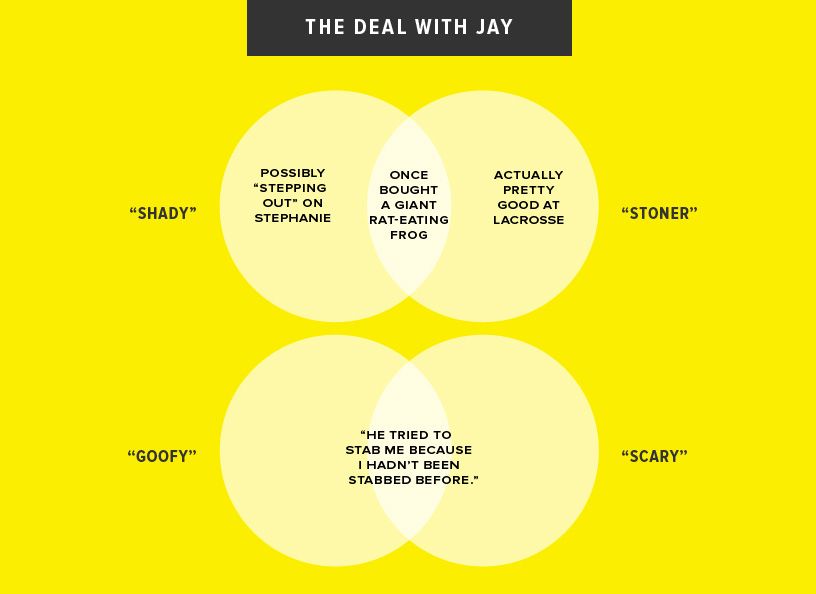
Charts for People Obsessed with Serial


On the lighter side, The Bold Italic has whipped up some humorous charts that poke fun at various things about the podcast and its fans. Here are two of my favorites:


serial-infographic


serial-infographic


Cell Tower Map


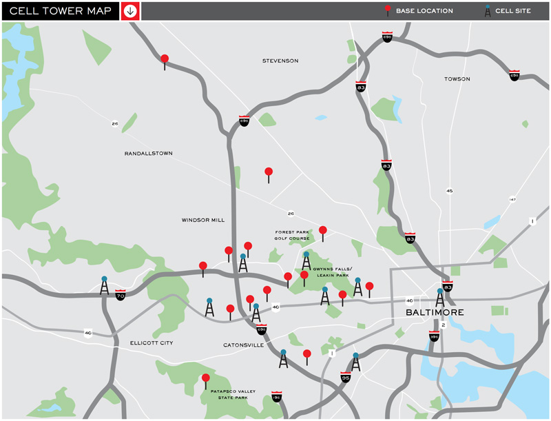
The last few graphics in this post are directly from the Serial website, where you’ll find all kinds of interesting extras regarding the case. This first graphic shows a map of the greater Baltimore area along with those cell towers you’ve heard so much about.


serial-infographic


People Map


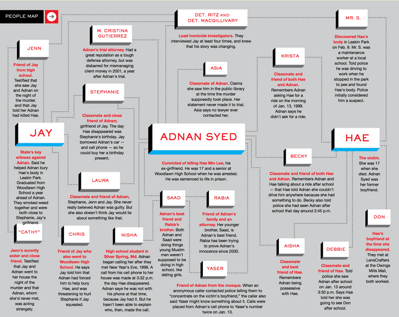
Adnan, Have, Jay, Nisha, there are so many people to keep track of if you’re going to follow this case closely! Fortunately, this handy graphic introduces you to all the key players.


serial-infographic


Timelines


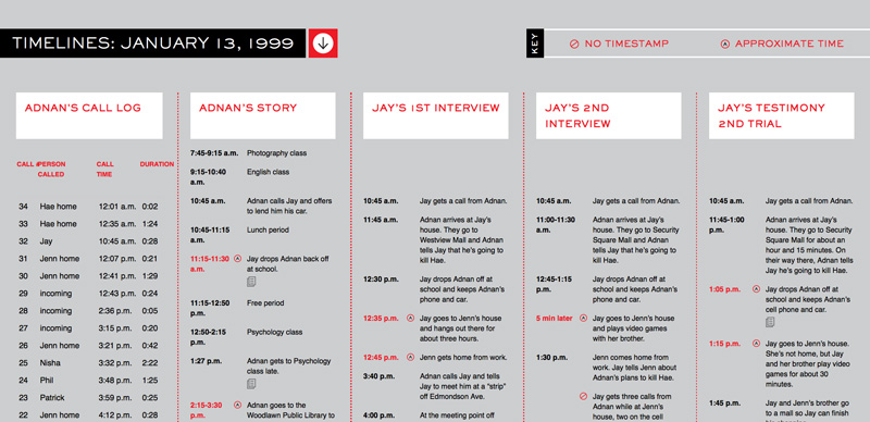
This incredibly helpful chart compares the various (and often competing) timelines of the tragic day that Hae was murdered. You’ll see how Adnan’s story differs from Jay’s, and even how Jay’s differs from Jay’s!


serial-infographic


Who What When


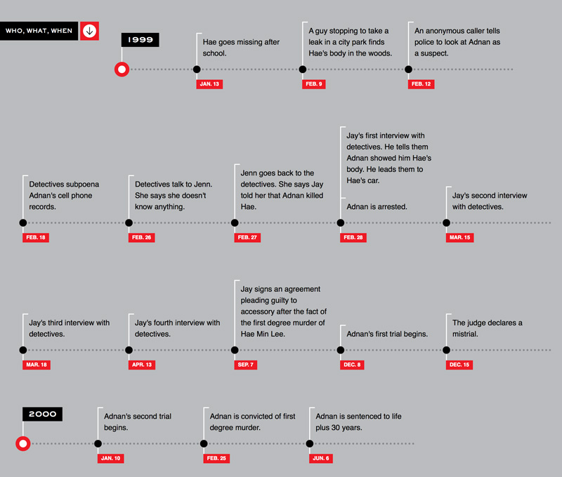
This last timeline strips out the speculation and sticks to the facts. Events like trial dates, calls, and interviews are all recorded.


serial-infographic


7 Infographics To Help You Make Sense of Serial

7 Infographics To Help You Make Sense of Serial

I often see a trend and actively run in the opposite direction, firmly planting myself in the “against” category just to be different. With Serial though, I fell victim to the trend, hard. I was hooked from the first minute, hanging on every word, running every piece of evidence through my brain again and again. Once the insanely popular podcast wrapped up season one, I was left wanting more. If you’re in the same boat, you’ll want to check out these infographics, which cover everything from cell phone tower locations to MailChimp mispronunciations.


Serial Visualized


This is perhaps the best visual overview of the case you can find. It’s a series of maps with overlays that include timelines, travels, quotes, and cell towers. If you’re a visual person all wound up in the confusing details in the podcast, this is a huge help.


serial-infographic


Charts for People Obsessed with Serial


On the lighter side, The Bold Italic has whipped up some humorous charts that poke fun at various things about the podcast and its fans. Here are two of my favorites:


serial-infographic


serial-infographic


Cell Tower Map


The last few graphics in this post are directly from the Serial website, where you’ll find all kinds of interesting extras regarding the case. This first graphic shows a map of the greater Baltimore area along with those cell towers you’ve heard so much about.


serial-infographic


People Map


Adnan, Have, Jay, Nisha, there are so many people to keep track of if you’re going to follow this case closely! Fortunately, this handy graphic introduces you to all the key players.


serial-infographic


Timelines


This incredibly helpful chart compares the various (and often competing) timelines of the tragic day that Hae was murdered. You’ll see how Adnan’s story differs from Jay’s, and even how Jay’s differs from Jay’s!


serial-infographic


Who What When


This last timeline strips out the speculation and sticks to the facts. Events like trial dates, calls, and interviews are all recorded.


serial-infographic


7 Infographics To Help You Make Sense of Serial