Showing posts with label Sense. Show all posts

Wednesday, February 18, 2015

30 CSS Puns That Prove Designers Have a Great Sense of Humor

The job of a web designer can be a real pain and frustrating one, but it is also a close-knit community with a healthy sense of humor. Take for instance CSS puns like this:


In fact, you probably get this universal truth even if you aren’t a designer! You can find more from this Reddit thread but for your reading pleasure, I’ve pulled 30 hilarious puns which cover jokes from daily life, movies, political subjects and more.


For more humor posts:


Welcome to the 99% club.


Rule No. 1 of married life


The only man who ever won an argument with his wife


Ninja!


Simplest form of ghost


When Eminem is speaking


Don’t mess with Bruce Banner


How Kim Kardashian makes the headlines


Mario’s secret


You have failed this city!


Autobots, roll out!


“Good artist steal, great artists copy”


Ikea builds table.


Lego is never built inline.


Harry Potter must know this one


For people with visual eye strain.


Pumped-up chicks


So that’s how the tower was designed


A monumental moment in history


#greatwall #madeinchina


The secret organization that is said to rule the world


How the Monarchy works


How the government works


This is why people joke about what the opposite of congress is


No wonder they don’t wear shoes


Countries with no border


countries with something like a border


Too Soon?


He wanted to pass so he did something about it


Error 404 for Planes And Ships


30 CSS Puns That Prove Designers Have a Great Sense of Humor

Tuesday, December 30, 2014

7 Infographics To Help You Make Sense of Serial

I often see a trend and actively run in the opposite direction, firmly planting myself in the “against” category just to be different. With Serial though, I fell victim to the trend, hard. I was hooked from the first minute, hanging on every word, running every piece of evidence through my brain again and again. Once the insanely popular podcast wrapped up season one, I was left wanting more. If you’re in the same boat, you’ll want to check out these infographics, which cover everything from cell phone tower locations to MailChimp mispronunciations.


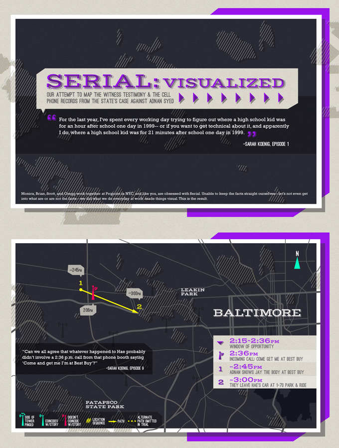
Serial Visualized


This is perhaps the best visual overview of the case you can find. It’s a series of maps with overlays that include timelines, travels, quotes, and cell towers. If you’re a visual person all wound up in the confusing details in the podcast, this is a huge help.


serial-infographic


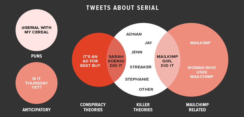
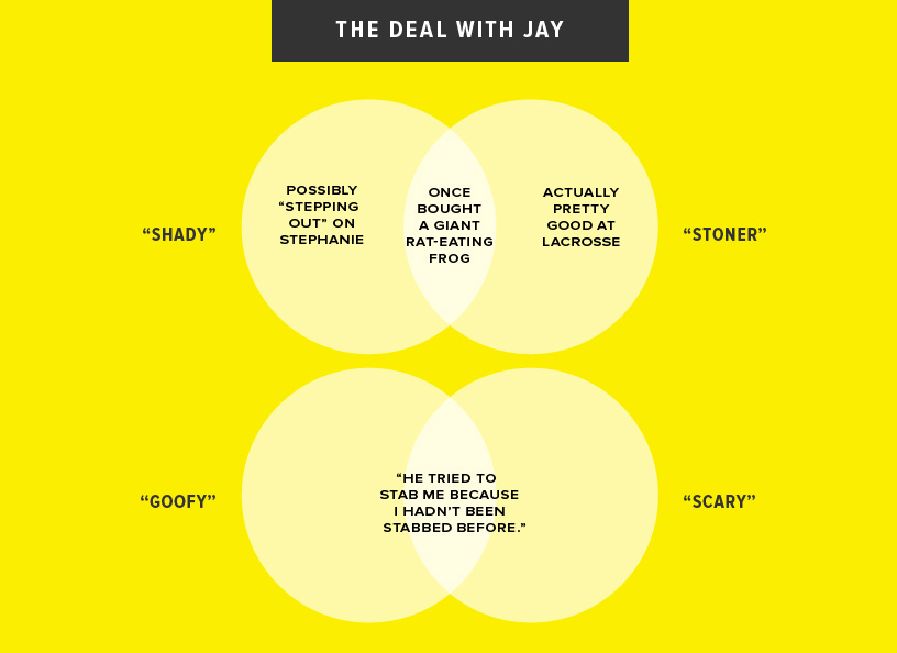
Charts for People Obsessed with Serial


On the lighter side, The Bold Italic has whipped up some humorous charts that poke fun at various things about the podcast and its fans. Here are two of my favorites:


serial-infographic


serial-infographic


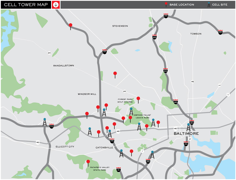
Cell Tower Map


The last few graphics in this post are directly from the Serial website, where you’ll find all kinds of interesting extras regarding the case. This first graphic shows a map of the greater Baltimore area along with those cell towers you’ve heard so much about.


serial-infographic


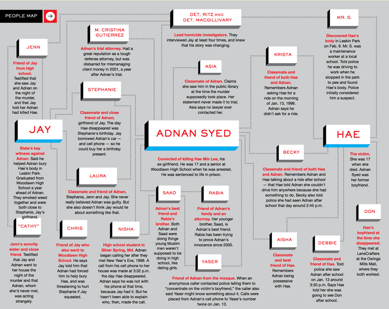
People Map


Adnan, Have, Jay, Nisha, there are so many people to keep track of if you’re going to follow this case closely! Fortunately, this handy graphic introduces you to all the key players.


serial-infographic


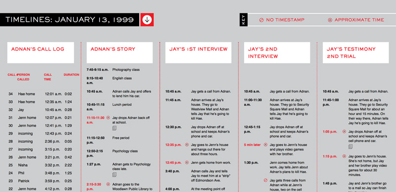
Timelines


This incredibly helpful chart compares the various (and often competing) timelines of the tragic day that Hae was murdered. You’ll see how Adnan’s story differs from Jay’s, and even how Jay’s differs from Jay’s!


serial-infographic


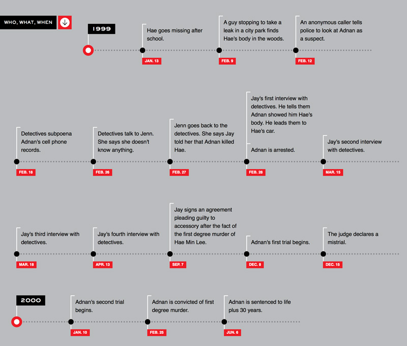
Who What When


This last timeline strips out the speculation and sticks to the facts. Events like trial dates, calls, and interviews are all recorded.


serial-infographic


7 Infographics To Help You Make Sense of Serial

7 Infographics To Help You Make Sense of Serial

I often see a trend and actively run in the opposite direction, firmly planting myself in the “against” category just to be different. With Serial though, I fell victim to the trend, hard. I was hooked from the first minute, hanging on every word, running every piece of evidence through my brain again and again. Once the insanely popular podcast wrapped up season one, I was left wanting more. If you’re in the same boat, you’ll want to check out these infographics, which cover everything from cell phone tower locations to MailChimp mispronunciations.


Serial Visualized


This is perhaps the best visual overview of the case you can find. It’s a series of maps with overlays that include timelines, travels, quotes, and cell towers. If you’re a visual person all wound up in the confusing details in the podcast, this is a huge help.


serial-infographic


Charts for People Obsessed with Serial


On the lighter side, The Bold Italic has whipped up some humorous charts that poke fun at various things about the podcast and its fans. Here are two of my favorites:


serial-infographic


serial-infographic


Cell Tower Map


The last few graphics in this post are directly from the Serial website, where you’ll find all kinds of interesting extras regarding the case. This first graphic shows a map of the greater Baltimore area along with those cell towers you’ve heard so much about.


serial-infographic


People Map


Adnan, Have, Jay, Nisha, there are so many people to keep track of if you’re going to follow this case closely! Fortunately, this handy graphic introduces you to all the key players.


serial-infographic


Timelines


This incredibly helpful chart compares the various (and often competing) timelines of the tragic day that Hae was murdered. You’ll see how Adnan’s story differs from Jay’s, and even how Jay’s differs from Jay’s!


serial-infographic


Who What When


This last timeline strips out the speculation and sticks to the facts. Events like trial dates, calls, and interviews are all recorded.


serial-infographic


7 Infographics To Help You Make Sense of Serial