Once upon a time, I was a teenager who knew Photoshop inside and out, but I was pretty clueless when it came to design principles. I had a feel for what worked and what didn’t, but no explicit knowledge or training.
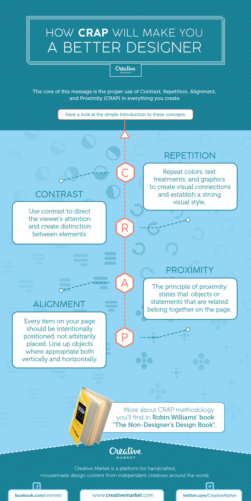
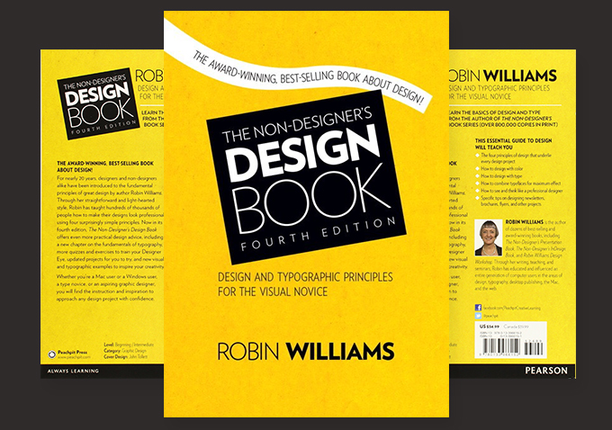
The very first book I ever picked up on design was called “The Non-Designer’s Design Book” by Robin Williams (no, not that Robin Williams), and I can honestly say that it changed my life. It used brilliantly simple and memorable concepts to teach anyone how to create great-looking designs, and it ignited in me a passion for simple, effective design that still drives me today. The core of Robin’s message is the proper use of Contrast, Repetition, Alignment, and Proximity (CRAP) in everything you create. The following is a simple introduction to these concepts.
Contrast
Use contrast to direct the viewer’s attention and create distinction between elements. A lack of contrast can make designs look lackluster and difficult to navigate. Contrast should be leveraged for both graphical and typographical elements.
Repetition
Repetition is the key to attractive, consistent designs. Repeat colors, text treatments, and graphics to create visual connections and establish a strong visual style.
Alignment
Every item on your page should be intentionally positioned, not arbitrarily placed. Line up objects where appropriate both vertically and horizontally. Remember that alignments are a communication tool. Many designs are built on simple, pixel perfect grids, but others use more organic layouts to convey a more natural or casual tone.
Proximity
The principle of proximity states that objects or statements that are related belong together on the page. Use logical groupings of graphics and messaging to convey contextual relationships and put plenty of whitespace between items that should be distinct.
CRAP Infographic
To help you remember to incorporate these principles into everything you create, we made a handy infographic for you to pin or bookmark.
A Brief Interview With Robin Williams
In a moment of pure geeky pride, I was able to ask Robin a few questions about her thoughts on design. Here’s what she had to say.
1. In a web-driven world focused on learning HTML & CSS, do you think there’s a lack of basic design education?
Robin: My experience has been that there are generally two different mind-sets: those who enjoy the left-brain coding and those who are more right-brain visual designers. Anyone who can combine the two skills is of course more competitive, and more and more designers are needing to learn the basic coding skills, and vice versa.
A similar process happened when the Mac came out and changed the world of print design: there used to be a clear demarcation of skills—visual designers came up with the vision, then skilled production people executed that vision and got it printed. But print designers now must know how to execute the vision themselves, not the least of which reason is that they need to know the software in order to know what the possibilities are.
But the web is so much more complex than print design. Even the best combination of a code-and-design mindset working on a large and deep site will soon get to a point of needing an excellent technician who loves code and a brilliant designer who understands information design.
But as in every field, the more one knows about the other aspects of the field, even if you are not hands-on in that particular area, the more valuable you are and the more you can utilize the potential of both design and code.
I have personally decided that I love print design. I love it when I put text and graphics on a page and they stay right where I put them. It makes me very happy.
2. Why should non-designers care about basic design principles?
Robin: It is just a fact in our world that we instantly judge things visually. We can’t help it; in fact, we need to make instant judgments just to get through a day: Think of dating—in a room full of potential dates, I guarantee you scan the room and immediately dismiss ninety percent of the people in it because their visual presentation is not what you are looking for. When buying a new watch, you scan the collection to narrow down the possibilities. Of course, we might occasionally miss out on something valuable this way, but in general our visual snap judgments are necessary to provide some sort of parameters within which we can function effectively. It helps us create order out of complexity.
Knowing this is how humans automatically operate means that we each have an obligation to be conscious of the design aspect of everything we create. People respond to the clarity of a well-designed piece and, like it or not, a well-designed piece (of anything) gets noticed more readily and is more respected.
I have found over the years that having basic design skills has been an asset in every aspect of my life. My school essays look better, my handouts for students garner more respect, my reports to colleagues have a professional appearance. I have control over things like party invites and favors, games and prizes, thank-you notes and small signage. I can create a variety of persuasive and informative presentations that come in handy in all sorts of areas of my life. I can create great product on sites like CafePress, Zazzle, and PrintPlace. The basic design principles help me dress, bake a pie, and decorate a room.
Having design skills has opened up the possibilities in my next career, one which I could not have explored otherwise—developing reading editions of Shakespeare plays designed specifically for reading the plays out loud and in community, and an ongoing series of booklets about tidbits of stuff in the Shakespearean plays. I just completed a Ph.D. in Shakespeare and my design skills helped in the organization of my research, the creation and professional appearance of the charts and tables I needed, the presentation of my thesis within the specific parameters of scholarly work, and they will provide me with a future in another field altogether different from the one in which I’ve worked for the past thirty-five years. Design skills fulfill Rule Number Two: Maximize your options.
3. What are some of your favorite resources for designers right now? (websites, books, tools, etc.)
Robin: I love all the template-based options for people who feel uncomfortable in the design process (and coding), although of course if you can design or code you can take things even further. Canva.com is amazing and useful and brilliant for those new to design and even for trained designers as another outlet. I love the proliferation of inexpensive stock photo sites that make design and inspiration easier.
Of course your site is one of my most favorites—such a remarkable resource! Lynda.com is amazing and can change your life. And I recommend anything that John Wade produces—BAmag.com, his videos, his forum called The Grid, and his print books.
Thanks Robin!
A huge thank you to Robin for taking the time to answer my questions and share her design principles. Be sure to check out all her great books and videos. If you read and enjoyed The Non-Designer’s Design Book, leave a comment below and let Robin know about it.
How CRAP Will Make You a Better Designer


No comments:
Post a Comment
Note: Only a member of this blog may post a comment.