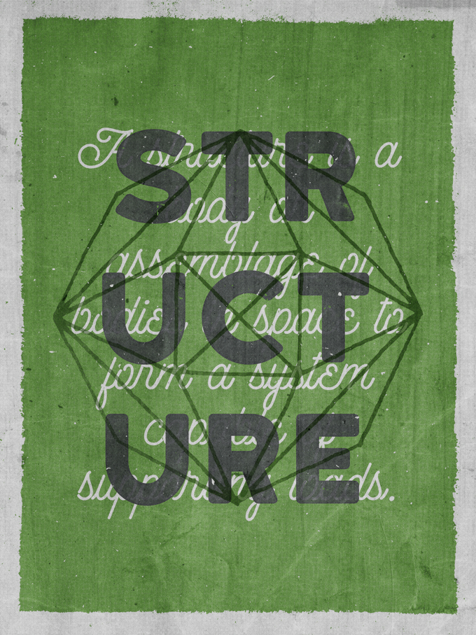
Hello Creative Market community! My name is Simon, and I run The Shop, which is both a design studio, and a design resources outlet here on Creative Market. Today, for my first post here, I will walk you through the process of re-creating a poster I call “Structure.” We will go through all the steps, from conceptualization to execution. I used many resources from Creative Market shops along the way, and I hope this will help see the awesome potential in high quality design inputs. I hope you’ll learn a few tips and tricks that you’ll be able to re-use in the rest of your work as well. Excited? Me too!
Step 0: The Story Behind the Piece
The Starting Point
The story is convoluted, but the short version is simple. I long wanted to create another piece with Ghostly Pixels’ polygon vector elements.
With that goal in mind, I started thinking through possible visual routes to go.
- I could play with photos, and use the polygons as masks
- I could still use a base image, but use one or more of the polygons as overlays
- Or I could use the polygon as the main visual element for my piece
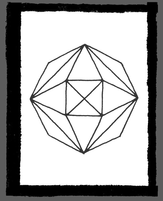
I chose to go with the last of these options, and to make one of the polygon the center of my piece. With that in mind, it was time to start sketching.
Putting Ideas Down
I used Wacom’s Bamboo Paper app on my iPad, along with a Bamboo stylus. I usually sketch stuff on grid paper with pencils and pens, but this experimentation proved interesting. It allowed me to create some layering, and to use color early in the process. Here’s the result of my exploration.
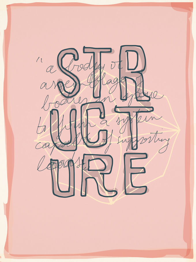
I used orange and yellow as my main colors, probably influenced by the polygons’ hero image. You’ll notice that I created a border around my piece, because I wanted to give it an enclosing frame.
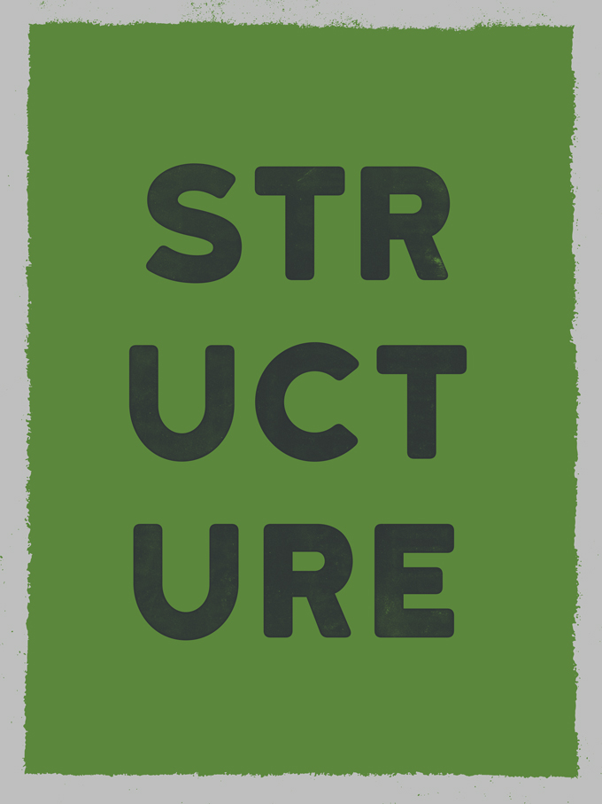
The shape I used from the pack makes me think of a structural element, hence the name of the piece. To further communicate this, I added “Structure” in bold on the piece, broken down in three lines of three characters.
I also wanted to have a longer text element in the background of the piece, that would contrast some with the bold type used for the title. I figured that using the definition of “structure” would be relevant.
Researching the Other Assets
After I was happy with my base sketch, I started looking into the assets I would need to put my piece together. Let’s have a look at the full list below.
GhostlyPixels’ Polygon Outline Shapes
Share on Pinterest
ThunderPixels’ 20 Dry-Ink Borders Textures – VES03
Share on Pinterest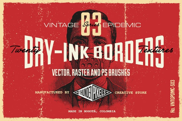
These will be perfect to create the rough frame around the piece.
Finck Inc.’s Katahdin Bold
Share on Pinterest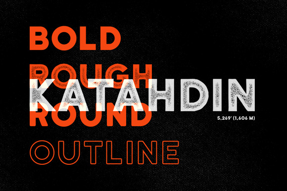
Here is our bold primary typeface, with a lovely vintage flair.
Decade Type Foundry’s Outfitter Script
Here’s the lovely script for the definition. It will contrast nicely with Katahdin.
ThunderPixels’ 20 Dusty and Speck Textures – VES04
Share on Pinterest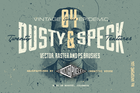
These will be great to add a little bit of vector grit, prior to using raster textures later on.
These are all the assets we need to get started. Let’s get to it.
Step 1: Piece Layout Assembling
With all the assets in hand, we can assemble them together to form the layout for the piece. While I’ll share instructions that are as detailed as possible, I want to encourage you to make the piece your own as much as possible.
Document Setup
We are going to use a canvas that is 18″x24″. North-American readers will recognize this size as being rather standard for a poster. For the rest of the world, the closest standard paper sheet size would be an A2 format.
The first part of the tutorial will have us use Adobe Illustrator. I’m using the CC version, but you should be able to follow along if you have Illustrator CS3 and above.
We’ll use Photoshop in the second half, when we’ll tackle the use of raster textures. But for now, vector it is.
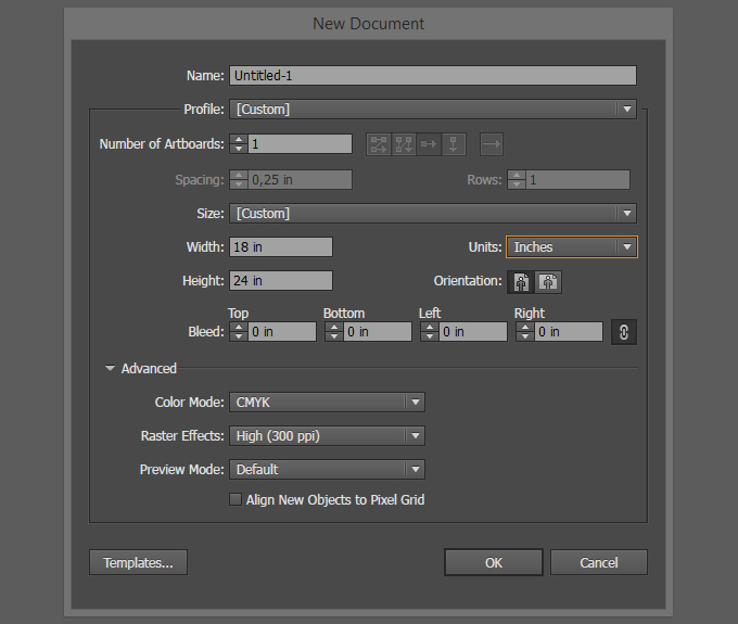
We are going to use absolute positioning value for most of the elements, thanks to the handy tools represented below. This will avoid us to have to place guides all over the place.

The Background Elements
If we refer to the sketch again, the background will consist of a solid color and a border. We won’t have a need to put the solid color in place yet, but we can tackle the border for sure. Open ThunderPixels’ 20 Dry-Ink Borders Textures. Not all 20 elements are suitable for our purpose as-is. Some rotation, and scaling, will need to take place.
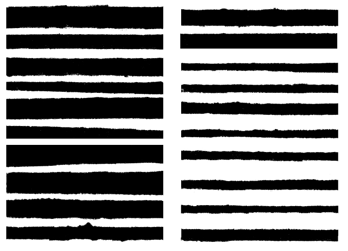
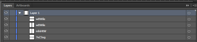
When creating his file, Iván gave each of the element a unique name.
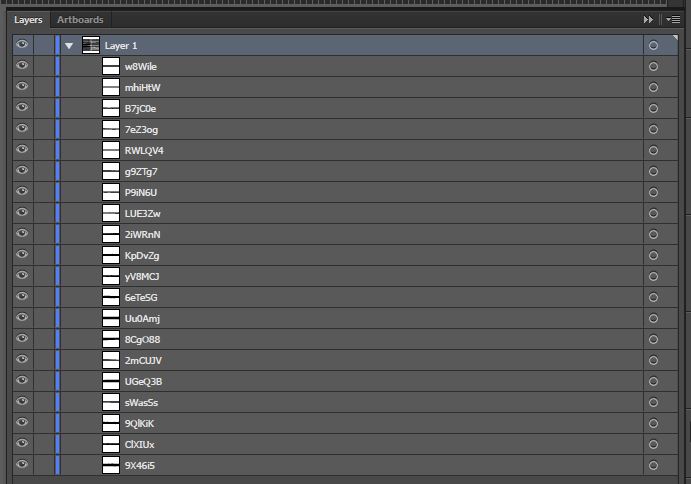
Here are the three elements we’ll use to create our dry ink border. Their names are:
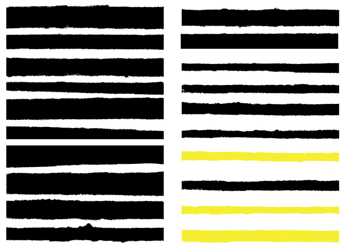
Let’s add them to our document.
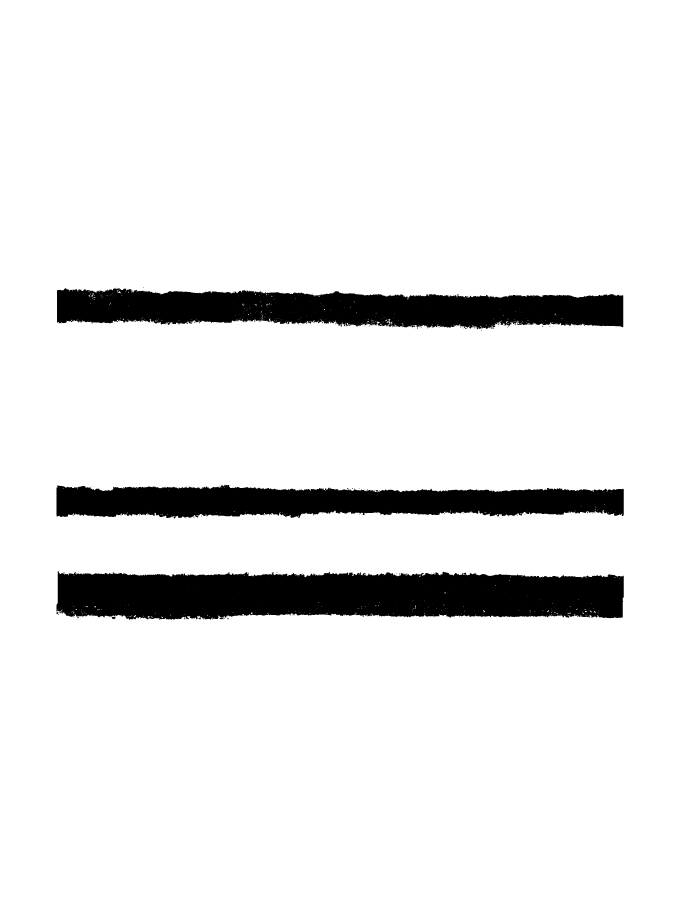
Let’s start with the left edge. Select w8Wile, and rotate of it 90°, clock-wise.
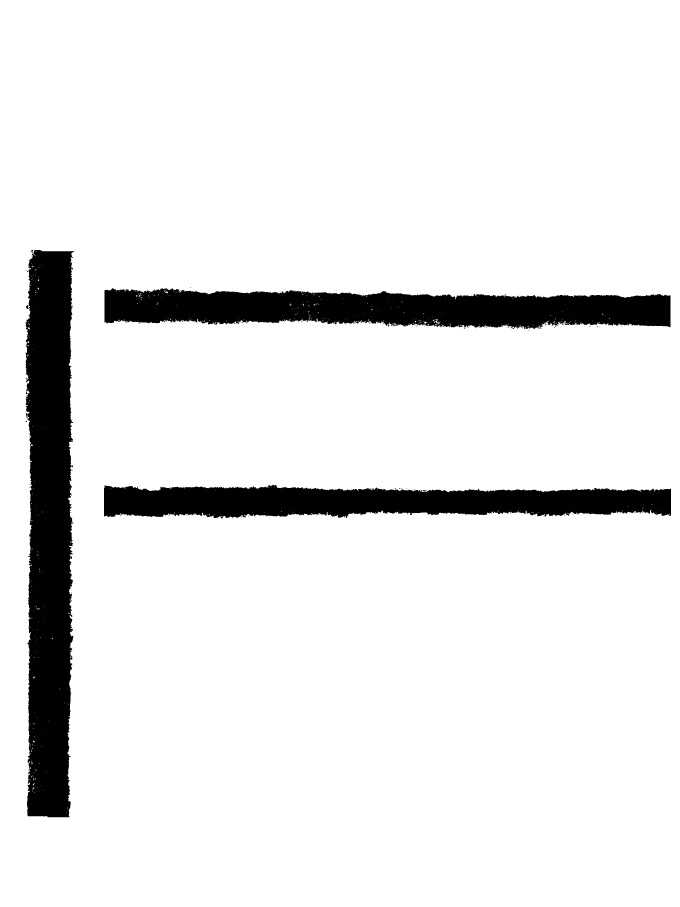
Let’s make it tall enough to cover the complete border of the canvas (25″).
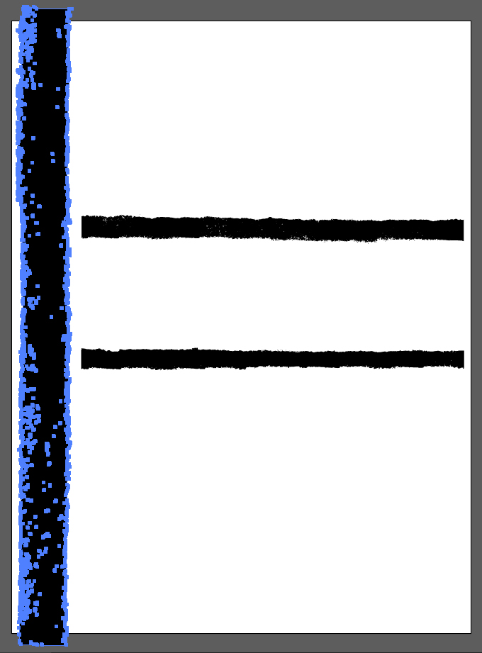
We need to place the border so its inner edge is 1″ from the edge of the frame. Use the absolute placement tools to do so. Simply change the reference point of the coordinates, and you’ll be good to go.

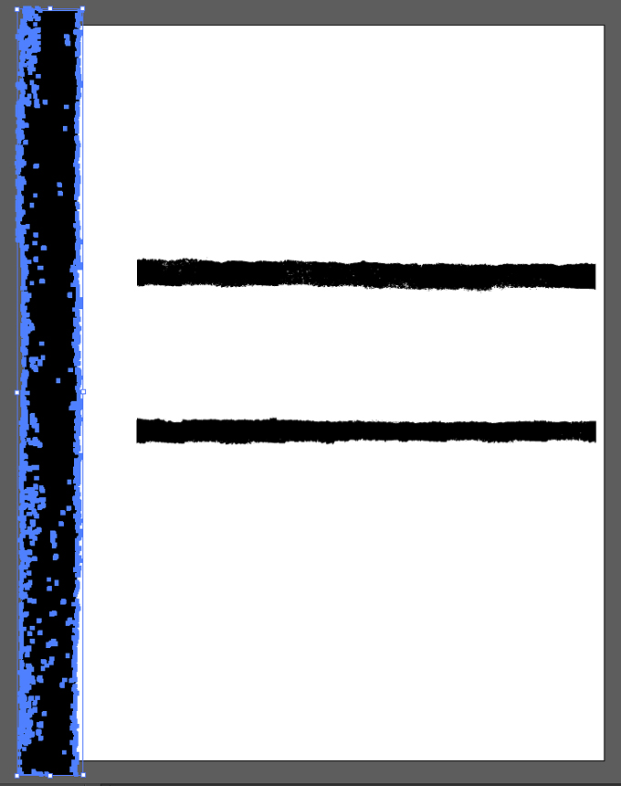
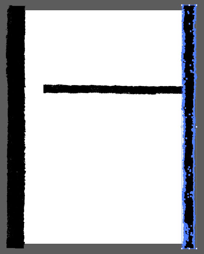
For the opposing border, we’ll use mhiHtW. It also needs to be rotated 90° clock-wise, and made 25″ tall.
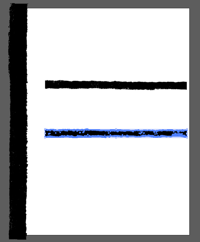
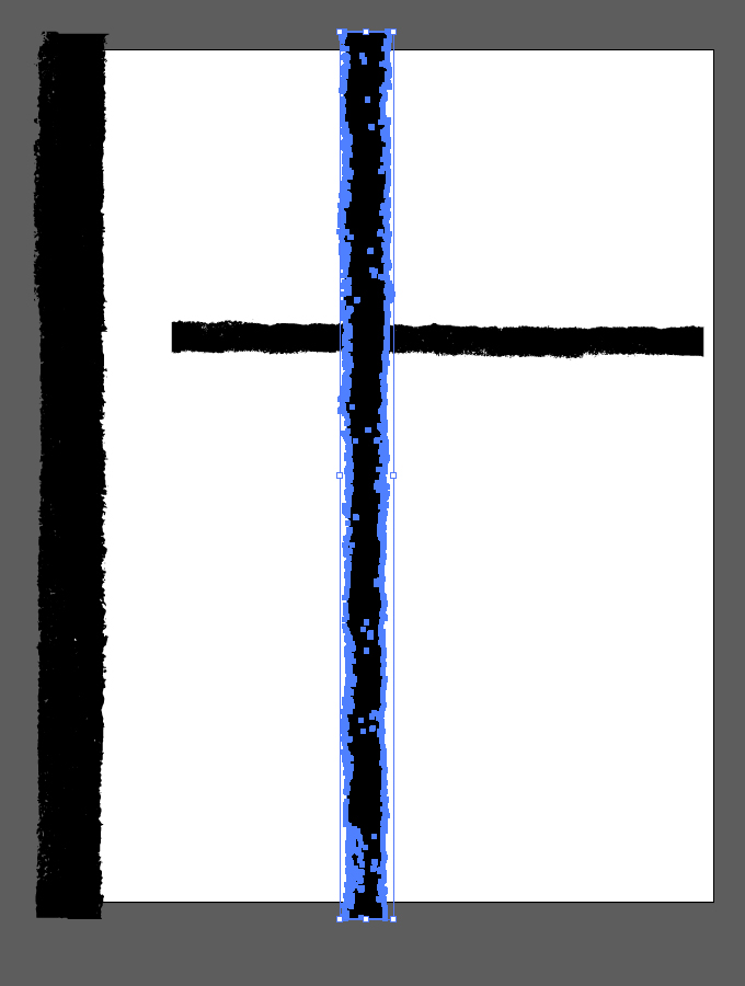

For the bottom border, we’ll re-use w8Wile. We are going to copy and paste the version we already have at hand.
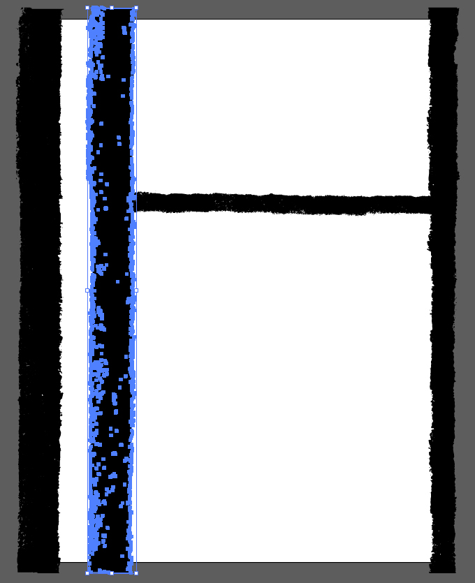
We’ll need to rotate it 90° counter-clockwise, and to scale its width down to 19″.
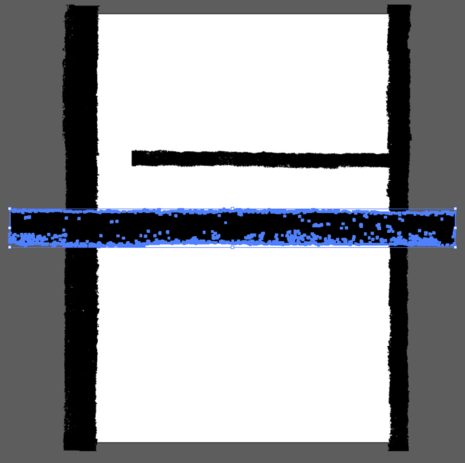
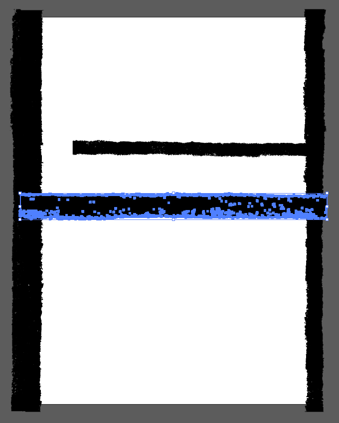
Finally, let’s put it in place. The inner edge of the border needs to be at 1″ of the canvas edge.
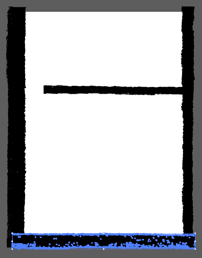

The last piece of the border is the top one. We’ll use 7eZ3og for that. It’s already properly oriented, so we simply have to scale its width up to 19″, and to place it so its inner edge is at 1″ from the edge of our canvas.
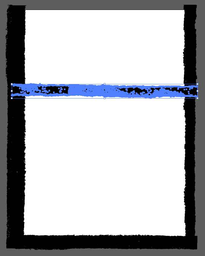
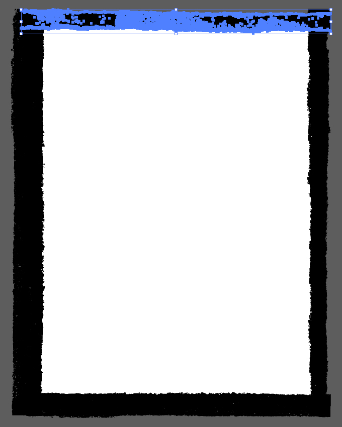

And our border is in place.
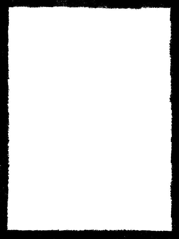
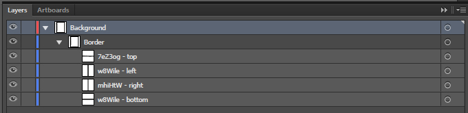
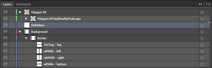
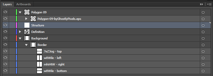
With all of that work accomplished, we need to organize our layers better. This includes but isn’t limited to proper naming habits, grouping, ordering, etc.
The Polygon
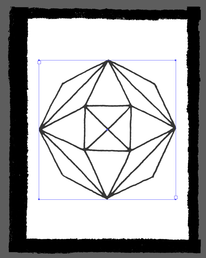
It’s time for us to put our focal element in place. Start by opening Polygon-09-byGhostlyPixels.eps.
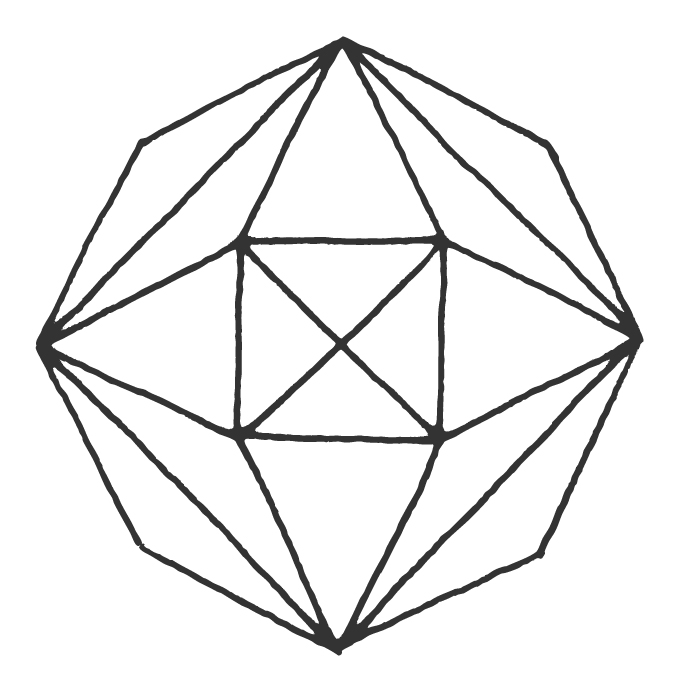
Create a dedicated Polygon 09 layer to host it, and paste it in there.
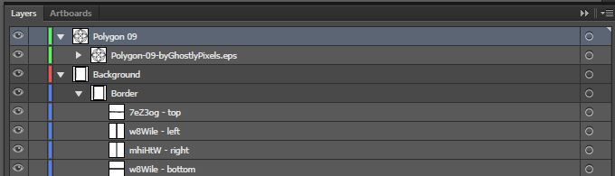
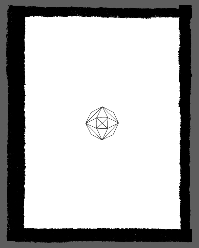
The polygon is centered in the canvas, and is 14″ wide.

Type: The Definition
There are two type elements n our poster. The first one that we’ll tackle is the edited definition of “Structure.” I’m using the Wikipedia entry as my base point:
A structure is a body or assemblage of bodies in space to form a system capable of supporting loads.
The definition will be set in Outfitter Script.
Share on Pinterest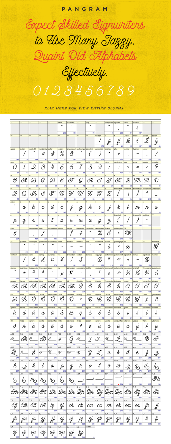
Start by creating a new layer called Definition below the polygon’s layer.
Create a text object that has roughly the height and width of the polygon.
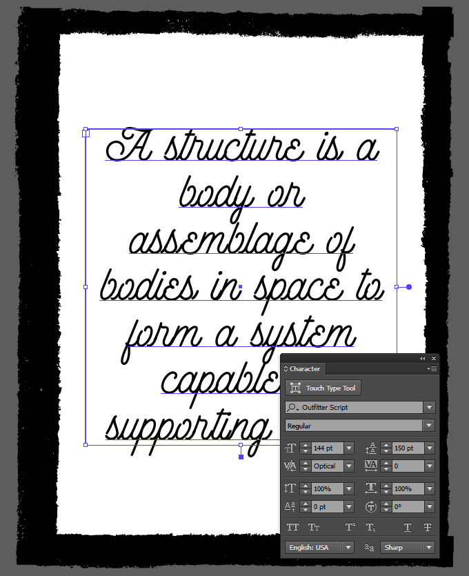
Hide the polygon for now, and paste the definition in the box. We will set Outfitter Script to be 144 points tall, with a leading of 150 points. The text should be centered, and the tracking can be set to optical. The paragraph settings shouldn’t allow for hyphenation.
Turn the polygon back to visible, and fine tune the text object so it fits its width and height as closely as possible.
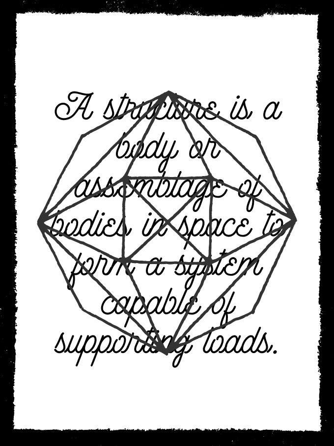
The resulting values of that process are below for the text box.

Type: The Headline
The second text object is “the tagline” of the poster. It’s the word “structure,” split in groups of three letters (STR / UCT / URE). That element has also been sized so it visually fits the height of the polygon.
We need a new layer for the text element.
We don’t have to create a text block for this one, but to create the line breaks manually. The copy is set in Kathadin Round Bold (note that we’re not using the aged version – we’ll do our own aging a bit later). The type is 330 points tall, with a leading of 384 points, and the tracking set to optical. The object is centered within the piece.
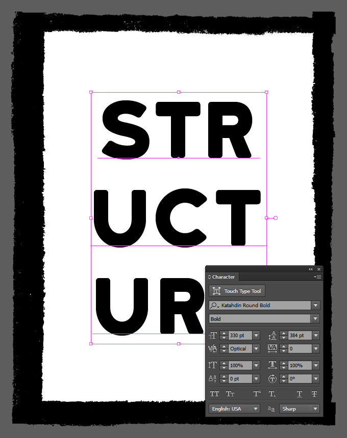
Our type elements are all ready now.
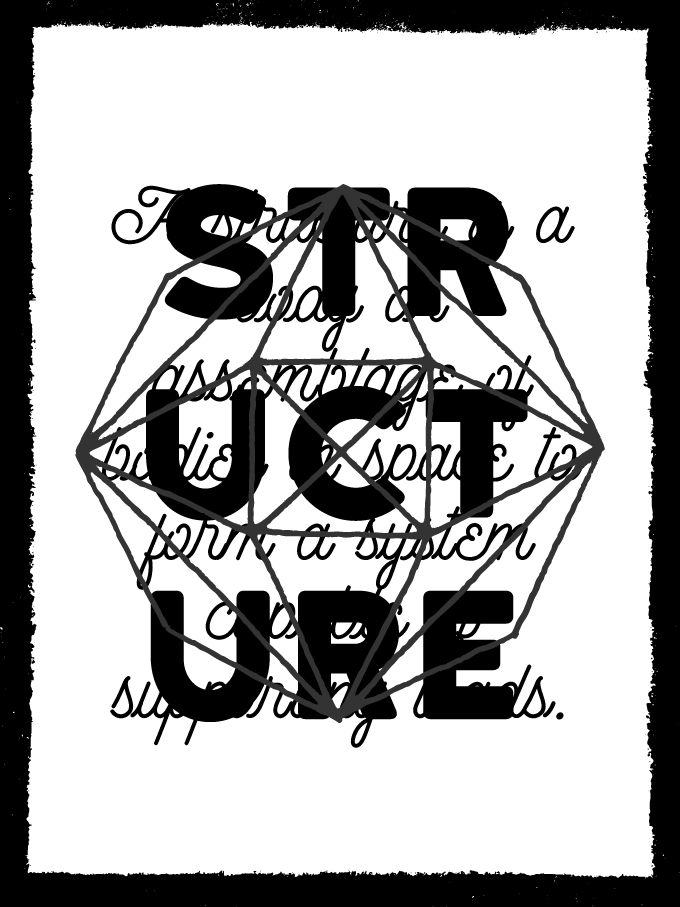
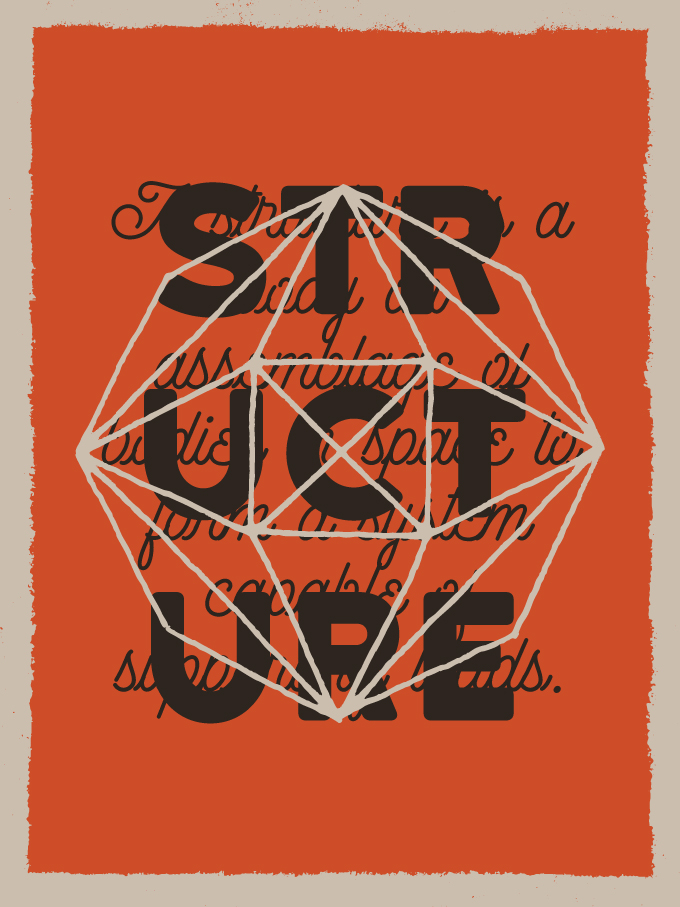
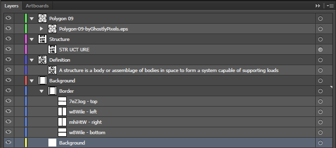
And here’s what our layers look like so far.
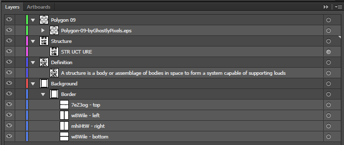
With all of these in place, we can start moving on to color. This will help us to make sense of the piece before we start adding aging elements all around.
Step 02 – Color Palette
Where to Find Color Palette Ideas
One of my favorite ways to get vintage color palettes is to look at old packaging. One of my favorite piece of old packaging is this box, designed for a Mullard EC88 vacuum tube (via The National Valve Museum).
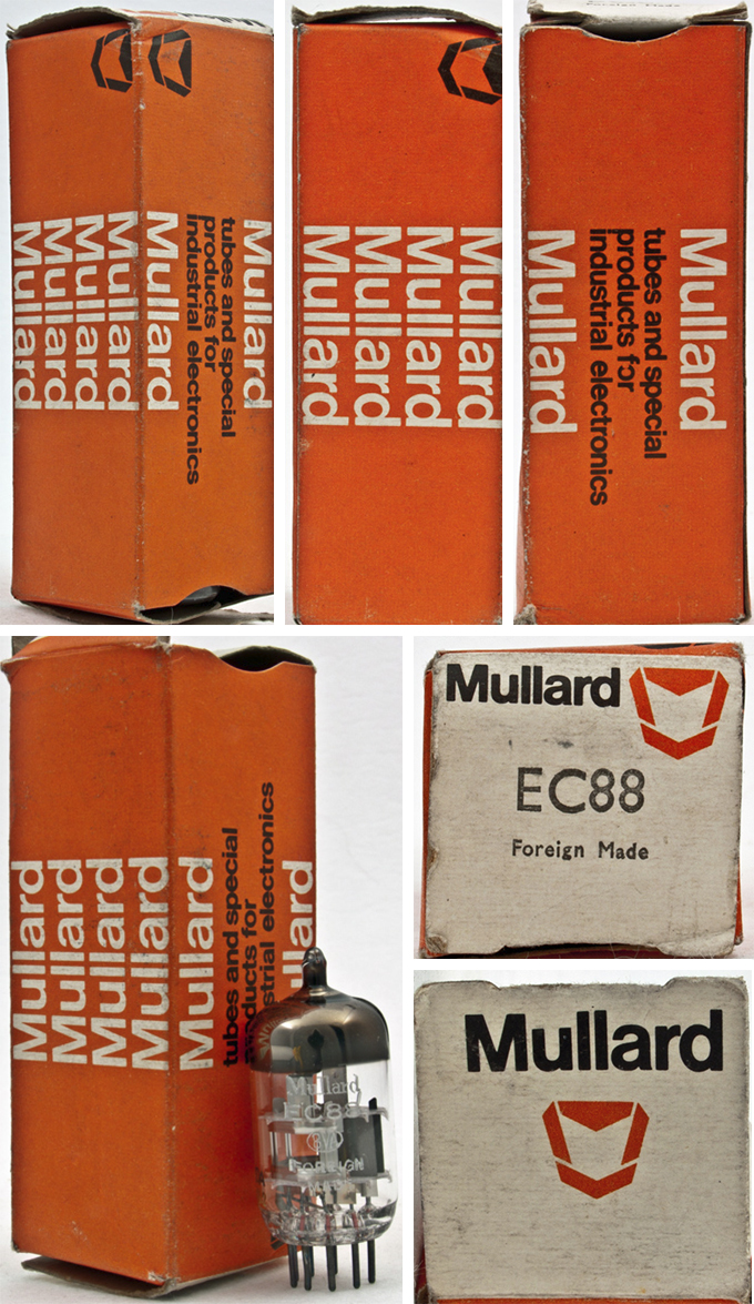
Trying Things Out
My first color scheme was based on this piece of packaging. I ran into some legibility issues, as I was missing at least one color to properly separate all of the elements (background, border, polygon, tagline, definition).
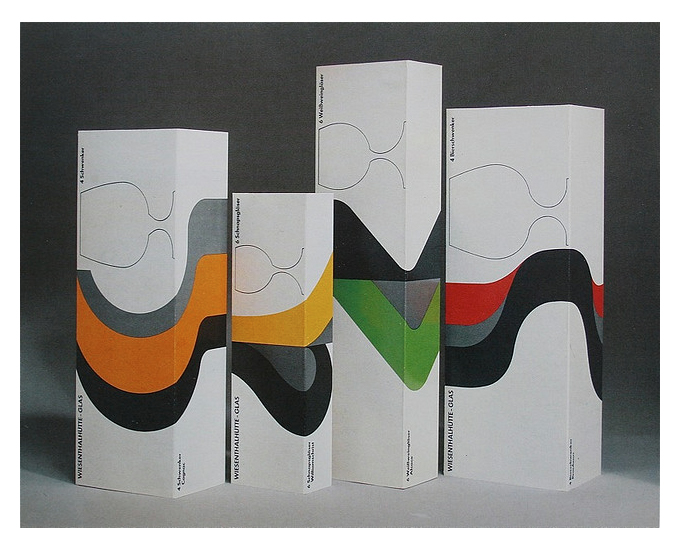
After researching additional old packaging references, I came across a great vintage packaging gallery on Wanken. These drinking glass boxes struck a chord, the green, white, black, and gray one in particular.
Settling on the Final Direction
After some sampling, I ended up again with a three color palette, but one that proved much more efficient in terms of contrast between each colors.

The thee colors are
- Medium green – #5b873c
- Medium gray – #bebfbe
- Very dark gray – #2e3335
Colorizing the Piece
Let’s start assigning colors. First, we’ll need to create a new sub-layer at the bottom of our background layer, in order to host the rectangle that will stand for our background color.
Create a rectangle with a medium green fill (#5b873c), that covers the whole piece.
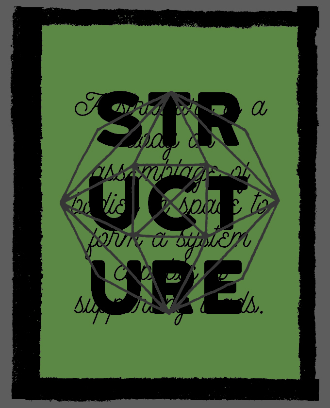
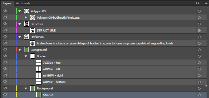
Next, change the color of the border elements to the medium gray (#bebfbe).
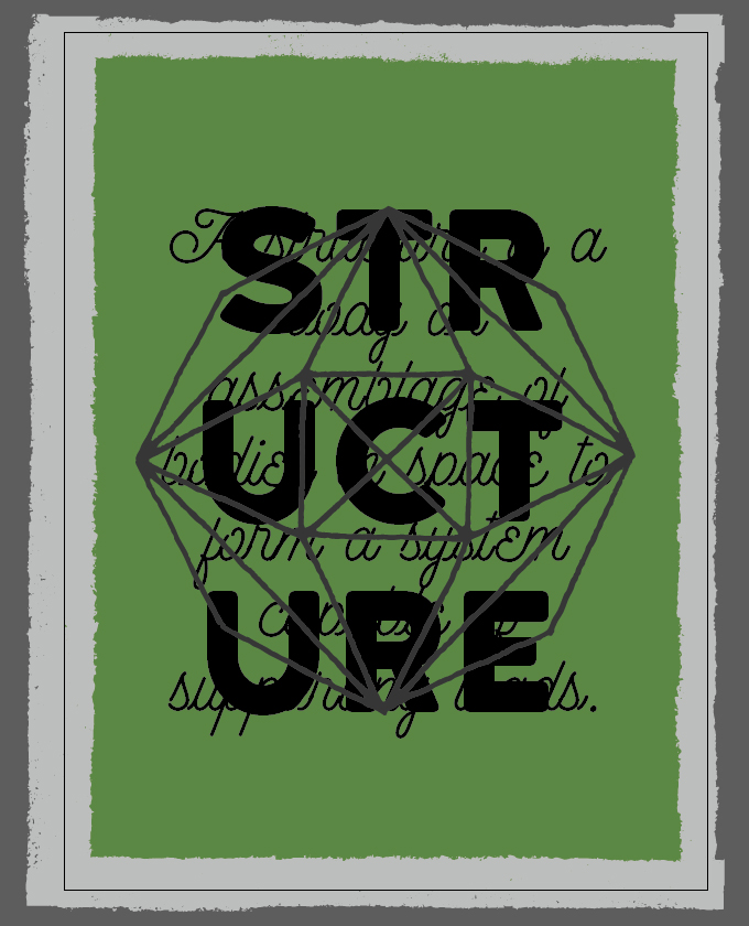
Change the color of the definition to the medium gray as well.
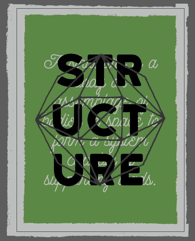
Finally, change the color of the tagline to the dark gray (#2e3335).
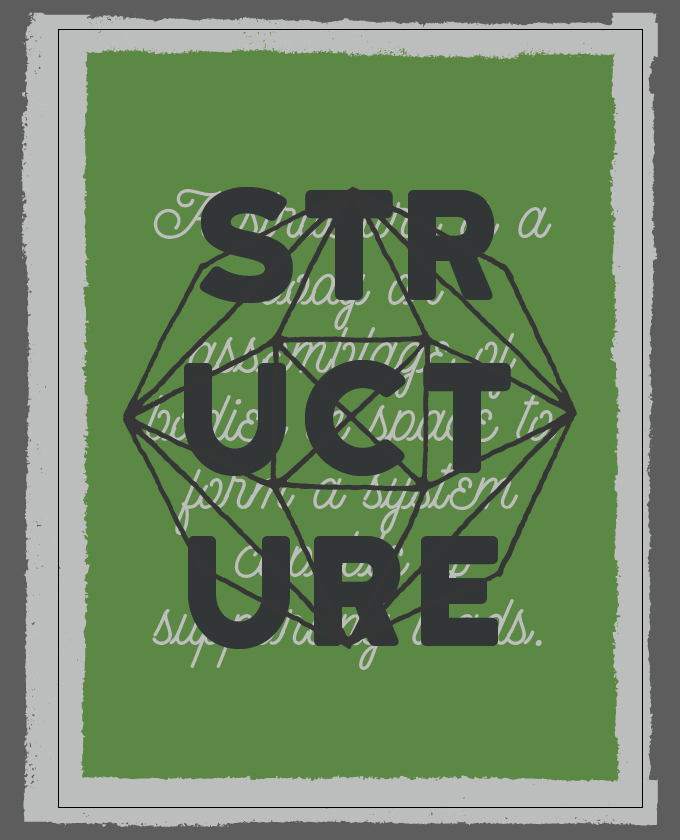
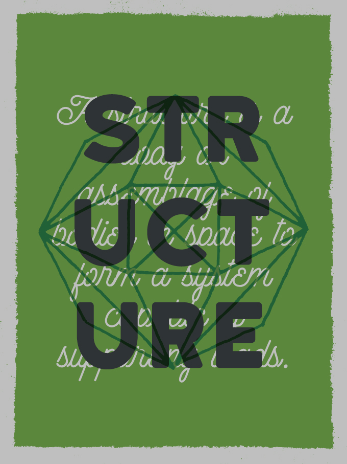
Now, we are going to “cheat” somewhat to expand our color palette. We are going to change the color of the polygon to our green (#5b873c), and also change its blending mode to Multiply @ 100% opacity. It’s like we have an additional color to play with.
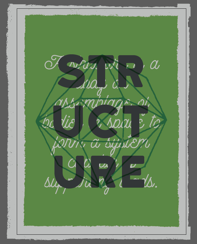
Note that if we were screen-printing this design in real life, in order to keep the numbers of colors down to three, we would probably print the poster on sheets that are the color of our medium green.
Either way, our colors are now in place.
Step 3 – Vector Grit
Since our colors are fully in place, it’s time to add the first pass of aging elements to our piece. This is were ThunderPixels’ 20 Dusty and Speck Textures pack comes into play.
Share on Pinterest
Let’s start this phase by creating a layer at the top of our layer stack to host the textures.
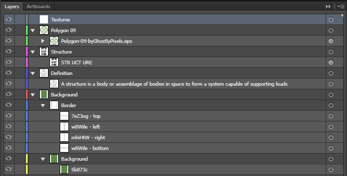
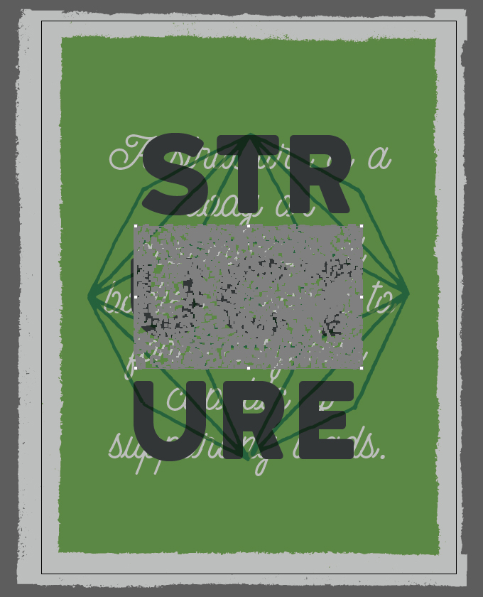
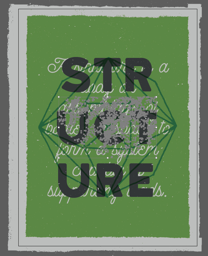
The first texture we’ll use is Vintage-Vector-Texture-02.ai.
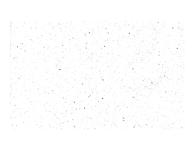
We are going to place it centered in our document, rotated of 90° counter-clockwise, and with a width of 18″.
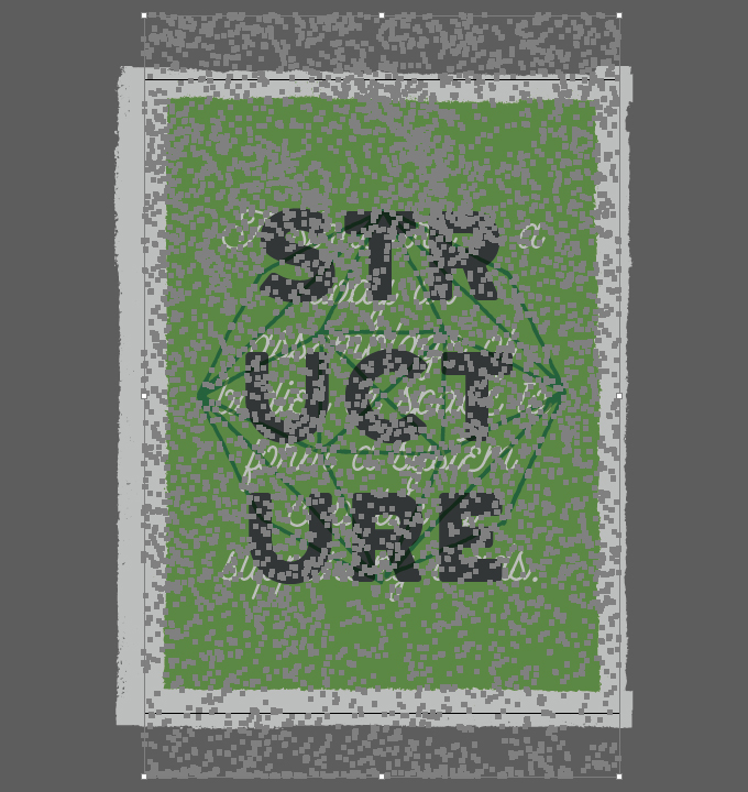
Finally, let’s change its color to our medium gray (#bebfbe).
The second texture we’ll use is Vintage-Vector-Texture-16.ai.
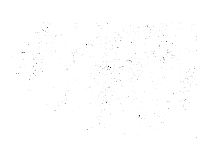
It will be placed along the same parameters (90° counter-clockwise rotation, 18″ wide, and centered in the piece).
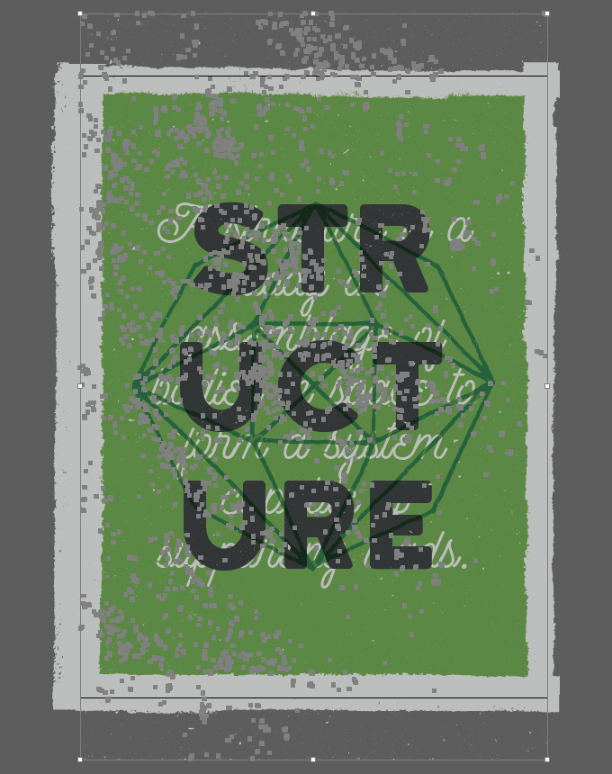
Last step: color change to the medium green.
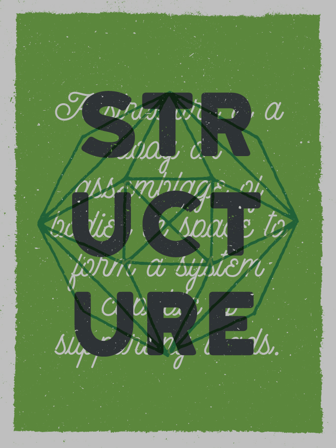
And with that, all of our vector elements are in place. Don’t forget to properly label everything.
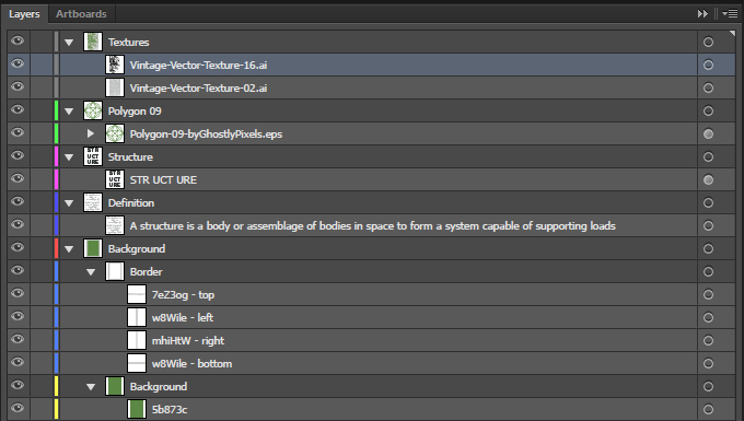
Next, to the world of raster textures and blending modes we go!
Step 4: Textures, Textures Everywhere!
Our vector base is ready to go. The problem we now have is that the texture work we need to accomplish will take place in Photoshop, not Illustrator.
Transferring Our Piece to a Photoshop Document
We can use raster textures in Illustrator, but we won’t have the same powerful tweaking tools at hand (adjustment layers, levels, etc.) to manipulate them. So we have to transfer our elements into a Photoshop document. The process is simple, if slightly annoying.
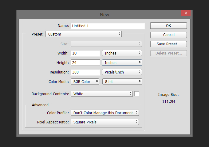
Start by creating a new Photoshop document with the same specifications as the Illustrator one (18″x24″ @ 300 ppi). Note that we’ll use a RGB document rather than CMYK, for reasons that will make sense later.
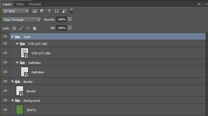
From there, it’s a matter of copying and pasting our design elements in as smart objects (type elements, polygon, border, vector textures). Use the absolute positioning tools to get things in place accurately. The background is generated using a layer.

Here’s a quick look at our layers and layer groups so far.
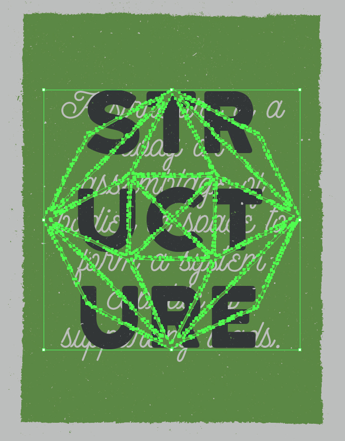
The polygon is next. Prior to paste the smart object in, we need to change its blending mode back to Normal @ 100% opacity in our Illustrator file. I’ve experienced weird things visually when counting on the Illustrator blending mode to carry over properly to Photoshop. Once properly pasted in Photoshop, re-enable the Multiply @ 100% opacity blending mode.
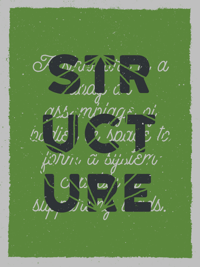
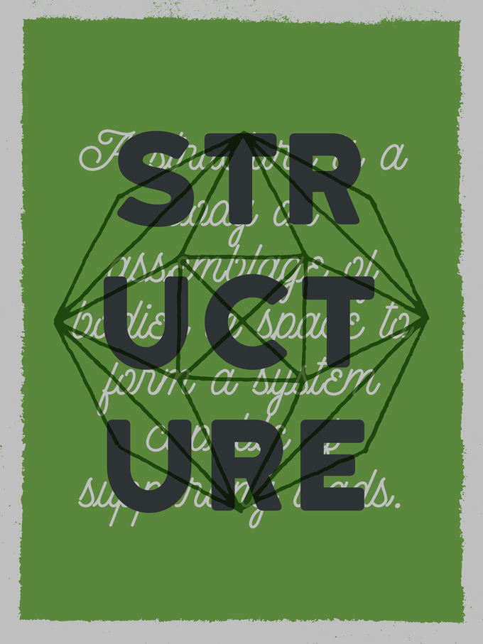
Past that exception, the two vector textures are all of what is left to transfer.
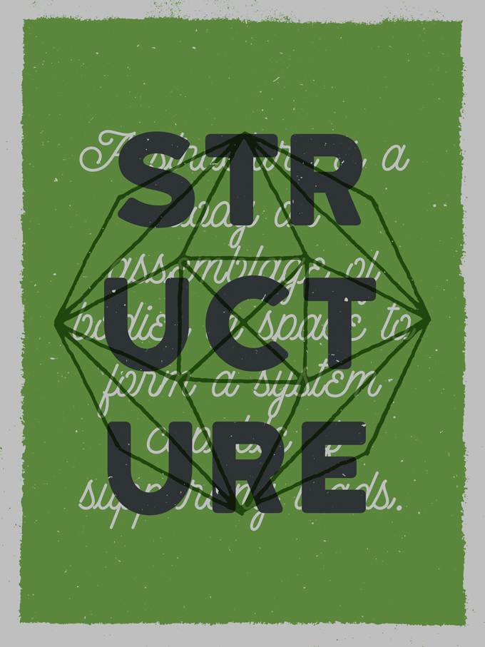
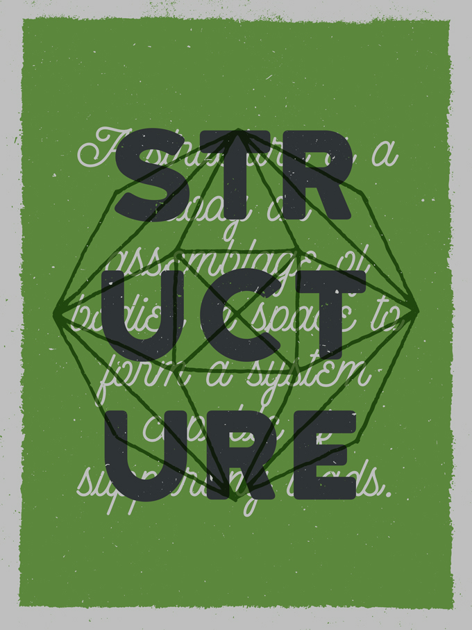
And here’s the state of the layer stack.
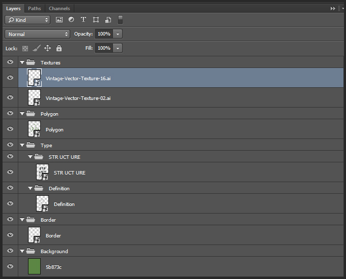
A Look at Our Assets
Here’s a look at the textures we’ll be using. Full disclosure: I created all of these packs.
The Shop’s The WMC Fest 5 texture pack will help us to distress some elements.
Share on Pinterest
The Shop’s Vintage paper textures volume 01 will help us to add subtle creases and folds to the piece.
Share on Pinterest
The Shop’s Vintage paper textures volume 02 will help us with subtle distress.
Share on Pinterest
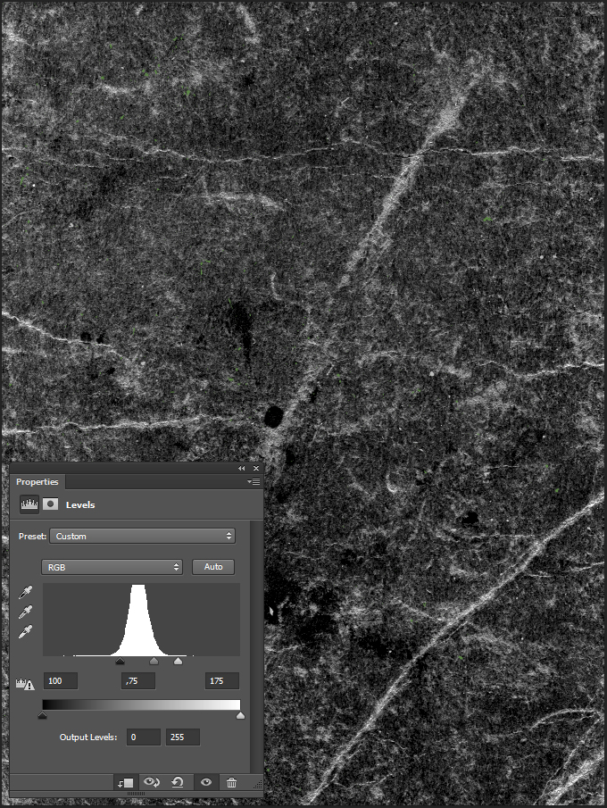
The Shop’s Vintage paper textures volume 03 will help to add some grit and paper grain to the piece.
Share on Pinterest
The Shop’s Brush stroke textures volume 01 will help us to add some brush strokes to the piece.
Share on Pinterest
Some Important Advice Before We Continue
Pro-tip #1: don’t know what a clipped layer is? Glad you asked! This means that the layer is only visible/applies to the layer directly below it. You can very quickly do this by holding ‘Alt’ down on your keyboard and clicking between the two layers. Here’s a quick demonstration.
Pro-tip #2: every time we’ll work with textures, we’ll follow this simple process: place a smart object, sharpen, desaturate, enhance contrast with levels, and modify the blending mode.
Pro-tip #3: placing the textures as smart objects, and using adjustment layers to tweak them allows us to stick to a non destructive workflow.
Texture Use N°1: Fading Elements
The first use we’ll make of all these textures will be to fade and weather elements. The first element to weather is the STR UCT URE type piece. Start by turning the visibility of elements off until all that is left is the background (border included), and the STR UCT URE type piece. This will help us to properly see what we are doing.
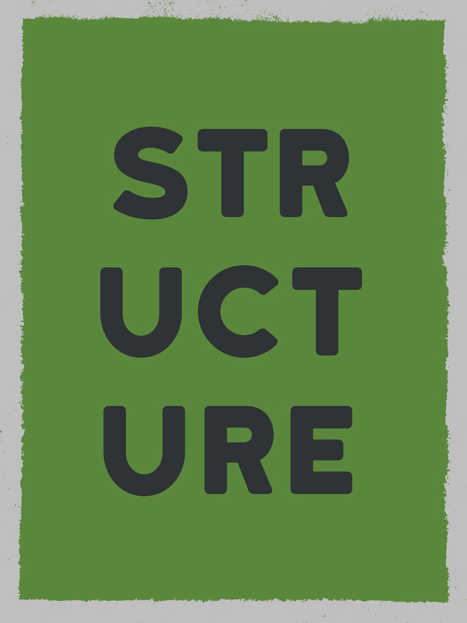
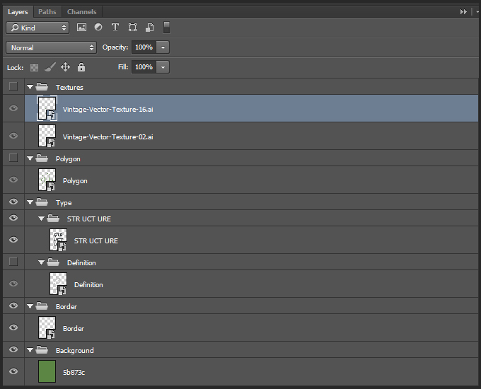
The texture we’ll use to weather the type is from the Vintage paper textures volume 02 pack. It’s called vintage-paper-textures-volume-02-sbh-009.jpg.
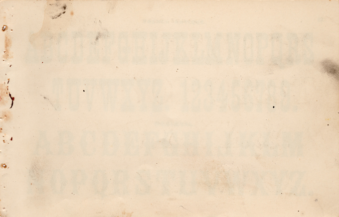
We’ll leverage it by pasting it in a layer mask assigned to the type element. The process to accomplish that is simple. Let’s begin it by assigning a layer mask to the type element (Layer > Layer mask > Reveal all or we can use the Add vector mask button at the bottom of the layer palette).
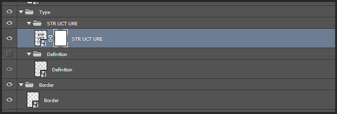
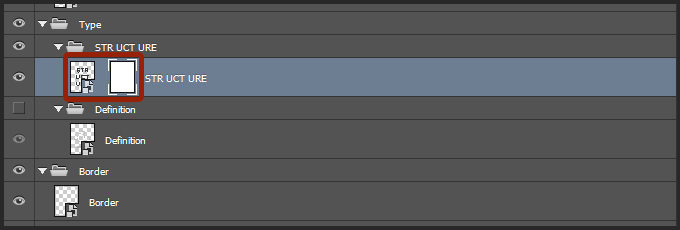
We have to make sure that the layer mask and the layer are “unlinked,” or independent from each other. If we don’t, manipulating the content from one will modify the content from the other.
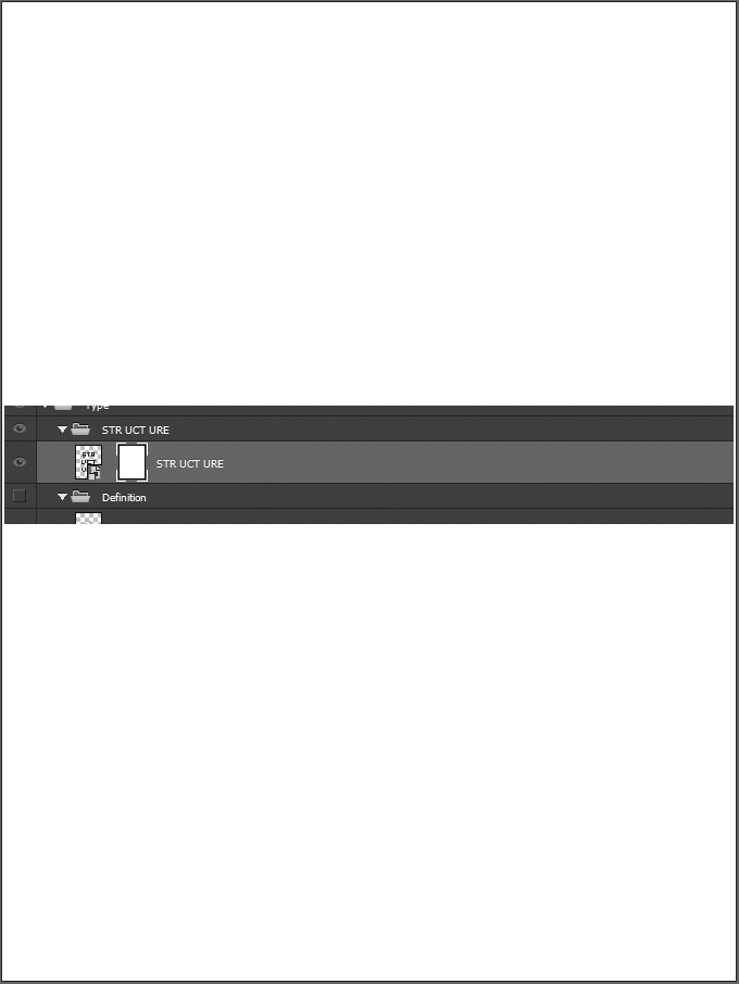
In order to paste the texture in that layer mask, we have to switch our view to “the layer mask content view.” The trick? To click on the layer mask thumbnail while pressing ALT/OPTION.
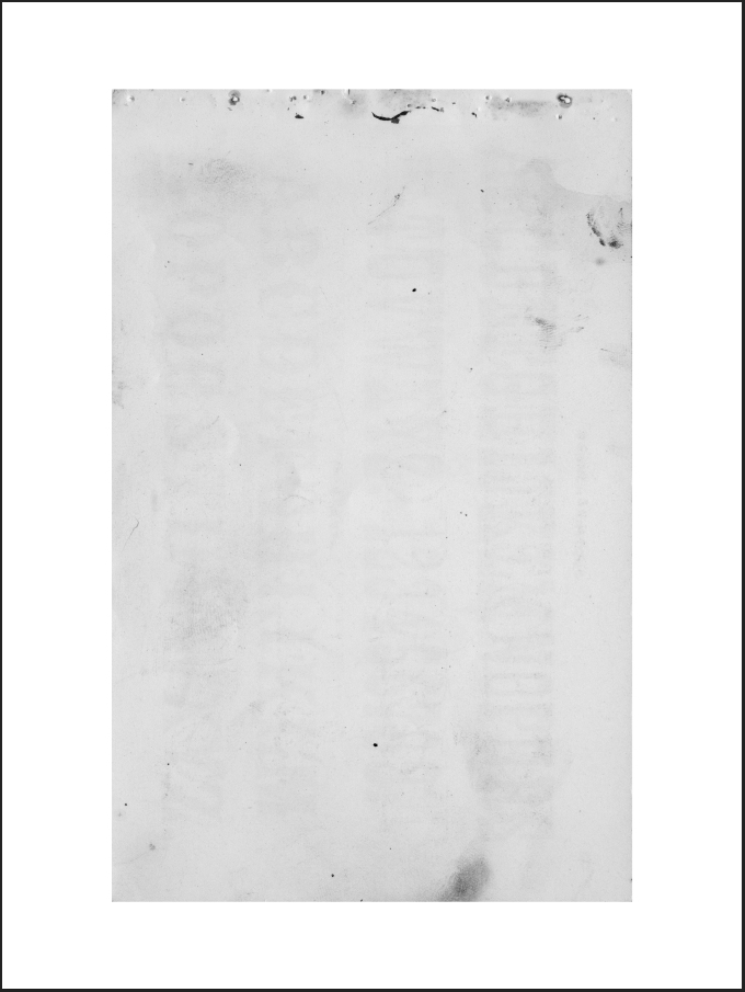
Once we have access to that view, we just have to paste the texture in the layer mask. The main imperative here is that the texture has to fully cover the type element. In my case, I rotated the texture clock-wise 90°, and sized it at 75% of its full size.

By clicking back on the type element’s thumbnail, we can admire the result so far. It’s going in the right direction, but can be improved upon.
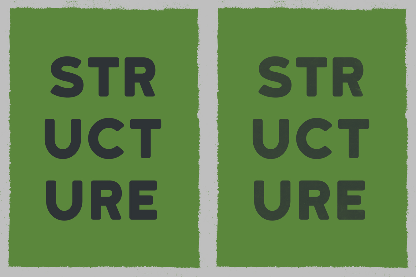
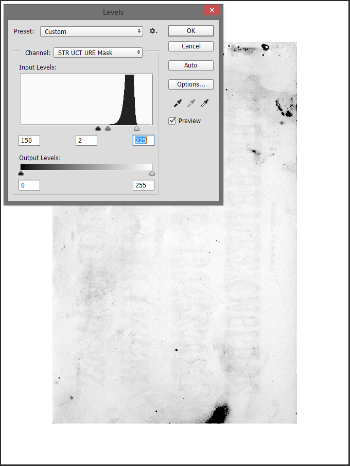
The first step is to switch back to the layer mask content view, and to sharpen the texture (Filter > Sharpen > Sharpen). Next, we are going to use levels to emphasize the various artifacts of the texture (Control/Command+L).
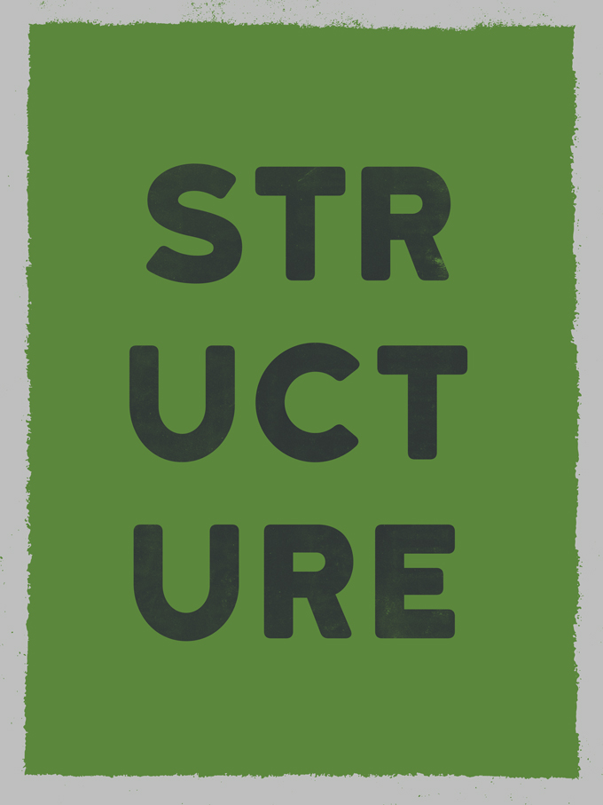
The result is a subtle fade, with dry ink-like effects.
The finishing touch will be to remove the texture from the edge of the type. Start by Control/Command+Click on the type object’s thumbnail to load it as a selection.
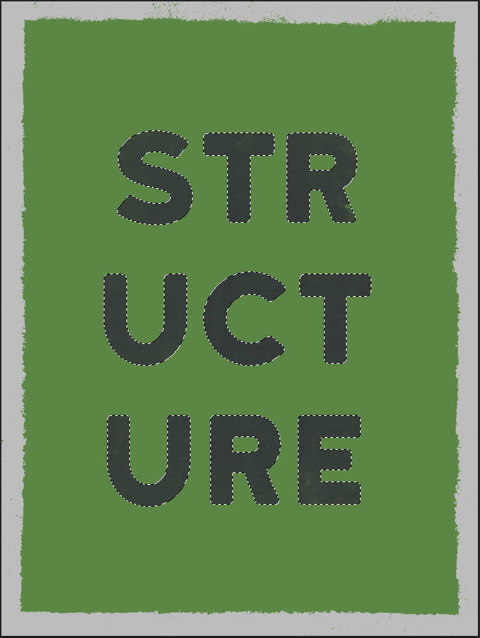
Next, we should head back to the layer mask view. The first step is to contract the selection of 10 pixels (Select > Modify > Contract).
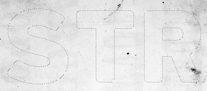
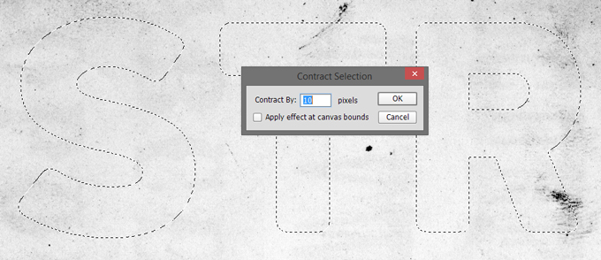
Next, we need to select the inverse of what we’ve selected so far (CTRL/CMD+SHIFT+I). After that, we can finally feather the selection of 10 pixels (Select > Modify > Feather, or SHIFT+F6).
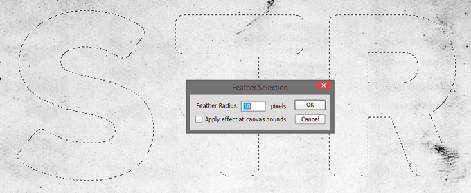
Once we’ve completed these steps, we can delete the content of the selection.
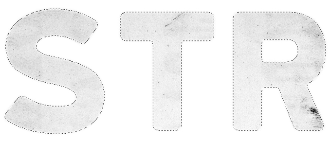
And admire the global result.


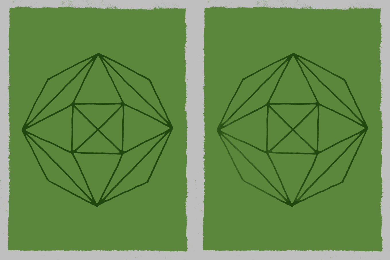
The next weathering bit will be done on the polygon, and will use wmc-fest-2014-texture-pack-sbh-035.jpg, from the WMC Fest 5 texture pack.
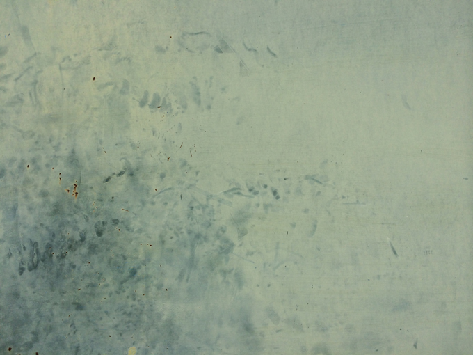
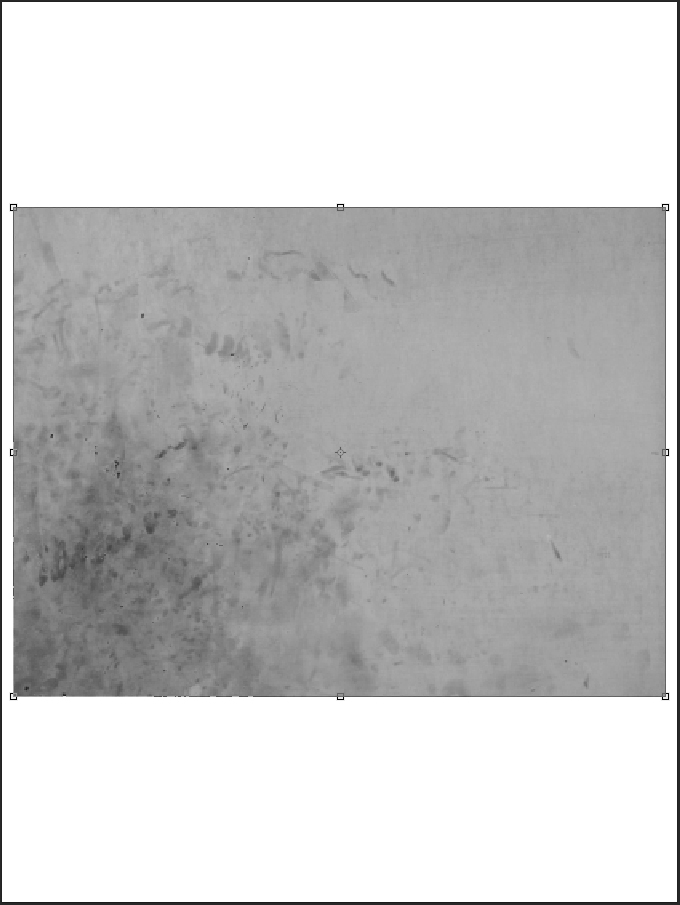
The process is the same: add an unlinked layer mask, paste the texture in it so it fully covers the vector asset.


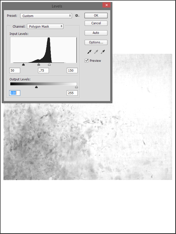
After sharpening the texture, it’s time to use levels again to get the best of it visible.
And we can admire the result.
Texture Use N°2: Layering
Now that we’ve weathered all the elements we needed to by pasting textures in layer masks, we can focus on the second way to use textures: by layering them in our piece. This is where the whole “placing textures as smart objects” comes into play.
Here’s where we’re starting from.
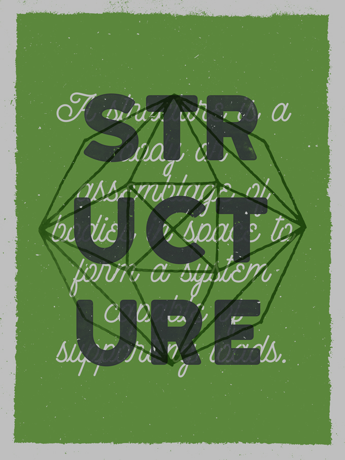
Note that the three textures we’ll use will rest below the vector textures we already have in the piece.
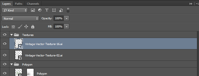
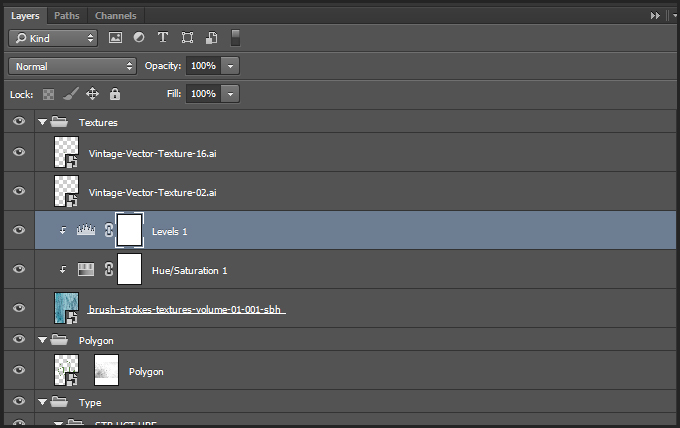
Let’s start with the first texture: brush-strokes-textures-volume-01-001-sbh.jpg.
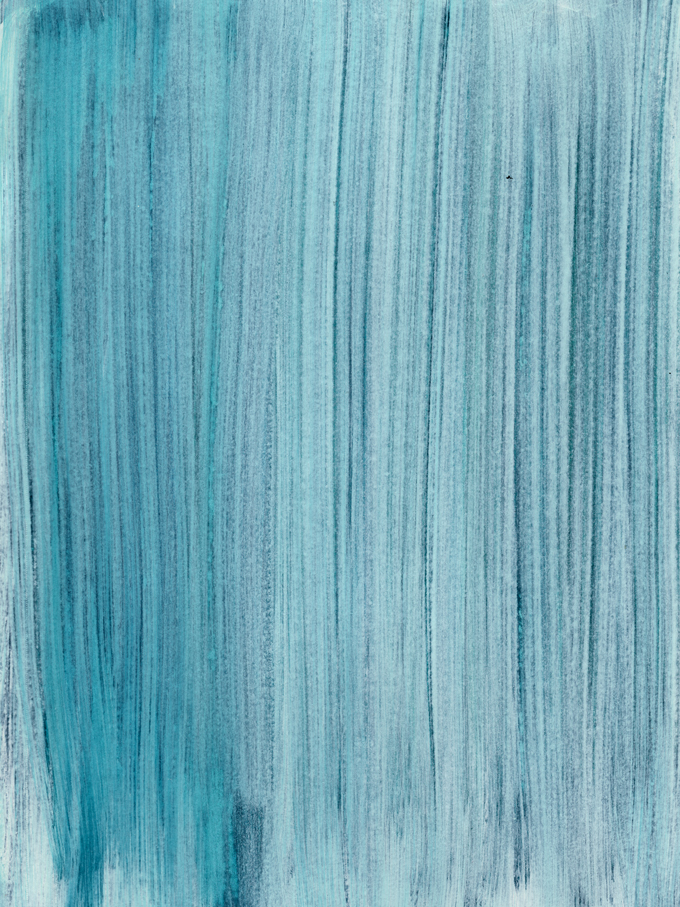
It’s placed centered in the canvas.
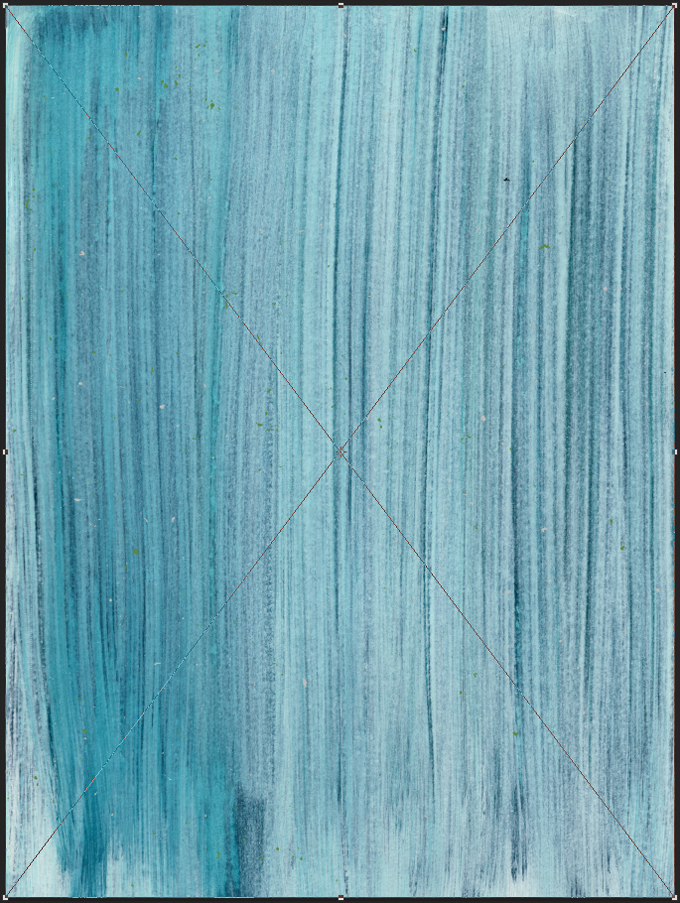
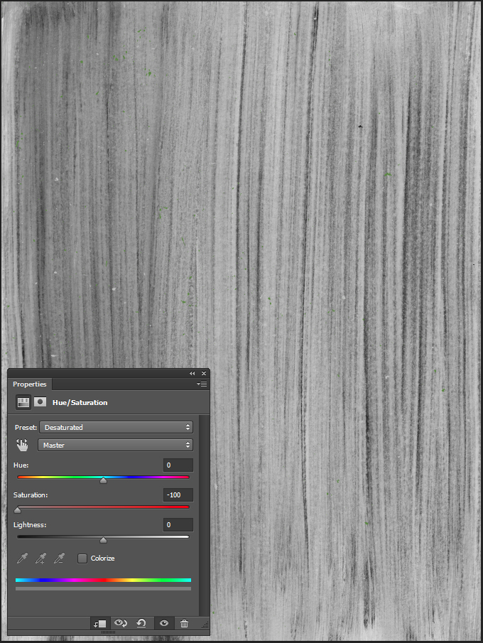
After sharpening the texture, we need to use a clipped hue/saturation adjustment layer to desaturate it.
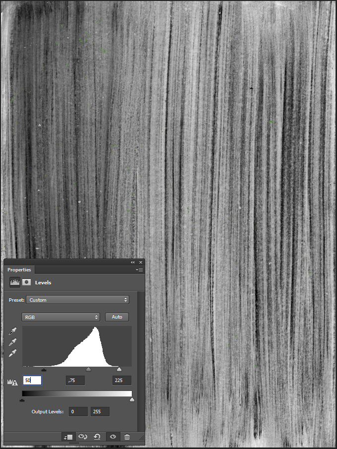
Next, we’ll use a clipped levels adjustment layer to further tweak the texture.
Finally, change the texture’s blending mode to Soft light @ 25% opacity.
And this is what our layers look like.
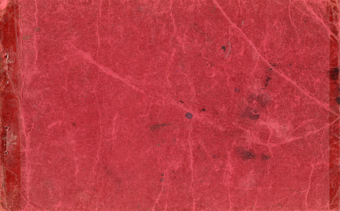
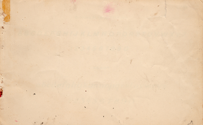
Next texture: vintage-paper-textures-volume-01-sbh-002.jpg, from the vintage paper textures volume 01 pack.
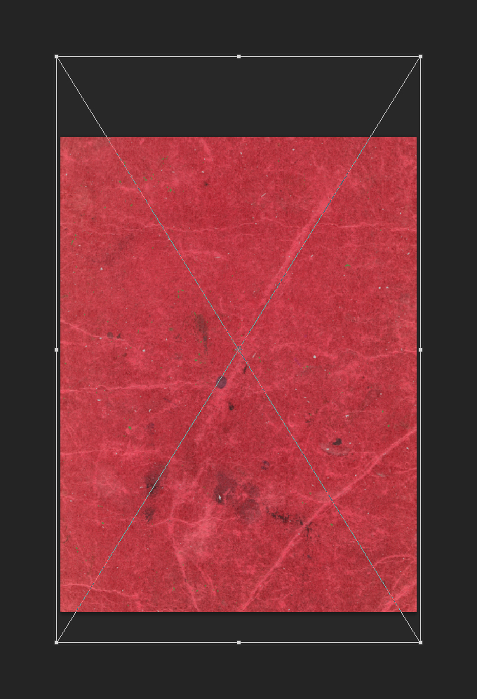
It’s placed so none of the tape marks at the top and bottom are visible on the piece.
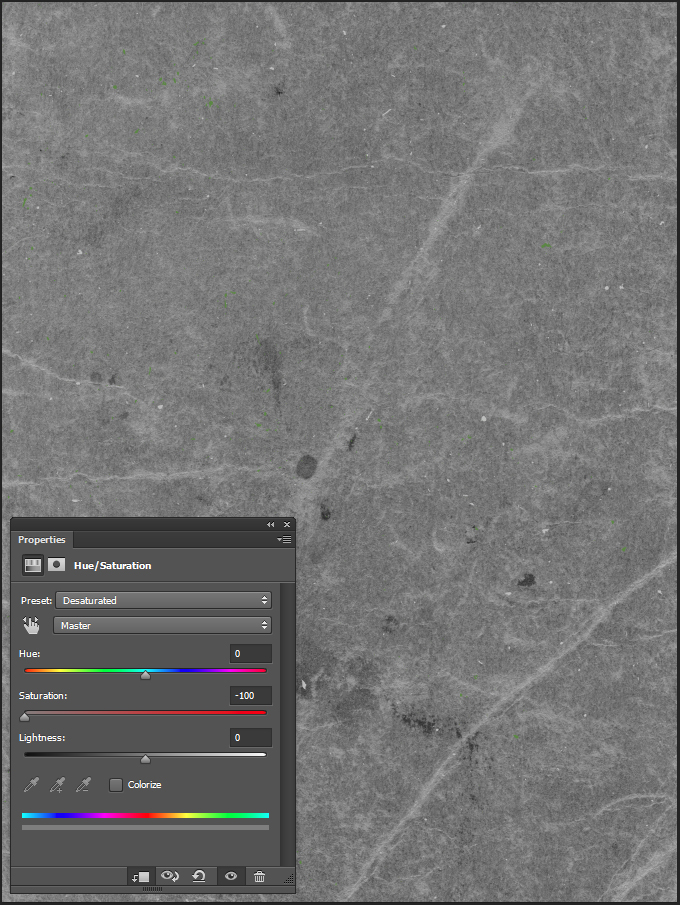
Desaturated.
Levels adjustment layer.
Blending mode: Soft light @ 25% opacity.
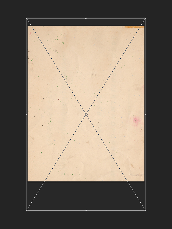
The last texture we’ll add to the piece is from the vintage paper textures volume 03 pack. It’s vintage-paper-textures-volume-03-sbh-011.jpg.
It’s placed so the tape mark at the top left corner of the texture shows up slightly at the top right of the poster.
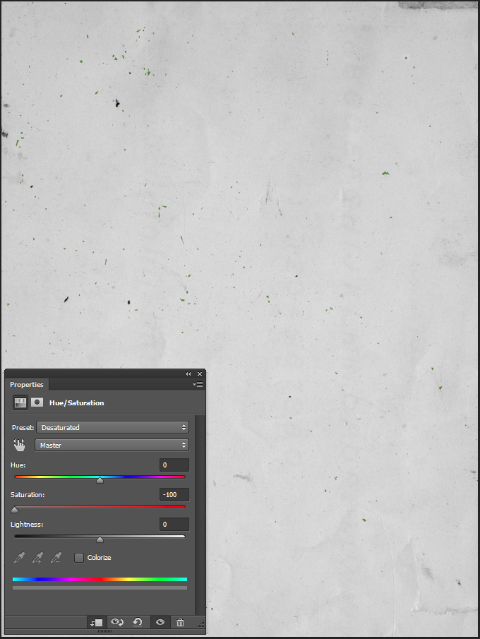
Desaturated.
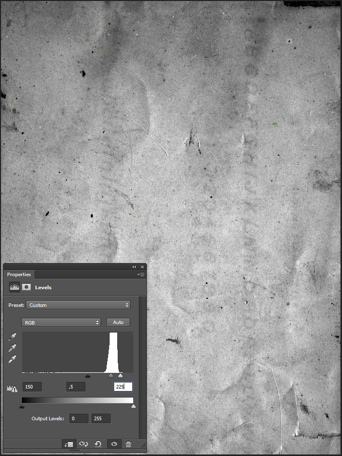
Levels.
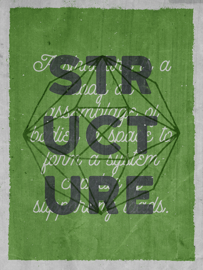
Blending mode: Soft light @ 75% opacity.
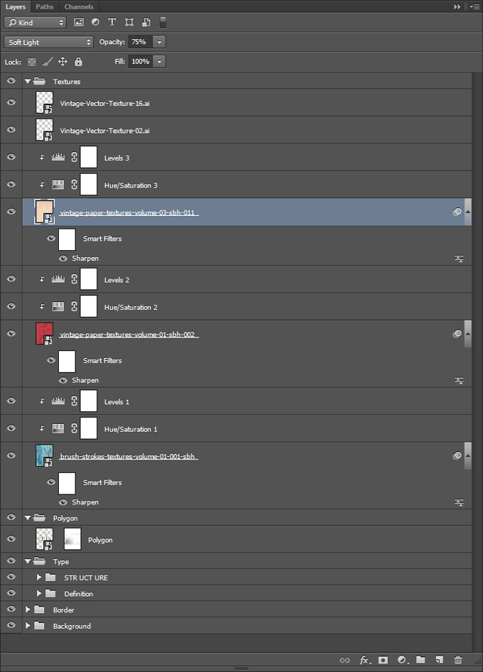
We’re done with adding textures to the piece. Here’s a view of our layers.
Step 5 – The Finishing Touch
Phew, we’re almost done, I promise. The last touch we’ll add to our “Structure” poster is a faint halftone effect. It will contribute to the “old print” vibe we have patiently crafted so far.
We’ll start by creating a merged copy of all our layers. This is accomplished by using the Command+Shift+Option+E keyboard shortcut. This will create a new layer at the top of our layer stack (here renamed into Halftones).
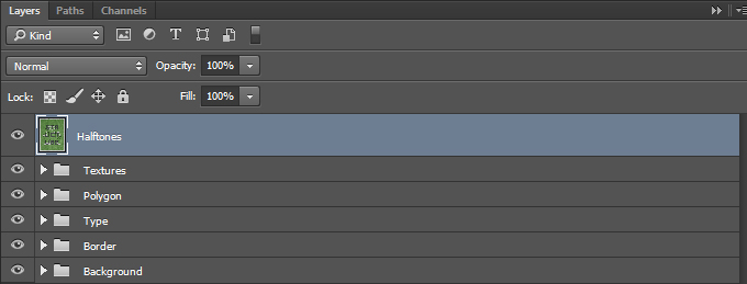
Make the layer into a smart object (Filter > Convert for smart filters on Photoshop CC, or Layer > Smart Object > Convert to Smart Object).
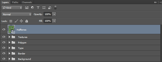
From there, apply a Color halftone effect to the layer (Filter>Pixelate>Color halftone).
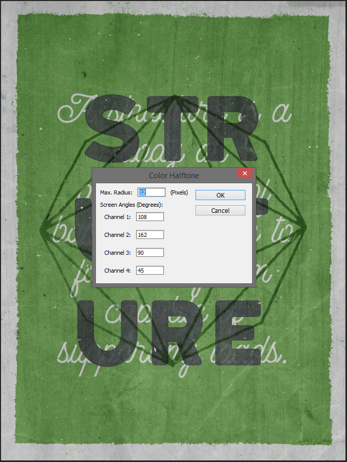
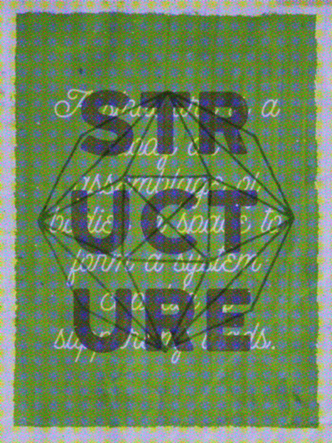
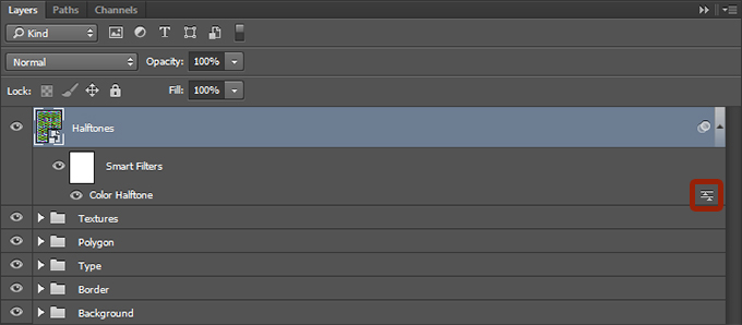
Change the blending mode of the effect to Soft light @ 100% opacity, by double-clicking on this symbol in your layer palette.
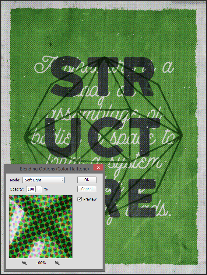
Change the blending mode of the layer itself to Lighter color @ 75% opacity.
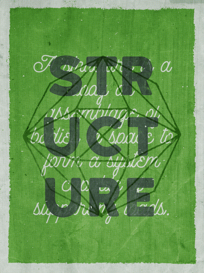
Finally, last but not least, in order to soften the saturation boost from the halftone effect, we are going to add a clipped hue/saturation adjustment layer to the halftone layer to desaturate it.
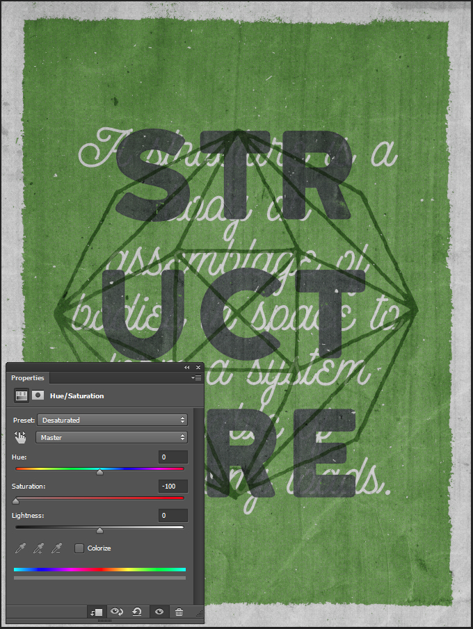
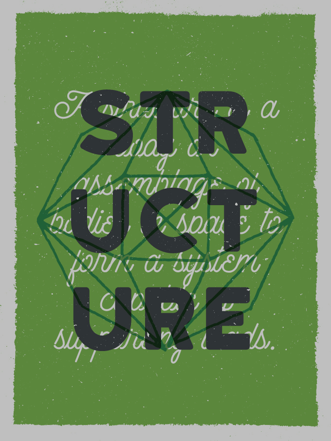
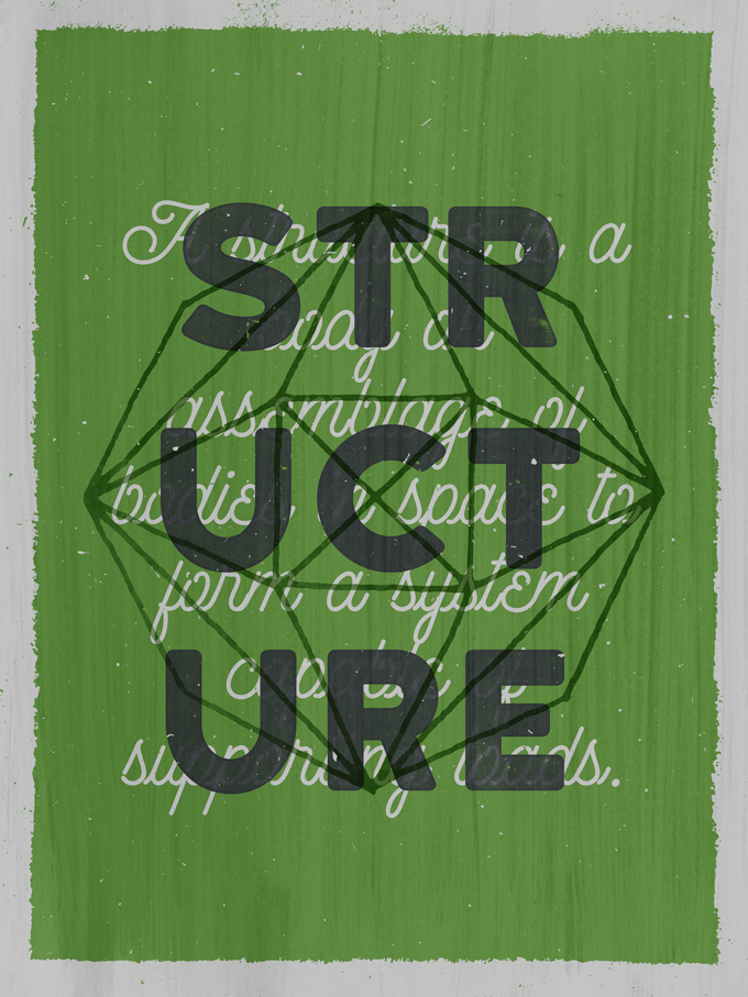
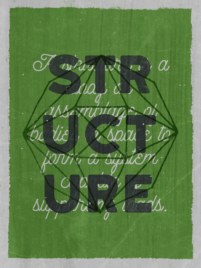
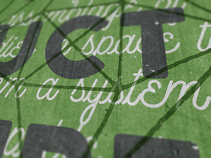
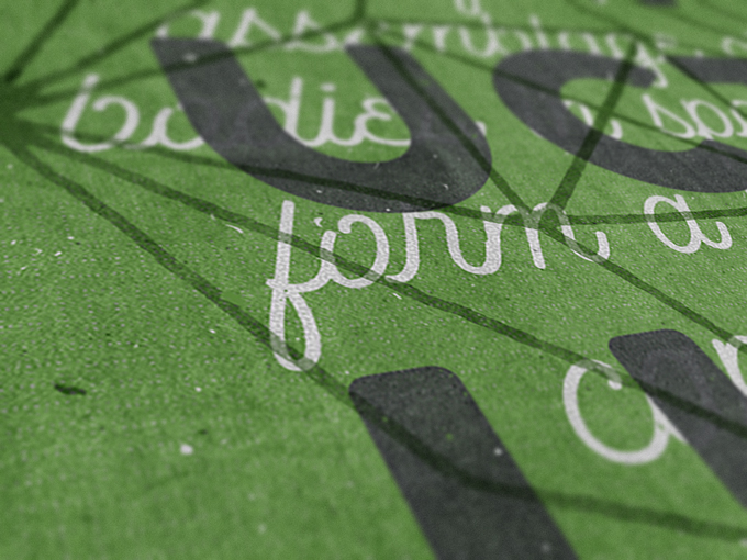
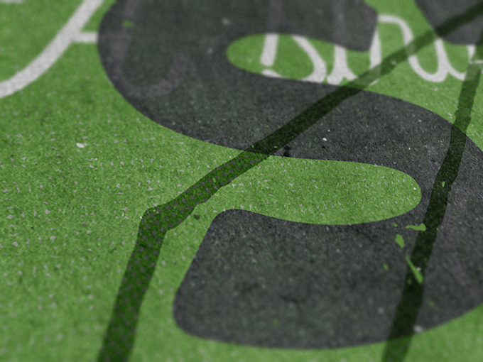
And our piece is complete!
Wrapping Things Up
Phew, that was a long one. I hope you liked reading, and following along, as much as I liked creating the piece, and writing the tutorial.
If you have any technical questions, don’t hesitate to ask them in the comments below! I’ll do my best to answer them in a timely fashion.
Also, don’t hesitate to share your outcomes if you follow the tutorial.
On that note, that’s all for me today. Until next time, cheers!
Simon Birky Hartmann is a designer from France, by way of Cleveland, OH, where he currently lives with his wife, and his crazy dog. He runs The Shop Studio, which is his design practice, as well as his outlet for design resources.
How To Create an Awesome, Retro Geometric Poster Design