We’ve heard that we need to start designing for retina screens for quite a while now. With more and more products being released with screens that are 2x the pixel density, our designs can start to look unprofessional and outdated by more people. And if you’re a web designer or blogger by profession, having pixelated images on your sites just won’t fly.
If you’re keeping up, you’ve already switched raster your images to vector wherever possible, especially when it comes to logos and icons.
One area where it’s easy to forget about retina-friendly images is in our blog content.
I became aware of this when I began to use a new Macbook Pro at work and saw my own blog on a retina screen for the first time. My pupils dilated and my stomach sank. It looked awful. I was pushing off the @2x switch for a while because I was afraid it was going to be too complicated. I only had a vague idea of what needed to be done and felt like it was outside of my skills. Turns out I was wrong, and it’s a much easier process than I thought!
If you’re producing regular blog content and want your images to look good on any screen, this tutorial is for you. It’s a lot simpler than it seems, I promise.
In this post I’ll talk about how to create your images, how to save the images for web, and then how to import and use your images within your blog posts.
A Note on Responsive Images
Before we get into it, I want to mention responsive images. The goal for good web design using images is to to provide the highest quality image at the lowest bandwidth possible, all the while keeping in mind the environment of the photo (portrait vs landscape, for example). The ability to do this using srcset, Javascript polyfills and using some critical thinking when it comes to creative image cropping, is a powerful tool that should be used whenever possible. (I recommend taking this course on responsive images for an in-depth look at how best to handle images for @1x and @2x screens of all sizes.)
However, the main purpose of this post is to show you how to provide @2x images for your blog audience who may have access to a high DPI laptop, tablet, or phone.
So, this process can (and should) be more complicated for the best performance, but it will hold true for most blog post photos.
How to Create Your Retina-Ready Images
Image Width is the Most Important for Retina
The most important thing when you’re creating retina-friendly images is the actual dimensions of the image.
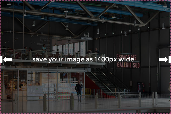
Here’s the big secret to creating images @2x: make your images double-wide.
For example, if by default your blog’s images are set to be 700px wide x 500px high, all you have to do moving forward is create your images at 1400px wide by 1000px high. If you can multiply by two, you can make retina-ready images.
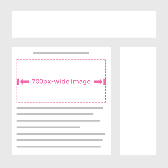
If you have a 700px wide area for images, create your images at 1400px wide for retina screens.
All images loaded to the web should be 72dpi, or dots per inch. Your retina-ready images stay at 72dpi, so we’re not changing anything with that for retina.
Quick note: this doesn’t mean you can take your existing 700px wide images and scale them up in Photoshop. You have to start with a big, 2x image. This may be obvious to some, but I didn’t want to leave this out for beginners.
This isn’t all, though. Keep reading to make sure your images are optimized for web and your CSS is correct.
Saving For Web in Photoshop
You may read this and think, really, that’s it? But the other important thing is that you still don’t want your site to load slowly. It’s important to get into the habit of Saving for Web within Photoshop, and there are a few components to get familiar with.
So, when you’re saving images in Photoshop, there are a few things to keep in mind, having to do with the image type, the width of the image, and the quality of the image.
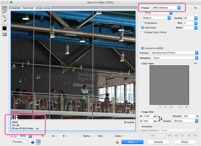
Saving For Web Dialog Box
In Photoshop, there are a few methods of saving an image. You can use the well-known method of doing a Save-As, but you need to get into the habit of Saving For Web. On a Mac, the shortcut is CMD+OPTION+SHIFT+S, and on a PC it’s CTRL+ALT+SHIFT+S. If you’re doing this process a lot, learning the shortcut will save you a lot of time.
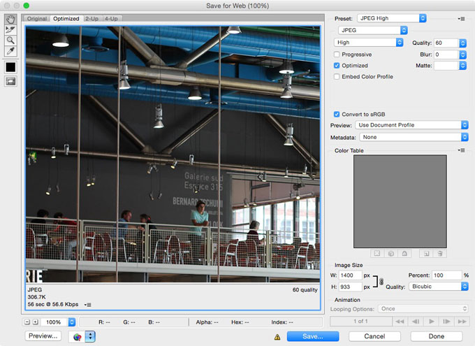
Within this screen that pops up, there are a lot of options. First, let’s figure out what type of image you need, keeping in mind the ultimate goal is to have the smallest file size at the highest visual quality.
Image Type
Unless your blog post image is fully vector shapes and text, you’re going to want to save your image as a JPEG. Otherwise, you can save it as a PNG.
The great thing about the Save for Web dialog box is that it will show you the file size as you switch between settings in the bottom-left corner. Remember the goal: smallest file size at highest visual quality. With the preview and the file size shown and the goal in mind, you can toggle through your options if you’re not sure what file type is best.
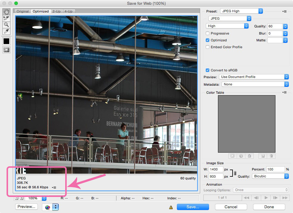
Image Quality
You can reduce the image quality of your double-wide image to Medium within the Save for Web dialog box, and your images will still look amazing on a Retina screen. (For PNG, you can use PNG-8 instead of PNG-24).
So if I’m creating an image for my blog, I create it at 1400px wide, Save for Web as JPEG Medium using the presets, and then upload it to my blog.
Go ahead and save your image file with the settings outlined above.
How to Use Your Retina-Ready Images Within Your Blog
The last part is uploading your new huge photos to your blog. Again, this part is simple. Upload your photos to your blog as normal.
But now you want to set them to be exactly 1/2 the width, so it will match your content and not be huge and weird looking. There are two ways to do this. If you feel comfortable digging into your CSS, set a rule so your content images will always be 100% width and have an automatic height.
Example CSS:
.blog-content img
max-width: 100%;
height: auto;
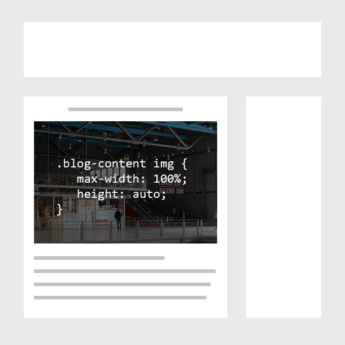
If you can’t dig into your CSS, manually set the width of your images to be exactly half. If we’re looking at an image for my 700-px wide blog content, I’d upload my 1400px image and then set width=”700″ within the img tag.
But What About All of My Other Blog Images?
Now that you know how to make your images look good on Retina screens, does this mean you should update all of your old images? Not necessarily. But there are some that you may want to pay more attention to.
At the very least, you’ll want to update your images that occur multiple times on your site. These images may include ones in your header, sidebar, and footer.
You may also want to do this for images that lie on your static pages, like your about page and portfolio pages especially.
If you’re feeling ambitious, you can try to update images for the 10 most popular blog posts on your site.
There’s a huge bonus: you may even notice that your Medium Quality 2x photos are actually smaller file sizes than your existing 1x photos!
The most important thing? Moving forward, you now create your images at 2x the width and height and shrink them down on your site. That will future proof your site, at least for a while.
Conclusion
As designers and artists, it’s important for our content to both look great and load quickly. Keeping on top of the more technical aspects of digital content creation can be hard, but making sure your images look good can now be a top priority, now that you know how to do it.
Make sure to investigate responsive images more, but for now you’re well-equipped to start providing @2x images in your blog posts.
*tl;dr*? Make your images twice as wide, save-for-web in Photoshop at medium quality. Load images onto your blog and resize to fit in your CSS or inline if you have to. Spend the time to make your header, sidebar, and footer images retina-ready. Do the same for static pages, portfolio pieces, and maybe your top 10 blog posts.
Have you started to make your content retina-ready?
Jennifer Coyle is a Philadelphia-based Designer and illustrator who loves to create fonts and resources on Creative Market. She also shares tutorials and inspiration for designers and creative entrepreneurs at Hello Brio Studio. Take her Skillshare class to learn how to make your own hand drawn font.
Products Seen In This Post:


How to Make Your Blog Post Images Retina-Friendly
No comments:
Post a Comment
Note: Only a member of this blog may post a comment.