Designing a logo is more than choosing a typeface or drawing an icon–it’s capturing a brand’s personality and distilling it into an all-purpose graphic. To create an identity that is eye-catching and memorable, the best designers find opportunities to use negative space or take advantage of wordplay in the company’s name.
Creative logo designers uncover hidden messages and then repackage them in a visually attractive way to be discovered by fresh eyes.
Take a look at 20 clever logo designs that push boundaries, challenge expectations and encourage viewers to linger.
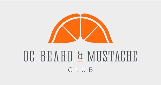
1. OC Beard & Mustache Club. The mustachioed men of Orange County, California might appreciate the whimsy of this logo, which forms two orange slices into handsome mustache.
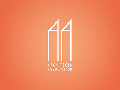
2. Architects’ Association. This minimalist logo turns these double As into a couple of towers. Simple, yet dramatic.
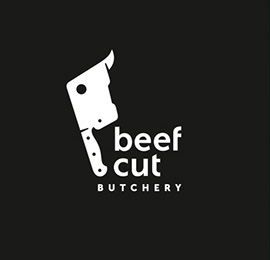
3. BeefCut Butchery. No need to ask where’s the beef in this logo. The bull’s head hidden in the cleaver.
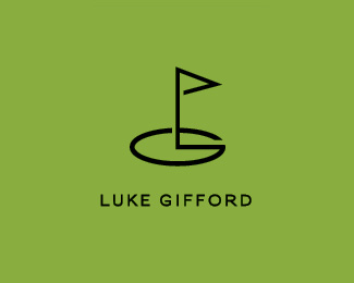
4. Luke Gifford. This hole-in-one design sets this golfer’s initials around the 18th hole.
5. Moon Photography. Zoom in on this logo that playfully incorporates a crescent moon and stylized camera.
6. Mitch Loewenherz. Bold, edgy with just a hint of tenderness. To appreciate how clever this logo is, it’s important to know that Lowenherz translates to “lion heart” in English.
7. Lighthouse Stories. A pin nib becomes the lantern of a lighthouse, illuminating whale tails with a whale of a tale.
8. Let Save. A stylized L and S combine to form a simple shopping cart.

9. Canadian Swan. This subtle use of negative space places a regal swan in the middle of the Canadian maple leaf.
10. Glance. An example of how to accomplish so much with so little. The stylized G is also an animal’s eye.
11. Surveysaurus. Check marks the spot on this dino in this minimalist logo.
12. Filmingo. In this word mark, the lowercase g is formed by a flamingo and a film strip. The imagery is incorporated into the typeface without sacrificing clarity or legibility.
13. Fur & Foliage. This logo’s graphic pulls double duty as paw print and tree.
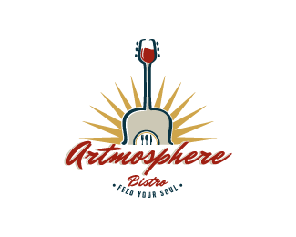
14. Artmosphere Bistro. There’s a lot going on in this logo, but the wine glass/guitar combo certainly sets the mood.
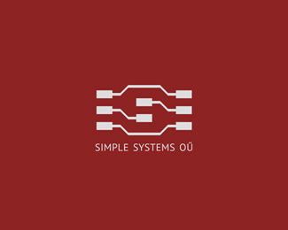
15. Simple Systems. Electronic circuitry are formed to create an S in the negative space in this simple logo.
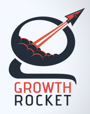
16. Growth Rocket. This dynamic logo turns a cursor into a rocket and a lowercase g into an ultramodern launching pad.
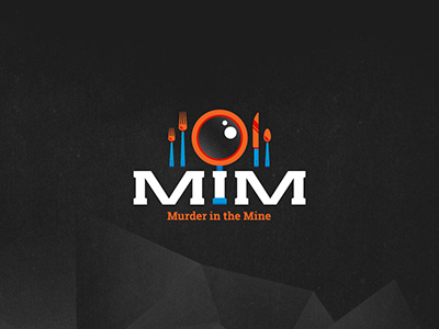
17. Murder in the Mine. The magnifying glass is an icon of mystery, and yet usually feels wedged into mystery graphics. This logo for a murder mystery dinner theater finds a clever way to disguise the icon.
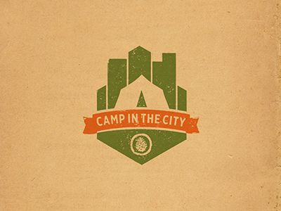
18. Camp in the City. This logo earns its creativity badge for using negative space to pitch a tent.
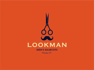
19. Lookman. The name alone demands attention, but it’s the graphics–scissors becoming a dapper man’s spectacles–that earn this logo a second glance.
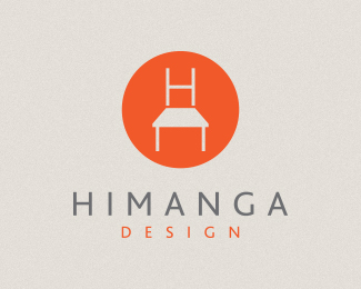
20. Himanga Design. A deceptively simple logo for an interior design firm. Look inside the circle–is it a chair or is it an H on top of a house or a table in front of a window?
Let these logo design examples serve as inspiration for future projects. Don’t shy away from exploring a brand’s identity through wordplay or visual puns. Keep an eye on the negative space and look for opportunities to use it for dramatic effect. It’s often the simplest ideas that have the most impact.
Products Seen In This Post:
Share on Pinterest
Share on Pinterest

20 Creative Logo Designs for 2015
No comments:
Post a Comment
Note: Only a member of this blog may post a comment.