Tuesday, March 31, 2015

10 Tips for Using Apple"s New Photos App

Apple’s new photo app, simply called “Photos,” released last month to developers for testing, and to consumers on the public beta. If you’ve signed up for the Yosemite 10.10.3 beta pre-release, you can now get it on your machine. Being a public beta, you don’t need a developer account or special access: just sign up, download, and install the beta utility, and you can receive the update via the App store.


Photos will be replacing both iPhoto and Aperture, so you might as well get used to it. And today, we’re here to help you with some simple tips for using the app more effectively.


The Basics


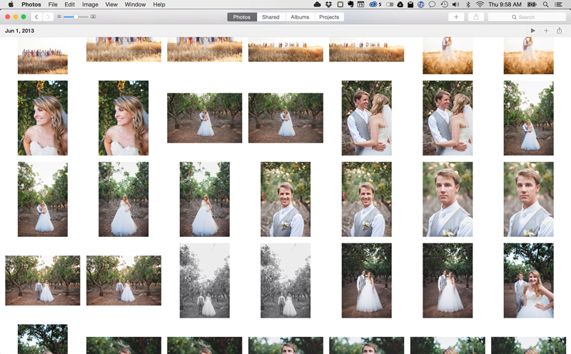
The program is more user-friendly and less cluttered than either iPhoto or Aperture, operating out of a single window with a sidebar that you turn on and off via the preferences window. In terms of power, it sits somewhere between the two: it offers more customization and functions than iPhoto, but fewer than Aperture.

photos-for-mac


It’s very fast, with incredibly smooth animations and interactions. You can scroll through your images at a lightning pace, and they’ll open with one click, and maximize with another. With the touchpad, you can pinch in and out to zoom, just like on an iOS device.


Getting the images is also incredibly convenient, no matter the source. For those of importing from a DSLR, it can open RAW photos with no conversion or delays. For those of you with iOS devices, PhotoStream is integrated into the program. When you take a picture with an iOS device, it goes straight to your photo library.


1. Open Other Programs’ Libraries


One of the features kicks in before you even open the program: you can use it to open an Aperture or iPhoto library by holding down the Option button while clicking on the icon for the Photos App. You can also create a new one, but be warned that it won’t be backwards-compatible, or able to be opened with any other program.


photos-for-mac


2. Add and View Info


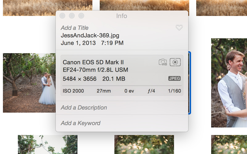
Control-clicking a photo, or clicking the info icon in the bar at the top right of the screen, brings up a dialogue that shows you the metadata, the camera information (and lens information if applicable), resolution, and size, a feature that was previously available in Aperture. You can also add a title, which is great for searching.

photos-for-mac


3. Do Some Simple Retouching


Photos allows you to fine-tune a photo’s exposure, highlights, shadows, brightness, contrast, and black point. It also comes with white balance, levels, sharpening, and noise reduction. As a bonus, the Red Eye tool pops up when the photo recognizes that someone in the photo might have red eye.


photos-for-mac


The granular editing is surprisingly lacking; with no smudge, dodge, or burn; but there is a clone stamp. It’s not as powerful as Photoshop, but in the words of Snazzy Labs, “it is pretty easy and foolproof.”


When editing, the program automatically saves the original, eliminating a lot of the potential for editor’s regret.


4. Create Smart Albums for Easy Organization


Like both of its predecessor programs, Photos creates Smart Albums based on several factors like photo location, type of photo—panoramas and videos are given their own sections, for example—and what photos you’ve liked; they’ve taken away the ability to rate photos, but you can still like them for a simpler organization method.


photos-for-mac


5. Sync Photos To iCloud


If you shoot with a DSLR, especially in RAW, I’m sure you know how quickly high-res photos can gobble up memory. This is a problem, since iCloud comes with only 5 gigs of free memory, and if you try to sync an entire device’s contents, it can easily consume all of that at once. That’s where albums come in. If you have just a few photos you want on your cloud, you can simply create an album and sync only that.

photos-for-mac


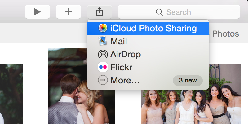
To make an album, go into the event folder. You’ll see albums, then click the plus sign on top of the folder. After you name it and select the photos you want in it via the windows that will come up, it’s easy to sync it to your iCloud: simply hit “share image” and select iCloud photo sharing.


You can also import anything from Aperture or iPhoto, but it creates a whole new library and copies it, so it doesn’t let you manipulate an existing library like iPhoto or Aperture.


6. Share To Social Networks


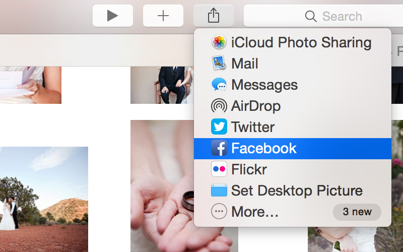
If you want to share a photo, just right-click and share, then you have all our OS X options for sharing. Post to Facebook, Flickr, Twitter, Airdrop, or IM it. You can also text message it or send it as an email.

photos-for-mac


You can tag your friends as well, or rely on the program to do it for you. The program’s pretty good at facial detection: not quite as good as Facebook’s, but still quite competent, and an improvement over iPhoto’s.


7. Learn Some Helpful Keyboard Shortcuts


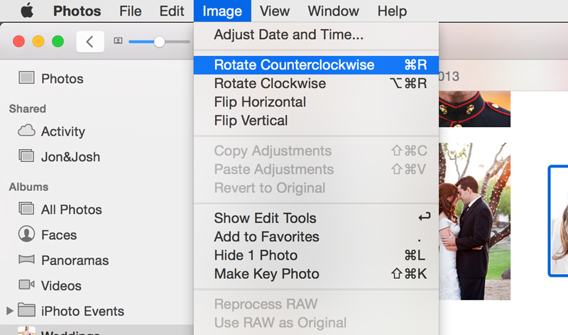
Mastering keyboard shortcuts is the key to efficiency in any application. Here are a few important shortcuts to start you off. Import is Command-Shift-I, and Export Photos is Command-Shift-E. New album is Command-N, and Command-Option-N makes a new Smart Album.

photos-for-mac


To rotate an image clockwise or counterclockwise, hit Command-R or Command-Option-R, respectively. To hide it, Command-L. If you want to view one in full-screen, Command-Shift-F. To select an image as a key photo, option-Command-K. Command-K by itself opens the keyword manager.


Upon opening the program for the first time, there’s one keyboard shortcut you might want to know most of all…


8. Get Your Sidebar Back


For those of you who were used to iPhoto, you might find the program’s initial lack of a sidebar a bit weird. Don’t worry: getting it back is simple: Just find “Show Sidebar” in the view menu (right under “Projects”), or hit Command-Option-S.


photos-for-mac


9. Use Projects to Make Dirt-Cheap Keepsakes


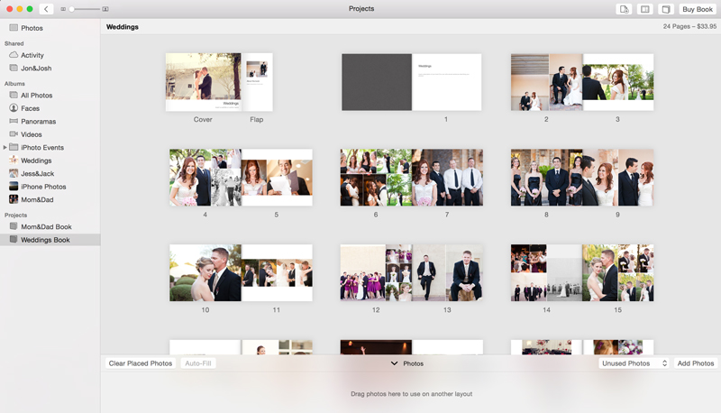
The Projects tab allows you to send orders for books, calendars, cards, prints, and posters of your images to Apple, to be shipped to the address of your choice for an amount automatically deducted from your iCloud account. It’s gotten both cheaper and more user-friendly since iPhoto and Aperture. Prints start at just over a dime, and folding cards at .50. Not to mention they can be mailed to the address of your choice.

photos-for-mac


10. Miss Aperture? Try Lightroom Instead


While Photos feels like a refreshingly simplified version of iPhoto, I suspect that former Aperture users will be deeply disappointed in its feature set. Photos is great for most people’s needs, but is far from the professional powerhouse of photography tools that Aperture users are accustomed to.

photos-for-mac


Anyone looking for a new go-to application to replace Aperture in their workflow should definitely check out Adobe Lightroom instead. Lightroom is very similar to Aperture and has become the industry standard for professional photographers all over the world.


What Do You Think of Photos?


Basically a desktop version of the iOS app, Photos is nowhere near the professional, or even prosumer level when it comes to editing. But it’s very competent for sorting, organizing, searching, and quickly sharing your photos either online or off.


Any comments, tips, or additional hacks you’ve discovered? Please let us know in the comments.


10 Tips for Using Apple"s New Photos App

Developers: Why You Shouldn’t Skip Documentation

In the development realm of mobile apps, web apps, desktop apps, or JavaScript libraries, documentation plays an important role that could determine the software’s development success. But if you have ever done documentation, you’d agree with me that it is pretty much the least favorite things for developers to do.


Unlike writing code (which is what developers signed up to do), documentation (which we didn’t) has to and should be easily digested by everyone. Technically, we have to translate a machine language (code) into a language that is understandable to humans, which is tougher than it sounds.


Although it can be a real burdensome, writing the documentation is important and will deliver advantages for your users, your colleagues, and especially yourself.


Good Documentation Helps Users


Documentation helps the reader understand how a code works, obviously. But many developers make the mistake of assuming that the users of the software will be proficient. Hence, the documentation may be thin material, skipping a lot of the essentials it should have contained from the beginning. If you are savvy in the language, you can figure things out on your own initiative; if you are not, then you are lost.


Documentation intended for users usually consists of practical use or the “how-to”. The rule of thumb when creating documentation for general users is that it should be clear-cut. Using human-friendly words is preferable to technical terms or jargon. Real use examples will also be greatly appreciated.


A good layout design would also really help users scan through each section of the documentation without eye-strain. A few good examples (aka my favorites) are documentation for Bootstrap and WordPress‘ “First Steps With WordPress”.


It Helps Other Developers Too


Each developer will have their own coding style. But, when it comes to working in a team, we will often have to share codes with the other team mates. So it is essential to have a consensus on a standard to keep everyone on the same page. A properly written documentation would be the reference the team needs


But unlike end-user documentation, this documentation typically describes technical procedures like code-naming convention, showing how particular pages should be constructed, and how the API works along with the code examples. Often we would also have to write the documentation inline with the code (known as the comments) to describe what the code is doing.


In addition, in the case where you have new members joining your team later, this documentation could be a time effective way to train them, so you don’t have to give them a 1-on-1 run down on the code.


Strangely It Also Helps The Coder


The funny thing about coding is that sometimes even the developers themselves do not comprehend the code that they have written. This is particularly true in cases where the codes have been left untouched for months or even years.


A sudden need to revisit the codes for one reason or another would leave one wondering what was going on in their minds when they wrote these codes. Don’t be surprised: I’ve been in this situation before. This is precisely when I wished I had documented my code properly.


By documenting your codes, you will be able to get to the bottom of your codes quickly and without frustration, saving you a lot of your time that can be spent on getting the changes in.


What Makes For Good Documentation?


There are several factors that to build a good piece of documentation.


1. Never Assume


Don’t assume that your users know what you know as well as what they want to know. It is always better to start from the very beginning regardless of the users’ proficiency level.


If you built a jQuery plugin, for example, you may take inspiration from SlickJS‘s documentation. It shows how to structure the HTML, where to put the CSS and the JavaScript, how to initialize the jQuery plugin at its most basic level, and even shows the complete final markup after adding all these stuff, which is something obvious.


The bottom line is the documentation is written with the thought process of a user, not a developer. Approaching your own documentation this way will give you a better perspective in organizing your own piece.


2. Follow The Standard


In adding documentation that goes inline with the code, use the standard expected of the language. It is always a good idea to describe each function, the variables, as well as the value returned by the function. Here is an example of good inline documentation for PHP.


 /** * Adds custom classes to the array of body classes. * * @param array $classes Classes for the body element. * @return array */ function body_classes( $classes ) // Adds a class of group-blog to blogs with more than 1 published author. if ( is_multi_author() ) $classes[] = "group-blog"; return $classes; add_filter( "body_class", "body_classes" ); 

The following are a few reference for formatting inline documentation with best practices in PHP, JavaScript and CSS:


If you are using SublimeText I would suggest to install DocBlockr that will cleverly pre-populate your code with inline documentation.


3. Graphical elements


Use graphical elements, they speak better than text. These media come in useful, particularly if you build software with graphical interface. You can add pointing elements like arrows, circle, or anything that may help users to figure out where to go to accomplish the steps, without guesswork.


The following is an example from the Tower app where you can draw inspiration from. They efficiently explain what how version control works in a pleasing way that makes it more understandable than using plain text command lines.


4. Sectioning


You may consider wrapping a few things in the documentation within bulleted lists and tables as this makes longer content easier to scan and read for users.


Add a table of content and split the documentation in easily digestible sections, yet keeping each section relevant with what comes next. Keep it short and straightforward. Below is an example of nicely organized documentation in Facebook. The table of contents takes us where we want to jump to in a click.


5. Revise and Update


Lastly, review the documentation for mistakes and revise when necessary or and whenever there are significant changes to the product, software, or library. Your documentation would be of no use to anyone if not regularly updated alongside your product.


Developers: Why You Shouldn’t Skip Documentation

Weekly News for Designers (N.278)


This is our popular weekly design news post where we share our favorite design related articles, resources and freebies from the past week.


You can sign-up to our awesome weekly newsletter for some more amazing articles, resources and freebies.


New Resources & Tools


Loaders.css, a collection of performance-focused pure css loading animations.
Loaders.css, a collection of performance-focused pure css loading animations


Primer, the CSS toolkit and guidelines that power GitHub.
Primer, the CSS toolkit and guidelines that power GitHub


RWDGRID, a responsive grid system based on the 960 grid system.
RWDGRID, a responsive grid system based on the 960 grid system


Wamer Sketch, an online WYSIWYG tool for component-based web development.
Wamer Sketch, an online WYSIWYG tool for component-based web development


Unitools, a suite of tools for working with Unicode in the browser.
Unitools, a suite of tools for working with Unicode in the browser


Rebar, a new Sass / Stylus grid framework.
Rebar, a new Sass / Stylus grid framework


lory.js, a touch enabled minimalistic slider written in vanilla JavaScript.
lory.js, a touch enabled minimalistic slider written in vanilla JavaScript


Typography Cheatsheet, a guide to smart quotes, dashes & other typographic characters.
Typography Cheatsheet, a guide to smart quotes, dashes & other typographic characters


Flat Colors, flat UI & Material Design colours as Sass, LESS & Stylus variables.
Flat Colors, flat UI & Material Design colours as Sass, LESS & Stylus variables


New Learning & Reading Resources


CSS Fixed Background Effect by CodyHouse.
CSS Fixed Background Effect


Free Ebook: Web UI Design for the Human Eye (Layout Patterns & Typography).
Free Ebook: Web UI Design for the Human Eye


Git from the inside out by Mary Rose Cook.
Git from the inside out


15 Must-Know Chrome DevTools Tips and Tricks by Danny Markov.
15 Must-Know Chrome DevTools Tips and Tricks


Creating a "Jump Loader" Animation with SVG and GSAP by Chris Gannon.
Creating a


Build Chrome-like Tabs with Bootstrap and AngularJS by Dimitar Stojanov.
Build Chrome-like Tabs with Bootstrap and AngularJS


Free GUI Resources Resources


20 Free HTML5 Web Templates.
20 Free HTML5 Web Templates


Freebie: Epic Outlines Font (100 Icons, Icon Font, SVG & PSD).
Freebie: Epic Outlines Font


And finally…


Made By: Chris Coyier (CodePen).


In Pieces: A rare specimen of CSS-based animation.
In Pieces: A rare specimen of CSS-based animation


You may also like to browse the Weekly News Archives.


The post Weekly News for Designers (N.278) appeared first on Speckyboy Web Design Magazine.


Weekly News for Designers (N.278)

Tell your Client’s Story Beautifully and Easily

Learn how to be more than a web designer. Start acting like a visual storyteller. 90% of information transmitted to our brains are visual. The reason? We process visual data faster than text. And we pay more attention to videos and images, than text. If you’re currently building a website or own one, then you should start thinking of ways to transform it into something eye-candy and visual.


Generation X and generation Z spend half of their day connected to a screen, often on visually powerful platforms such as Facebook, Pinterest or YouTube. In order to grab their attention, you need to create powerful stories; no matter if they are about people, companies, products or NGOs. In other words, you need to be a visual storyteller.


1


We all fight for the same attention, engagement, time and money. The battle is tight and resources are limited. To get to the final lap means to create a perfect balanced mix between visual and content, image and text, symbols and letters. You have the chance to achieve the perfect balance of spreading beautiful online stories with Qards, a robust visual editor powered by WordPress.


If you aim to build the right website for your clients in order to highlight their unique brand stories, than maybe it’s time to take a look at this easy-to-use web design plugin. It could bring real added value for everyone around the table: you, as a web designer always aspiring to reach more, your client and his challenging business and the prospective customers who are tired to skim through stale www pages.


2


Here are Top 10 reasons for why this user-friendly design plugin helps you both achieve relevant results, no matter what your goal is: awareness, more customers, and a better experience for users or an asset to be proud of. All of them are meant to initiate a prolific digital dialogue:


  • Customizable pre-designed cards to match your needs

  • Fully editable components, such as Grid, Text, Cover, Feature

  • Typekit integration to find the right fonts for spreading the message in a nice wrap; Plus, all the best Google fonts are there.

  • Easily to adapt to any kind of stories (from business websites to personal blogs)

  • Flexible backgrounds to highlight beautiful products (Videos included)

  • SEO friendly to make sure Google is your ranking comrade

  • Maximized performance to run faster and safer

  • Better caching for a bunch of plugins, such as W3 Total Cache, WP Super Cache and Quick Cache

  • No-code to write or to struggle with

  • Provider of great experiences for end users

3


4


5


And that’s not all. A simple push on the play button of the following Qards demo video will prove we’re right. Just a tip before you start watching how Qards actually works: pay attention not only on the great features provided by this visual editor, but also on how smooth everything happens. It’s, indeed, an emotional experience. You can play it twice just to make sure you fully perceive the whole beauty of it.


The essence of simplicity


All in all, Qards is the essence of simplicity for anyone who wants to create beautiful digital stories. Easy to use, very user-friendly, an amount of features just one-click away and much more than that. If it was to choose a single word to define this WordPress visual editor that would be style.


6


You can integrate Qards in an existing website or create one with it in the blink of an eye.


  • Convenient HTML & CSS editor for beginner developers, no need to learn how to write a single line of code

  • Effortlessly duplicate blocks of content or entire pages (text, image or video, it’s your call)

  • Flexible layout with a bunch of visual elements (you can sync them in a couple of seconds)

  • Easily match design patterns to create an integrated visual story (no matter you’re a blogger, fashion lover or an agency)

  • Adjustable grid to match in-depth needs just by one click

  • Embed YouTube videos with a simple copy-paste of the URL

  • Upload brand images with Drag & Drop

All these features are so intuitive and easy to put in practice that all you have to do is to warm up your creativity and start building exquisite visual stories.  Playing Qards in a smart way will give you a huge playground to adventure in. Furthermore, your clients will happily return with future business projects and you will keep succeeding in transforming their story into a powerful and visual one.


Feel free to get some inspiration from these websites built with Qards


7


8


9


With Qards next to you, playing the role of a visual storyteller becomes natural and enjoyable. It’s more like being a painter: you have the colors, the brushes, the easel, the instruments to exhibit and a creative drive to draw thrilling canvases and share them with the entire world.


Leading by example is one the most powerful ways to contribute to a more appealing digital world, where aesthetics meets utility and business goals achieve concrete results. Afterwards, that’s the spell of being a visual storyteller, right?


Start your creative journey now.


Tell your Client’s Story Beautifully and Easily