Hand lettering can appear to be a daunting task, but when you break it down to the fundamentals, it’s simpler than it seems. So let’s talk about how to define it, what materials to use, and all the steps involved. By the end, you’ll be able to create unique lettering for anything from greeting cards to comics, invitations, or even banners for special occasions.
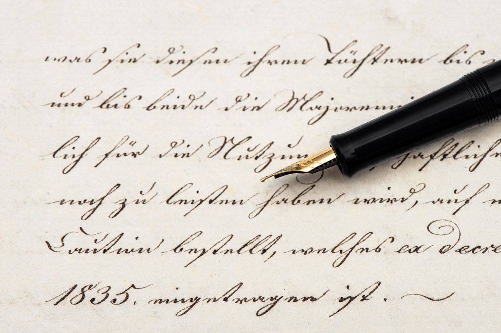
Let’s start with the most basic: what is lettering? Despite what many think, it’s a very different art from calligraphy, which is essentially writing at its most graceful. Think of it like this…
Calligraphy is about perfecting the motions of your pen.
Lettering is essentially drawing. Or draftsmanship, depending on how precise you choose to be.

As such, you can use virtually any materials for it, but different ones will yield different results and take different skill levels to master. Let’s go over some of them.
Materials
First, for all but the most freeform of projects, get a ruler. You’ll need it to plot the overall shape of your piece before sketching the letterforms, make grids, and block off your letters so they’re spaced appropriately.
Paper
You’ll also need something to draw on. There are three most common types:
Plain Printer Paper: For less formal projects, or in the planning stages, it’s perfectly fine to use this. It’s cheap, good for getting ideas down, and can be used for anything you won’t need a hard copy of after you scan it. And later, we’ll also explain a neat trick you can use with it that can cut down on time and effort if you feel like you’re struggling. However, it’s very acidic and will yellow with time, so don’t use it on anything you want to preserve for a while.
Bristol board: If you want to give your piece some weight and endurance, Bristol board is an excellent choice. It’s also perfect for framing. If you choose this, you’ll then be faced with the choice between vellum, with a softer matte finish, and plate, which is smooth and shiny. It’s generally said that vellum is better for pencilling, where plate is better for inking. Inks are more likely to bleed on vellum, but plate is known to smear pencil lines with the slightest touch.
Grid Paper: If you’re particular about making sure your lines are straight, or if you’re planning on finalizing your project via computer, grid paper can save you a lot of time on the blocking stage. It’s also fairly cheap and very easily available.
Pencils and Pens
It doesn’t matter what kind of pencil you use for the layout and sketch stages. Some of the world’s most talented letterers use #2’s or ordinary mechanical pencils for the layout stage. And similarly, ballpoint pens can be used for quick sketches, informal projects, or anything you want to have an intentionally messy feel.
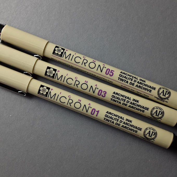
Image by “The Marmot”
For intermediate inkers, archival markers, like Pigma Microns and Prismacolor Premiers, are a solid all-around choice, being easier to control than a dip pen but more professional than ballpoints. They do have a major drawback, though: each pen gives you just one line weight. In other words, it takes a pack of markers to do the job of one dip pen, and this can get expensive. However, it’s worth noting that some, like the chisel-tip and brush-tip, provide more variety than the fixed-width ones.
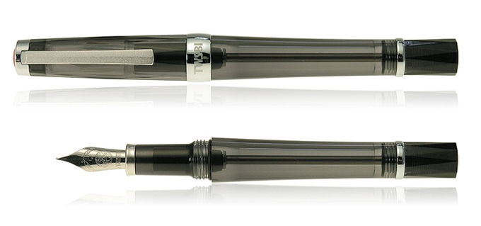
Image by Chris Lott
Let’s move on to dip pens. They’re high-maintenance, needing to be washed and cared for regularly, but the professional result they give is worth it. Drawing with them could be the focus of a whole separate article, but the basics are that you need to the right balance of ink—enough to ensure a good flow, but not so much that it leaks and splatters—and the right balance of pressure. it takes a light hand—if you press down too hard, you can bend the nib, which will ruin it—but you also need to move with confident strokes. Also, each side of the pen creates a different line weight and will move in different ways, so you’ll need to learn to use each one.

Technical pens are for truly dedicated and detail-oriented users. They’re not just expensive but high-maintenance, requiring you to change the ink cartridge, take care not to break the often tiny nibs, and clean them regularly to prevent clogs. However, in the right hand, they can create incredibly delicate and precise lines.
Steps in the Process
In short:
- You pick out the fonts you’d like to use (or sketching out your own beforehand)
- You measure and block out your piece so that your letters are all spaced as you like
- You hand-ink your piece or scan it, then finish in a vector program
Preplanning
First, a hand-lettered piece can serve many purposes, so what would you like yours to say? And what letter style would you like to use? If you already have in mind the words and character styles you plan to use, all the better. Now, the more complex the design you’ve plotted out, perhaps with some flourishes surrounding your lettering, the more you’ll need to plan ahead.
The first thing to determine is the theme and overall feel that you want to present in your piece. This will both help you find attractive and thematic fonts, but also the decorative elements that you might use to accentuate them.
There’s nothing wrong with imitating a font you’ve seen before, in fact, when you’re new, it’s probably a good idea to print some out to use as reference (this is also part of the trick we’ll explain later) at the size you want them to appear in your piece.
Measuring
First, decide on the overall shape of your piece. For your first few times, you might want to stick to a rectangle, but once you’ve got some more practice under your belt, you can start experimenting with a wide variety of different shapes.
Create the baseline you’ll draw your text on top of, then evenly space horizontal lines to block off where you would like your letters to go.
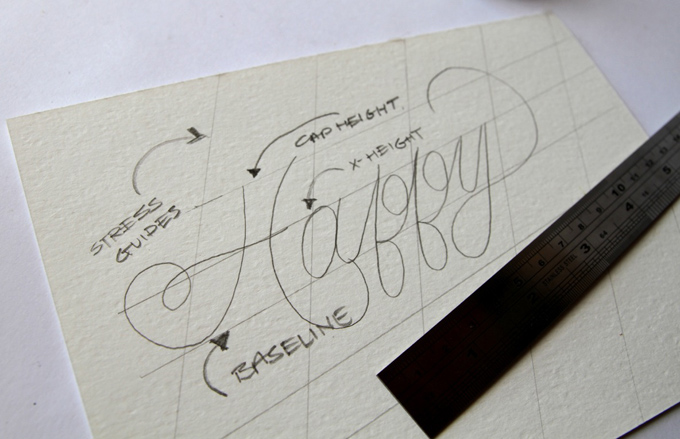
Image from A Pair and a Spare
The Pencil Sketch
First, you start to lightly sketch a rough outline of each letter, just so you know how large each one is going to be. If you’ve done your blocking correctly, you should have a much easier time with this stage.
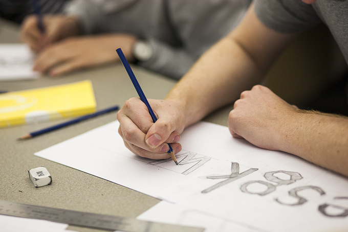
Image by Workturn
Or, you can use that trick we mentioned earlier: a graphite transfer. Basically, you take a pencil or a graphite stick, rub it against the back of what you want to transfer, lay it down, then draw over what it is you want to copy, transferring a light image of it onto the page.
Once your initial rough is done, go over it again to solidify the letterforms’ final shapes. Remember that you only want to draw the outline of the letters. If there are portions of solid black, don’t fill those in. Too much graphite can show through your ink and clog your pen.
Inking
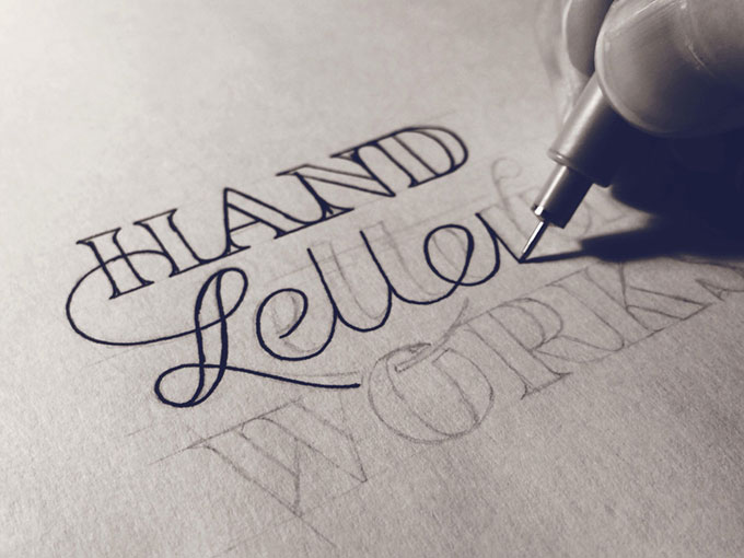
Image by Sean McCabe
Trace over the lines and fill in the black areas with your pen. To avoid smudging your pencil lines, tape a piece of paper or plastic over the area that you’re not working on. This way, your hand will rest on the cover sheet instead of the drawing itself.
Once you’ve got everything filled in, let it completely dry before fixing anything. If you’re using Bristol board, don’t use correction fluid to fix mistakes: it isn’t quite white, so correction fluid will stand out against it. And even if you are using white paper, a a white gel pen that’ll dry flat is better than correction fluid that’ll often dry lumpy.
Scanning and Cleaning Up
If your paper is too large to be scanned in one fell swoop, Photoshop can take multiple scans of different parts of a piece and automatically composite them into one continuous image. If you don’t have Photoshop, Microsoft ICE can do the same thing for free.
Once it’s in, if you’re planning on using your lettering as an isolated graphic, there are plenty of ways to separate it from the background, especially if your design is fully inked, creating an even contrast and sharp lines you can pull out via the Color Select or Magic Wand tools.
Conclusion
Hand-lettering is a lot like any other form of drawing, but with letters as your subjects and font sheets as your reference material. Get some basic materials, start practicing, and you’ll be well on your way to creating unique and personalized text for any occasion. Reading up on some basic drafting definitely won’t hurt either.
Got any questions? Other tips or resources? Leave us a comment.
Products Seen In This Post:

Hand Lettering for Beginners
No comments:
Post a Comment
Note: Only a member of this blog may post a comment.