“A good typographer is one who can arrange the type so as to produce a graceful and orderly page that puts no strain on the eye.” says Staffordshire design professor Jim Williams in his excellent typography treatise, “Type Matters.” He goes on to describe ornamental type as “the most dangerous diversion the typographer can find.”
This is half-true. On one hand, when it comes to conveying information, a la body text, simpler is better. You want a clean font that facilitates quick and easy eye movement through the text. That’s why simple, ornament-free fonts are still the most popular among web designers.
If it was entirely true, however, what would be the point of any other type of font existing? No matter how practical the basis of typography is, its decorative side is what keeps it fun and interesting. It lends whatever you’re working on a personal flair, an artistic touch. After all, life’s not all about pragmatism.
And decorative type has another benefit: it places your text in time. Compare ads fifty years ago, with their long columns of serif text, to today’s, with their short headlines and big, bold modernist fonts. Some people see this as a negative, afraid of making something that won’t age well, but let’s look at it from a different perspective: who doesn’t love an iconic, period-defining look?
This begs the question: what are today’s trends, the ones that they’ll look back on decades later as integral parts of “tens design?” Here are a few, and some suggestions on how you can use them in your own work.
1. Handwritten Fonts
This trend has been around for a while, but it’s arguably reaching its peak right now.
If it’s not immediately obvious, these probably shouldn’t be used for anything but decorative headers. They don’t mix very well with the corporate world, but they’re great for giving an artistic and indie vibe to a business that prides itself on creativity.
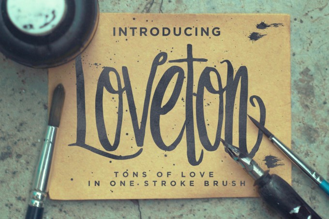
Loveton, currently for sale on Creative Market
Beyond that, however, go wild. Much of the beauty of handwritten type lies in its flexibility. The options are virtually limitless. Do you prefer chicken scratch or calligraphy? What personality traits do you want to convey? And what age do you want to suggest? Fonts based on the handwriting of everyone from kindergarteners to professional painters can easily be found online.
If you want your site to have a personal touch, why not make a font from your own handwriting? Or, if you’re really willing to experiment, cross the border from typography into lettering, drawing the text yourself and scanning it. Don’t worry, if you’re not one for drawing, you can always hire a professional lettterer to hand-craft you some seriously impressive text.
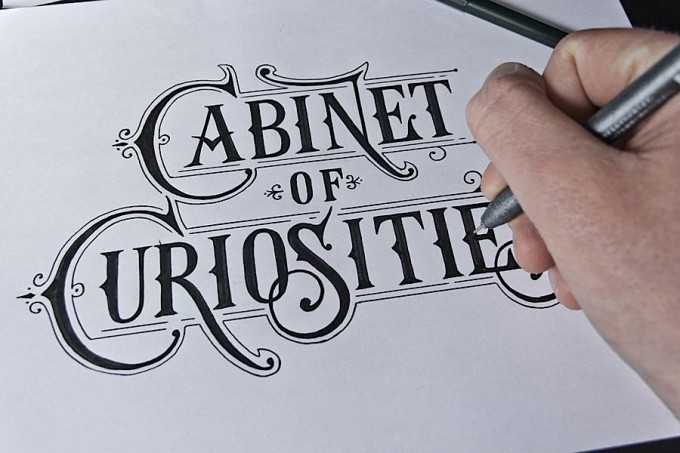
From Abuzeedo, design by Tobias Saul
2. Letterpress-Style Typography
“Letterpress-style” can mean one of two things.
The first (also known as “inset typography”) refers to type with a subtle inset effect that makes it look pressed-in, like type set into paper via a letterpress.
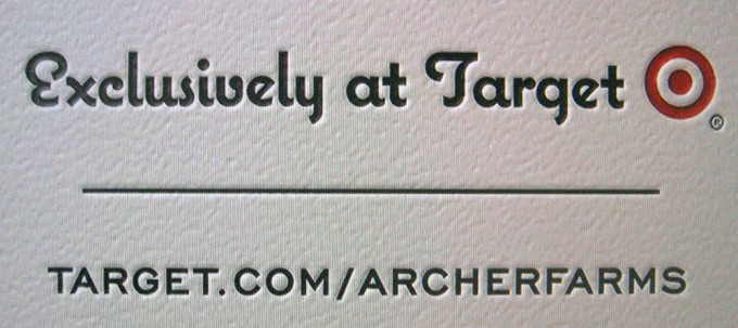
From Mark Simonson Studio
The second (also known as also known as “lock-up” typography) is a retro design style in which the text is fit into one centered and justified column, inside which all different point sizes and fonts are mixed-and-matched, creating an effect like a poster designed on an old-school letterpress.
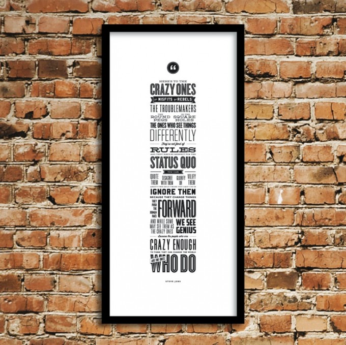
From Pinterest
This look’s second wave of popularity has lasted quite a while, but it hasn’t aged, and it’s still very good for artistically presenting quotes and short ad copy.
3. Photo Overlays
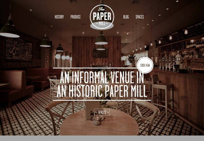
From Web Designer Depot
Not just for misattributed quotes on your high school friends’ Facebook walls anymore, text laid over photos is a very common design choice now, especially since CSS now makes it relatively easy to make that text selectable and editable.
Text seems to work best when laid over photos that can safely remain in the background: the kind of thing that doesn’t contain any elements that particularly jump out at you, distracting from the text. (You know, like that picture of a mountain range Sarah imposed that “Ghandi” quote over.) Ones with muted colors or naturally low contrast, or ones that have been faded a bit, seem to work best.
As for the text itself, this works fairly well with most headers and small amounts of copy. However, unless the opacity is set very low, it makes high volumes of body text harder to read, and makes it hard to draw attention to any embedded links.
The text is almost always either white text on a dark-colored image, or black text on a light-colored image.
4. Icon Fonts
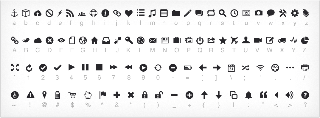
From Pictos.cc
Call them Webdings for the 21st century, if you’d like.
They’re the simplest way to generate a set of icons that are simultaneously consistent and easily modifiable, both alone and in batches. And being vectors that are easy to scale along breaking points, they’re also the answer to responsive site builders’ prayers. Not to mention that free ones can be found all over the place.
5. Heading Back to the Basics
From TNW
Williams would be proud. In fact, he probably is, since he’s still with us. And so is his ethos: especially with the rise of flat and flat-inspired design, the bucking of trends is now itself a trend, with lots of web designers choosing to head back to simple, utilitarian design featuring gimmick-free fonts inspired by Hevletica and Garamond.
Also being cast aside are drop shadows and gradients, since those are also no-nos in flat design, and an emphasis on easily scalable type.
In Summary…
When looking at current type trends, it’s important that you don’t throw yourself entirely into them: instead, just borrow from them and take inspiration from their better uses while keeping your own unique identity at the forefront. But it’s still better to know what’s going on in the type world than not to.
What are your favorite current type trends? Are they seeing any use in your design projects yet? Let me know with a comment.
Products Seen In This Post:


Typography Trends to Try in 2015
No comments:
Post a Comment
Note: Only a member of this blog may post a comment.