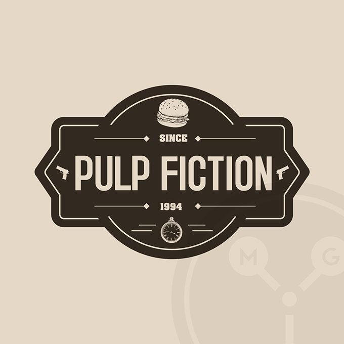
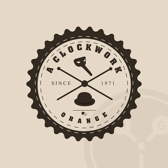
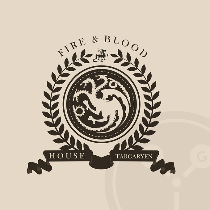
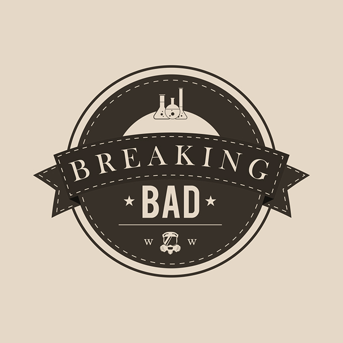
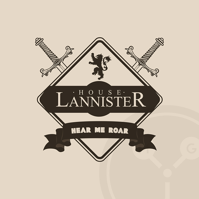
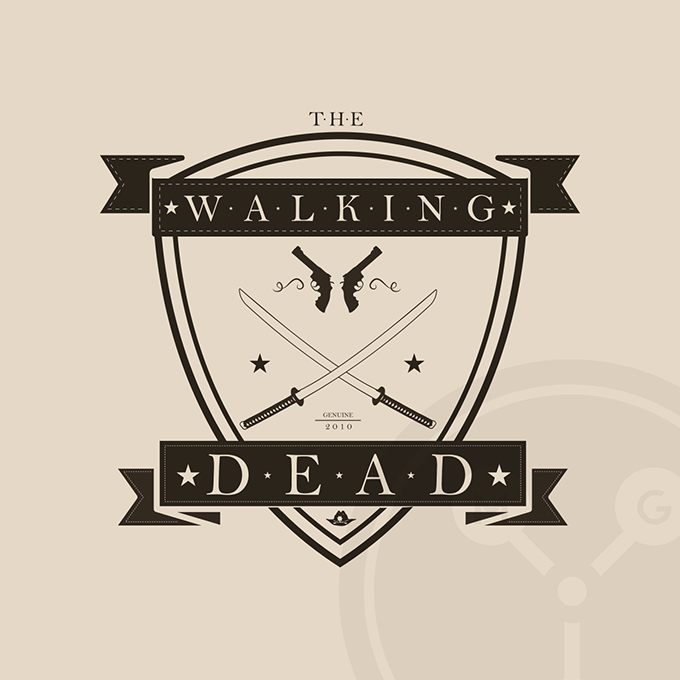
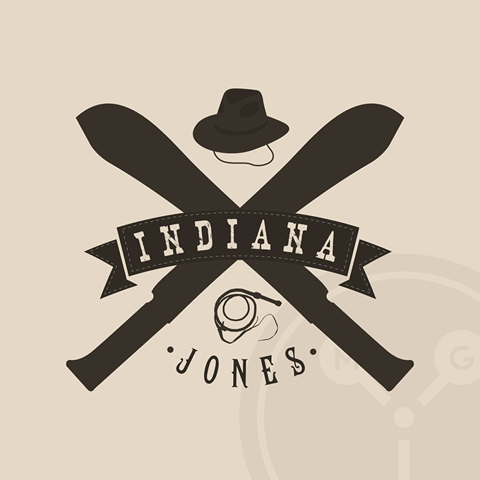
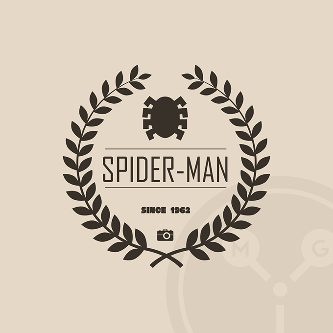
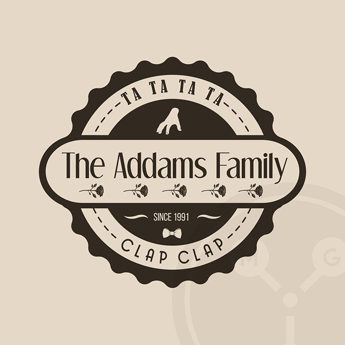
We’ve all seen one of the latest trends in design nowadays: the old school logo. You know, the one that looks like it was designed with a slide ruler on a drafting table, using little more than pen and ink. One enterprising person created Ciné-Hipsters on Tumblr, and they make hipster style logos for TV shows and movies.
It’s not clear if the site is a critique or celebration of the seemingly ubiquitous hipster logo fad, but either way, it’s pretty awesome. Don’t believe me? Keep scrolling. You’ll get it sooner or later. And if not, just know that we liked it before it was cool.

Kevin Whipps is a writer and editor based in Phoenix, Arizona. When he’s not working on one of the many projects in his queue, he’s looking for fun and irreverent things online to share with his friends.
Breaking Bad, Pulp Fiction, and More Reimagined as Hipster Logos
No comments:
Post a Comment
Note: Only a member of this blog may post a comment.