When you’re showing your work to a new client or potential partner, you want it to be perfect. All the details matter: your outfit, your speech, and your presentation. Detailed and unique Powerpoints or Keynotes are few and far between, and a stand-out presentation is essential to making your ideas and products memorable. Here are a few tips for making a great presentation.
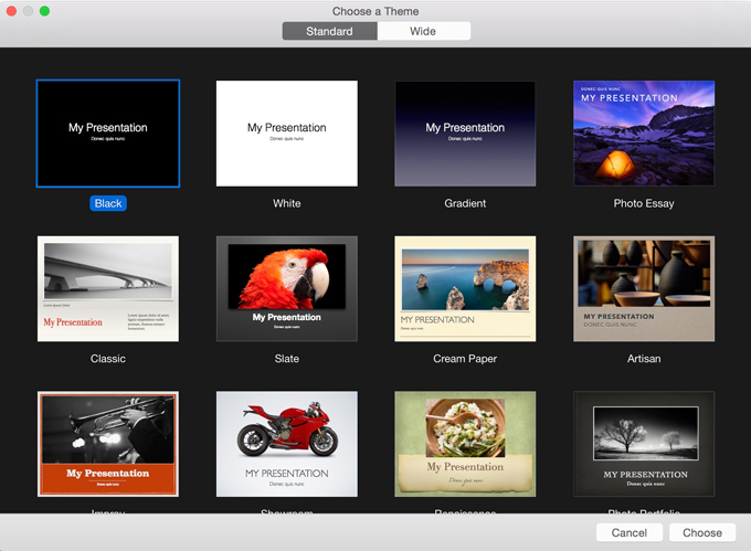
1. Never Use a Built In Template
No matter how sweet it looks or how much time built-in presentation templates will save you, if you want to impress your audience, you should use a completely unique presentation design. It’s not that pre-made, built-in templates don’t look good or are poorly designed. Chances are that your audience has seen the template before, so you are associating yourself with those past presentations, instead of looking unique. In addition to that, they show a lack of effort. You need to spend time and effort on every aspect of your presentation, including how it is laid out.
2. Keep the Graphics Super Simple
Presentations should be secondary to what you are presenting. If you try to say too much with graphics or icons, you’ll lose your audience to them. Good presentations seem almost ephemeral – as if they were just conduits for the information you’re conveying. Think about how effortless and simple good design seems. Check out this great example called AppPower by AWSM Designs. Its beauty is in its clarity. It’s tailored to the subject – this presentation is about a phone app and nothing else. The icons are simple line drawings that convey simple messages.

3. Leverage the Power of Great Photography
Graphics and icons are included in your presentation for helping communicate the data and the facts, but photographs do something different. They can evoke emotions or styles that you hope to achieve. They can bring you on a journey to a different place. Classica Zine Keynote Template by AWSM Designs is a great photo presentation template. The design has the feel of a high fashion or hip pop culture magazine.

4. Make Boring Data Beautiful
This point goes hand in hand with tip #2. Simple graphics used with intent can present the most boring statistics and numbers in new and exciting ways. Infographs and charts will help your audience understand the subject better. Louis Twelve has a great presentation template called Benchmarking Business Keynote. It has some of the most creative charts I’ve seen. The Personal Diagram is a great way to present your positives without sounding pompous, or to describe the ideal customer or employee. Take a look at the way Arcadia by Ryanda allows you to use maps in different ways to present geographic data in big ways.


5. Create a Basic Color Scheme and Stick to It
Think about your color scheme like the background music of a movie – several instruments played well in harmony to aid the story. A good color scheme has balance and is internally consistent, yet it doesn’t distract you from the information you are presenting. Monica, another presentation template by Ryanda, has only a handful of colors, but they each play off one another well to create a unified, but varied backdrop.

6. Keep Your Body Fonts Basic and Readable
This is a pretty obvious one for experienced designers, but can be an easy mistake for amateurs to make. Body fonts are unique in their subtleties and are not a place for extreme fonts. They need to be clean and legible. Stick with the basics: Helvetica, Arial, Garamond, etc.

7. Headline/Title Fonts Can Be More Unique and Interesting
This goes along with the last tip. If you want to express yourself through creative typography in your presentation, use the heading and title fonts effectively. The Idea is King Keynote by AWSM designsis an excellent example of tips 6 and 7. The powerful brushstroke font provides a unique look to balance the plain and clean body text font.


Cool Headline Fonts
If you’re in the market for some great headline fonts, here are some that have been really popular lately.


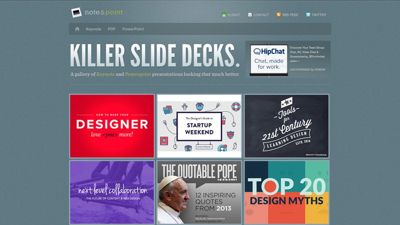
Find Great Inspiration
One of the best ways to get in the zone for designing great presentations is to look around and see what others are doing. Here are a few of our favorite presentation inspiration sites.
What Do You Think?
Your presentation should look as fresh as your idea. Following these tips will help you create your own stand out presentation template. Have any additional tips or questions? Post them in the comments below.
Products Seen In This Post:


How to Design a Presentation That Rocks
No comments:
Post a Comment
Note: Only a member of this blog may post a comment.