It’s funny how many fonts there are out there, but people still end up using inappropriate typeface all the time. Anything that uses letters, numbers, and symbols, whether it’s a sign outside your store or the report you need to submit to your boss, requires a specific typeface that would make all the difference. The typeface dictates what message you are trying to send across, what the tone is, and even who its creator is.
Some fonts may come across as casual, while some may look formal and professional. Others show a fun and carefree identity, while some give you an impression that they’re meant to be used for more serious things. This is what typefaces do. They give any text they are used on its own personality, allowing people who read it to identify with it more effectively.
Questions to Ask when Choosing a Typeface
Great text using the wrong font does not only ruin the entire design, it also ruins the entire message. You wouldn’t want to trust your taxes with an auditing firm whose name uses a font like Comic Sans or Chiller, would you? I mean, how in the world could you take them seriously?
Before you choose a typeface you must ask yourself a few important questions. The answers to these question will lead you in the right direction to finding the perfect typeface.
Is it legible enough?
Let’s face it. Fonts were created to give life to the text, but there are times when font designers overdo it and end up creating typefaces that can barely be read. Some fonts may also be too thin to read, while some may be too bulky that it’s hard to distinguish one letter from another when an entire word is spelled out.
Make sure that the font is legible by checking if each and every letter can be easily read, and if they can still be distinguishable should they be placed beside other letters. Is the shape taking up too much space? Do the strokes lack definition?
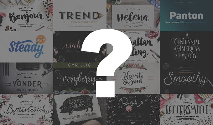
If legibility is your goal, here are some great, easy-to-read fonts that come in a variety of weights:


How much emphasis do you need?
Some fonts give more emphasis to text compared to others. The font Impact for example, stays true to its name as its width makes the letters stand out over other typefaces. Some fonts also come in varied styles to allow you to lessen or improve the amount of emphasis that it gives. Helvetica Neue, for instance, also gives you options for light and ultra light, aside from the usual bold and italic styles.
How do you know what kind of emphasis you are looking for? Figure out where the text will be placed. Is it the main heading of a webpage? Then this definitely needs a bolder approach compared to the rest of the text on the page. Is it something that should only represent the fine print on an ad? Then choose a font that comes across as subtle and unobtrusive, but still readable. Is it going to be used for the brand name on a store signage? Then choose something that would stand out from a mile away. And if you’re looking for a font to use for the tag line beneath that brand name, then make sure that there is just enough emphasis for it to be noticed without overshadowing the name above it.
Is it appealing to the audience?
In choosing the right font, you have to figure out what personality your audience has. What would appeal to them the most? What’s their age bracket? Are they the fun type, or are they the serious type? Once you have this all figured out, you could finally choose the kind of font that you believe would appeal to them the most.
The font Gotham has a beautiful contemporary design perfect for audiences who are modern, confident, and secure. However, this font is also President Obama’s favorite font, with all his banners, flyers, and other campaign material using this specific typeface. So you may want to use this if you want a contemporary look, but think twice if you think the association with the person using it a lot may not be fitting for what you need.
If you’re looking for a professional look but would still want your text to pop out, avoid using Times New Roman as a default. The font has been overused and comes across as boring and devoid of creativity. Now look at Apple Garamond and compare it with the previous font. Isn’t the second one friendlier to look at, and a lot more stylish? This font is associated with the Apple brand however, as this was the font they used in all their marketing materials. So if you’re speaking to a loyal Samsung crowd, then this would be the worst choice.
Does it represent your brand and goals?
If you are designing material for a learning center for toddlers, do you think fonts like Garamond or Baskerville would be appropriate? Definitely not. Because you want to have a colorful, fun, and lively façade, you could be better off with something that would show just that.
Go back to the brand and what it represents. What are your goals? What image do you want the brand to have? What do you want your audiences to think the moment they see the final design? If the font you choose aligns with your brand and its goals, then this is the perfect font for you.
Once these questions have been answered, then you may be on your way to achieving the design that you want.
If you’re looking for fonts that are uniquely appealing, check these out:


Criteria to Use When Choosing a Typeface
And so, once you get to the drawing board and start creating the design that you need, have a checklist ready for the things that you need to consider.
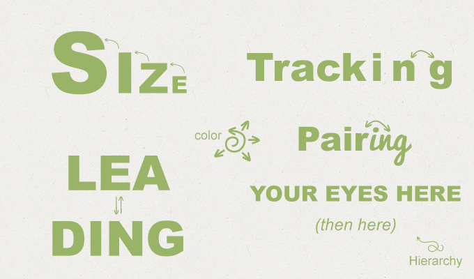
Pairing
You will need more than one font to make a design work, especially if you’re working on a webpage. This is why pairing matters. You have to make sure that the fonts you use are similar enough to complement each other, but different enough to show the distinction between them.
Size
Better readability would also mean using larger sizes. Titles would have to be large enough to be noticed, but not too large that it overpowers the rest of the text. Text bodies would have to be readable enough, but should not be too large that they start taking up too much space on the page.
Hierarchy
Every design has hierarchy to all the aspects involved. For example, the title should have the top rung of the ladder, and should have the most emphasis. The subtitles should be smaller than the title, but not too small that the emphasis is taken away from it.
Leading
Leading is the amount of space given between each line of text. Figuring out how much leading you need would depend on the font you use. The smaller the font, the smaller leading that it would also need in between the lines. The bigger the font, the larger the leading as well.
Tracking
If leading decides how much space there is between lines, then tracking decides how much space there is between letters. The spaces should not be too small that it becomes hard to make out one letter from another, but not too wide that a single word takes up a whole lot of space even if it uses a smaller font.
Color
Of course, color is not exactly one of the main aspects that comes with choosing a font, but it greatly affects the end product, so this should also be thought about quite seriously. If your font is already light enough as it is, then avoid using light colors and go for more solid ones.
Always have this checklist handy when designing anything with text. These would decide how effective your end product would be.
Final Thoughts on Finding the Perfect Typeface
Here are a few final words that could help you decide what font or typeface you need for your design:
Have an Outline of the Content
Having a clear outline of the entire text on a page would help you plan the number of fonts that you need, as well as on how you are going to lay everything out.
Look at Other Designs for Inspiration
There are so many amazing creative designs out there that show how the right choice of font creates a masterpiece. Find some of them and use them for inspiration. Here’s a great resource to do just that: Design Inspiration: Sites and Tools for Boosting Creativity
Stand Out to Be Noticed
Of course, getting inspiration from other designs does not mean that you will make your design very similar to it. You have to find ways to make your design stand out. Don’t be afraid to experiment and be bold with your choices.
Do Research About the Font
Make sure you do some research about the font you’re using. Using Trajan as a font for a page that discusses Ancient Greece for example, would be a little awkward once you’re asked to explain your choice. This is because Trajan was actually a Roman Emperor that came much, much later than the period of Ancient Greece.
Avoid Clichés
Stop using Comic Sans for funny text, and stop using Papyrus for anything related to Ancient Egypt. This makes the entire design too predictable, and makes it appear to lack creativity.
With this guide on choosing the perfect typeface for your project, are you ready to create a masterpiece?
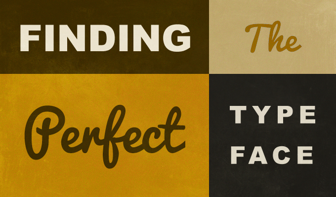
How to Choose the Right Typeface
No comments:
Post a Comment
Note: Only a member of this blog may post a comment.